Robin Kinross is proprietor of Hyphen Press. After graduating (1975) and postgraduating (1979) from the Department of Typography & Graphic Communication at the University of Reading, he began to do ‘editorial typography’ (editing and design in one process) as well as write about typography. In 1980, while still living in Reading, he re-edited and re-published […]
This interview was recorded in London on 28 May 1999, and published in Slovenian translation in the cultural magazine Emzin’.
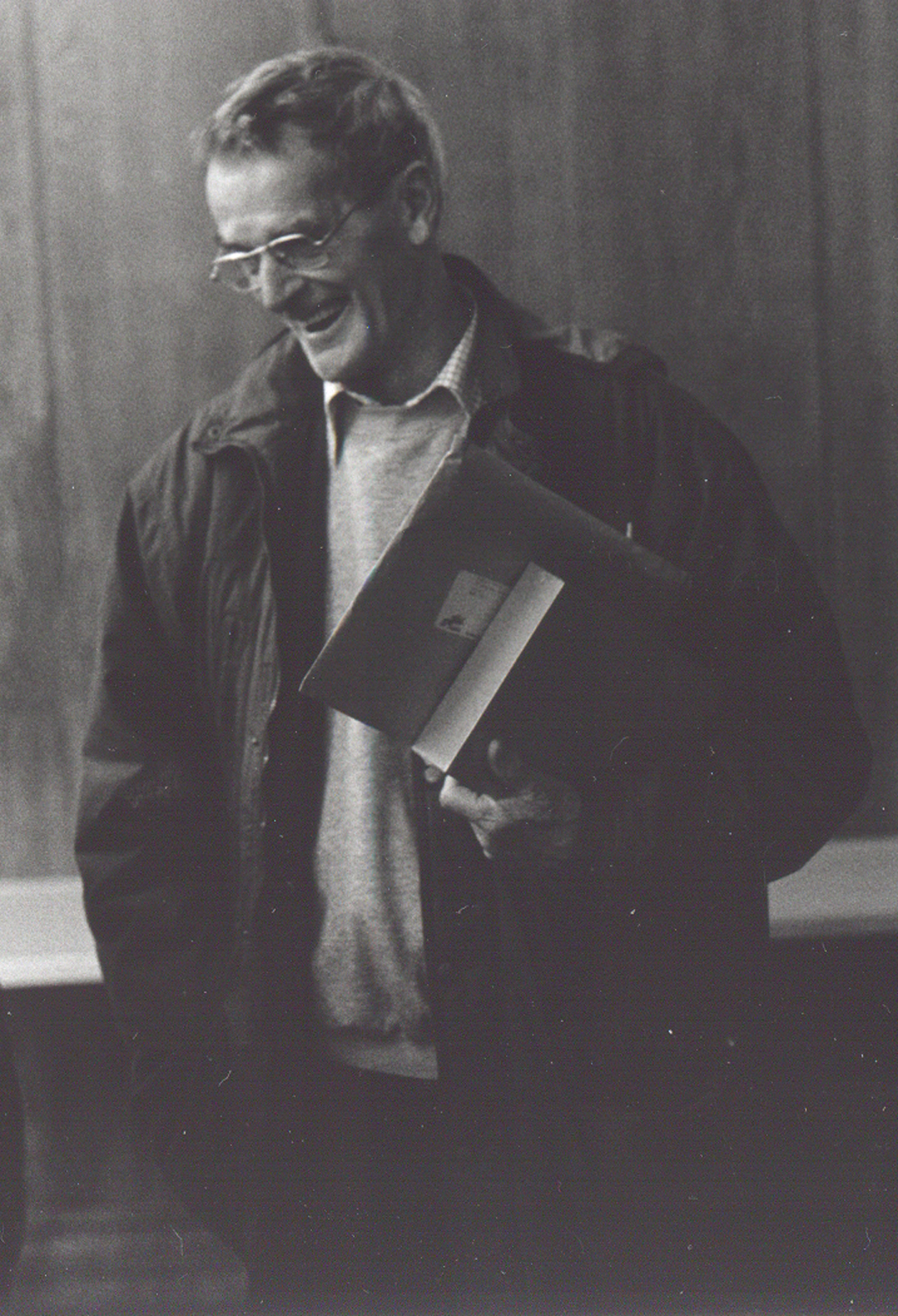
Robin Fior died on 29 September, in hospital at Mafra, outside Lisbon. This is not an obituary (his friend Richard Hollis has written a good one), but merely a set of memories of someone I knew, off and on, over twenty or so years. He was part of a certain network of designers in Britain, whose work has provided a main impetus for Hyphen Press.
From this week to the end of June, Robin Kinross is living and working in the Netherlands: taking up this year’s Fellowship at the Konkinklijke Bibliotheek [Royal Library].
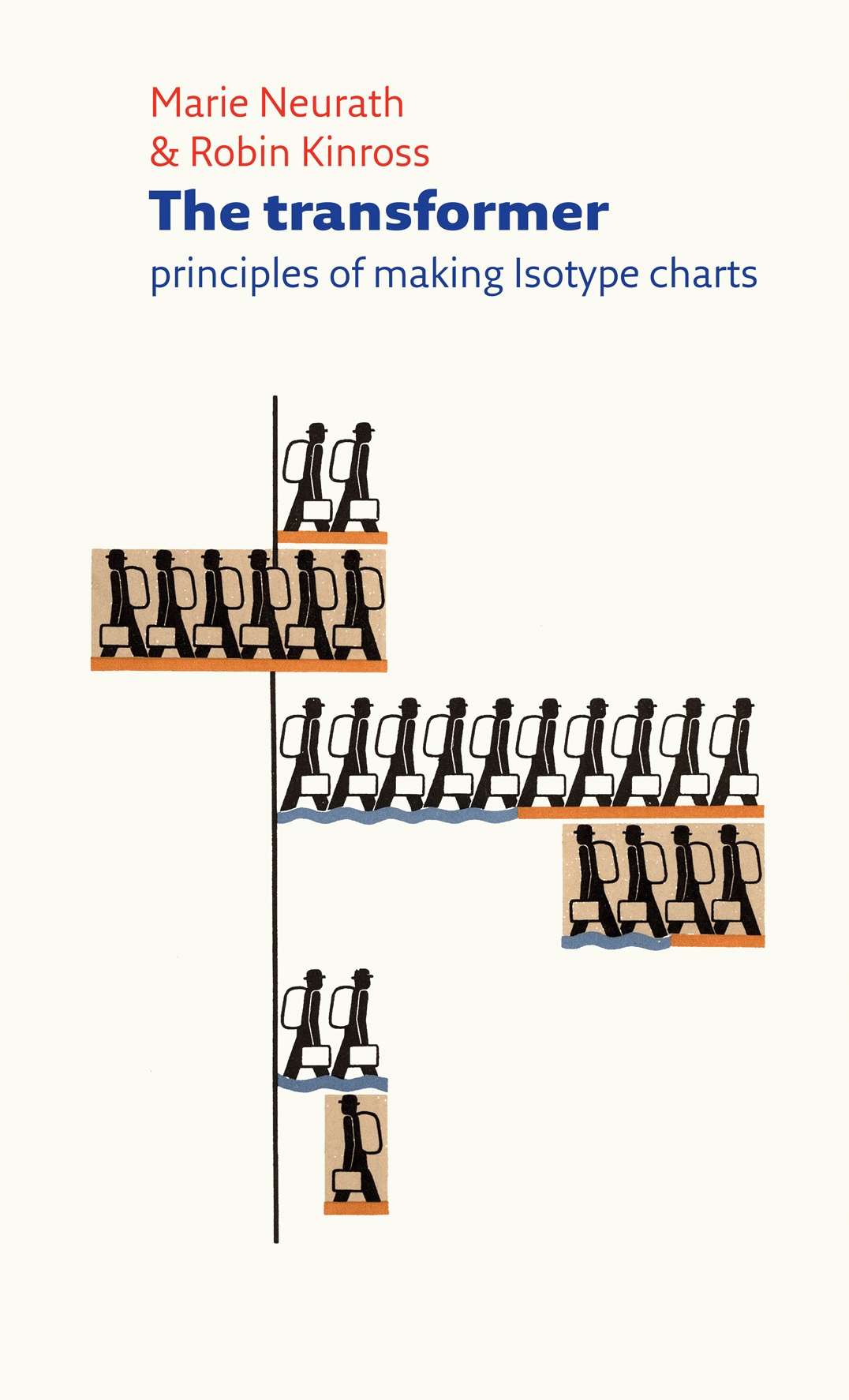
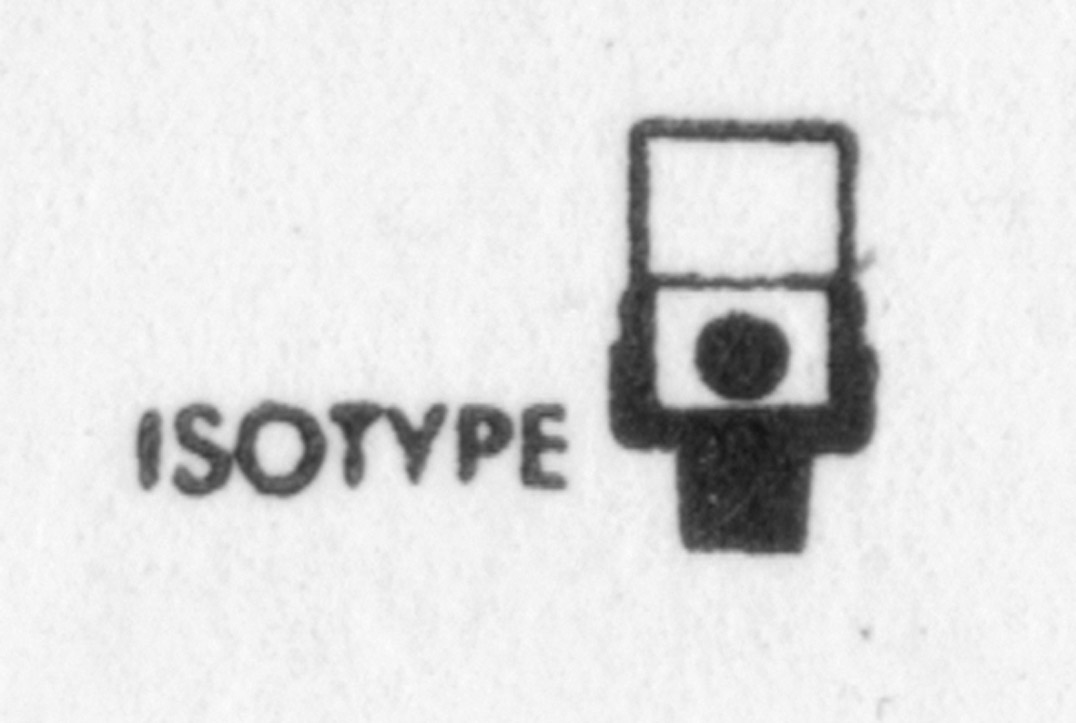
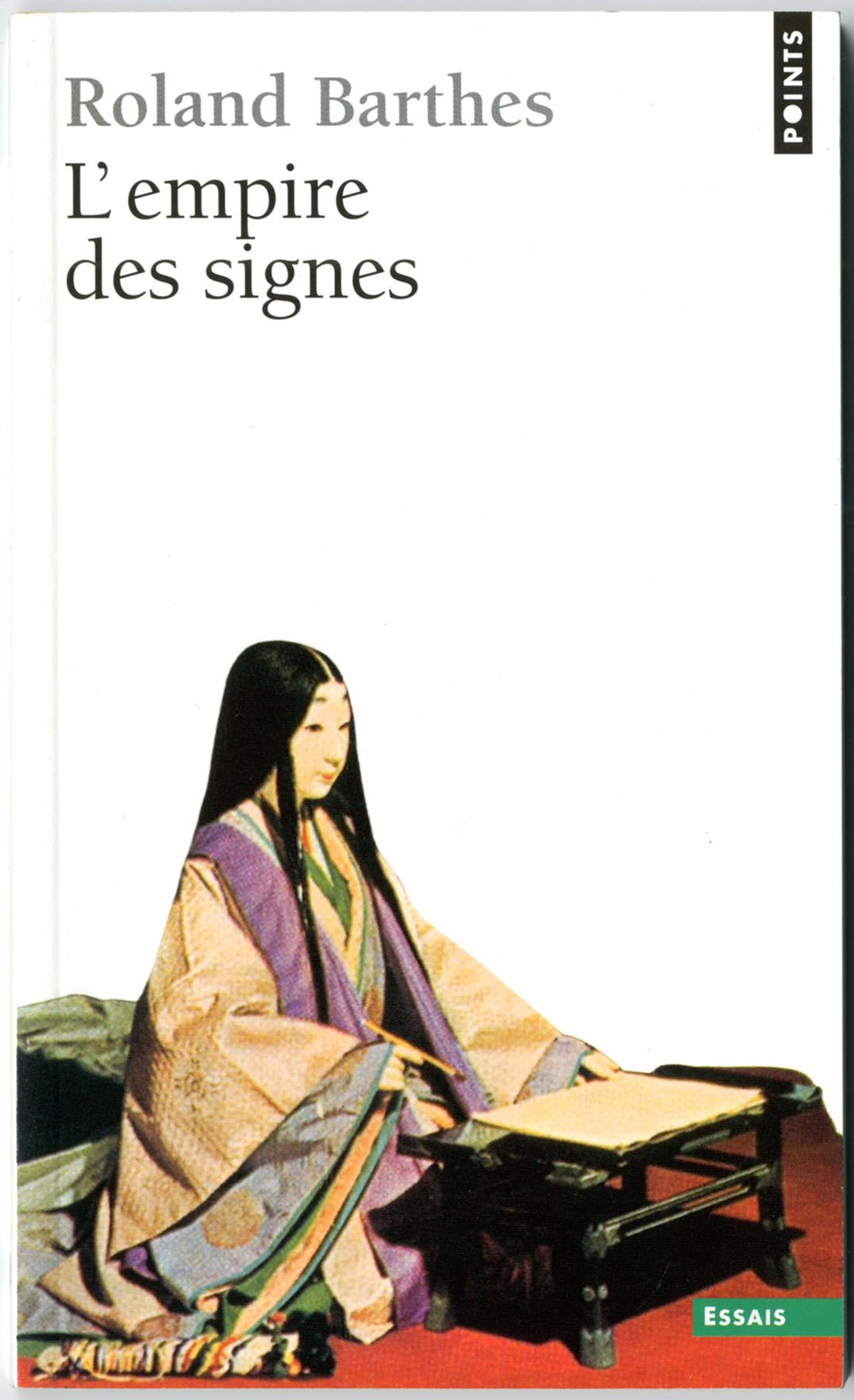
The visual work of Otto Neurath and his associates, now commonly known as Isotype, has been much discussed in recent years. This short book explains its essential principles: the work of ‘transforming’, or putting information into visual form. This deeper level of their work – which is applicable in all areas of design – is routinely neglected in the assumption that Isotype is just a matter of symbols and pictograms. At the core of the book is a previously unpublished essay by Marie Neurath, the principle Isotype transformer, which she wrote in the last year of her life. This is supplemented by Robin Kinross with commentary on illustrated examples of Isotype and other supporting short essays.
Next week in Vienna, two events hosted by the Typographische Gesellschaft Austria take place: a workshop with Jost Hochuli (Monday 11 to Friday 15) and a talk by Robin Kinross on ‘Design for meaning’ (Wednesday 13).
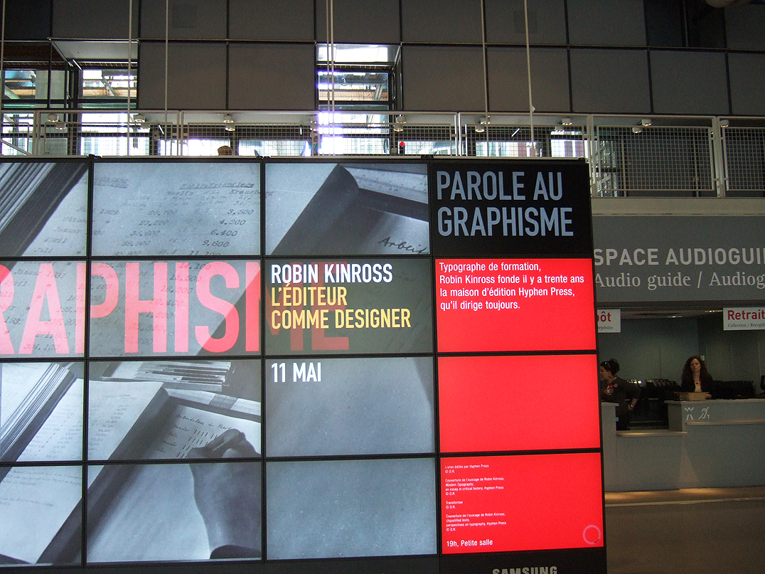
The photograph below records the entrance space at the Centre Pompidou in Paris, last week, where Robin Kinross gave a ‘conférence’ on the occasion of the publication of the French edition of Modern typography.
On the occasion of the publication of the French edition of Modern typography, Robin Kinross is speaking on the theme of ‘editing as design’ at ÉSAD Valence next Thursday, and at the Centre Pompidou on Friday.
A short report, with the introductory remarks by Robin Kinross and Eric Kindel, and Christopher Burke’s more substantial exposition of the making of our edition, can now be found on the ‘Isotype revisited’ website.
On Thursday 28 October (7.30 pm) at the Highgate Library in Chester Road, London N19, Robin Kinross will be speaking about his work with Hyphen Press.
Last December, Michel Aphesbero and Thomas Boutoux came to London to interview Robin Kinross, for the rosab.net web-magazine, made at the École des beaux-arts de Bordeaux.
On 15 October, in a talk at this year’s Cheltenham Literature Festival, Robin Kinross will attempt to explain what typography is.
There has been much discussion in recent years about the typeface Helvetica, prompted by the book made by Lars Mueller and now a film by Gary Hustwit. In this connection, Erik Spiekermann has been active. Much of Erik’s work has been a wonderful effort in surpassing the unthinking, formulaic and bureaucratic approach that often entails the use of Helvetica. In 1991 Erik brought out his typeface Meta. With the great success of Meta, it came to be some sort of alternative to Helvetica: more subtle and humane than the essentially regularized-industrial forms of Helvetica. The tag ‘the Helvetica of the 1990s’ has become attached to Meta, and has sometimes been attributed to Robin Kinross.
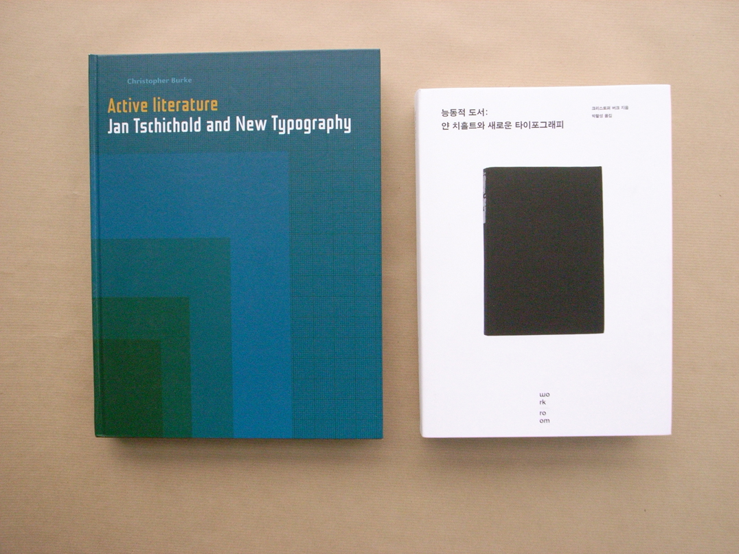
In connection with his forthcoming book Active literature, Christopher Burke will be talking on 19 June at the St Bride Printing Library in London on ‘Jan Tschichold: the missing typefaces’. An exhibition at the Library of work by Tschichold, curated by Christopher Burke and Robin Kinross, will open then and be on display through to 23 August.
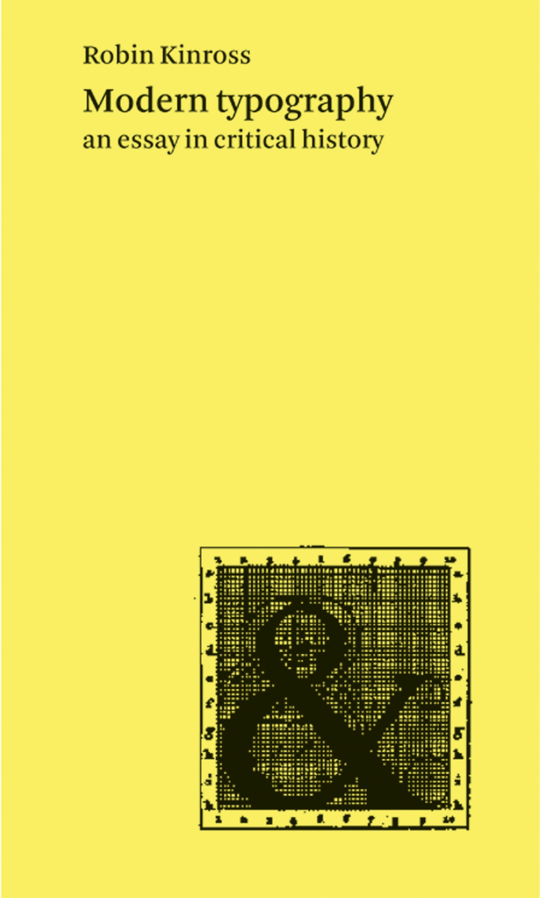
The much delayed second edition of Robin Kinross’s Modern typography is now finished and available.
Robin Kinross is giving a talk with this title at the Information Design Histories conference at Coventry (UK), 10 December 2003.
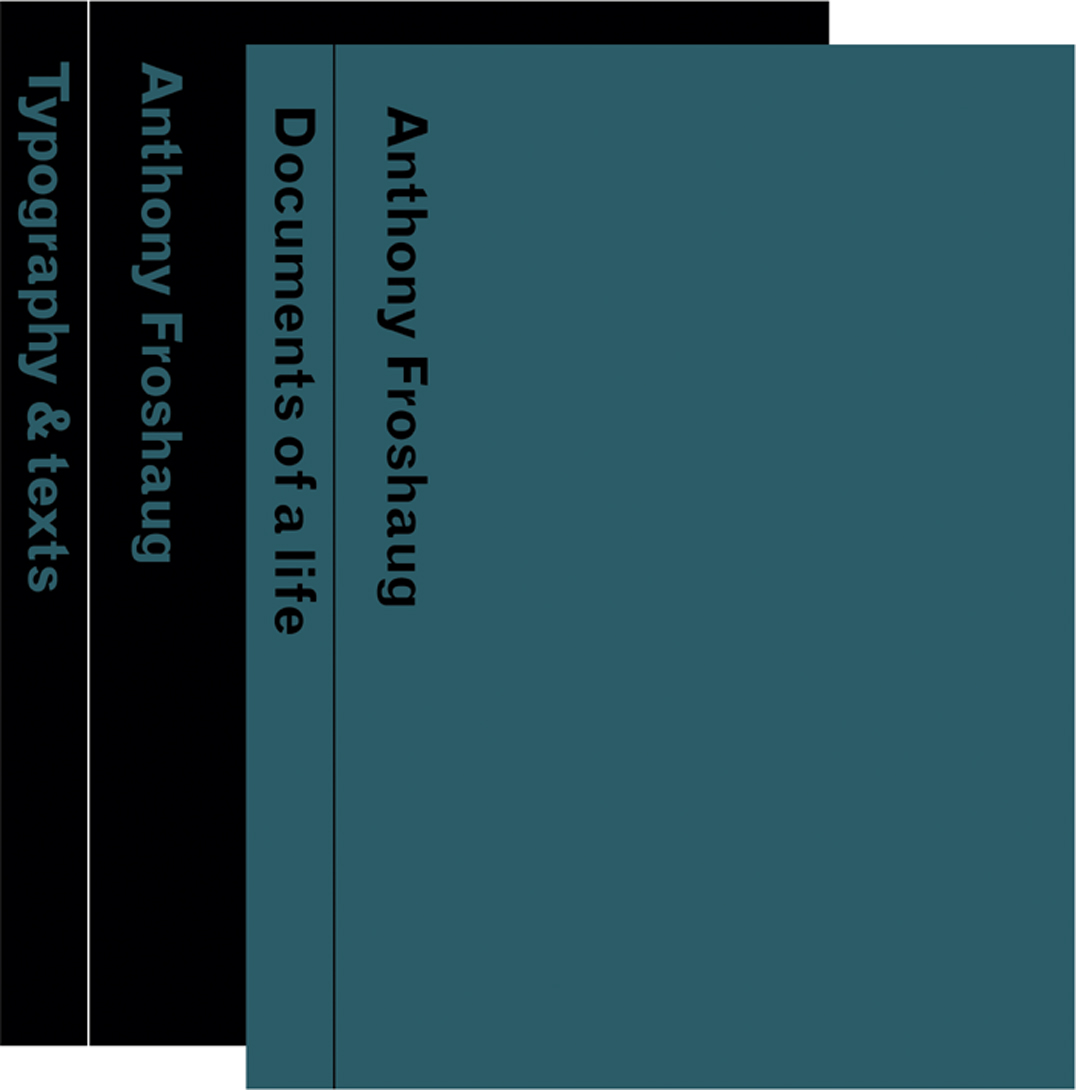
The second issue of Dot Dot Dot is just out. Among the more directly Hyphen-related contents are a review of Anthony Froshaug by Paul Barnes, and an article by Robin Kinross on ‘The uses of failure’.
A long interview between Petra Cerne Oven and Robin Kinross has just been published in Emzin.
Robin Kinross is contributing to the ‘Ma[r]king the text’ conference at Trinity College, University of Cambridge, England, 3–6 September 1998. The topic of his talk is ‘Judging a book by its material embodiment’.
My first encounter with Nick Jacobs happened in 1970. I had started to read New Left Review: in those days especially, the journal had an air of discovery about it, and I seemed to read most of every issue. That year, 1970, was when New Left Books was launched. NLR subscribers could buy these books by mail order, at a favourable price.
With Hat Hut, the musical content and the graphics, typographics and architecture of the packet, are fused more than most. Werner Uehlinger, who runs the label from Basel (before that, Therwil in the same Swiss canton) has a telling story of how it began in 1975.
As often, it began with a remark by Anthony Froshaug. I had told him that some book had a certain number of pages – it was an odd number. He observed that this must be a strange book. To imagine a sheet of paper with just one side, or to imagine a folded sheet or a gathered number of folded sheets, with five or seven or nineteen or twenty-one sides is to enter the world of M.C. Escher.
Last year we moved this website to a new hosting company and into a new CMS (WordPress). The appearance of the website has changed only in some details. This has provided an opportunity to check through content, and especially to look at and try to mend the now many broken links. This is a large and still continuing project. It has also provided the occasion to update the occasional indexes to the journal that have been offered here. These are now consolidated as the present post.
A book of writings from twenty-five years of engagement on the peripheries of both journalism and academic life, and drawn largely from small-circulation and now hard-to-access publications. Persistent themes include: editorial typography, the emergence of graphic design in Britain, emigré designers, Dutch typography, the work of critical modernist designers.
This is the novel first published in 1937 in London. We are publishing facsimile editions of this book and its sequel, Asleep in the afternoon. A third book, God’s amateur: the writing of E.C. Large is being published alongside the two novels, as a companion.
The work of Karel Martens occupies an intriguing place in the present European art-and-design landscape. Martens can be placed in the tradition of Dutch modernism – in the line of figures such as Piet Zwart, H.N. Werkman, Willem Sandberg. Yet he maintains some distance from the main developments of our time: from both the practices of routinized modernism and of the facile reactions against this. His work is both personal and experimental. At the same time, it is publicly answerable. Over the now 50 years of his practice, Martens has been prolific as a designer of books. He has also made contributions in a wide range of design commissions, including stamps, coins, signs on buildings. Intimately connected with this design work has been his practice as an artist. This started with geometric and kinetic constructions, and was later developed in work with the very material of paper; more recently he has been making relief prints from found industrial artefacts. This book looks for new ways to show and discuss the work of a designer and artist, and is offered in the same spirit of experiment and dialogue that characterizes the work it presents.
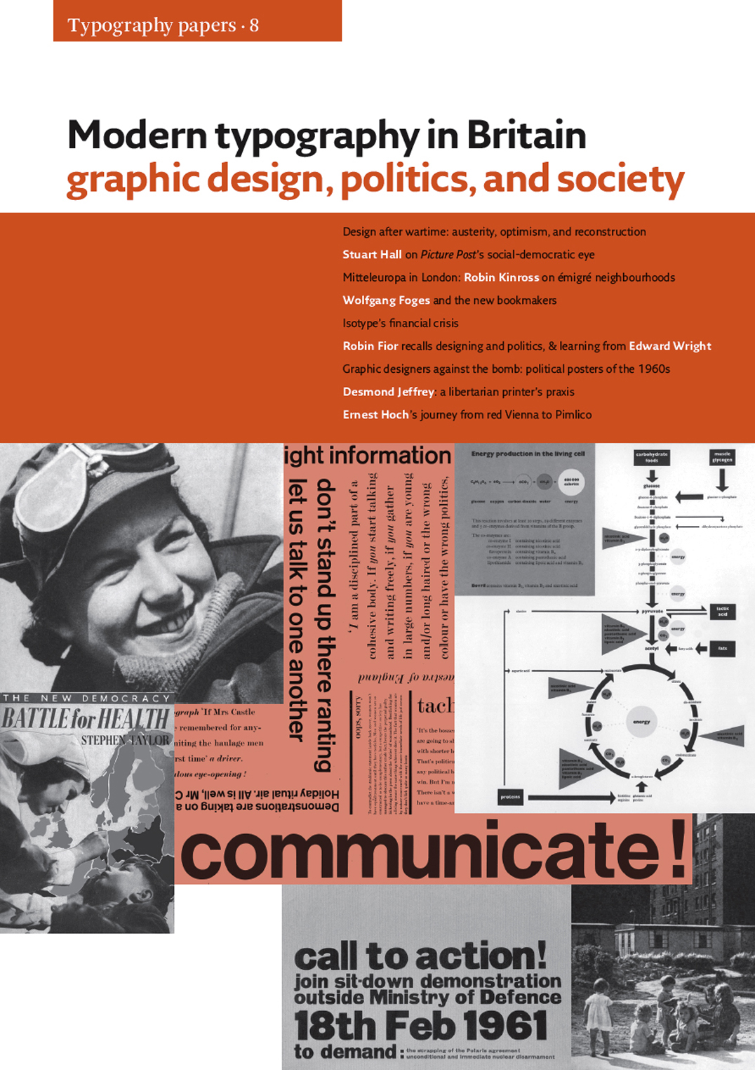
This remarkable volume is a collection of eleven essays and shorter articles which for the first time provide rich contexts – social, cultural, and political – for graphic design in Britain. Reaching from the Second World War to the early 1970s, they fizz with provocative interconnections: between print culture, photojournalism and publishing, the London of émigrés, political meetings and demonstrations, cultural cafés and art schools. From these disparate milieux emerged new ideas about designing: configuring and picturing the world of facts and processes, shaping them for understanding, learning, and action. Presented here are documents of the nation’s life in war, its reconstruction through the passages from scarcity to plenty, the seeds of later fragmentation, always fertile with multiple intersections between biography and history.
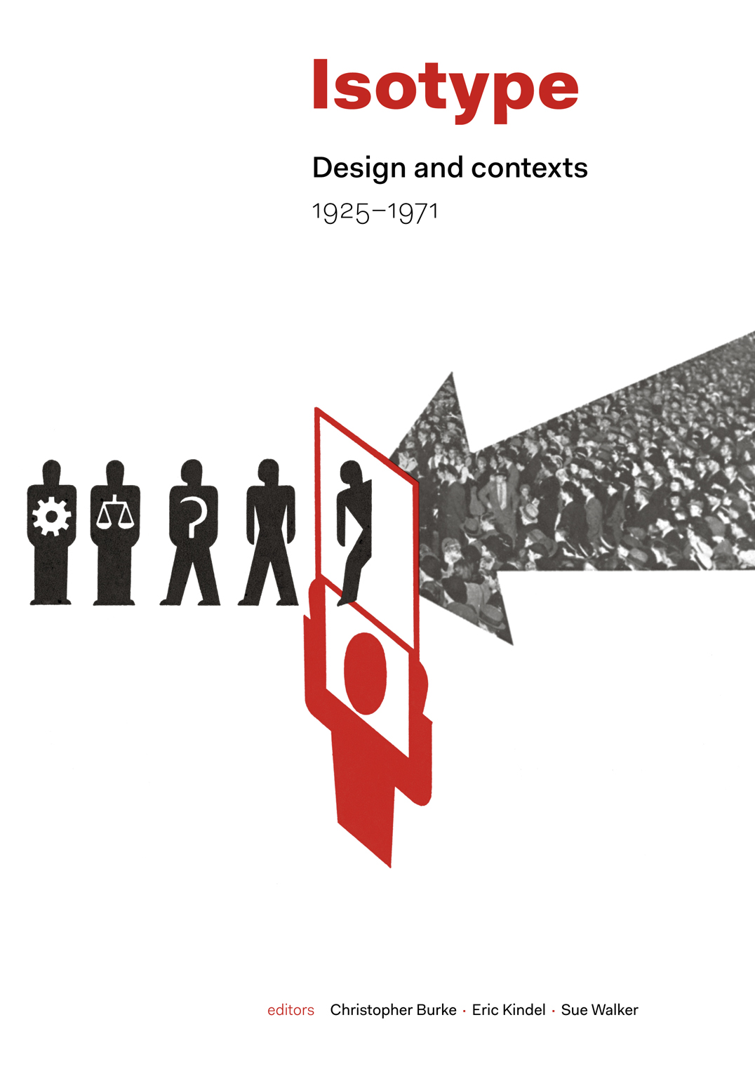
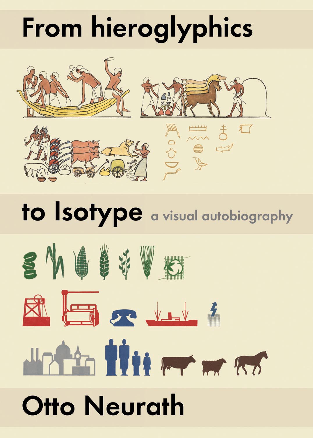
The work in graphic communication carried out by Otto Neurath and his associates – now commonly known simply as Isotype – has been the subject of much interest in recent years. Conceived and developed in the 1920s as ‘the Vienna method of pictorial statistics’, this approach to designing information had from its inception the power to grow and spread internationally. Political developments in Europe played their part in its development, and production moved to the Netherlands (1934) and to England (1940), where the Isotype Institute continued to produce work until 1971. Bringing together the latest research, this book is the first comprehensive, detailed account of its subject. The Austrian, Dutch, and English years of Isotype are described here freshly and extensively. There are chapters on the notable extensions of Isotype to Soviet Russia, the USA, and Africa. Isotype work in film and in designing for children is fully documented and discussed. Between these main chapters the book presents interludes documenting Isotype production visually. Three appendices reprint key documents. In its international coverage and its extensions into the wider terrain of history, this book opens a new vista in graphic design.
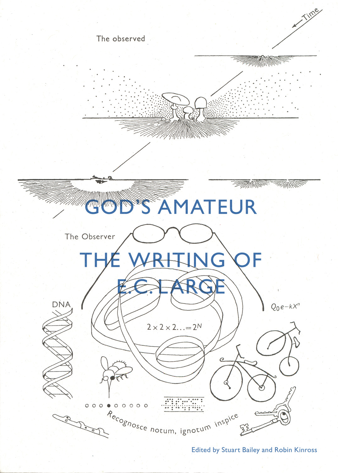
A book of and about E.C. Large, which contains a selection of his shorter writings – travel essays, reportage, reveries, reviews, critiques, autobiographical pieces – and which reveals the extent of his achievement. These show a notably exact writer, with sane no-nonsense views, and yet with great imagination. Some unpublished texts are shown in facsimile. Also here is a bibliography of his published writings (both ‘literary’ and scientific), and an essay by Stuart Bailey, which sees his work with present-day eyes.
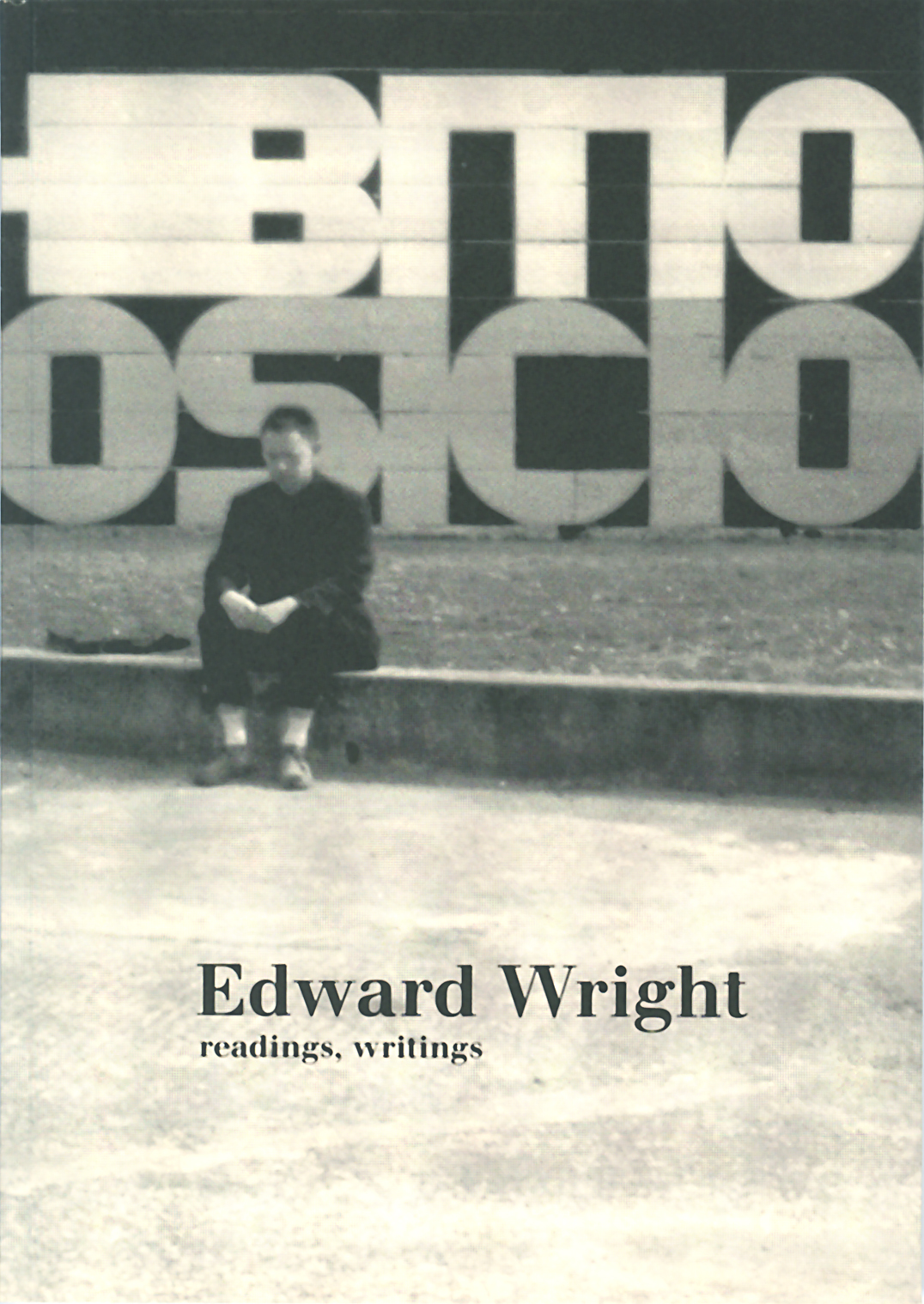
Born to South American parents, British citizen, cosmopolitan at heart, Edward Wright – painter and object-maker, typographer, writer, teacher – was an enigmatic presence in London’s post-War art and design scene. Wright has been described thus: ‘His subjects: human communication, the mundane, the street. His manner: sparing, self-critical, yet the work had vigorous attack and full conviction. His typical method: assemblage, with what was to hand.’
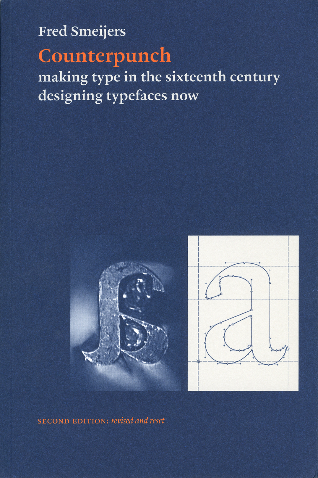
Counterpunch is packed with ideas. It is both an investigation into the technics of making metal type by hand, and a consideration of present questions in type design. The discussion takes in the fundamentals of designing and making letters, so that the book can be read as a guide to type and font construction in any medium. Lively, pointed drawings and photographs complement an equally fresh text.
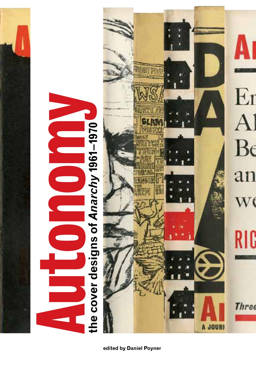
Anarchy was a journal of ideas published in London in the 1960s. Although its contributors were many and diverse, Anarchy was essentially the creation of one person, Colin Ward (1924–2010). With this journal, and throughout his work as a writer, editor, and activist, Ward proposed the idea that anarchist principles of mutual aid and autonomous organization outside a centralized state can be achieved here and now. This book gives attention for the first time to the covers of Anarchy, designed mostly by Rufus Segar. These little-known works provided the enticing entry to the plain text pages of the journal. The book reproduces all of the covers in a sequence that suggests, incidentally, something of the history of graphic design in Britain in those years. And it goes beyond the images, with an array of supporting texts that give a full picture of Anarchy and its context.
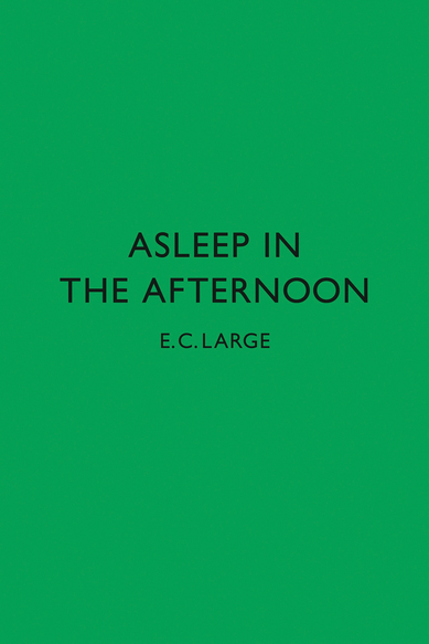
This is the novel first published in 1938 in London. We are publishing facsimile editions of this book and its precursor, Sugar in the air. A third book, God’s amateur: the writing of E.C. Large is being published alongside the two novels, as a companion.
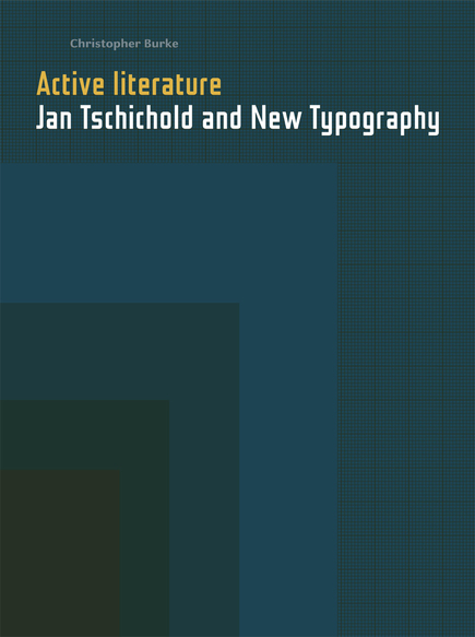
In the first book on Tschichold to be based on extensive archive research, Burke turns fresh and revealing light on his subject. He sets Tschichold in the network of artists and designers who constituted New Typography in its moment of definition and exploration, and puts new emphasis on Tschichold as an activist collector, editor and writer. Tschichold’s work is shown in colour throughout, in freshly made photographs of examples drawn from public and private collections. This is not a biography, but rather a discussion of the work seen in the context of Tschichold’s life and the times in which he lived.
We welcome enquiries and comments. Write by email to: info [at] hyphenpress.co.uk Robin KinrossHyphen Press24a York RiseLondon NW5 1STEngland
In 2017 we published the last book from this imprint and completed the set of music CDs. None of the out-of-print titles will now be reprinted or re-edited. A number of factors are at work in this decision: changes in the nature of the book trade, economics, age, weariness. There are still numbers of some books in the […]
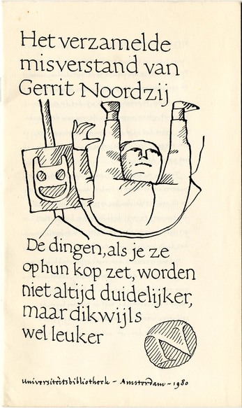
Gerrit died a few weeks ago, aged 90. Even more than most human beings, he was complex. He was simple, sophisticated, dogmatic, open, authoritative, anti-authoritarian, inquiring, certain, proud, humble, unpretentious, masterly, amateur. I did not know him well, but did encounter and engage with him and his work over many years.
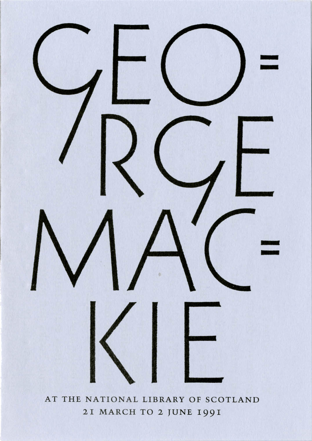
An appreciation of the work of the artist-designer George Mackie (1920–2020)
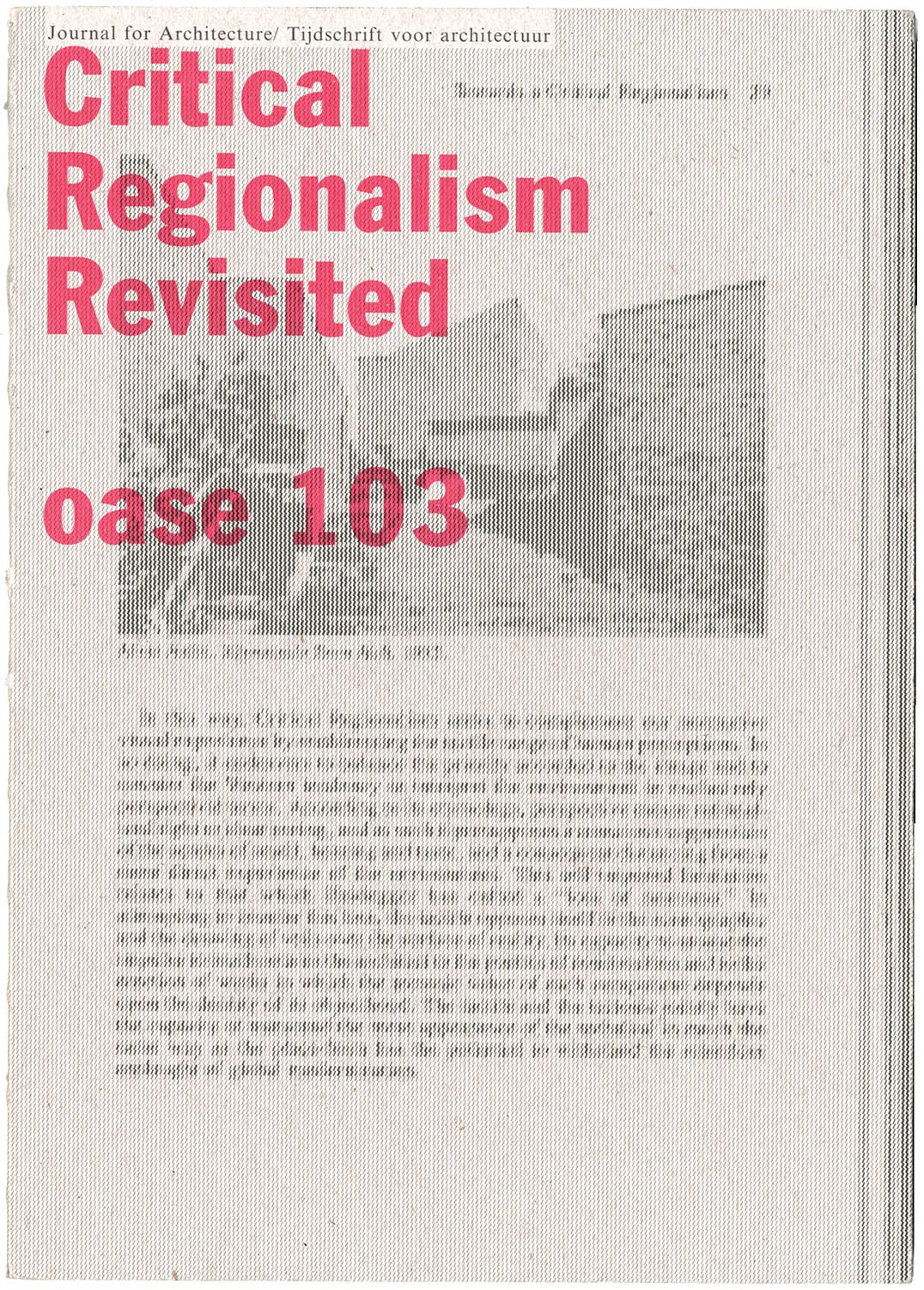
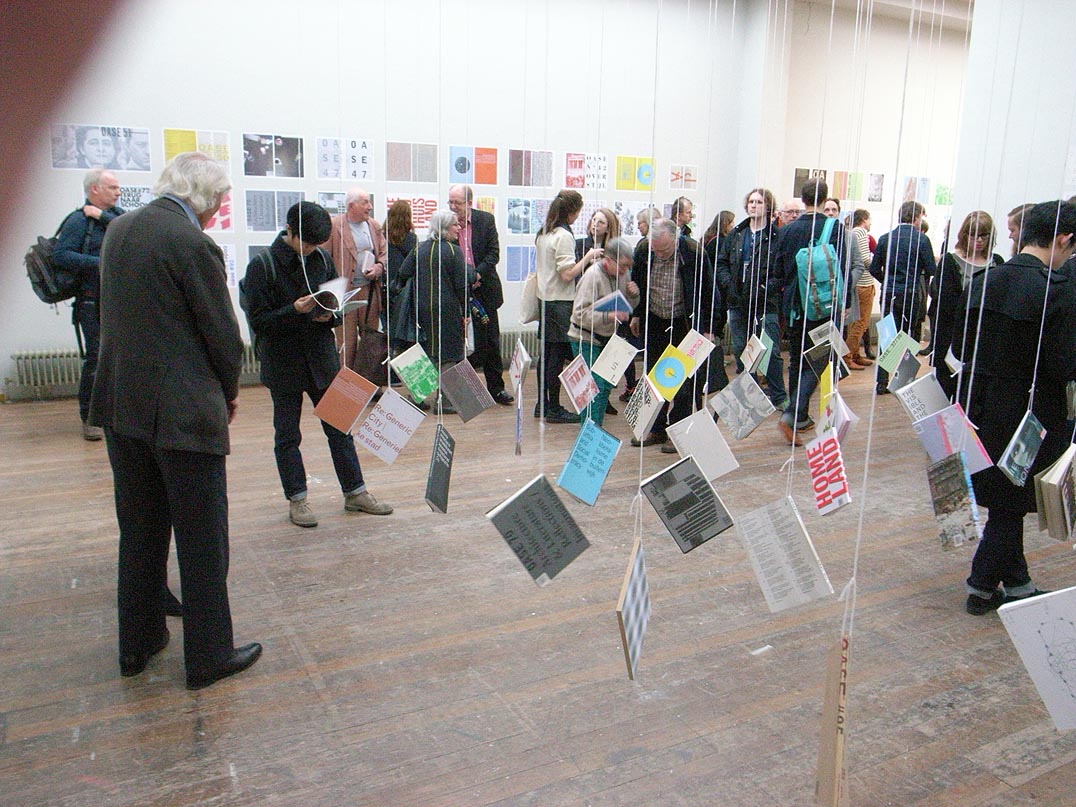
The latest issue of Oase, the journal of architecture, is worth getting hold of. It is devoted to a discussion Kenneth Frampton’s theory of ‘critical regionalism’, which he published first in an essay of 1983. In this special issue of Oase, the original article is reprinted in facsimile, with Dutch translation added; there is a retrospective interview with Frampton, and discussions of the critical regionalism theory by other, younger practitioner-historian-critics: the combined role that Frampton has himself exemplified in his now long career.
In the 1990s the annual meetings of ATypI (Association Typographique Internationale) were often fascinating events. The organization was in transition. Formed in 1957, as a grouping of type manufacturers, it represented the industry’s attempt to regulate itself, and especially to prevent – without recourse to the courts of law – one company from copying the designs of another.
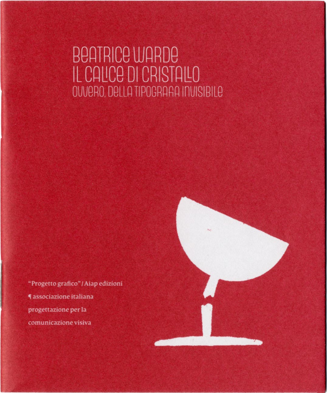
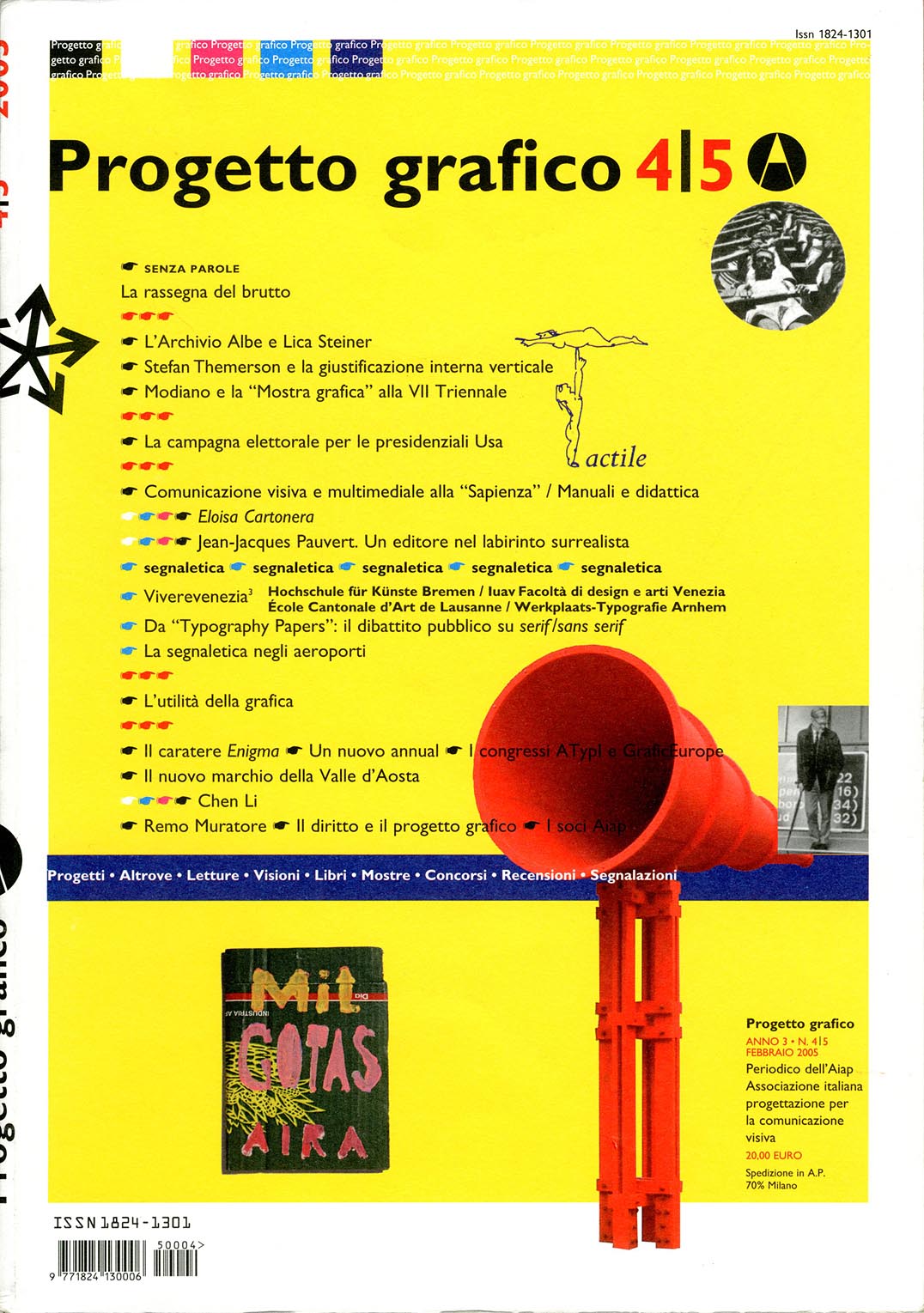
In 2006, invited by Giovanni Lussu and his colleagues on the editorial board of the journal ‘Progetto grafico’ (published by Aiap, the association of Italian graphic designers), I wrote a consideration of Beatrice Warde’s ‘Crystal goblet’ essay. This became part of a symposium on Warde’s view of typography, which was published in ‘Progetto grafico’, no. 8.
This article follows on from the more general considerations on copyright in Isotype published here.
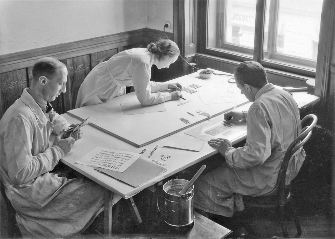
Isotype is now the generally used name for the work in visual communication carried out by groups under the direction of Otto Neurath and, after his death in 1945, by Marie (Reidemeister) Neurath. The institutions that produced this work were the Gesellschafts- und Wirtschaftsmuseum in Wien [GeWiMu] (1925–34), the International Foundation for Visual Education [IFVE] (1934–40), and the Isotype Institute (1942–71). We have published three books on Isotype: From hieroglyphics to Isotype, The transformer: principles of making Isotype charts, and Isotype: design and contexts, 1925–1971. The question of where copyright in the Isotype work lies has been a persistent one. The notes here provide an answer to it.
A previous installment of this occasional series on book production concerned a novel by Julian Barnes, The noise of time. The book was published in 2016 in London by Jonathan Cape, an imprint of Vintage Publishing, and in turn part of Penguin Random House UK.
Comments on the picture-sharing service Instagram have pointed to an interesting detail in Harry Carter’s book A view of early typography. Our edition of this work was a facsimile reprint of the book published by Oxford University Press in 1969, with added editorial matter.
A detail of Hyphen Press style has sometimes caused puzzlement. We give the title of a book with initial capitalization only in the first word. Thus: The arrow of gold, rather than The Arrow of Gold. We have used this style in the text of most of the Hyphen books, and in their display typography too, in catalogues, and on this website.
Julian Barnes’s latest novel was published in London a couple of weeks ago. This is mainly a note on its qualities as a physical object.
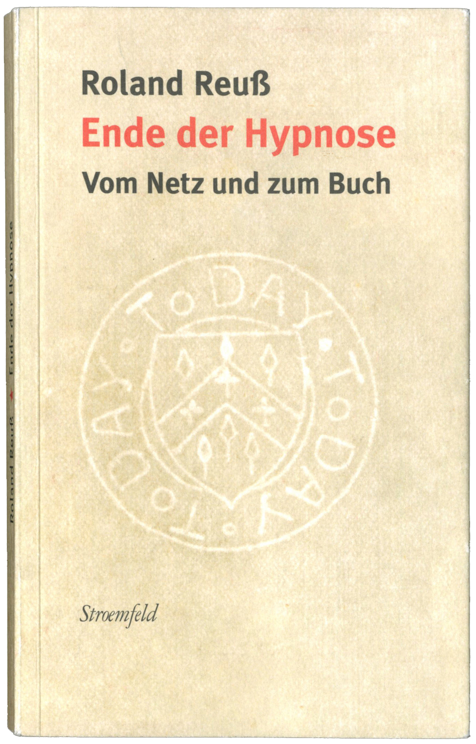
Roland Reuß teaches literature and text-editing at the University of Heidelberg, and co-directs the Institut für Textkritik there. As well as co-editing, with Peter Staengle, major historical-critical editions of Kleist and Kafka, he is a prolific writer on the subject of literature and editing. In addition, in the last few years he has published a stream of articles, especially in newspapers (notably the Frankfurter Allgemeine Zeitung and the Neue Zürcher Zeitung), on wider and more explicitly political themes: the rights of authors and publishers in the face of unlicensed copying of their work, the continuing virtues of the printed book as a means of embodying and duplicating texts and images, the role of independent publishers and booksellers in maintaining human culture.
The Gerrit Noordzij Prize, organized by the Type and Media postgraduate course at the Koninklijke Academie van Beeldende Kunsten (Royal Academy of Art) in The Hague, is awarded every three years. Last week it was presented to the type designer Cyrus Highsmith, and the previous winner, Karel Martens, was celebrated in a seminar, an exhibition, and a book.
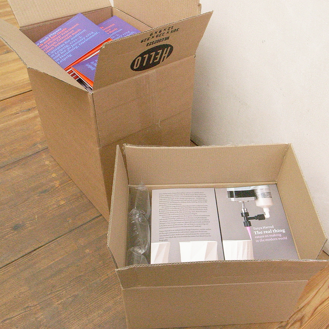
Copies of our new book, Tanya Harrod’s The real thing, arrived before Christmas. We published it formally on 22 January, launching it that evening at a reception at the Art Workers’ Guild in London.
When graphic design work is reproduced, what rights do the people who made this work have? This piece looks at some of the issues, and at what United Kingdom law has to say about them. Reproduction of works of art presents a connected set of issues, and these will be looked at in a following article.
At work over the holidays on a writer’s first draft, the following notes seemed of possible wider interest.
One of the most gratifying and interesting moments in book-publishing is seeing a book of ours issued by another publisher in a translated edition.
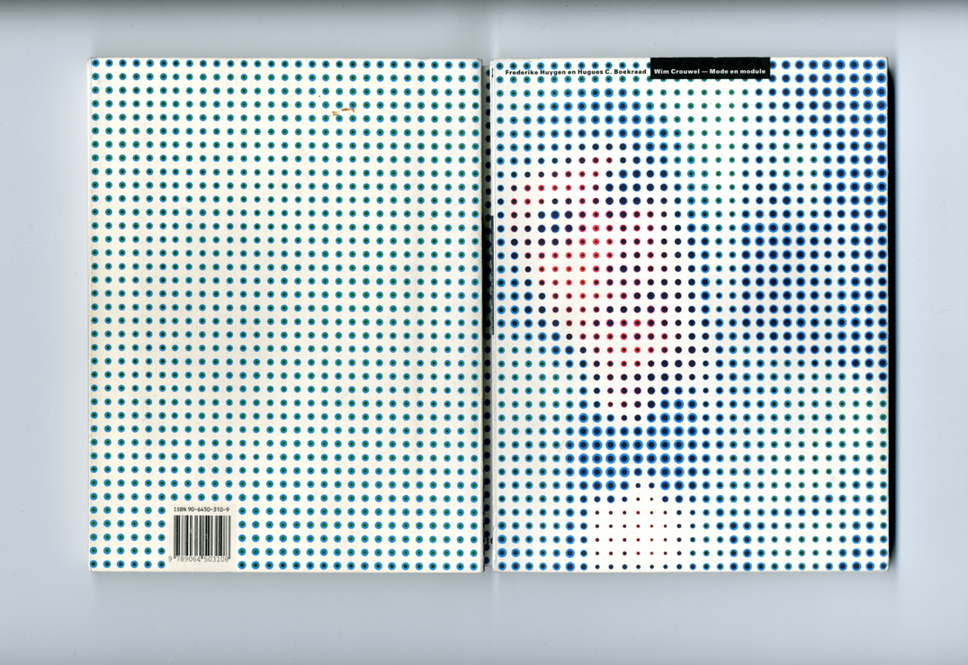
This review of the book Wim Crouwel: mode en module by Frederike Huygen and Hugues Boekrad, was written for and published in an issue Typography papers, now out of print. The Crouwel book, as it was often referred to, was issued only in a Dutch edition, which sold out quickly. Since then, Wim Crouwel’s renown has only increased.
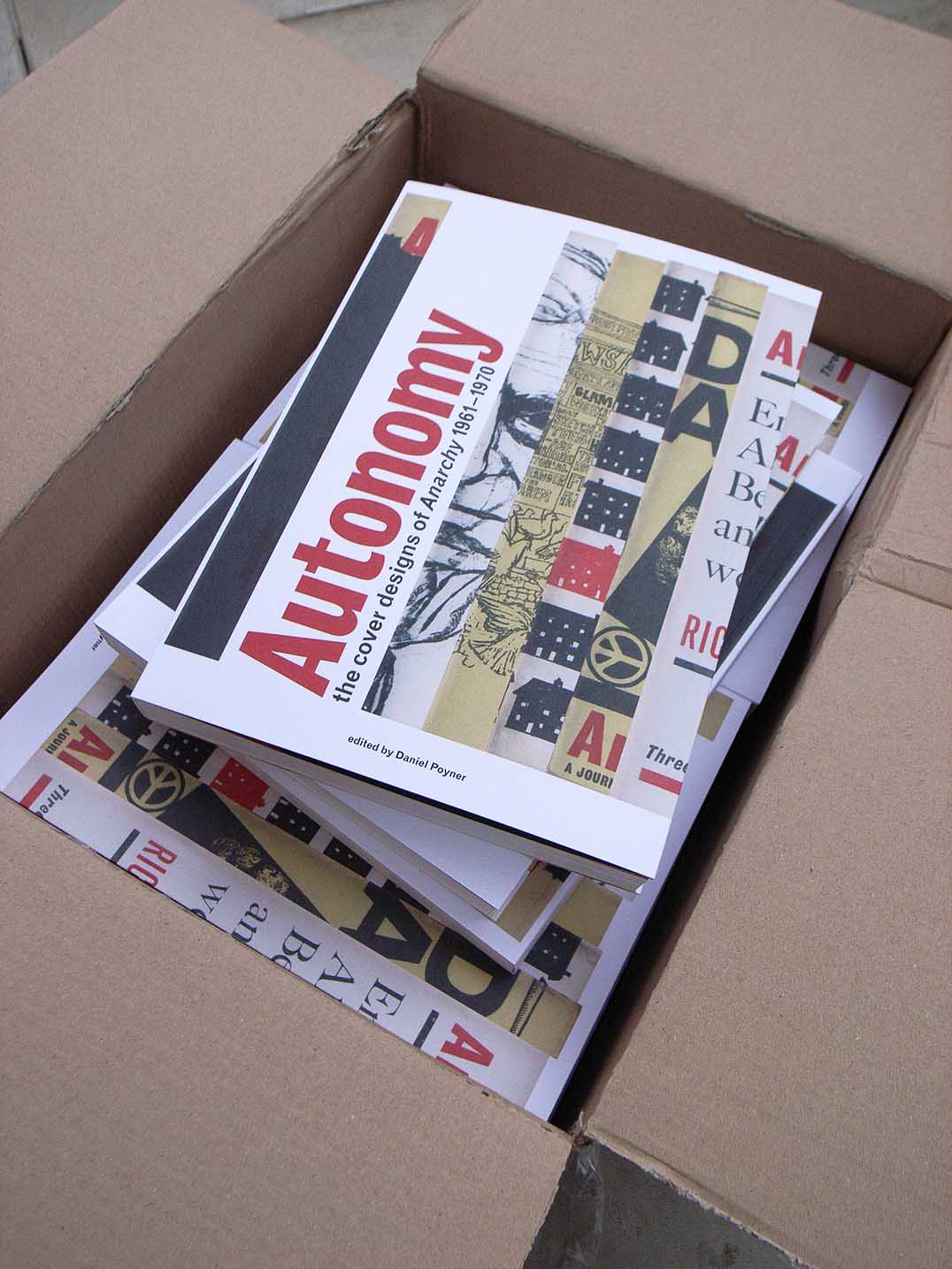
Some finished copies of our next book, Autonomy: the cover designs of ‘Anarchy’ 1961–1970 were delivered to the office this morning.
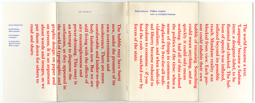
This is the cover of the pamphlet Fellow readers: notes on multiplied language, which Hyphen Press put out in 1994. The piece was prompted by the debates over typography that had been published in the pages of Emigre and Eye magazines, and elsewhere. A participant in this discussion, I saw the chance to make a more extended contribution when my book Modern typography was coming up for a reprint.
Peter Campbell died yesterday at his home, after being diagnosed last year with cancer. He was a special man, both in his nature and in the combination of his talents. We were very glad to publish his writings, and to add him to the list of Hyphen authors, who seem often to be people whom the world finds it hard to pin down.
We are working on a book, with the title Isotype, which will provide an extensive and detailed history of the work in graphic communication produced under the direction of Otto Neurath. This is a collection of freshly written and fully illustrated essays, supplemented by documents published for the first time in English translation or in transcription.
Our re-issue of two novels by E.C. Large, Sugar in the air and Asleep in the afternoon, and publication of a companion work, God’s amateur, prompted this piece in Lodown (no. 74), the magazine of ‘Populärkultur und Bewegungskunst’, published from Berlin. The introduction and email interviews are by Renko Heu.
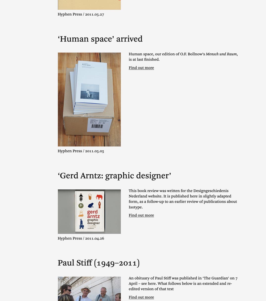
This book review was written for the Designgeschiedenis Nederland website. It is published here in slightly adapted form, as a follow-up to an earlier review of publications about Isotype.
An obituary of Paul Stiff was published in ‘The Guardian’ on 7 April – see here. What follows below is an extended and re-edited version of that text
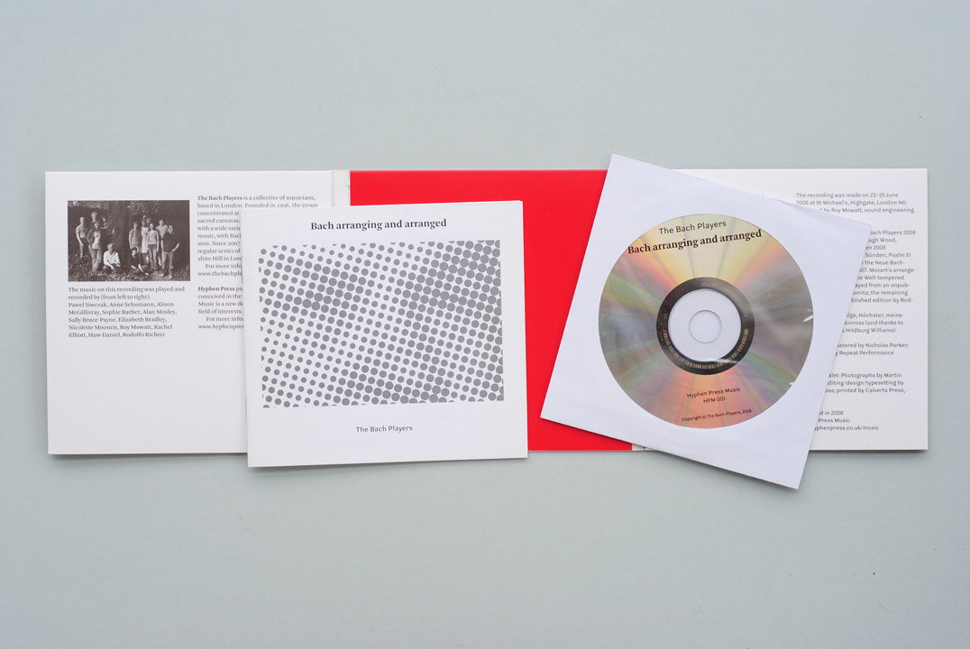
When we were planning to publish music CDs, I tried to keep in mind that (since all the decisions were in our hands) it was a chance to think freshly and not – or not necessarily – use the reigning model of a plastic jewel case with printed ‘inlay’ sheet and booklet.
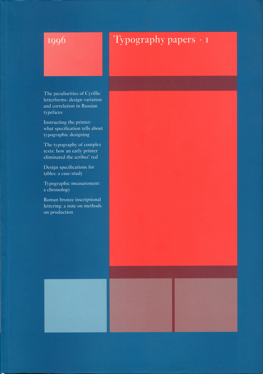
We get quite frequent enquiries about Typography papers: which issues are still available? how best to try to get hold of out-of-print numbers? contents of the back numbers? And, from subscription agencies: please send us the issue for 2010!
Teus de Jong died last week in hospital in Groningen, after a succession of serious illnesses. He was the typesetter of a number of our books, especially the paperbacks designed by Françoise Berserik.
It’s been suggested elsewhere in these web-pages that we can judge the quality of a book by looking at its production as an object for carrying meaning. The space between the lines will tell us something about the quality of thought in the editorial-design processes, and so – because editor and writer might work hand-in-hand – in the writing too; and the glue on the spine will tell us something about the thinking in the publishing house
Some years ago – I recall events and publications in the early 1990s – there was some noise about the ‘designer as author’: graphic designers would have a hand in writing (or maybe ‘authoring’) the texts that they also designed, and designers could even be considered as authors.
Idea magazine is pleasantly print-fixed: none of the words it publishes are put online, so anyone wanting a taste of it simply has to go out and find a copy. The current issue, no. 341, has an article that refers to Hyphen Press and its efforts. This essay, ‘Subterranean modernism’ by Randy Nakamura and Ian Lynam, is perhaps the first published piece by unconnected observers to address ideas that we’ve been busy with for now 30 years.
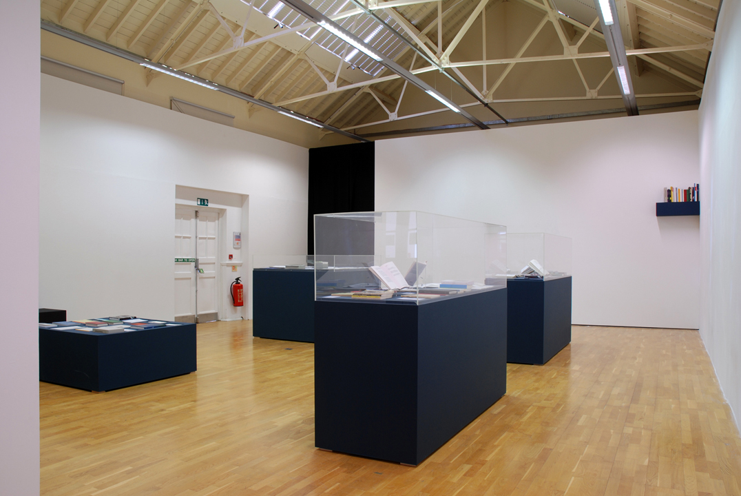
Our exhibition at International Project Space opened last Saturday and will be there until 8 May. The show could be an occasion for a visit to the model village of Bourneville. In some respects the exhibition tries to be a model too.
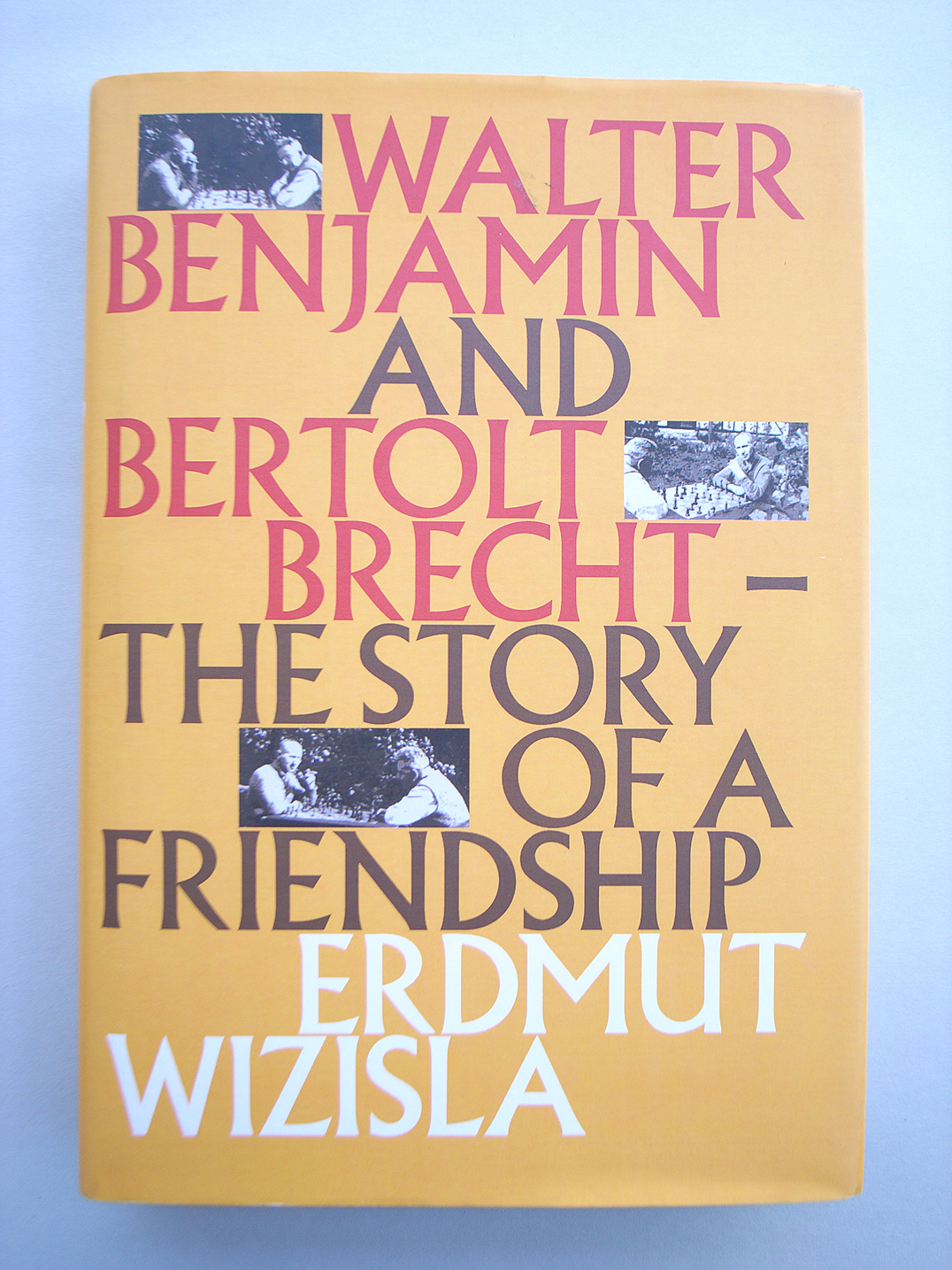
Last Thursday the London publisher Libris brought out Erdmut Wizisla’s Walter Benjamin and Bertolt Brecht: the story of a friendship. This is an English-language edition of the book published originally by Suhrkamp. Behind that edition was a first embodiment, as its author’s doctoral thesis.
The typographer Alexander Verberne died on 27 May 2009. After a stroke in 1997, which was followed by further strokes, he had been seriously impaired and was living in a care-home in The Hague. He was born on 18 August 1924 in Den Helder.
On 11 June at the Koninklijke Bibliotheek in The Hague, Robin Kinross is giving a lecture on standard paper sizes. This is the culmination of his period this year as a joint Fellow at the KB and NIAS. The talk will have the character of preliminary survey, towards a long history of paper sizes.
This new typeface designed by Fred Smeijers has just been released by OurType. As its name promises, it is an echt-German production: recalling the early-nineteenth-century Grotesk letter.
A recent tidying of the office turned up an offprint from the journal Matrix (no. 21, 2001), which published two pieces written on the occasion of the publication of our book ‘Anthony Froshaug’. Looking at them again, they seem worth reviving – to explain something of the process by which that book was made.
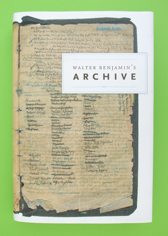
Now that every word that Walter Benjamin published in his lifetime has been collected and republished, and now that his many unfinished words have been similarly collected and printed, and now that to this set of ‘collected writings’ we can add letters and diaries that he cannot have thought of publishing, there only remains to be transcribed and multiplied the scraps, cards, sheets, that fill up the rest of his archive.
The recent flourish of interest in the visual work of Otto Neurath – let’s call it Isotype – may be seen as a second wave, coming after a first period of discovery, which included exhibitions of the work in Reading (1975) and Vienna (1982), and an exhibition of the work of the Neurath group’s main artist, Gerd Arntz, in The Hague (1976).
Among the speakers at the Friends of St Bride Library Conference on 15 and 16 May is Karel Martens.
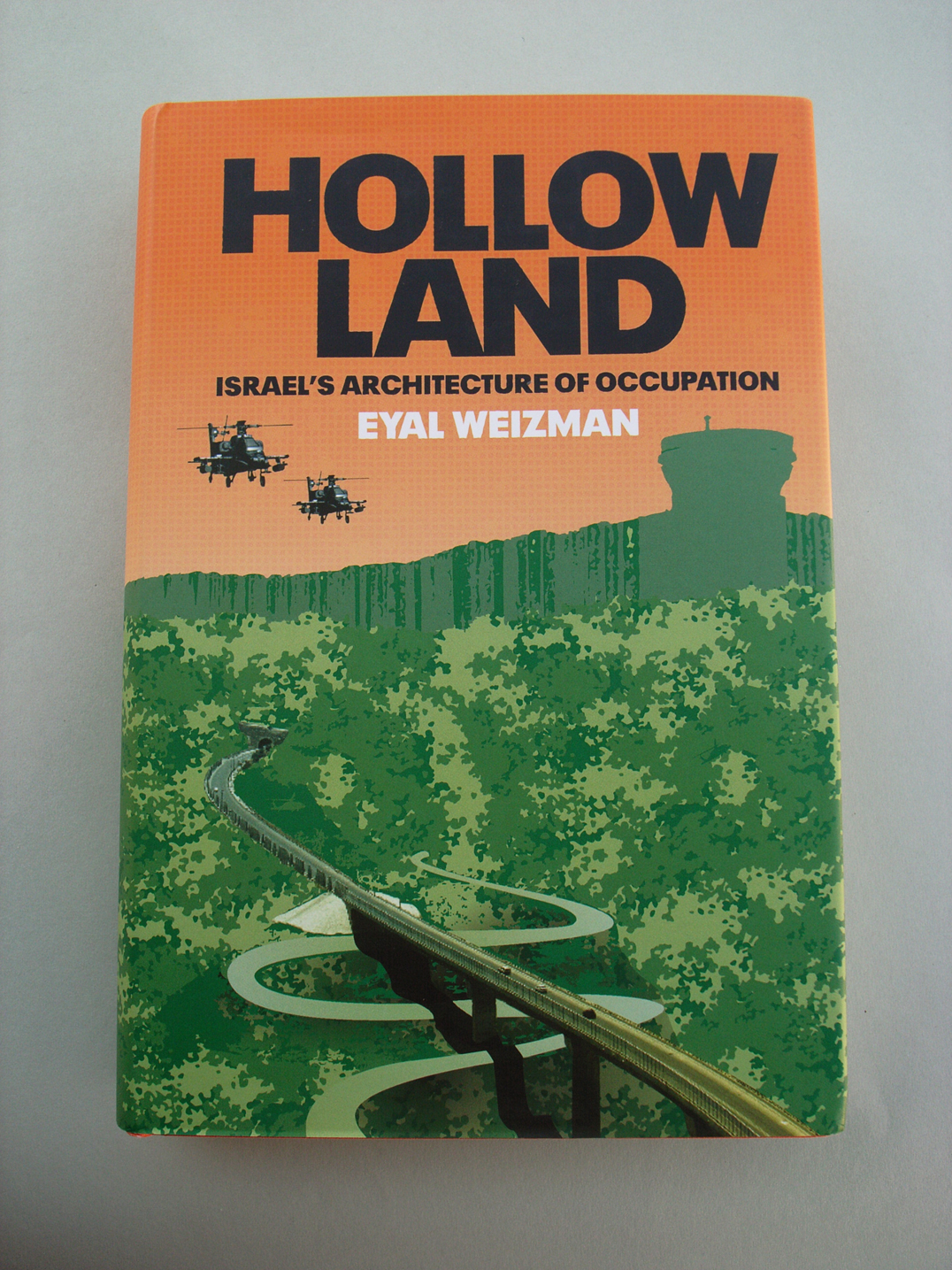
Compare and contrast these two good books published by Verso in London and New York.
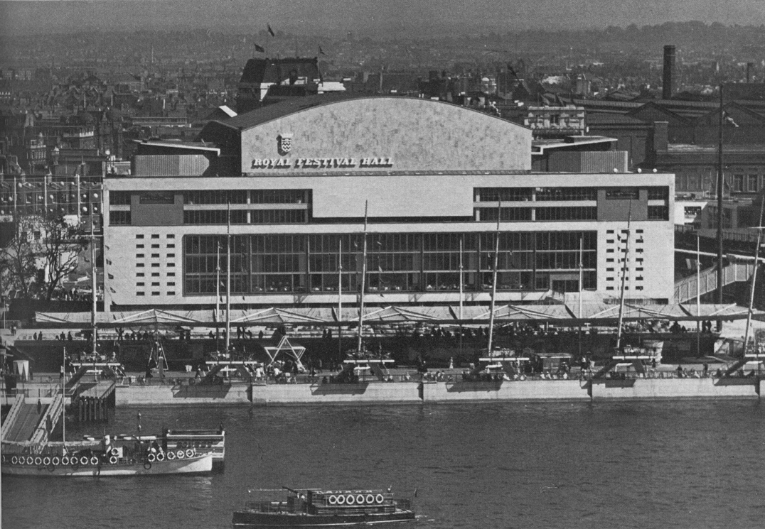
In summer of this year the Royal Festival Hall, on the South Bank of London’s river, was reopened after a major, two-year refurbishment. The auditorium itself was remade and restored, and the rest of the building was significantly remade/restored too. The spirit and the materials of the original building were respected, at the same time changes needed for the place’s new uses were made.
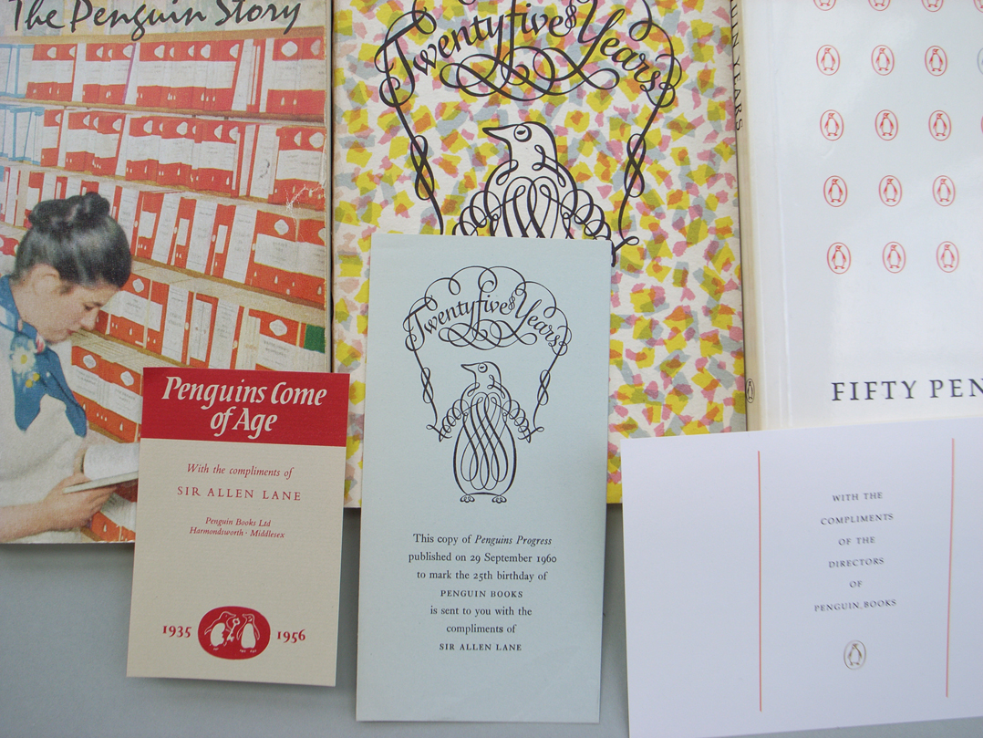
As any long-term reader and watcher of Penguin Books knows, the company has always cultivated its own history, seizing the chance of an anniversary to make an exhibition or put out a book celebrating its own story.
Two demon constituents of capsule English-language biographies (for book-flaps, catalogues, CVs, and so on) are ‘currently’ and ‘based in’. ‘Cormac Wrathbone is a freelance writer and critic, currently based in London.’ What’s wrong here? It’s not just the tiredness of the phrasing.
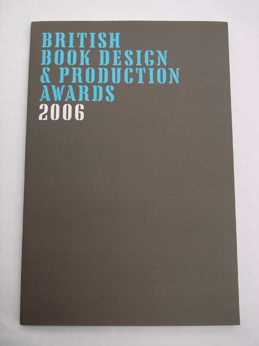
This year’s catalogues for the best-designed/-produced books have been appearing. The Swiss catalogue for books issued in 2006 is just published. The German catalogue for the same period came out some weeks ago. The British publication, also carrying the designation ‘2006’, was produced towards the end of last year. The Dutch best-books catalogue is on its way, and will cover books published in 2006. With the exception of the British publication, these catalogues describe and discuss books that are put on exhibition in their own countries, and which are also, in the autumn, added to a showing at the Frankfurt Book Fair of all the world’s best-books of that preceding year. A proper survey of the best-books exhibitions would take in all the countries represented at Frankfurt, including (as I recall) Finland, Denmark, the Czech Republic, the United States, Spain. These remarks are addressed to the countries with which I am most familiar.
This is an introductory survey of a vexed issue of book-production: binding techniques. The intention of the piece is general enlightenment, and to support a process that is threatened with extinction. A version of this article was published here in May 2007. The text and images here are a new version of this article – thoroughly revised and reshaped in April 2018.
This review has just appeared in the new number (no. 11) of Text, within an issue on the theme of ‘Edition & Typographie’.
Peter was there in Stafford as a constant point of reference for me for about thirty years. I remember making what seemed like a pilgrimage from Reading to Stafford, in 1977, to meet him for the first time, and the others around him in the group that made and ran the typography course at the College of Art and Design.
When it launched its website in July 1995, the internet seller Amazon seemed a wondrous thing. Here was a bookstore stocked with almost every title, and one that would reach parts of the country (the United States of America) that were far from any bricks-and-mortar shop. It was indeed based in Seattle, and its employees, one imagined, were mainly grunge-kids in baggy jeans and t-shirts, fetching and packing the books for minimum wages. The company seemed endearing to those of us who like brave new ventures.
In a bravura act of publishing, Taschen Verlag has put out an extended selection, in facsimile, of the magazine Domus. This short review of the venture appears in the November issue of Architecture Today.
A symposium on Otto Neurath and the after-effects of his visual work (Isotype) will be held on 31 October at Stroom Den Haag.
Last month the Society for the History of Authorship, Reading & Publishing – SHARP – held its annual gathering over several days (11–15 July) in The Hague.
Designers, places, publications are woven together and put in historical perspective in this short text by Paul Stiff.
At the ATypI conference in Rome last week, three Hyphen authors spoke.
Andy Crewdson’s ‘New Series’ is now launched. This is a natural successor to his weblog Lines & Splines, which in its later entries had begun to move towards more extended discussions.
An exhibition of the work of the Werkplaats Typografie (Arnhem) will open at the end of June at the Stedelijk Museum, Amsterdam, running through to September.
Architectural and design publishing has seen remarkable changes in recent years. How does this sector of publishing work now? How did it come to have this structure? What part does the design of these books play?
The Gerrit Noordzij Prize 2001 was awarded to Fred Smeijers in a meeting at the Konklijke Academie van Beeldende Kunsten in The Hague. The prize was first given in 1996, to Noordzij himself, during the ATypI meeting there.
We are pleased to publish this address given by Tanya Harrod to the meeting on 10 October 2000 at the Conway Hall, London, to launch the book Anthony Froshaug.
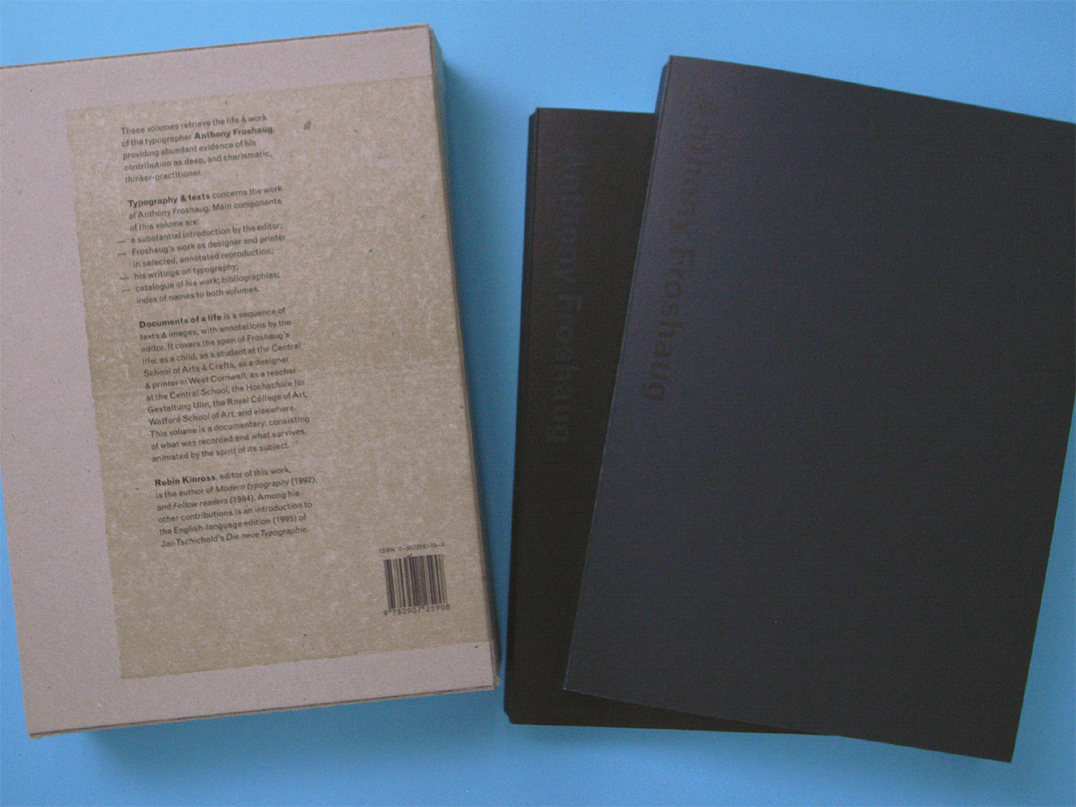
Presents the work and life of this essential typographer, until now too little known outside the circle of his friends and students. Froshaug was a deep and charismatic thinker-practitioner, whose insights return us to the fundamentals of typography. The book consists of two interacting volumes: the solid record of the work is placed against the contingencies of the life. A traditional monograph is unsettled by an exploration in documentary.
The book was launched with a meeting at the Conway Hall in London.
In the September issue of the magazine Lingua Franca (the bright and irreverent ‘review of academic life’, published from New York), the topic of the ‘breakthrough books’ column was design.
One of the most pleasing aspects of publishing is to see translated editions of your books appearing. Italian, Spanish, and now Korean editions of Modern typography have been made in recent years. Meanwhile our own second edition of the work is out of print and awaiting a reprint, with corrections and small updatings. We hope […]