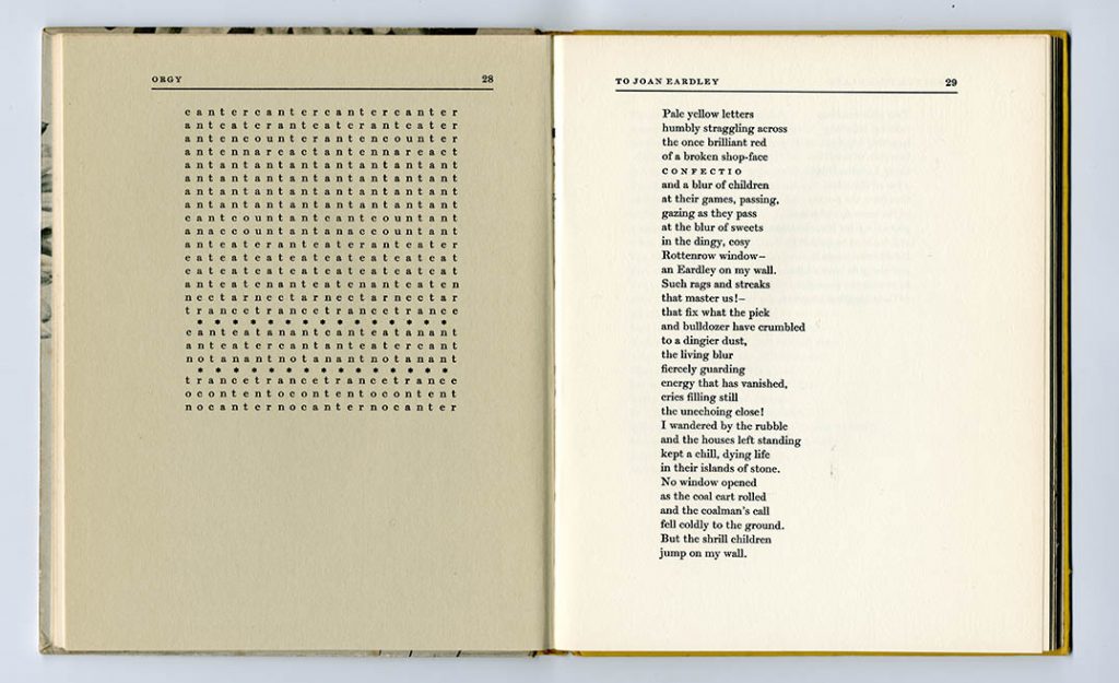
An appreciation of the work of the artist-designer George Mackie (1920–2020)
The work of George Mackie first entered my consciousness in the late 1960s. There was a copy of A.J. Youngson’s The making of classical Edinburgh on my parents’ bookshelves, given to my father as a present soon after it had been published in 1966. Like all the books of the golden years of Edinburgh University Press, the designer was not credited, but the book has the characteristic signs of Mackie’s hand: evident material qualities in the papers used and in the cloth that covered the case of the binding, pages that invite reading, well-resolved typographic details, intelligent editing, well-assembled and well-placed illustrations within the text. The photographs in this book are quite astonishing: black-and-white images, bled off on all sides to occupy whole pages, possessing all the dignity of the townscape they show; they are printed on coated paper, whose leaves mostly wrap around the book’s sections and are thus intelligently positioned in the text, rather than dumped off into sections. The photographer is given a credit on the rear flap of the jacket: ‘Mr Edwin Smith, whom the publishers invited to illustrate this book, has won international acclaim with such books as The English Garden, The Wonders of Italy, and Ireland, to name only the most recent.’ In this informal, humane description I hear the voice of Archie Turnbull, Secretary to Edinburgh University Press from 1953 to 1987, and the essential editor – with a keen interest in book design and production – without whom Mackie could not have operated successfully.1
After this first encounter I began to become aware of EUP books: C.H. Waddington’s Behind appearance (1969) I bought in 1971 as a remainder (£4.50). It’s quite different in style from the Youngson, as is appropriate to its subject of the connections between modern science and modern art. As with The making of classical Edinburgh (at least in its reprint of 1967) the text was set in metal and then printed by lithography by Kynoch Press in Birmingham; this was quite a common procedure in those years. But the text is set in Univers Light in two columns, and the configuration has aspects of both symmetry and asymmetry. Again, the plates (reproducing paintings) have a stand-out quality, literally because they are printed on coated paper and ‘tipped in’ – glued on to the uncoated text pages. The acknowledgements tell us that the blocks used to print the pictures were loaned from the magazines Vingtième Siècle and Studio International, so their sizes would have been already given. Around this time I must have encountered Edwin Morgan’s The second life (1967) and a bit later the ‘Modern Scottish Painters’ series (8 volumes, 1974–80). It would have been these books that led me, when I was finishing the undergraduate course at Reading in 1975, to say to the external examiner that Edinburgh University Press was the publisher that I hoped to work for. The examiner was Ruari McLean, who by then had left England and was back living and working in Scotland. McLean would have known all about EUP and that it had no design department – he smiled at my wish.
A little later, still at Reading, I was invited by Hans Schmoller to come to lunch one Saturday. Schmoller lived not far away, near Windsor, and I was just getting to know him. By then in retirement from Penguin Books, he was a kind, generous, and very sympathetic man (some of his work colleagues remember him as showing a tougher side at Penguin’s). I remember that he did the cooking for lunch: a chicken recipe from Mastering the art of French cooking by Julia Child et al (Penguin, 1966). There were two other guests: John Dreyfus and George Mackie. (Tanya Schmoller explained that ‘we thought we’d get all the typographers done in one go’.) I don’t remember much more of this occasion except that when Mackie was introduced to Dreyfus – by then one of the grand figures of the English typographic scene – he said something like ‘yes, I’ve heard of you’. I saw a short, strong, Scottish man: direct and fearless.
—————
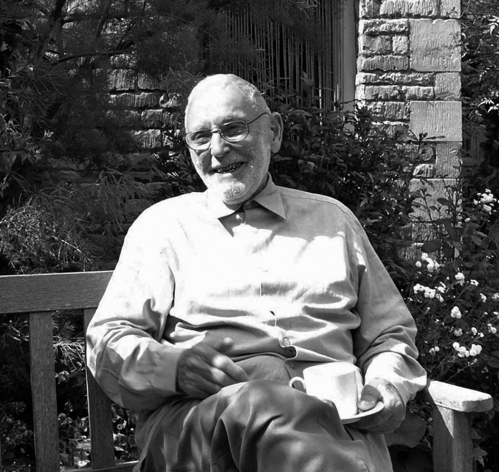
George Mackie, Stamford, July 2007
George Mackie died at his home in Stamford, Lincolnshire, on 3 October last year, just past his hundredth birthday. In August he sent me an obituary that he had written himself (‘Being autobiographical it is unpublishable in the Guardian ’), from this, and from his letters and emails, I draw the following account.2
He was born in Cupar, Fife, to a Scottish father – a saddler – and an English mother, who died a month after giving birth. Some years later his father remarried; his real mother was not mentioned. Only in his early twenties was he able to meet his mother’s parents and understand this history. He wrote to me that ‘Excluding the first two decades I have had an enchanted life …’ (letter, 3 August 2020).
In 1937 Mackie enrolled in Dundee School of Art, and a year later tried to enlist as a weekend pilot in the Royal Airforce Volunteer Reserve, formed in 1936 in preparation for the likely war. When war came he joined the RAF and Bomber Command. In 1941 he started to fly Stirling aircraft (the first of the four-engined bombers) on operations. After some months he was taken off operations, becoming an instructor, posted at Waterbeach, near Cambridge: I suppose that his gifts as a teacher were already evident. However – after ‘some outburst at a mess meeting’ – he was later put back on operations. By then Stirling losses were much worse than those of the other bombing aircraft. He then flew Fortresses, an American plane that carried radar.
In his auto-obituary Mackie mentioned two authors whom he encountered during these war years, each of them living not from far from airfields where he was stationed: Henry Williamson, then farming in north Norfolk, and David Garnett, living just outside Cambridge. He had read their books and was interested to meet them. I have the sense of an active reader, eager to expand his horizons, inviting himself to these writers’ homes. Mackie the reader is a key to Mackie the book designer. ‘I was an amateur, in the simple sense of the word, in book design.’ (email, 22 September 2020)
Mackie’s war service was recognized with the award of a DFC (Distinguished Flying Cross) in 1944. He left the RAF in 1946 and returned to education, now at Edinburgh College of Art. Having finished as a student at Edinburgh he practised as a freelance graphic artist and designer. He also got some teaching work in the Department of Printing at Heriot-Watt College: ‘Here I met the printing industry for the first time.’ (NLS, p. 12) By the end of the 1940s he had met Barbara Balmer, the painter, whom he would marry in 1952, and Archie Turnbull, working then at the publishers W. & R. Chambers. His no doubt precarious position as an illustrator, graphic designer, and part-time teacher, would have been stabilized when he took a full-time job at Gray’s School of Art in Aberdeen (he told me that his DFC helped to get him this job). ‘I took over a corrupt Department of Design and Crafts in 1956, the first thing was to stop staff being addressed by their forenames, couldn’t do that today, no radios allowed, strict time keeping, introduced letterpress printing, installed Victoria press, vertical bed, fonts, co-operated warmly with nearby Monotype book printer. Introduced stone printing. For staff a four day week, nine till six. Introduced life drawing class. I got home for supper at 6.30 then worked till ten, eleven. Weekends and Monday, my day off, solid work, drive to Edinburgh perhaps.’ (email, 17 August 2020)
Apart from all the illustration and design work – and by then a father to two daughters – an achievement of his years in Aberdeen were his paintings of the city’s harbour, about to undergo rapid transformation with the discovery of oil in the North Sea. In 1998, for an exhibition of these paintings at Aberdeen Maritime Museum, he wrote a note about these works: ‘I regard the drawings and paintings I made of the harbour in those years as a sort of documentary. There is now of course no place in art for the topographical artist as there was in [J.C.] Bourne’s day, before the camera. But I would like to think that the artist’s hand and eye can still put down on paper something of value that escapes the emotionless lens.’
In 1980, Mackie retired from the position at Gray’s and went to live with Barbara in an early seventeenth-century house in Stamford, Lincolnshire – a town he discovered by chance, after taking a wrong turning on the car journey from London to Aberdeen. He installed a lithographic press in the cellar and made prints, drawing directly on the stones. Later, in the 1990s, he got an Apple Macintosh and learned QuarkXPress.
—————
What are the qualities of Mackie’s work? Although he lived and worked in Britain, was inspired by the very English illustrator Edward Bawden, and took sustenance from the English revival of printing of the twentieth century (Meynell, Simon, Nonesuch, Morison, Monotype), his design work seems to me not very British at all. Through the years of ‘graphic design’ in the twentieth century he remained an artist who designed books. He looked to predecessors on the European mainland and across the Atlantic. ‘I have responded most warmly over the years to the artist-typographers of our century, notably Weiss, Koch, Dwiggins and Vox. For them the word and the picture are as one. The pictorial and alphabetic draughtsmanship, and their graphic experiments, added wit and piquancy and warmth to the printed page.’ (Matrix, p. 163) One sees an unBritish pleasure in abstract ornament in the bindings and display pages. His illustrations were often Bawdenesque, but when he designed the books within which they were placed, one sees something sharper; the colours are stronger; there is a clarity of design thinking at work.
In his two published essays on his own work, George Mackie wrote as well as anyone has about the work of designing books.
Any design worth its salt is the consequence of feeling as well as thought. Typography has its own abstract, non-alphabetic structure whose aesthetic elevation needs the heart as well as the head. The result should be rational, but with an individual quality. The structure might be said to represent some kind of gravitational field, where major and minor elements are fixed in harmony with a tension of attraction between them. Thus all lines and words announce themselves fittingly in degrees of importance, hierarchically.
(NLS, p. 26)
And, closing this retrospective essay:
I cannot claim to have excelled in the designing of books but I have helped, and been helped, to allow certain usages and fragile values to survive a little longer. They are largely invisible and their necessity is consequently difficult to justify to the sceptical. Nor can this very invisibility, the real measure of competence in the designing of books, do much for the ego of the designer. I am nevertheless a fortunate man to have been both teacher and practitioner in an area of civilised importance. Mediocrity is easy to despise, as someone has said, but damned difficult to achieve. The task now, certainly in the business of book design and production, is to re-achieve mediocrity. Without it, it is vain to hope for excellence.
(NLS, p. 35)
He clearly liked to write and wrote readily by hand. His letters to me (and I am sure to others) were real compositions, advancing thoughts and arguments. His own handwriting was not touched by the italic revival of Edward Johnston and Alfred Fairbank, but seemed to come from an earlier time – perhaps the nineteenth century. He was happy to use this handwriting, or developments of it, in his own design and illustration work. In his later letters to me he found other ways of salutation than the conventional opening. I see one from 2008 that opens ‘Always a pleasure to hear from you, dear Robin.’ And from 2007: ‘Robin! Thanks for TP. This glue-ing business is a bugger.’ (TP was Typography papers.)
George Mackie was, by his own account, someone who educated himself, in intellectual matters as well as in design. In describing him one could use the title of one of EUP’s most celebrated books – and one that seems to owe its existence to Archie Turnbull’s skills as an editor – George Davie’s The democratic intellect (subtitle: ‘Scotland and her universities in the nineteenth century’). His intellect was democratic both in the sense of building on fundamental philosophical knowledge, rather than specialized learning, and also in not bowing to any perceived social superiority. He was on a level with you, or with anyone. I think here one could use his Scottishness to explain it, though he was certainly aware of the burdens that Scotland can impart. At one time, in the years in which I knew him, he used to say he was a Ruskinian – and he was.3 He believed in the importance of art in everyday life, in the moral necessity of art, in the virtues of labour, in the need for every worker to have the freedom to work without regimentation. Like Hans Schmoller and other thoughtful designers of that generation, he was divided between the wish to get exactly what he wanted from the compositors and printers, and yet to allow them some initiative and independence. As he suggested, the way for a designer to work was in collaboration with the people who would implement the plan: to meet them and to talk it over with them.
George Mackie lived through all the phases of change in print production of the second half of the twentieth century: from the secure years of printing from metal in the 1950s and into the 1960s, the shift from letterpress to litho, and from hot-metal to photocomposition in the 1970s, and on into the digital technologies of more recent years. The books and other items shown below, which are from my own collection, will give some idea of his work.4
—————
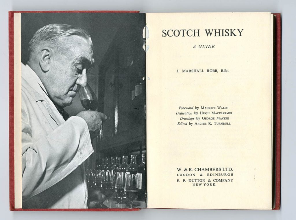
J. Marshall Robb, Scotch whisky: a guide (London & Edinburgh: W. & R. Chambers, [ 1950 ], 7 1/4 × 4 3/4 in | 184 × 120 mm)
An early result of GM and Turnbull collaborating: title-pieces like woodcuts, each one signed with a ghostly ‘M’, and some illustrations.
Printed by Scottish County Press, Dalkeith
—
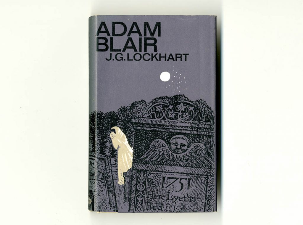
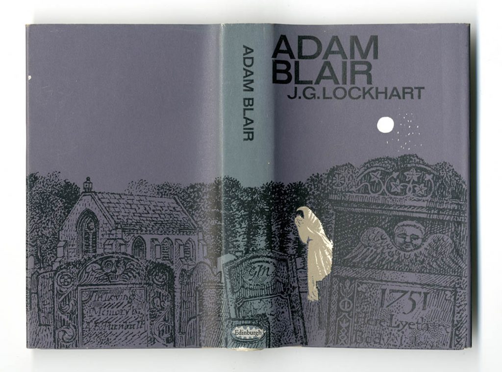
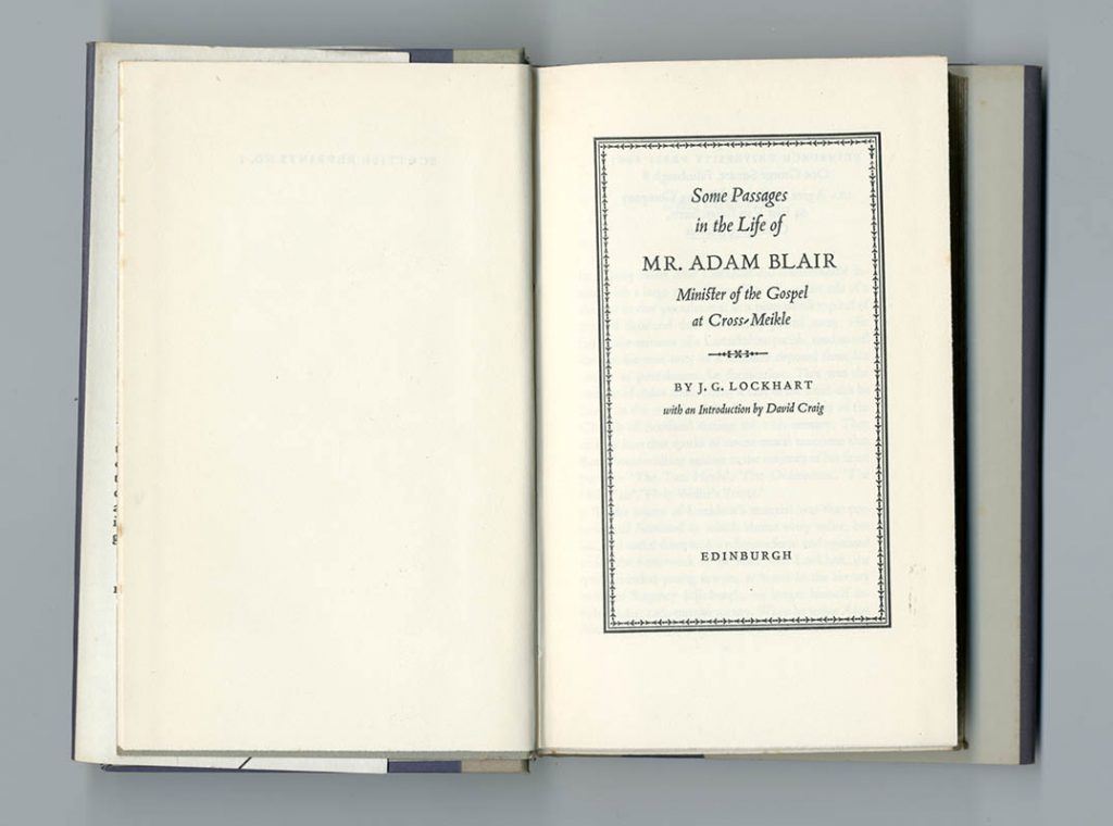
J.G. Lockhart, Adam Blair (EUP, 1963, 6 7/8 × 4 1/8 in | 174 × 105 mm)
For the jacket illustration, GM used three flat colours, with the white of the paper appearing to be a fourth. This treatment of white became his usual method. On the spine, GM gives himself a gravestone. On the pages, note the uncut tail edges (only the heads, which is where dust gathers, need to be cut); this was a feature of earlier industrial book production, but was beginning to die out then.
Printed by R. & R. Clark, Edinburgh. Text set in Monotype Poliphilus: 11/12 pt
—
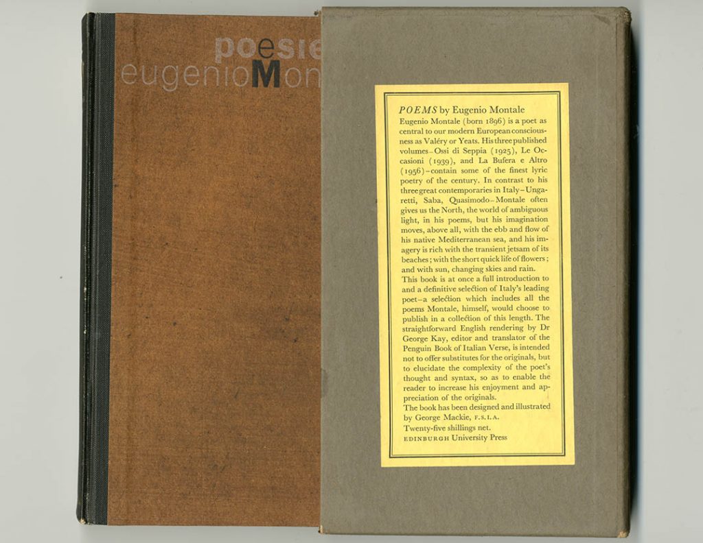
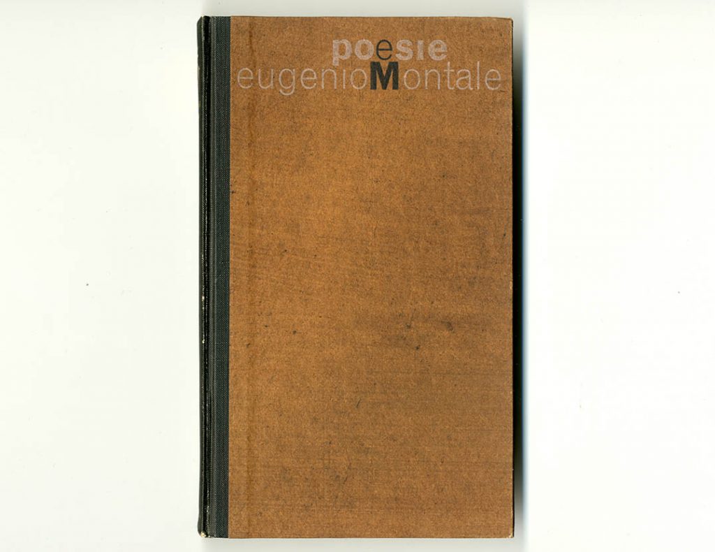
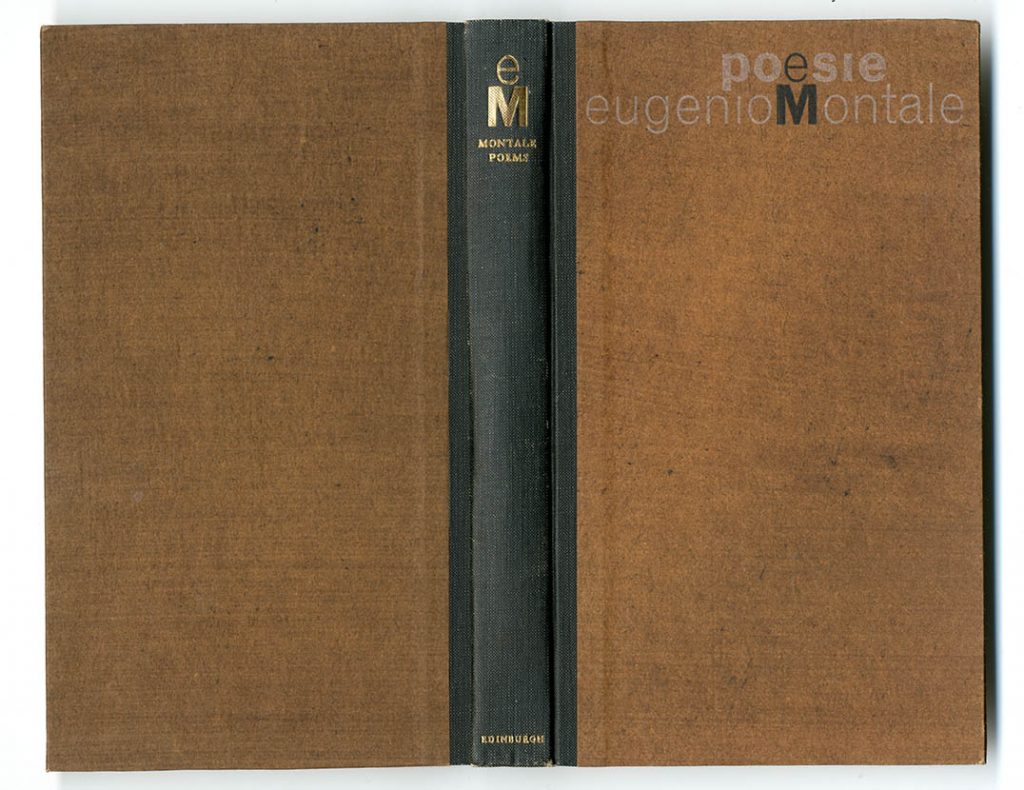
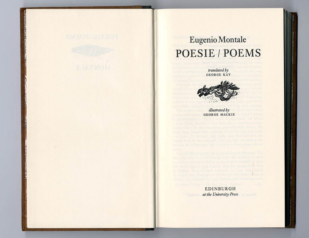
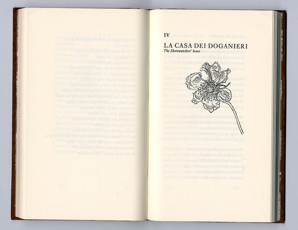
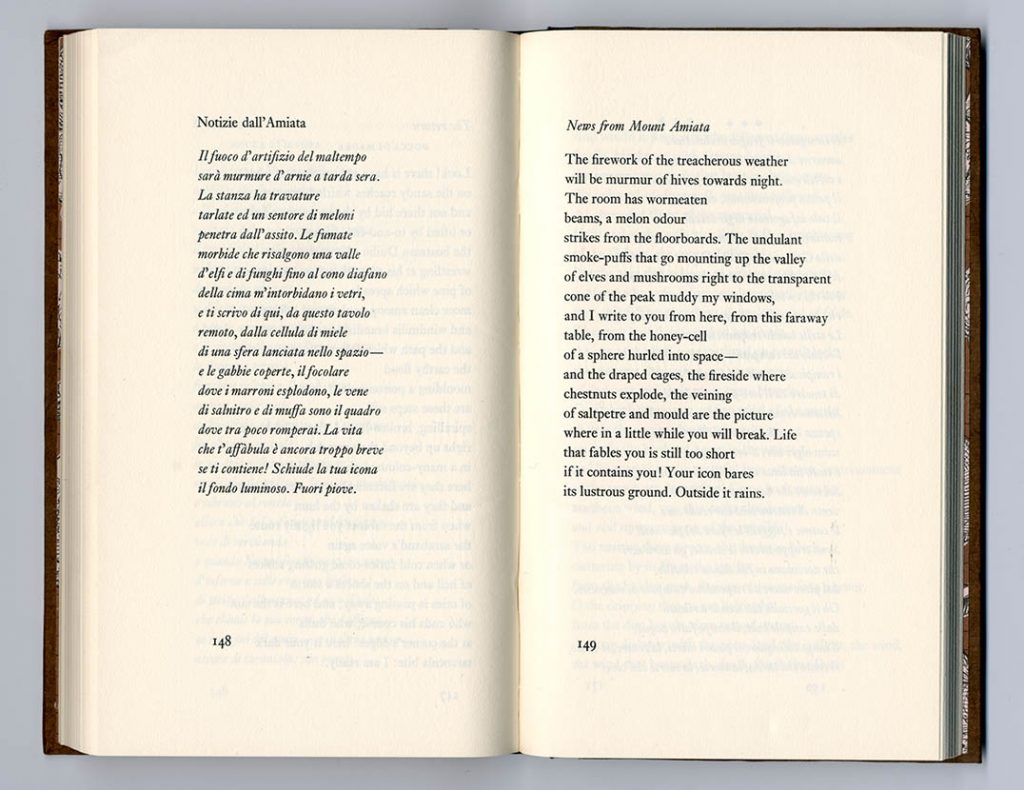
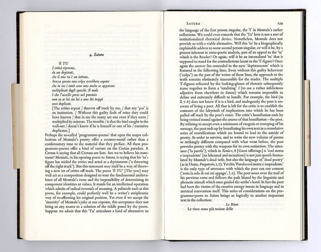
Eugenio Montale, Poesie / poems (EUP, 1964, 8 1/2 × 5 in | 215 × 127 mm)
The book stands out in EUP’s production as being very fully designed and illustrated by GM, and given relatively lavish production: a slipcase, quarter-bound square-backed case with playful typography, illustrated endpapers printed in two colours, drawn illustrations to introduce the sections of the book. Montale’s poems are given with English translations on the facing page; the typography is strong and solid, with a slightly larger size of type than might be usual now.
Printed by Aberdeen University Press, Aberdeen. Text set in Monotype Ehrhardt: 12/16 pt
—
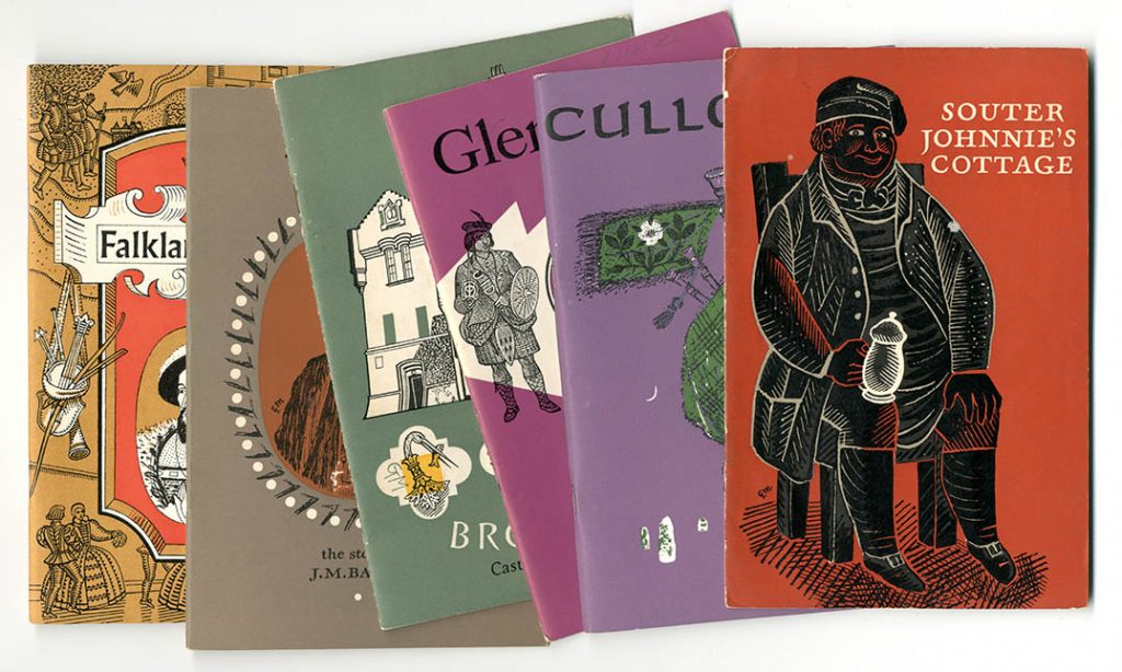
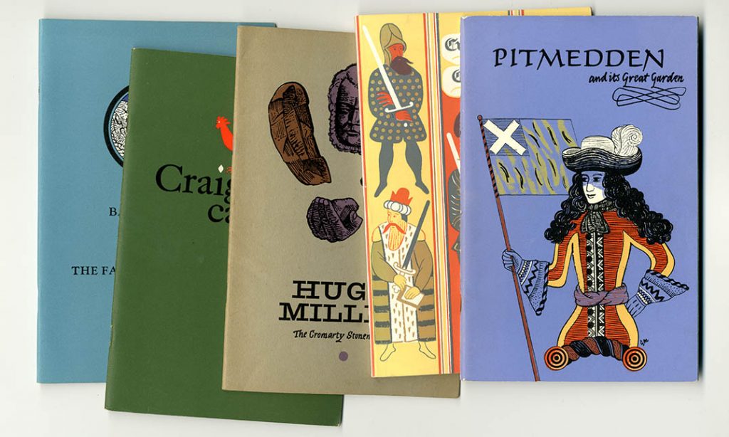
National Trust for Scotland booklets (1960s and 1970s. 8 1/2 × 5 1/2 in | 215 × 140 mm)
GM’s hand can be seen in several (certainly more than ten) of the booklets published as guide books by the NTS. Sometimes it was just the cover design, sometimes the interior illustrations were his too, sometimes the whole booklet was under his control.
—
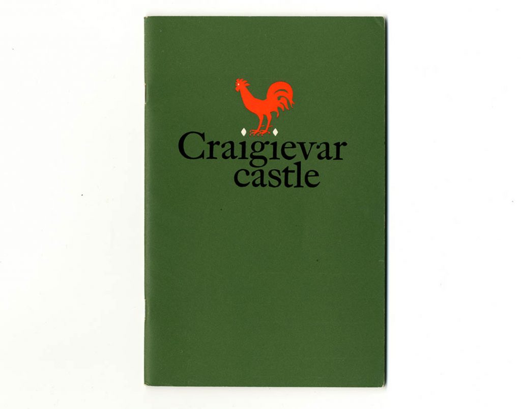
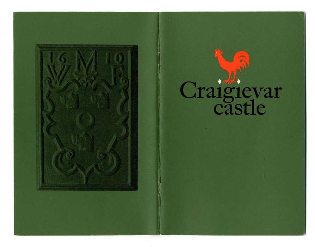
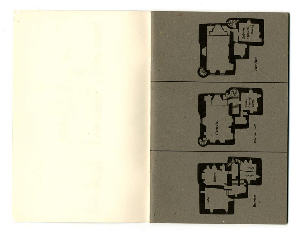
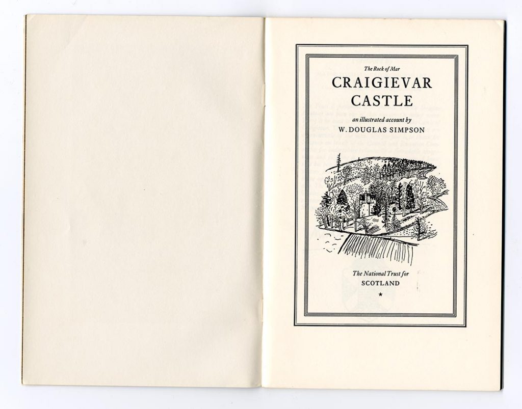
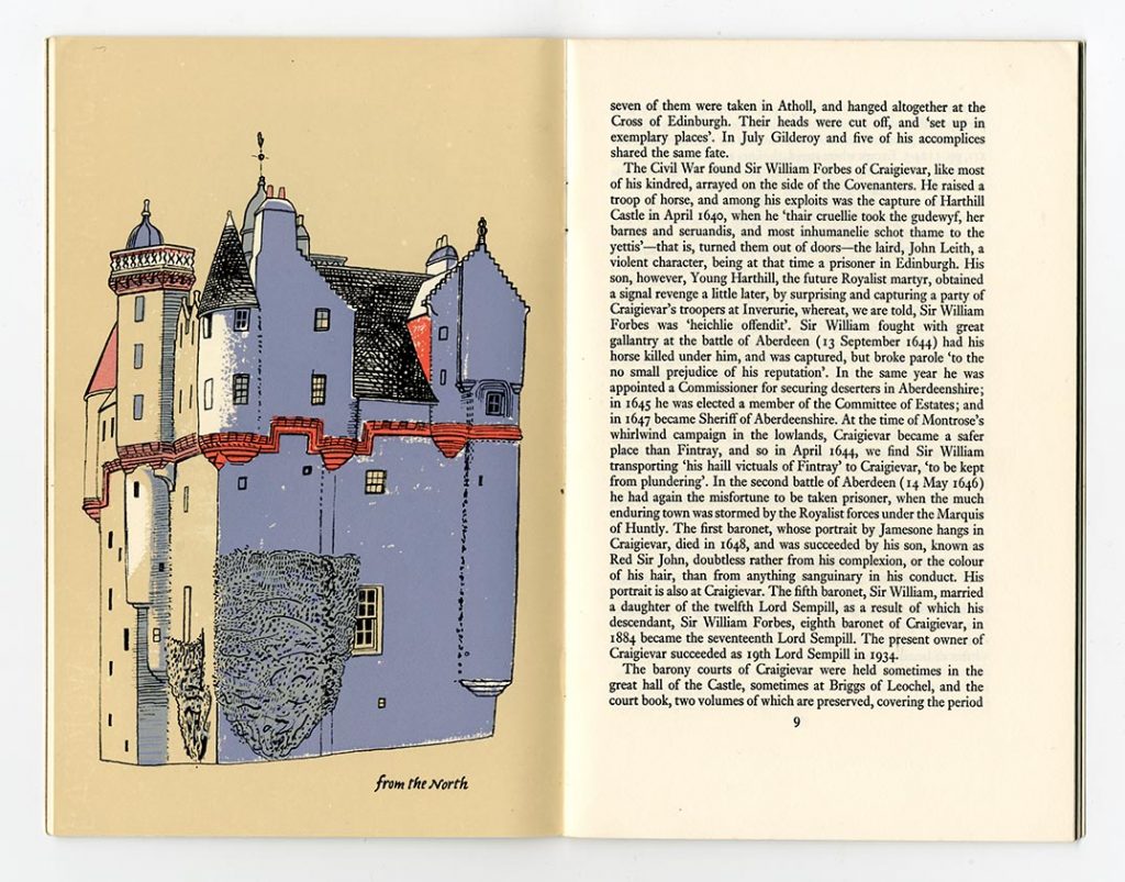
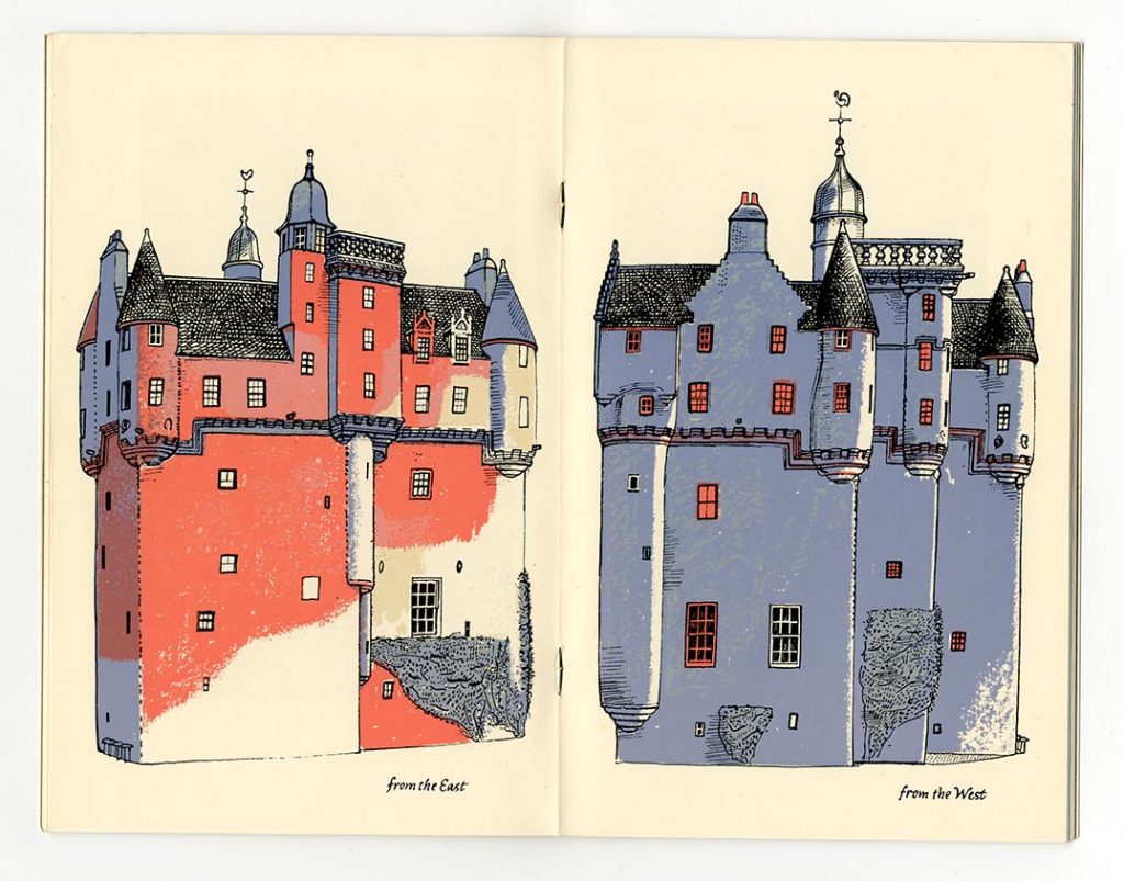
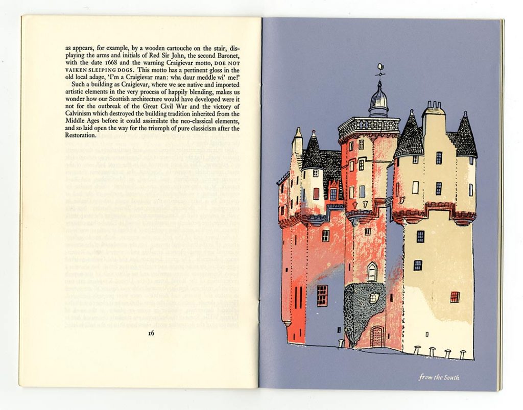
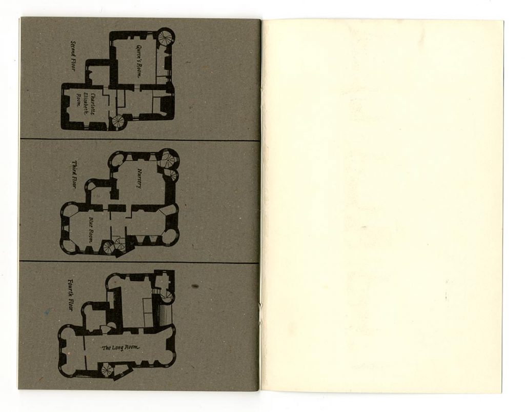
W. Douglas Simpson, Craigievar Castle (NTS, n.d, 8 1/2 × 5 1/2 in | 215 × 140 mm)
Of the booklets designed for the National Trust for Scotland, this stands out as one in which GM was able to design and illustrate more thoroughly. Four papers are used: an off-white text paper; grey sugar paper for the plans of the castle; one-sided coated paper for a photo on the recto before the title-page, which then leaves its verso – facing the title-page – blank; a semi-coated paper for the coloured drawings of the castle. These drawings, printed in four flat colours, are elevations from the four cardinal directions. The plans and these elevations provide much material for contemplation. GM sent me a copy of this booklet, without any accompanying note, a few days before he died.
Printed by Aberdeen University Press, Aberdeen. Text set in Monotype Ehrhardt: 11/12 pt
—
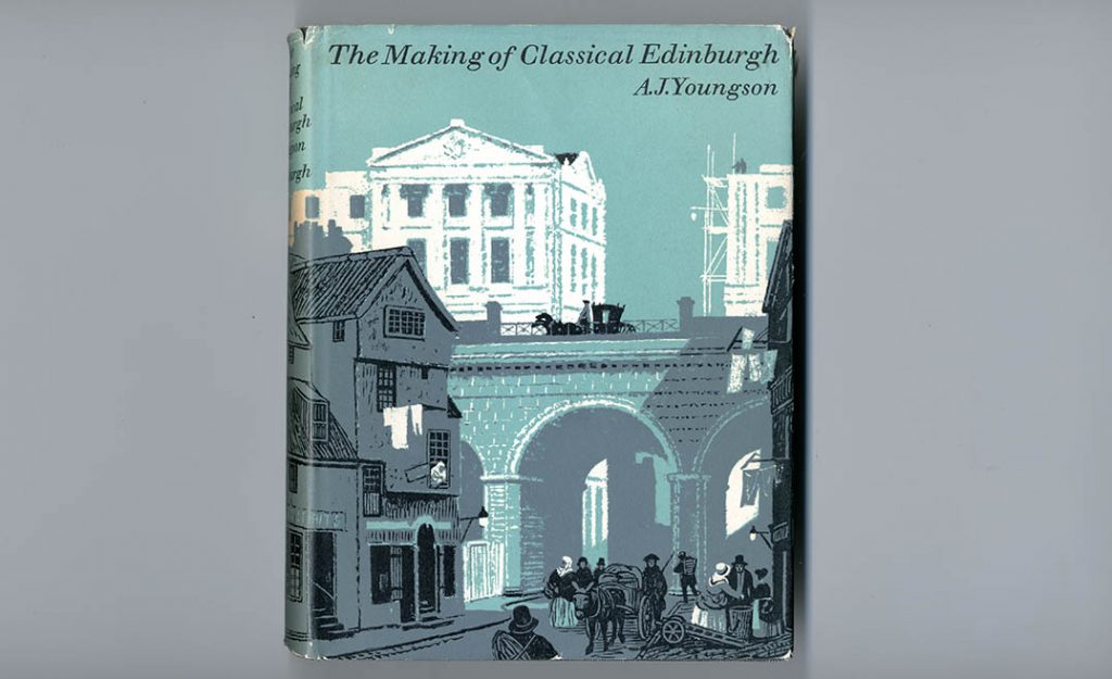
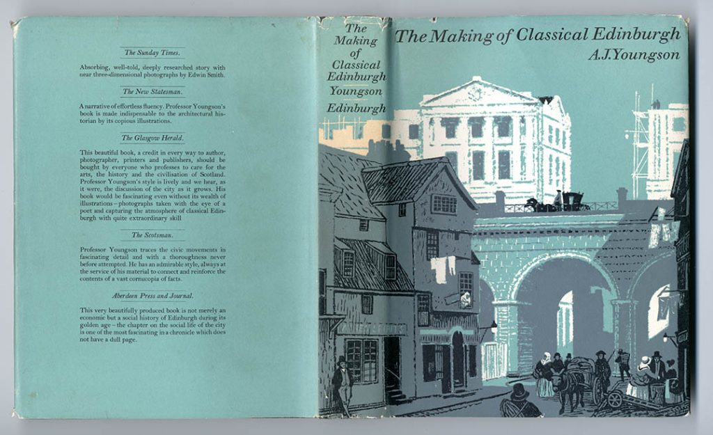
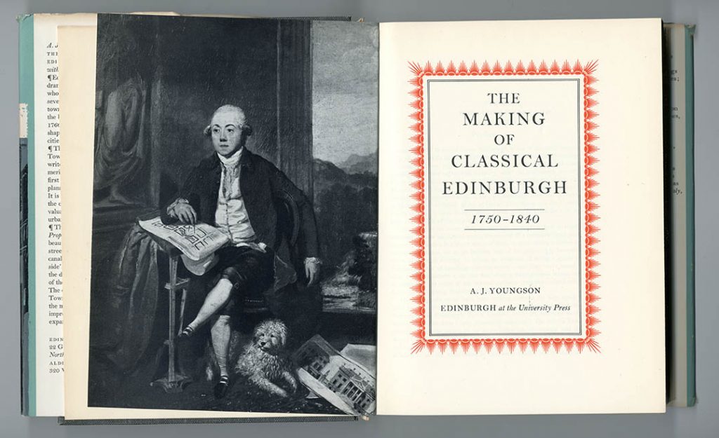
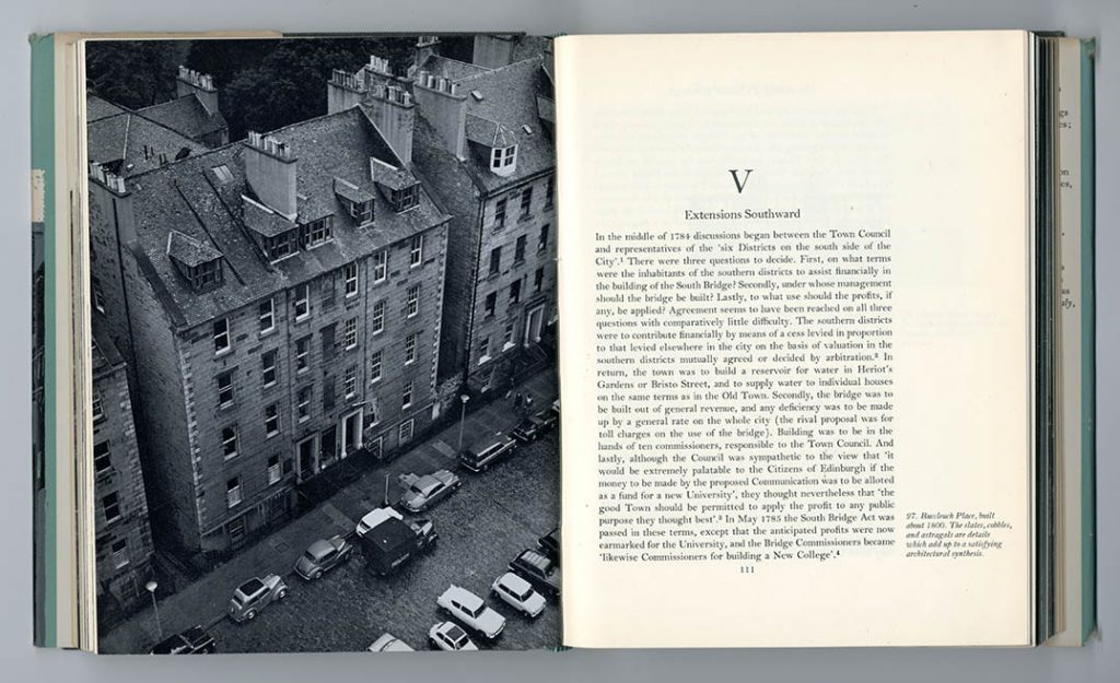
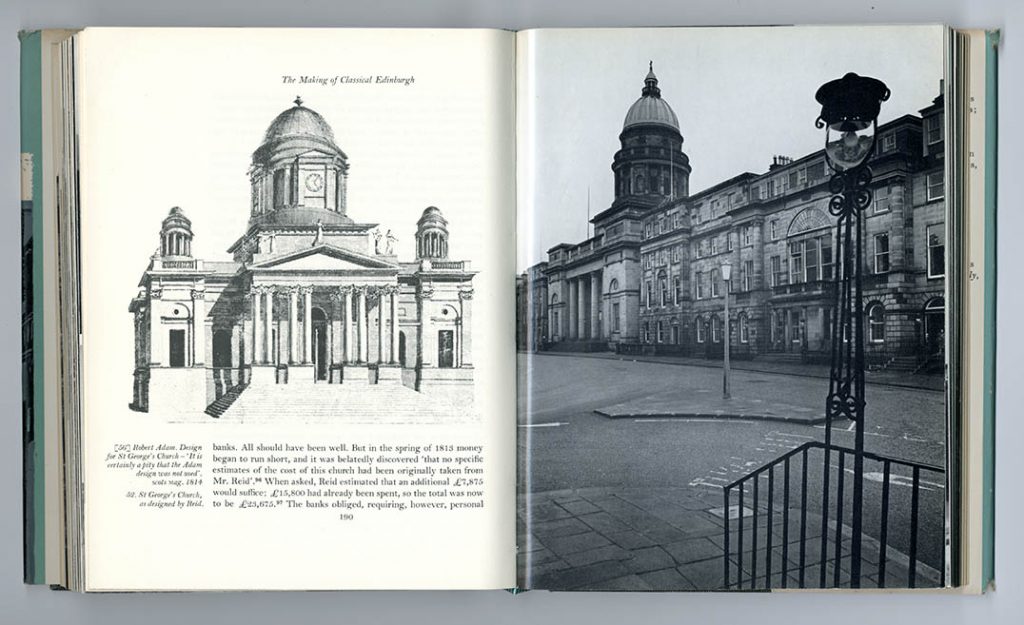
A.J. Youngson, The making of classical Edinburgh (EUP, 1966; reprint 1967, 9 × 6 7/8 in | 228 × 174 mm)
The jacket illustration shows GM’s by then familiar manner, using three flat colours, with the white of the paper appearing to be a fourth. The title-page is a serious statement, with the frontispiece portrait of James Craig anticipating the book’s bled-off photographic pages. The two interior spreads show the careful handling of the photographs; especially the second spread, in which the photo is placed exactly where it needs to be.
Printed by Kynoch Press, Birmingham. Text set in Monotype Bell, 11/13 pt
—
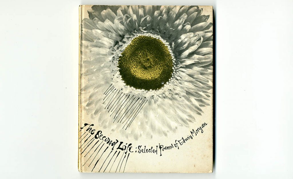
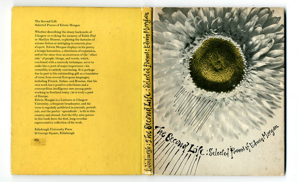
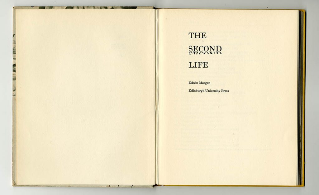
Edwin Morgan, The second life (EUP, 1968, 9 × 7 1/8 in | 228 × 183 mm)
This was Morgan’s first substantial collection of poems: the design accommodates his various modes of writing; the colophon includes this: ‘Computer typeset in 12 pt Scotch Roman by R. & R. Clark Ltd, Edinburgh, using The Monotype Corporation Ltd equipment and I.C.T 1900 computer.’
The printed cover was pasted on to boards; it used a treated photograph, and GM’s expressive writing. The book has sections of different papers: visual poems on a pale grey paper, ordinary poems on white paper. The whole is a surprising book that may embody Edwin Morgan’s very various poetry better than his many subsequent volumes were able to.
Printed by R. & R. Clark, Edinburgh. Text set in Monotype Scotch Roman: 12/15 pt
—
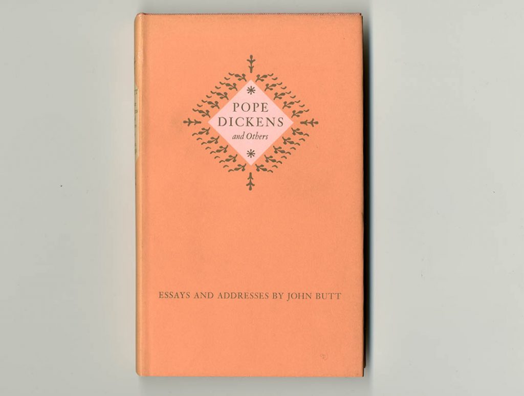
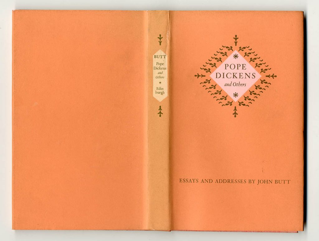
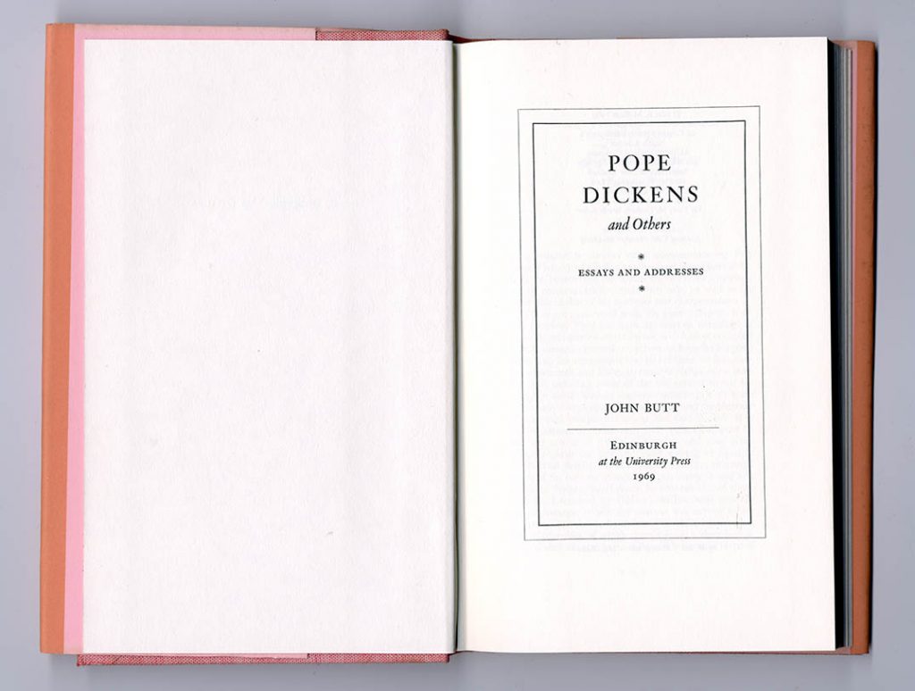
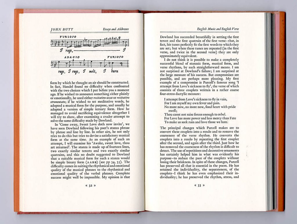
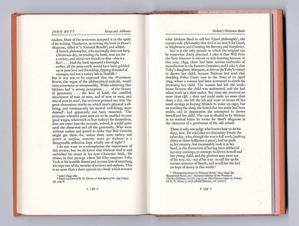
John Butt, Pope, Dickens, and others: essays and addresses (EUP, 1969, 8 × 5 in | 203 × 123 mm)
For the jacket, pink paper was used, with two printed colours (black and orange). GM liked strong colours. The format is narrow and elegant. Quotations are set unjustified; GM drew the music examples himself.
Printed by W. & J. Mackay, Chatham. Text set in Monotype Van Dijck, 11/12 pt
—
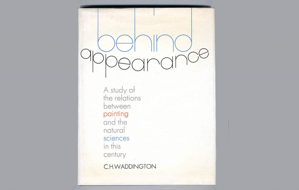
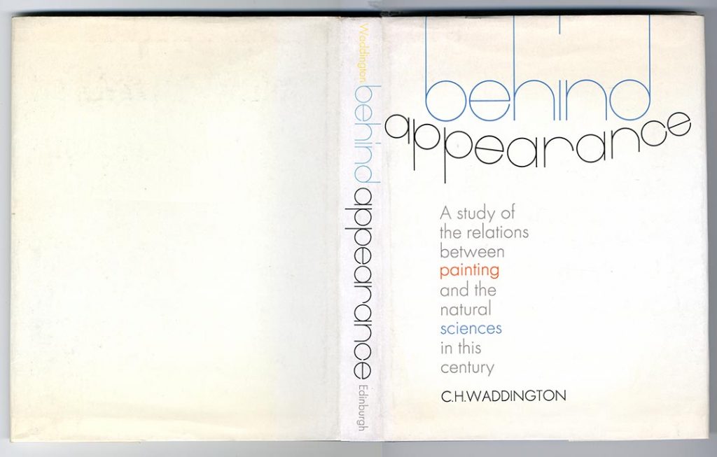
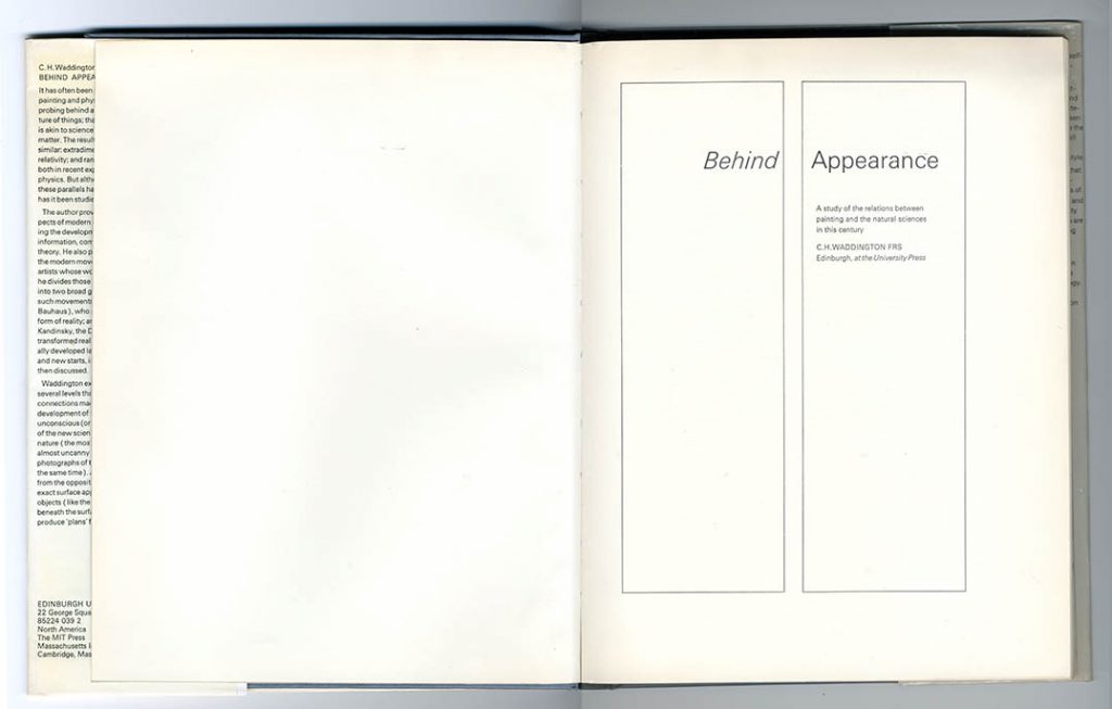
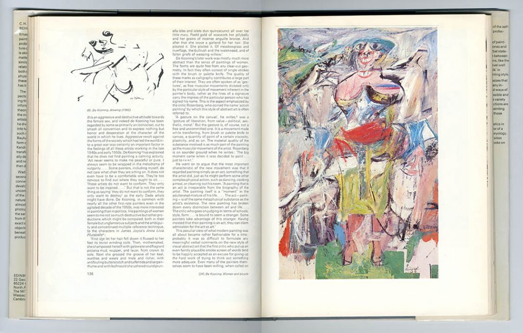
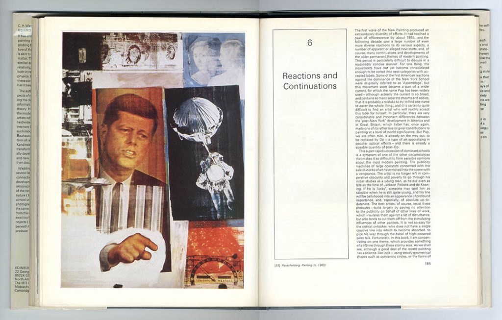
C.H. Waddington, Behind appearance: a study of the relations between painting and the natural sciences in this century (EUP, 1969, 297 × 230 mm)
Waddington was Professor of Animal Genetics at Edinburgh and published several major scientific works with EUP. He was also a knowledgeable critic of modern art, and this exceptional work brought his two sides together. It shows GM’s command of contemporary style, in page design and in his lettering on the jacket
Printed by Kynoch Press, Birmingham; colour plates printed by W. & J. Mackay, Chatham, and Arti Grafichi Amilcare Pizzi, Milan. Text set in Monotype Univers Light, 9/11 pt
—
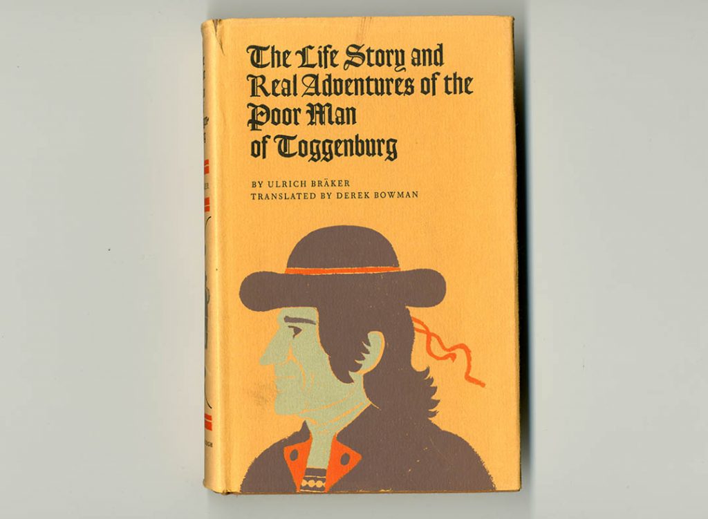
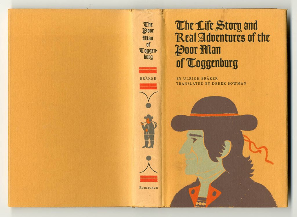
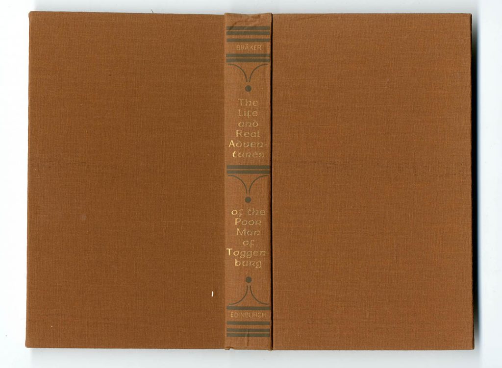
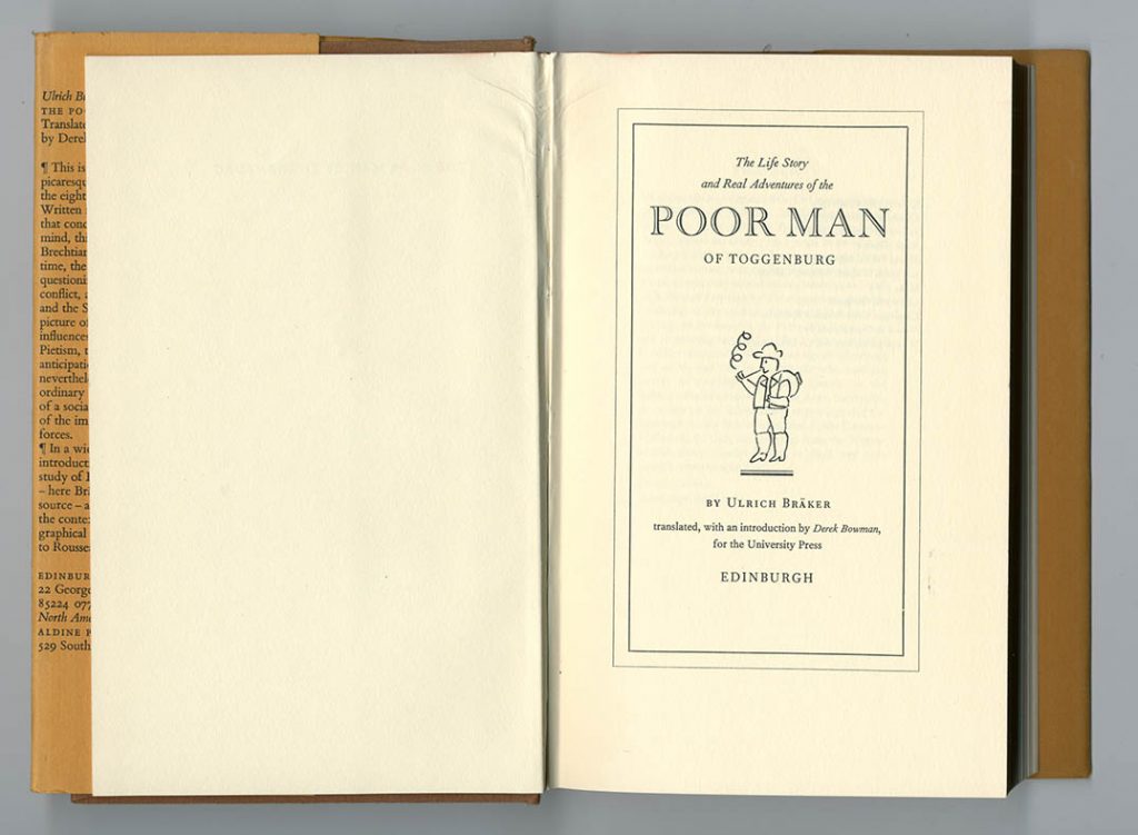
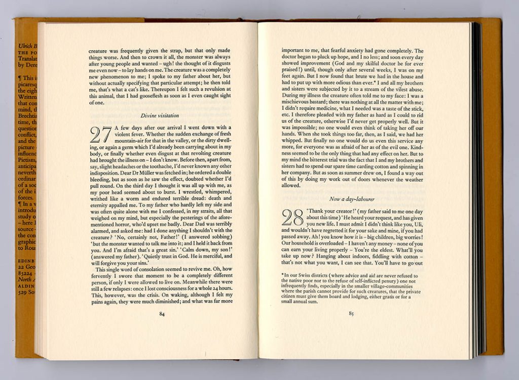
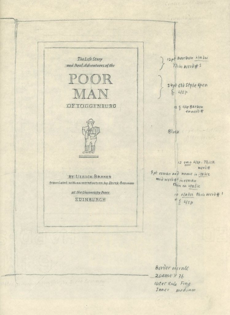
Ulrich Bräker, The life story and real adventures of the poor man of Toggenburg, translated & introduced by Derek Bowman (EUP, 1970, 8 × 5 in | 203 × 123 mm)
With the Montale edition, this was one of the special EUP books within its translations of European literature, and GM was allowed to give it considerable character, in every part. The book’s cloth case, especially, might have come from a German or German-influenced American publisher of earlier in the twentieth century. The layout here (reproduced with GM’s Matrix article) shows his method: precise, but humane in not overspecifying. The lines indicating the facing page are a splendid touch.
Printed by W. & J. Mackay, Chatham. Text set in Monotype Barbou, 10/11 pt
—
Full-page advertisement for Edinburgh University Press, Times Literary Supplement, 25 June 1976, p. 791
14 1/4 × 10 1/2 in | 363 × 267 mm
—
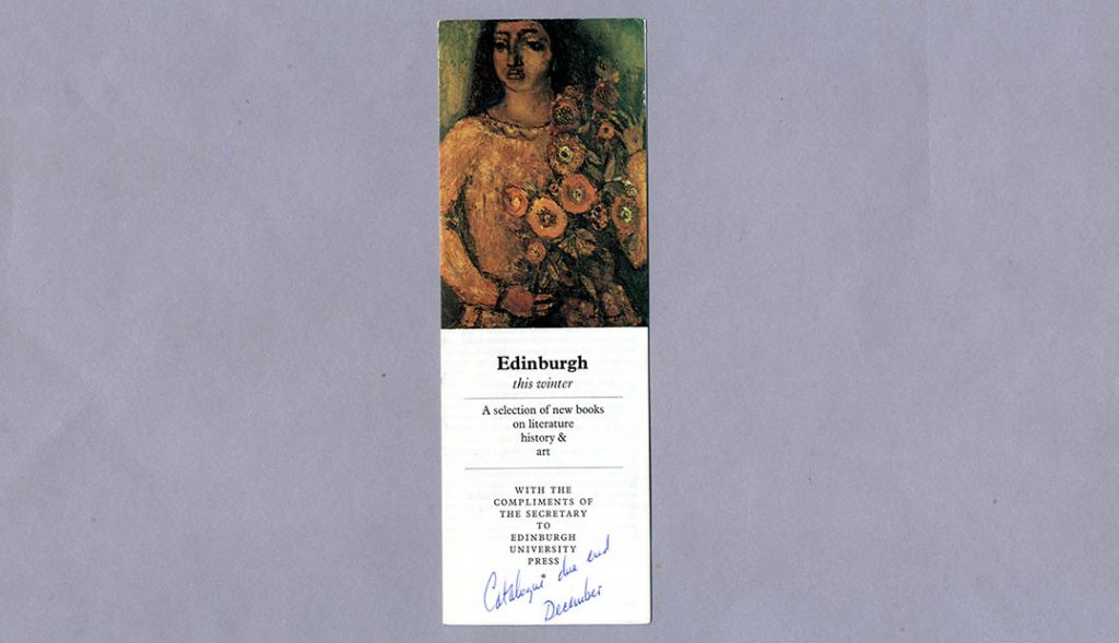
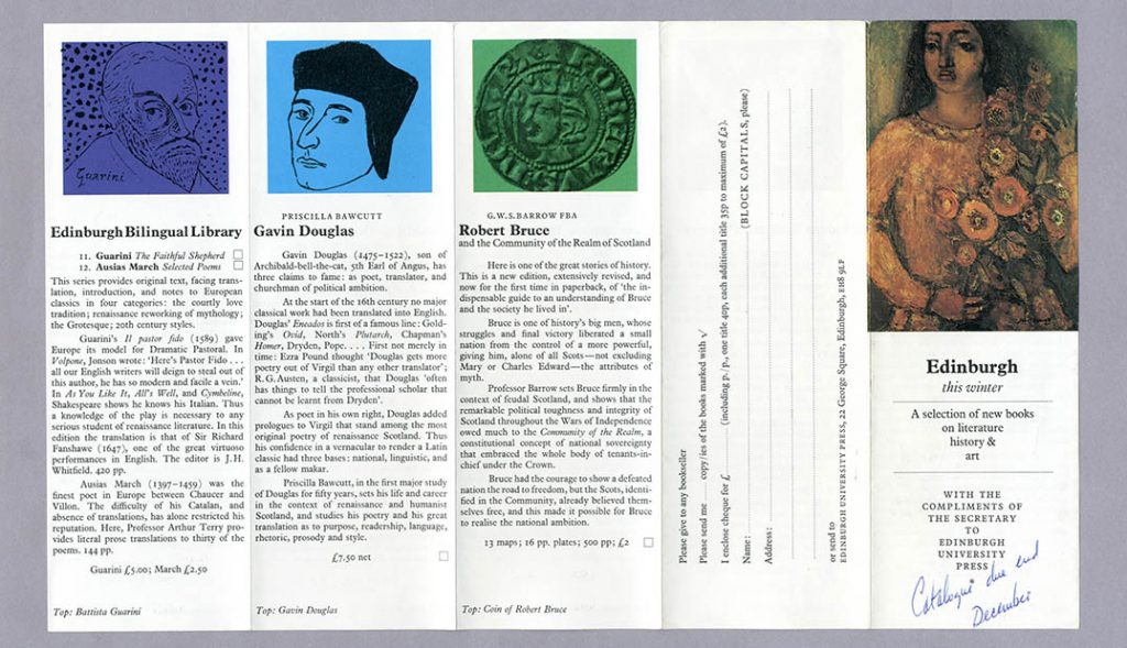
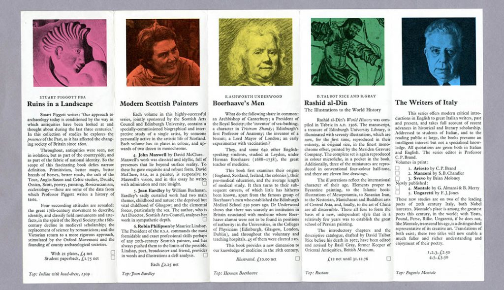
Leaflet for EUP, 1976
214 × 364 mm, folds to 214 × 74 mm
The front panel uses a painting by Robin Philipson, one of ‘Modern Scottish Painters’, printed in four-colour half-tone; the other images are printed in a single colour with black – which strengthens them. The text may have been photocomposed.
—
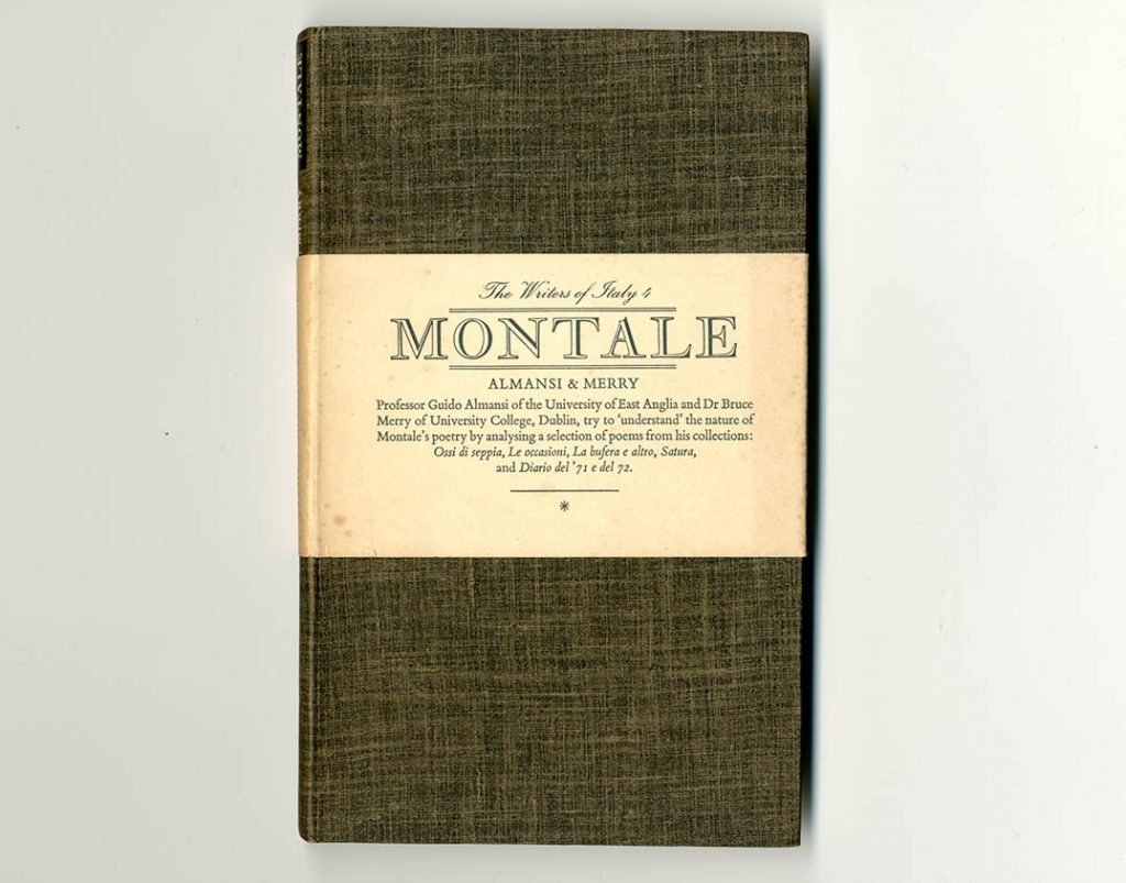
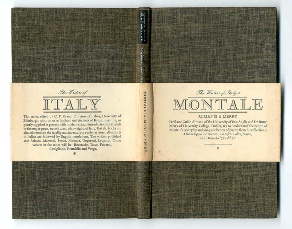
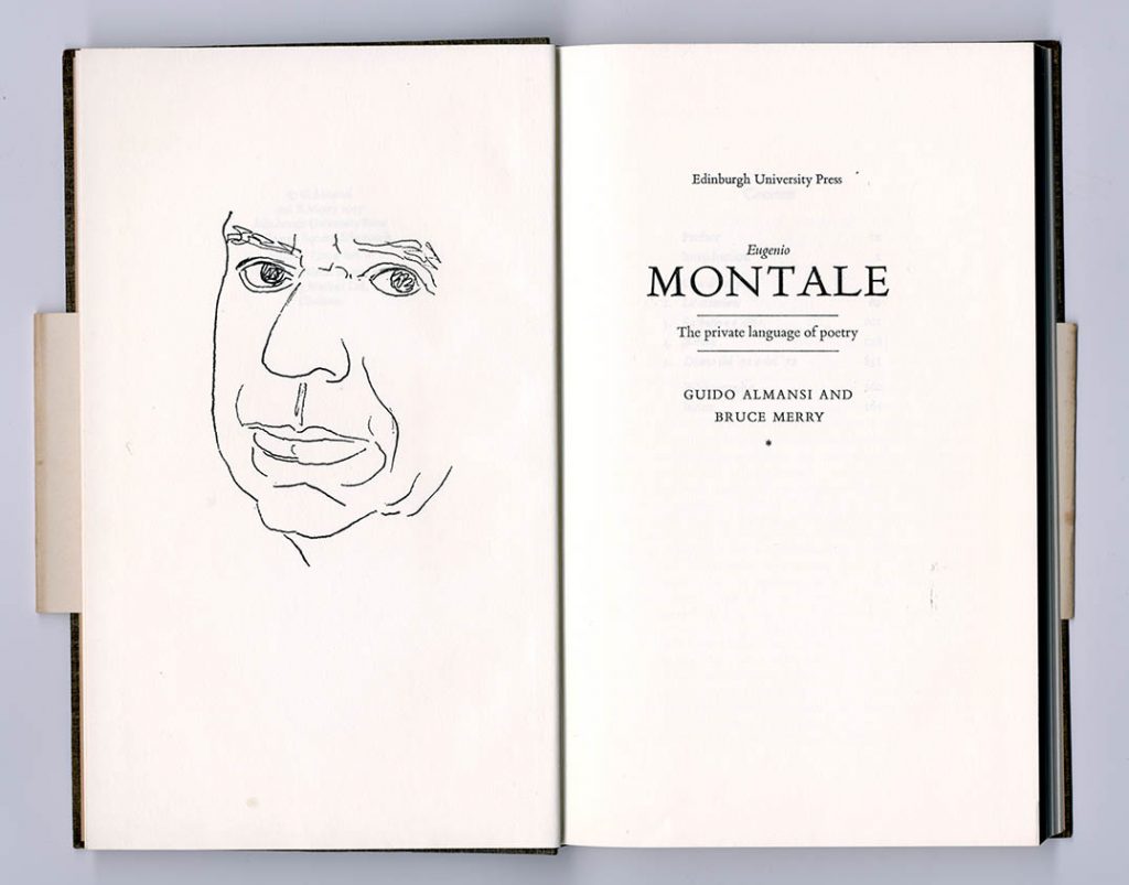
Guido Almansi & Bruce Merry, Eugenio Montale: the private language of poetry (EUP, 1977, 8 1/2 × 5 in | 216 × 130 mm)
This was one of the ‘Writers of Italy’ series, which ran to nine books over ten years. Rather than a jacket, a thick ‘belly band’ was used, letting the cloth-covered and wonderfully flexible case be visible. (This also exposes a contradiction of EUP house style: case titling ran upwards in the Continental manner, and jacket titling ran downwards in the British manner.) Title page spreads featured a drawing of the subject by GM. The text page spread shows the treatment of quotations, of which there are many. The bibliography and index spread has an unfussy, straight-ahead manner that may remind us of Aldus Manutius – as does the typeface used.
Printed by W. & J. Mackay, Chatham. Text set in Monotype Poliphilus, 11/12 pt
—
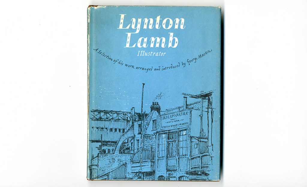
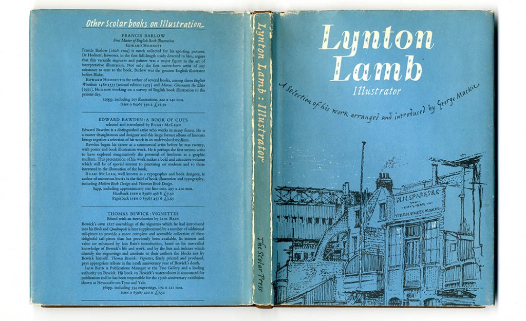
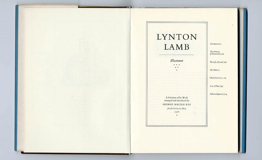
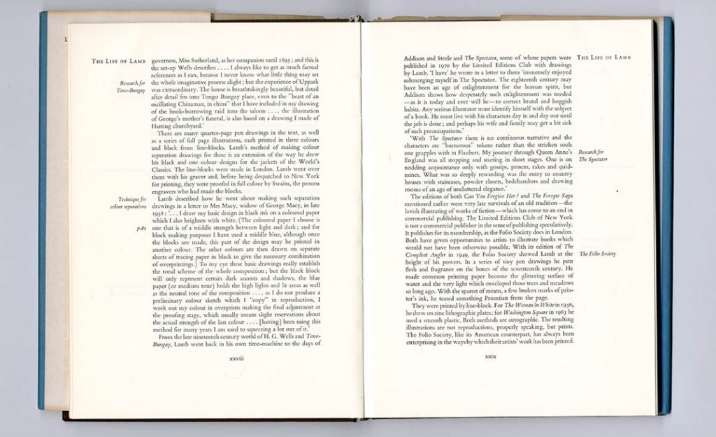
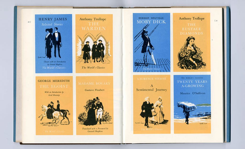
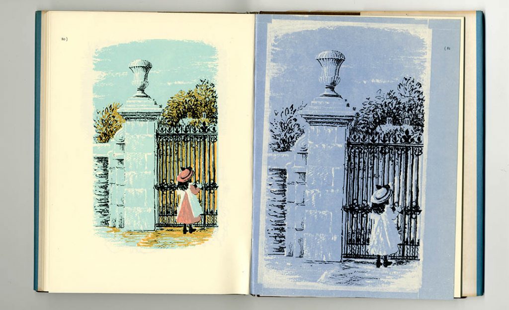
George Mackie, Lynton Lamb: illustrator (London: Scolar Press, 1978, 9 × 6 5/8 in | 230 × 170 mm)
This is GM’s tribute to an English illustrator in whose steps he followed; a book that could only have been designed by its author, so coherently does it present its materials. The title page and contents pages are combined in one. This is both an astonishing deviation from modern convention, and an irresistible consequence of the use of side-titles in the introductory pages. GM shows us Lamb’s method of finding a white highlight in a picture by leaving parts of the paper unprinted, used in the Oxford University Press World’s Classics covers. This technique, which GM used consistently, he lets Lamb explain: ‘I draw my basic design in black ink on a coloured paper which I also heighten with white. (The coloured paper I choose is one that is middle strength between light and dark; and for block making purposes I have used a middle blue, although once the blocks are made, this part of the design may be printed in another colour. The other colours are then drawn on separate sheets of tracing paper in black to give the necessary combination of overprintings.) To my eye these basic drawings really establish the tonal scheme of the whole composition; but the black block will only represent certain dark accents and shadows, the blue paper (or medium tone) holds the high lights and lit areas as well as the neutral tone of the composition.’ (p. xxviii) The last spread here shows how it was done: artwork on the right, printed page on the left.
Printed by The Scolar Press, Ilkley. Text set in Monotype Bembo, 11/12 pt
—
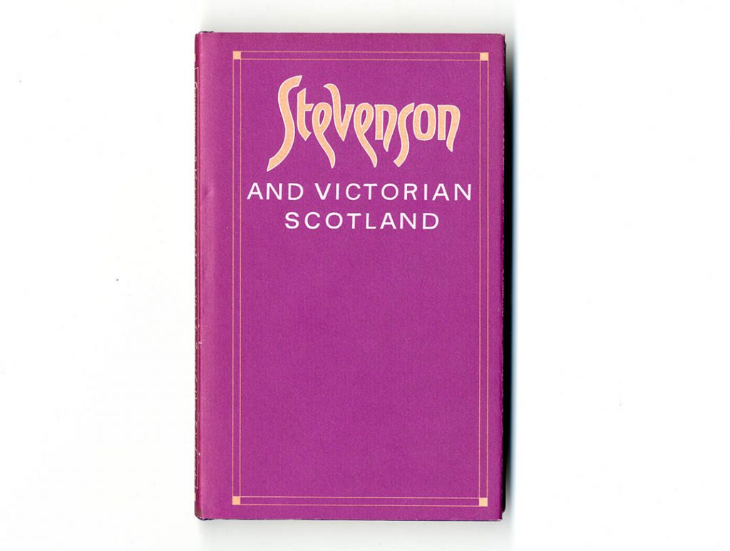
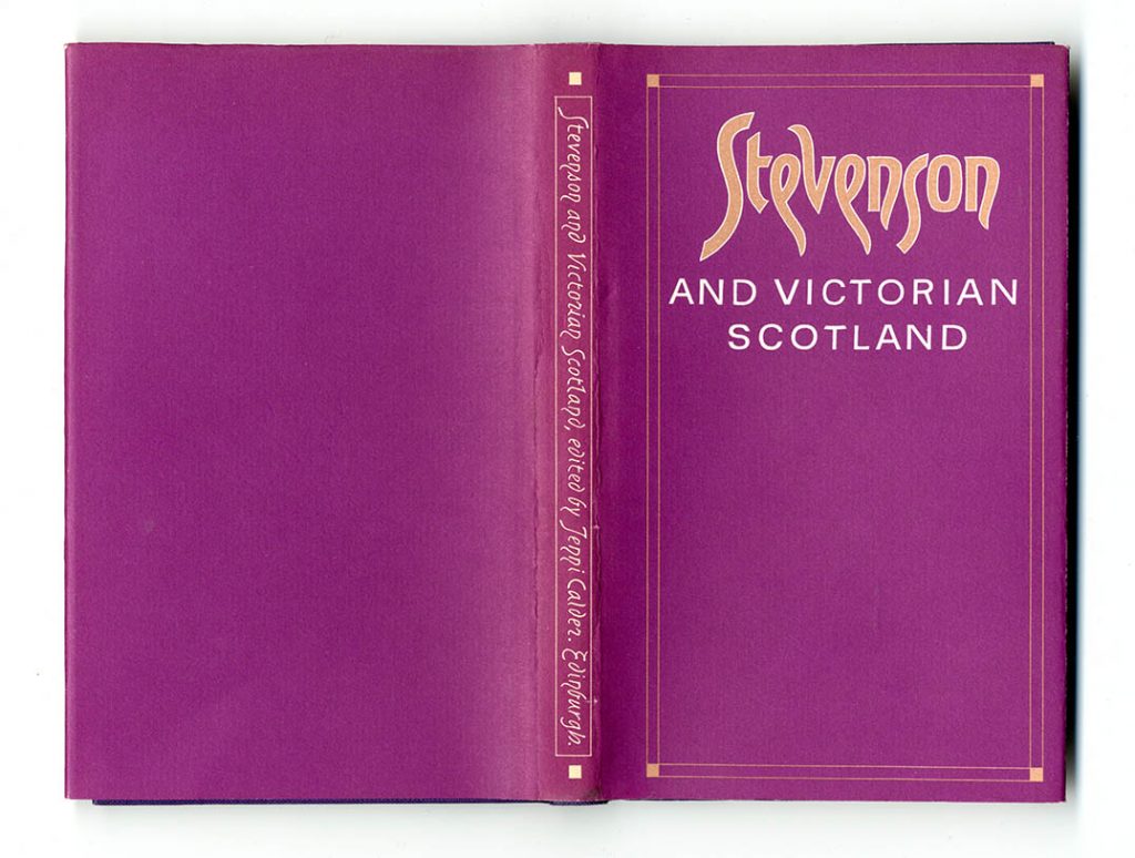
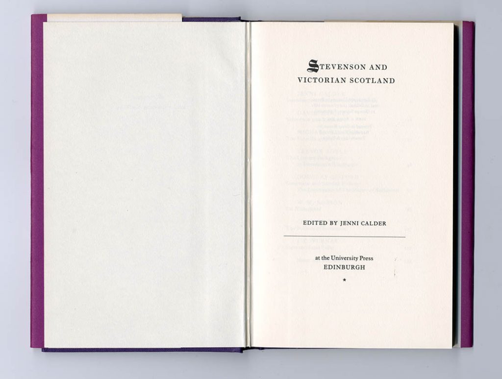
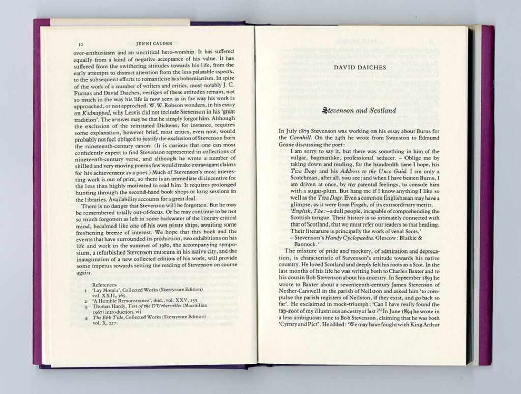
Jenni Calder (ed.), Stevenson and Victorian Scotland (EUP, 1981, 7 7/8 × 4 7/8 in | 197 × 123 mm)
An example of one of the later EUP books, now photocomposed and printed by a less distinguished firm. The typography of the interior pages is still recognizably GM’s. The cover design pursues Scottish Victorian motifs – art nouveau and grot lettering on a purple ground, within a border – without falling into Mackintosh-kitsch. The lettering on the spine is unmistakably GM’s.
Printed by Redwood Burn, Trowbridge & Esher. Text set in Linotron Plantin, 10/11 pt
—
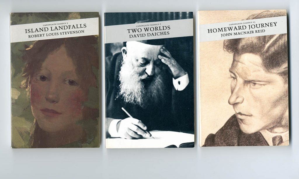
Canongate Classics (Edinburgh: Canongate, 1987–, 196 × 127 mm)
Robert Louis Stevenson, Island landfalls (1987), no. 3
David Daiches, Two worlds (1987), no. 7
John MacNair Reid, Homeward journey (1988), no. 13
The series design for covers and text typography was by GM, and the early titles in this series show his hand, especially on title pages. Linotron Trump Mediaeval was used for the text on the covers, front and back. But this presence quickly began to disappear. ‘Canongate Classics was a failure, I had insufficient control.’ (email 25 August 2020)
—
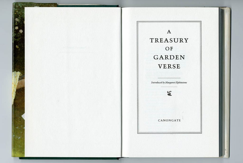
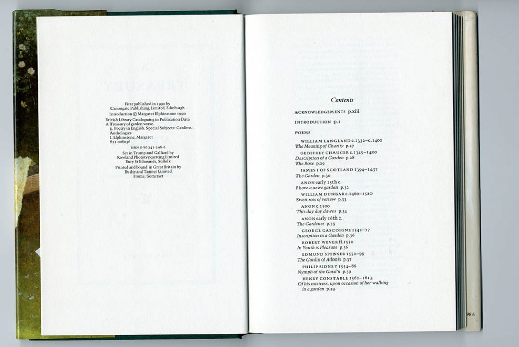
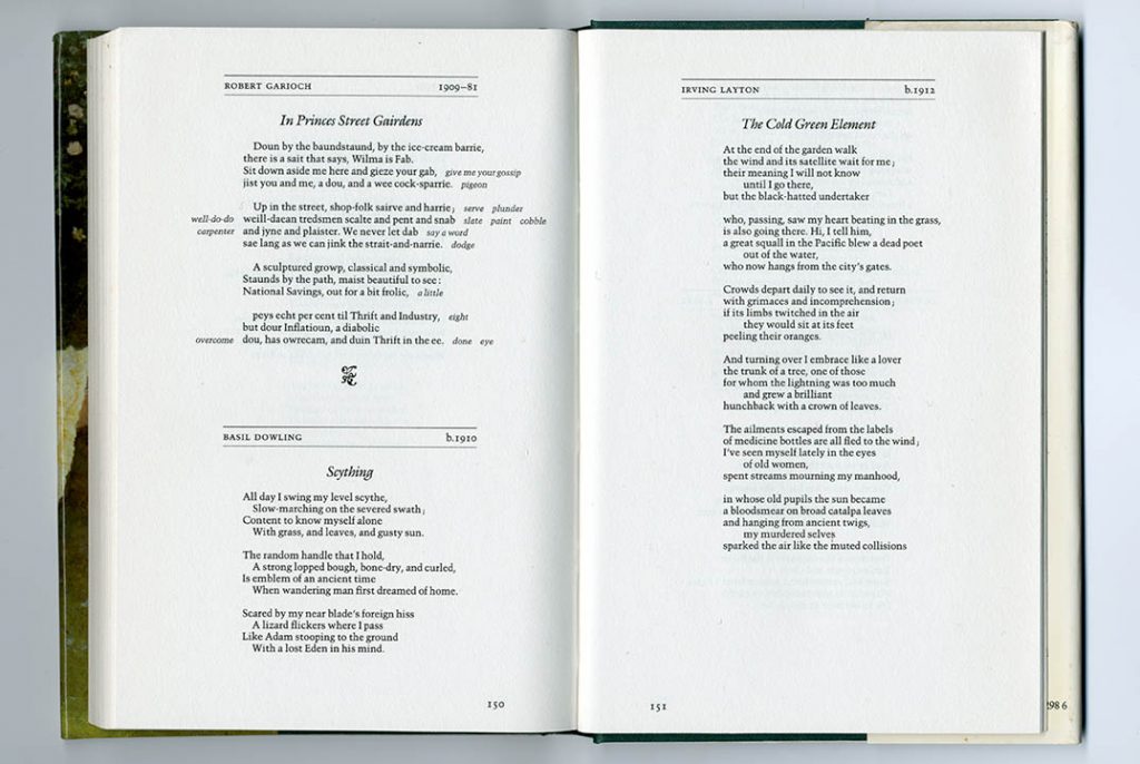
Margaret Elphinstone, A treasury of garden verse (Canongate, 1990, 233 × 154 mm)
The contents pages are notably information-rich and clearly configured, with the dates of poets included, and page numbers put near the poem titles. The placing of a poem follows its own shape: there is no consistent left margin; poems with shorter lines are pushed to the right, to let them sit centrally. Titles are then centred above the body of the poem below. In the top-left poem, note the glosses placed on the lines, left and right – just where the reader needs them
Printed by Butler & Tanner, Frome. Typeset in Linotron Trump Mediaeval
—
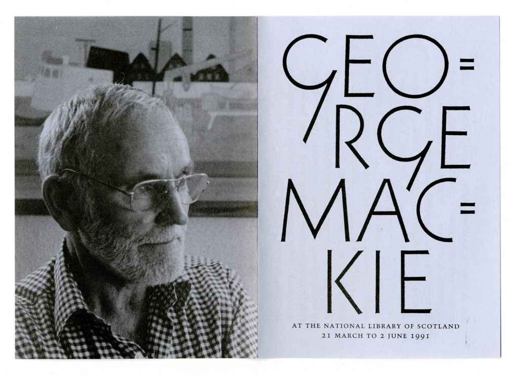
National Library of Scotland leaflet for its George Mackie exhibition, 1991
Front and back: folds to 148 × 105 mm.
The leaflet was photocomposed in Trump Mediaeval, which became a favourite for GM in the post-letterpress years. Here again he was aligning himself with the Continental artist-typographers – Georg Trump being a notable if too little known example of this figure. The lettering for the front also shows an allegiance to Continental models – perhaps Rudolf Koch.
—————
Sources
Quotations from George Mackie’s published writings are taken from his articles of 1988 [Matrix] and 1991 [NLS].
Measurements of the things shown are given in inches and millimetres. Metrication was officially obliged for the British printing industry by the end of 1970, but formats conceived in inches lingered on into the metric era.
Peter Bell, Edinburgh University Press publications 1953–87, Edinburgh: Portsburgh Press, 2001
George Mackie, ‘Designing for an enlightened publisher’, Matrix, no. 8, 1988, pp. 158–63
National Library of Scotland, Books, mostly scholarly, and some ephemera, designed by George Mackie, Edinburgh: National Library of Scotland, 1991
Paul Stiff, ‘Instructing the printer: what specification tells about typographic designing’, Typography papers, no. 1, 1996, pp. 27–74
Archie Turnbull, ‘Declarations of interdependence’, Times Literary Supplement, 25 June 1976, pp. 792–3
Archie Turnbull, ‘Tribute to a paper maker’, The Bookseller, 13 August 1977, p. 1445
Acknowledgements
Thanks to Eric Kindel for conversation and help with Matrix.
————————————————————
Robin Kinross
————————————————————
Notes
- Obituaries of Archie Turnbull (1923–2003) can be found in The Guardian and The Independent. I met Archie Turnbull only once, in the last years of his life, but have a strong memory of hearing two concert-interval talks that he gave on BBC Radio 3: ‘The uncreating word’ (10 March 1979) and ‘The rise and fall of the publisher’ (3 February 1980). In one of these, lamenting the present state of publishing, he fixed on the new category of ‘airport books’. Closing the talk, he gave heavy emphasis to its very last word. He said it’s appropriate that it is the airport that now embodies the state of literature, which is indeed terminal.
- Obituaries of George Mackie have been published in UK national newspapers: The Daily Telegraph, 20 October 2020, and The Guardian, 23 December 2020.
- GM’s letter to the London Review of Books, 25 October 2012, in response to a piece by Jonathan Meades on the memorial to Bomber Command in London, expressing his ambivalence about any such built memorial, is rightly quoted by his obituarists. He expressed his thoughts there with precision and moral weight.
- These pictures are all scans, as the pressed-against-glass nature of them suggests: the sharpness of a scan is the gain here; the loss is a fuller sense of the book as a three-dimensional thing.