This year’s catalogues for the best-designed/-produced books have been appearing. The Swiss catalogue for books issued in 2006 is just published. The German catalogue for the same period came out some weeks ago. The British publication, also carrying the designation ‘2006’, was produced towards the end of last year. The Dutch best-books catalogue is on its way, and will cover books published in 2006. With the exception of the British publication, these catalogues describe and discuss books that are put on exhibition in their own countries, and which are also, in the autumn, added to a showing at the Frankfurt Book Fair of all the world’s best-books of that preceding year. A proper survey of the best-books exhibitions would take in all the countries represented at Frankfurt, including (as I recall) Finland, Denmark, the Czech Republic, the United States, Spain. These remarks are addressed to the countries with which I am most familiar.
Looking at the Swiss, German and Dutch catalogues of the past fifteen or so years, the development has been as follows. The Dutch led the way towards ever more amazing feats of production in these catalogues (while the books described in them might be quite ordinary – in a good way). One might cite the catalogue for 1989 (published in 1990) as the one that really set this new tone.
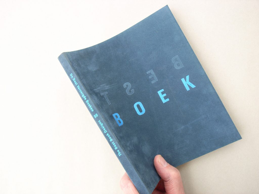
The 1989 Dutch catalogue (the cover misleadingly carried the designation ‘1990’).
It was bound, in an early application of the Otabind technique, in a thin flexible card, felt-covered on the outside. The title-lettering on the cover was embossed: of the two words there (BEST / BOEK), one had the letters in mirror-image and was blind-embossed; the other was set the right way round, and printed in either blue or yellow metallic ink. On the rear cover this was all reversed. So on the front you read ‘BOEK’ and on the back you read ‘BEST’. Inside the text was printed on thin paper, with much show-through, and the pictures were printed in colour on high-gloss paper, with a matt reverse side on which an inside spread of a chosen book and some descriptive text were printed. This two-sided gloss paper was cut on its outer edge to two widths, so that, flicking through the book, one saw only the inside pages of a book and its description. Or, alternatively, flicking through from back to front, one saw only the introductory text to a book and its front cover. At least, that’s how I think it all worked. It was a masterpiece of extraordinarily considered and delicate design, and wonderful printing and binding: a rare specimen. (And, as it happens, not to my taste; but one had to be amazed.) Inside the world of Dutch graphic design, it made the name of its designer: Irma Boom. After this, the Dutch went overboard for Design, and it took quite a few years for their best-books catalogues to calm down and exist without too much self-consciousness.
The Swiss catalogues had always been the most modest, the most uniform. Year after year they hardly changed: a small-format, stapled booklet, showing one book per page in black & white photographs. But then in their catalogue for 1999, the Swiss took a leap into Design. The catalogue grew in page size, various papers were used, and books were now shown in colour photographs. Most memorably, they were also shown in the context of everyday life: photographs were made of the books around the place: being read on a bus or tram, on the street, and in the apartments of – one guessed – friends of the designers (Gilles Gavillet and Cornel Windlin). One of the photos showed someone reading one of the selected books in the bath; another showed someone under a duvet, who had gone to sleep over his book. This signalled the start for the Swiss of a conjunction of sober description and what one still has to call art: the art of the photographers whose work is seen in museums of modern art, or the art of artists who make installations out of multiple copies of some banal mass-produced item. For such artists the publication accompanying their show can be as important as the show itself. These are often artists who have absorbed some of the manners and habits of design. So, in latching on to this kind of design-influenced art, the Swiss catalogues make a further twist in a spiral of mutual stimulation.
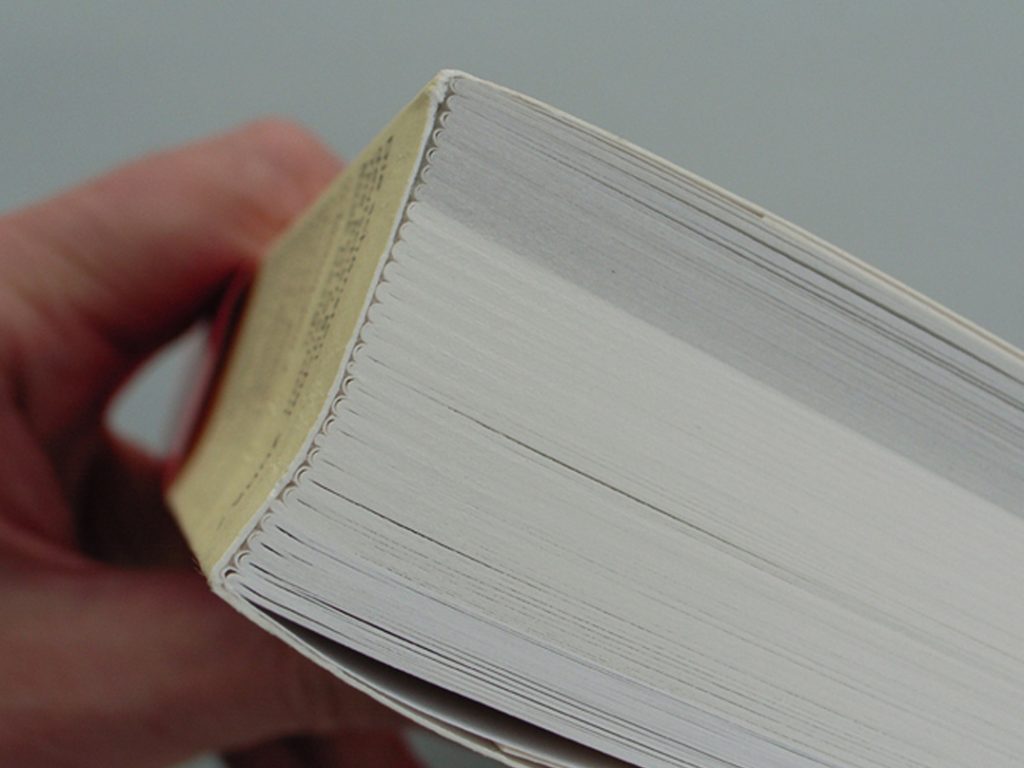
Two years ago, in the catalogue for 2004, the Swiss took another leap forward. A quest for true representation led the designer Laurent Benner to the incorporation of pages from some of the selected books, which were reprinted on the papers actually used in those books. The colophon read: ‘Gedruckt in Deutschland, im Libanon, in der Tschechischen Republik und der Schweiz.’ To cope with all this, the page size of the 2004 catalogue was 335 × 240 mm; it was 26 mm thick and weighed 1600 gm. (The catalogue for 1997 had weighed 150 gm.) For the 2005 and now the 2006 catalogues, Laurent Benner, now working with Jonathan Hares, has used the same approach. Sections of the actual papers have been incorporated, lending these catalogues the air of paper samples. That is indeed useful, even if it still doesn’t represent the book completely: book designers constitute the core readership of these catalogues, and the exact specification of the paper in a particular book is often just what they want to know. In the latest Swiss catalogue (for 2006) the wish to represent the chosen books has led to them being shown as thumbnail spreads, as one can obtain from a QuarkXPress or InDesign file. Thus a 272-page book is shown this way over six pages of the catalogue, with whole pages reproduced same-size on a further two pages, and all this on the paper actually used in the chosen book.
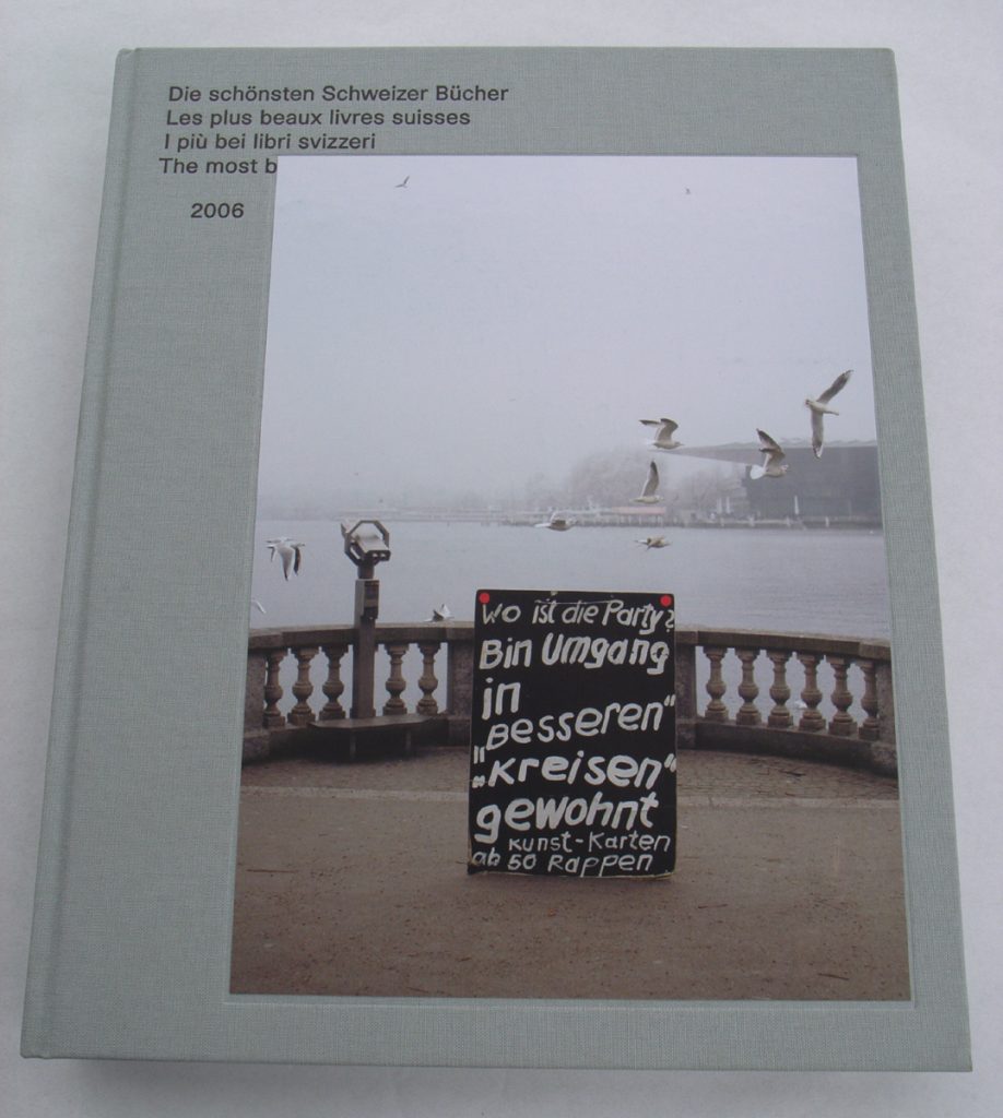
The 2006 Swiss catalogue. Page size is 275 × 225 mm. The binding is by Buchbinderei Burkhardt: cased in cloth, with sections sewn and hot-melt glued.
François Rappo, chairman of the Swiss jury, remarks in his report in the 2006 catalogue:
there is a noticeable trend that was already discernible in previous years: a sort of competition among publishers and book designers to produce the most material and highly profiled book by means of a kind of hypermaterialisation of the medium and the message. It is as if, among all the communication strategies used in the media, electronic and otherwise, a new place is now seen for the book as a tangible object, having a ‘brand’.
One can apply this also to these best-book catalogues, especially the recent Swiss ones. In their search for ever more total and ever more material representation they have become extraordinary artefacts. And yet, the books that are being represented never can be completely represented. The search will always be a hopeless one. Perhaps one will do just as well with the grey and illegible pictures of the 1997 catalogue? At least it was cheap to make, didn’t take up much space, and could be easily chucked out by recipients who weren’t interested (one imagines this happening at a hundred embassies and cultural offices around the world); at least those old catalogues were innocent.
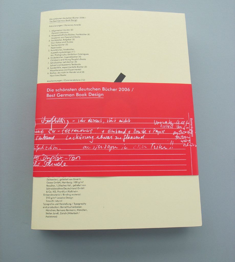
Turn now to the German catalogues. While the Dutch went slightly crazy, with every year a new lurch into eccentricity, and while the Swiss turned towards art-grit photography and then conceptual art, the Germans stayed thorough and sturdy. With their bases in Frankfurt and Leipzig (whose spring fair also hosts a gathering of international best books), the Germans have played the role of responsible parents to the national best book competitions. The sense of fairness and seriousness in the German event is exemplified by the evaluation forms in which the jury members write their comments, with their own hands, and with their own pens and biros. These are left in the books at the annual exhibition and can be inspected by any visitor. Everything seems to be above board in the German event, as is hardly the case in other competitions – in which judges are also prize-winners, and in which books of no apparent merit, neither of design nor of content, get chosen.
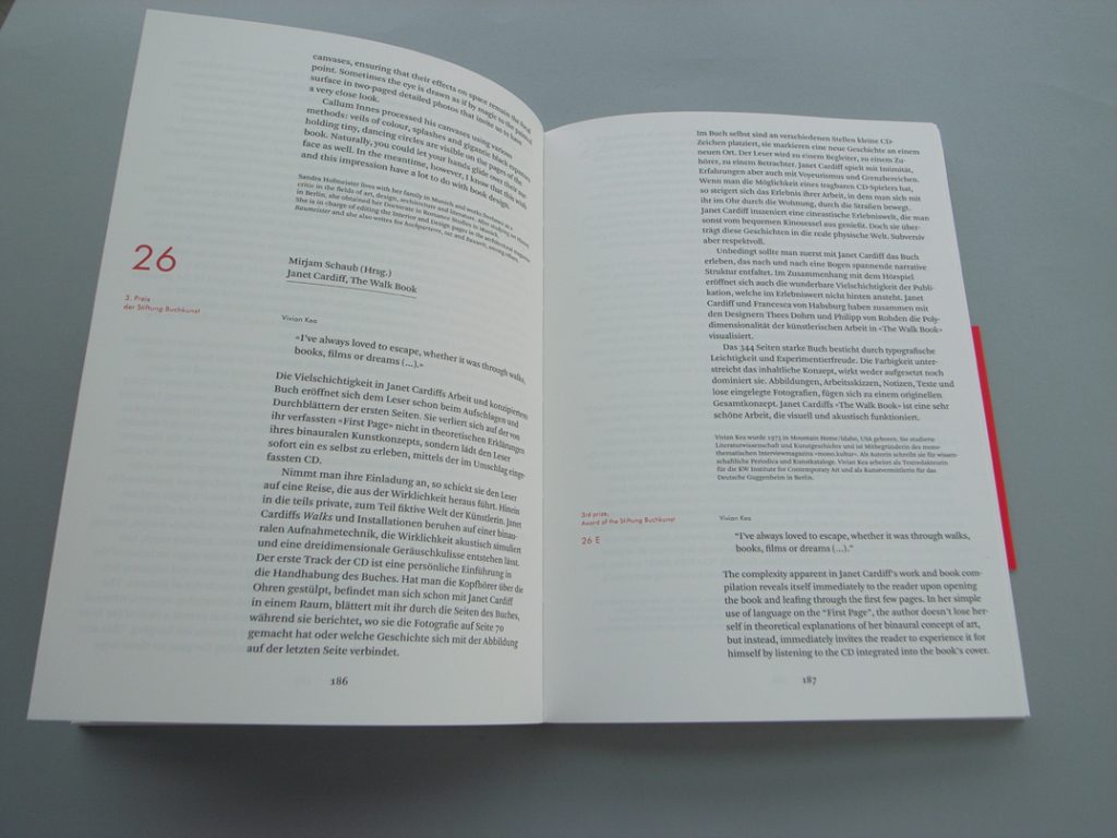
The latest German catalogue is quite a bit thicker than usual, and it is less illustrated than in recent years. Covers of the chosen books are shown in colour, at the front of the catalogue, and inside spreads are shown in small black & white photos, printed on a grey paper towards the back. But the main work of representation is done in words, in short essays by a team of commentators (writers, designers, publishers). Uta Schneider, for the Stiftung Buchkunst, explains the idea: since representation is never quite possible, and so is always unsatisfactory, then why not take another way and use words to describe these books? After all, this is what books are all about: words, writing, reading, imagination. This idea comes from the principal designer of the book, Bernd Kuchenbeiser.
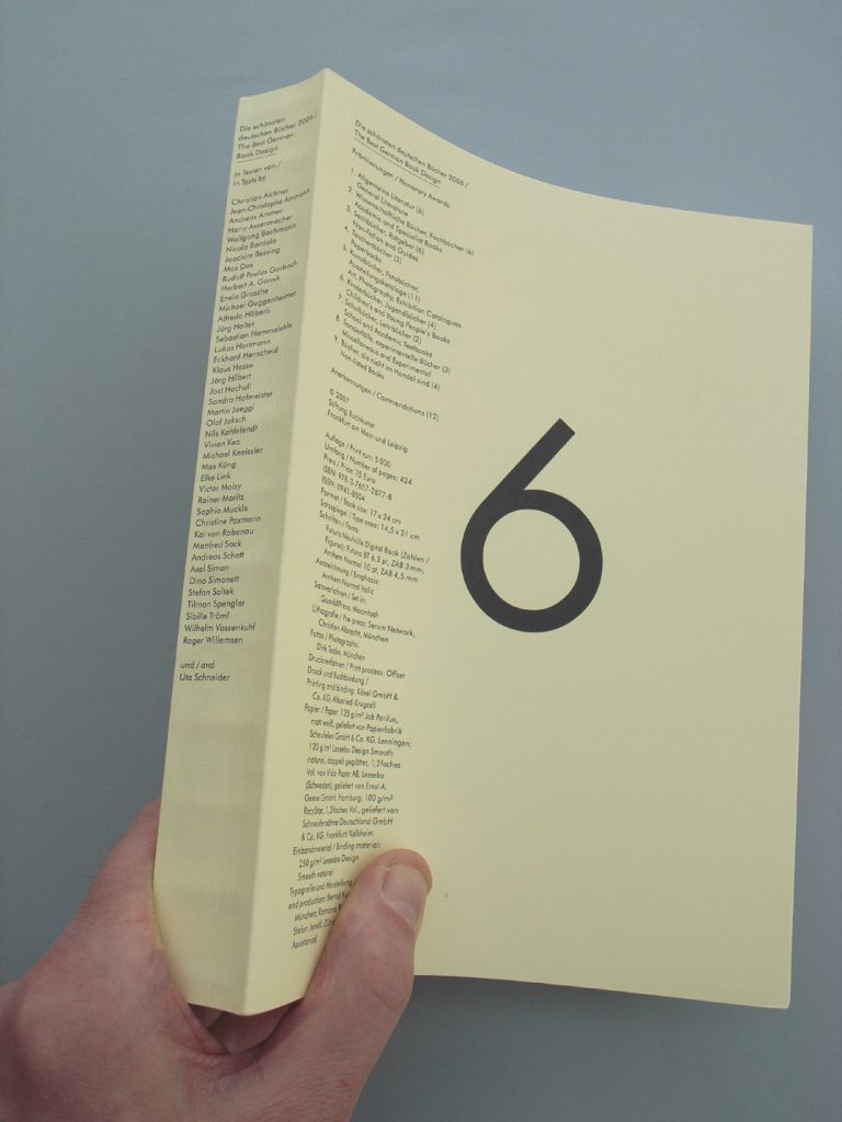
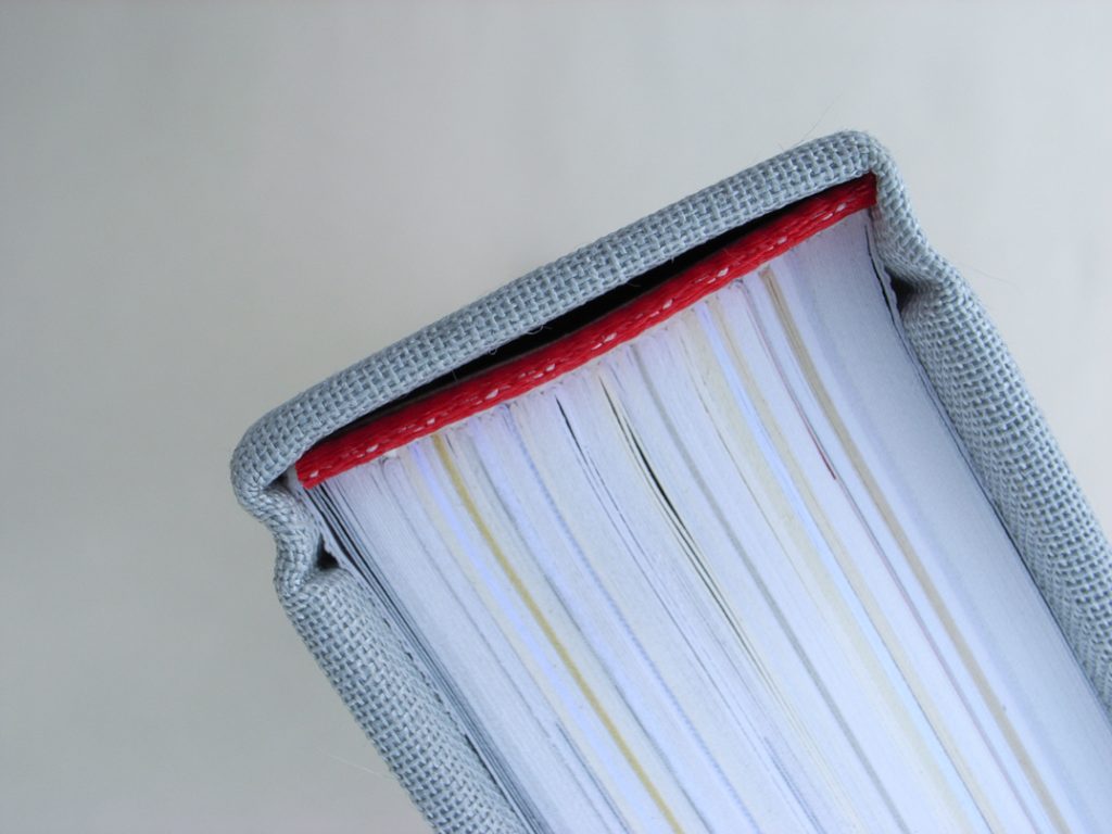
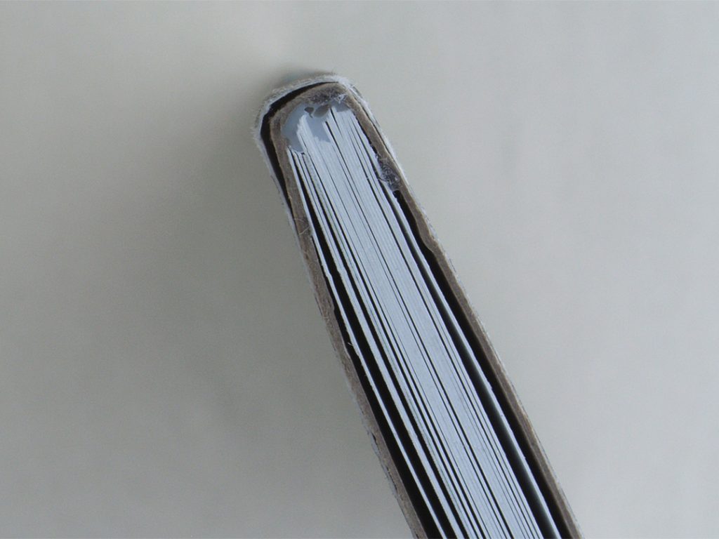
The 2006 German catalogue. Page size is 240 × 170 mm. The binding is by Kösel GmbH & Co: paper-bound, with flapped covers, with sections sewn and cold-glued. Note the way in which the threads of the binding are evident as ridges at regular intervals along the spine of the book: the sign of a strong and elegant construction.
The German catalogue for 2006 is a wonderful object. A thick flapped paperback of 424 pages, its text is typeset in Arnhem, with Futura used for supporting matter. The binding uses cold glue. This physical aspect of the catalogue is quite superb. But the whole thing – content and design, as well as its material embodiment – feels thorough, quiet, normative.
The German, Swiss, and Dutch catalogues belong to a broadly shared culture of sophisticated design values applied to the still flourishing publishing worlds in their respective countries. This one cannot say of the British catalogue. In explanation of the poverty of the British effort, one can point to the lack of public-money support for its ‘best books’ event – in marked contrast to the Swiss and German competitions. And one might well cite the very fragmented, exploded nature of book publishing in the UK. Here in this country the publishing industry (that’s what it likes to call itself, with some truth) is now, for a large part, a sector of Americo-Anglo and wider conglomerate enterprise. The publishing office may be in London, but its ultimate owner will reside in New York or Locarno; printing and binding may well be routinely done in China or Singapore. So what is British about books that are made by such publishers? This is partly an effect of the world dominance of the English language, partly of the nature of free-market capitalism in the USA and UK, partly a matter of now very weak traditions of design and industrial manufacture in these two countries.
Even allowing for the forces with which it struggles, the British Book Design & Production Awards catalogue is, however, much worse than it needs to be. The event it records is not an exhibition: the books are not left on display, are not sent to Frankfurt. Rather, the catalogue is issued on the occasion of a dinner in London. Participants are asked to buy tickets for this. They cost £95 (plus 17.5 per cent tax) if booked before a given date, or else £110 (plus tax). A table for ten people will cost £950 plus tax (or £855 plus tax if booked before the critical date). In their introduction to the 2006 catalogue, the three-person judging panel thanks the organizers at the British Printing Industries Federation for ‘putting on such a great “do” (and we all know how much those of you in the world of print and publishing hate a good night out!)’. What is going on here? It seems to be another manifestation of the philistine Anglo-culture that you can see in the downmarket UK newspapers and men’s magazines, in English football supporters abroad, or in a stag-night party in some cheap-flight Continental destination, with a gang of smart-casual Brits using the occasion as a pretext to get drunk – to the puzzlement of the local population.
As this air of desperate male fun suggests, the British event is essentially a printers’ affair: ‘Well done Nicola!!’ concludes the caption to the ‘best jacket / cover design’ winner. Yet the books chosen are inevitably, given the real state of Americo-Anglo publishing, not all printed in the UK: a good number of them were made in the Far East, some others in Italy, Germany, Belgium. The catalogue is entirely unclear about criteria for inclusion, but the determining factor seems to be ‘published by a firm or person with an office in the UK’. This might be fair enough, but it needs to be spelled out. In fact the Dutch, German and Swiss events also show some signs of struggle over country of production. The German catalogue this year includes two books from a Swiss publisher, but then the books in question were printed in Germany. The Dutch do spell out their rules in a set of numbered articles (see here), and say that two out of three of these conditions must be met: the publisher must work from the Netherlands; the designer must be Dutch or working in the Netherlands; the book must be printed in the Netherlands. That seems a good formula, and allows for the close connections with Belgian printers, and for the fact of designers coming to the Netherlands to study, then staying on and settling there. One of these turns up in the Swiss catalogue, for a book wholly designed and produced in the Netherlands, but co-designed by this person of Swiss origins. And I cannot help suspecting that this book only came to the attention of the Swiss competition because it uses an unusual typeface designed by one of its jury members and includes work by another. But it’s a nice book and deserves a prize.
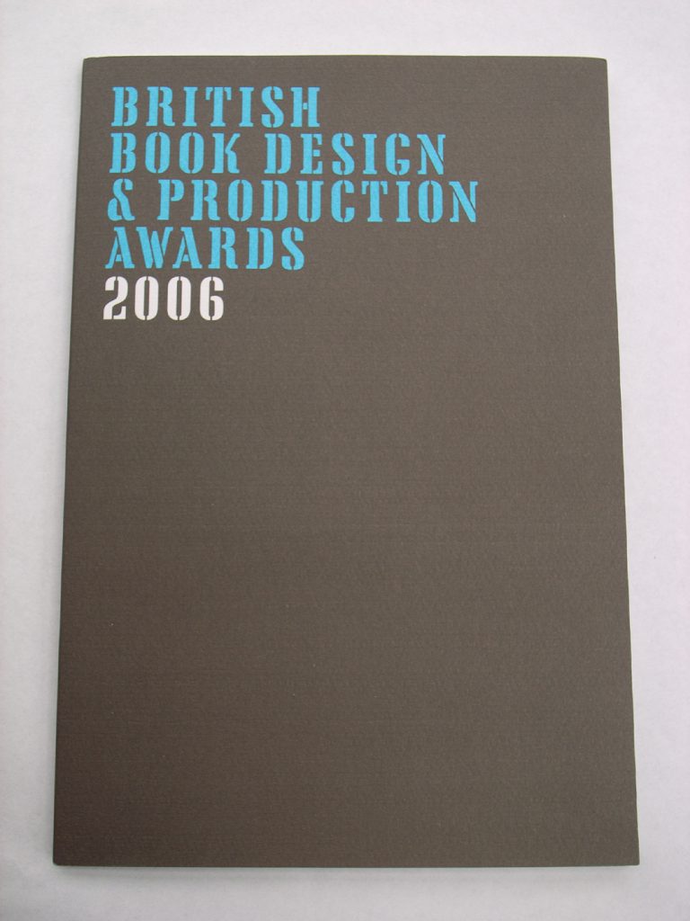
The 2006 UK catalogue. Page size is 280 × 190 mm. It seems to be ‘burst-bound’. The binder’s name is not disclosed. There is no way in which the book will lie open.
The British awards are thoroughly cosy in this respect of keeping it in the family. One of the gang of three British judges also designed the catalogue. This double-duty suggests that this designer cannot have been surprised, on the evening of the prize-giving dinner, to have three of his books selected, nor to have one of these three chosen, tout court, as the ‘Best British Book’. It too is a nice book and could well deserve a prize … but that isn’t the point here.
Robin Kinross