In 2006, invited by Giovanni Lussu and his colleagues on the editorial board of the journal ‘Progetto grafico’ (published by Aiap, the association of Italian graphic designers), I wrote a consideration of Beatrice Warde’s ‘Crystal goblet’ essay.1 This became part of a symposium on Warde’s view of typography, which was published in ‘Progetto grafico’, no. 8. Other components of the symposium were an Italian translation of the ‘Crystal goblet’, published as a booklet that came free with that issue of Pg, and essays by Alessandro Colizzi, Sergio Polano, and by Giovanni Lussu writing together with his colleagues Antonio Perri and Daniele Turchi. The essay by Lussu, Perri, and Turchi, has just been published in English translation. This has prompted the publication of the text (in its English original) that follows here.
(Beatrice Warde, Il calce di cristallo, Milan: Aiap, 2006)
Re-reading Beatrice Warde’s text, it seems a better argument than I remember. In my memory had been its language, and the over-ripe talk about ‘a flagon of wine’, and this wine which was ‘a deep shimmering crimson in colour’. ‘Crimson’ is almost inevitably a cliché: in an ancient battle, the blood on the ground is ‘crimson’; or the lips of a seductive woman may be ‘crimson’. And what is a flagon? The word has gone from English usage. ‘Flagons’ were perhaps last heard of in Errol Flynn movies of the 1950s, when men in tights jumped onto tables littered with ‘goblets’, and challenged each other to a sword-fight. Warde was speaking after dinner to the Society of Typographic Designers, and this explains something about the approach of her discussion and her metaphor of the wine glass – the ‘crystal goblet’. But if you can look past the trite language of her text, there is certainly something of substance in what she says. It defines one common view of typography.
Beatrice Warde was putting into more popular language ideas that her colleague and friend Stanley Morison had recently (in 1929) advanced in his essay ‘First principles of typography’, originally written as the entry on ‘typography’ for the Encyclopaedia Britannica. ‘Typography is the efficient means to an essentially utilitarian and only accidentally aesthetic end, for enjoyment of patterns is rarely the reader’s chief aims. Therefore, any disposition of printing material which, whatever the intention, has the effect of coming between the author and reader is wrong.’ For many years, and perhaps still, this view has been accepted by traditionalists, ‘new traditionalists’, and even by hardline modernists who have done typography in ways that Morison would have hated.
Alongside the view of the text as a wine glass or (as she suggests later in the essay) as a window pane, there has been another tradition that says the opposite. This is the view that typography should be expressive – should express the text. One may quote F.T. Marinetti, writing in 1913:
My revolution is aimed at the so-called typographic harmony of the page, which is contrary to the flux and reflux, the leaps and bursts of style that run through the page. On the same page, therefore, we will use three or four colours of ink, or even twenty fonts if necessary. For example: italics for a series of similar or swift sensations, boldface for the violent onomatopoeias, and so on. With this typographic revolution and this multicoloured variety in letters I mean to redouble the expressive force of words. (From ‘Lacerba‘, 15 June 1913)
Marinetti’s revolution was exactly the opposite of the Warde / Morison idea. And ever since these two views were articulated, they have polarized the debate on typography. So much so, that there has never been any hope of dialogue between the two.
I find it interesting that much of the celebrity of Warde’s essay today has come from its recent use by opponents of ‘transparent typography’. (Let us call it that, rather than ‘invisible typography’, which suggests printing with lemon juice, as practised by spies and schoolboys.) Through the years of modernist ascendancy, in the 1960s and 1970s, the ‘Crystal goblet’ essay was ignored. There was no need for it: ‘transparency’ as an ideal was understood and accepted. But with what was sometimes known as ‘the legibility wars’ of the late 1980s and early- to mid-1990s, Warde’s essay was given a new life. It was often quoted by the radical debaters in Emigre and Eye, who argued that typography should reject this pretence of neutrality. Using the theories of deconstruction they argued that, since it is readers who create the text, the design of the text should embody these readings. Design should act out the themes and meanings of the text. A text about schizophrenia might have a gap running down the middle of the page. If the reader was then not sure how to read it – whether to jump across the gap to make one line, or to move down to the half-line below – this would be an appropriate acting out of the meaning of the words.
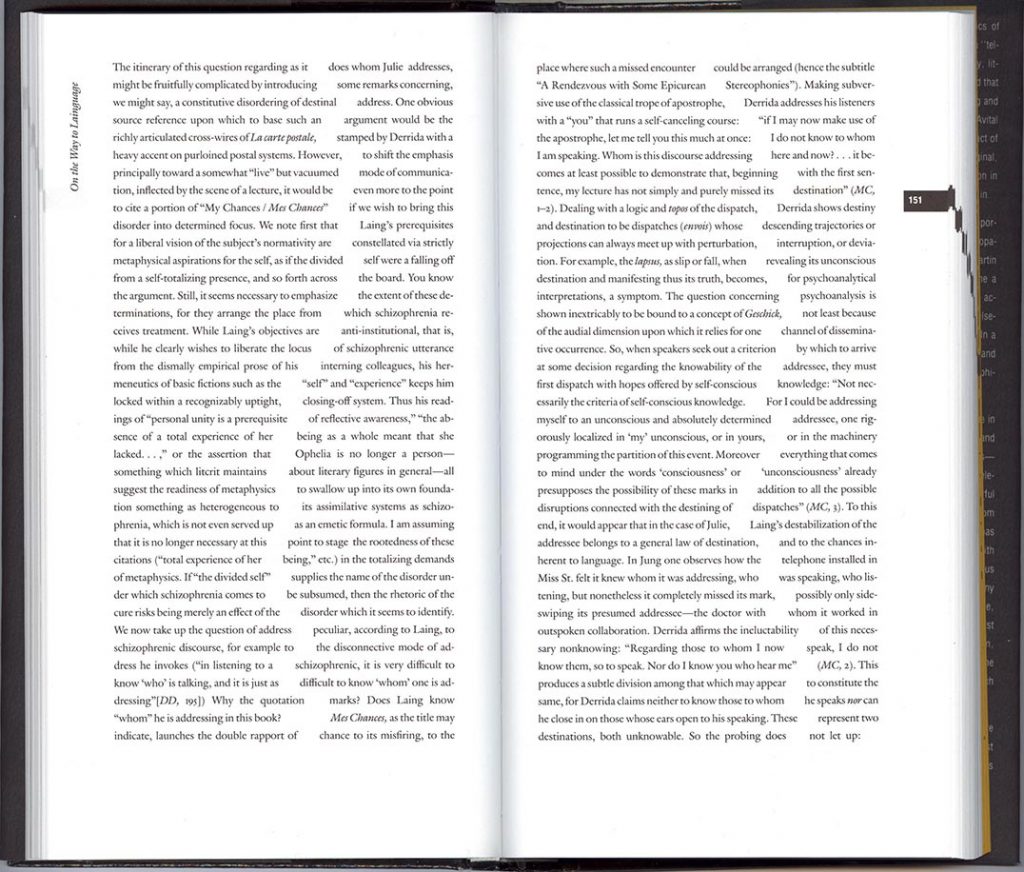
(Avital Ronell, The telephone book, Lincoln: University of Nebrasaka Press, 1989)
The deconstructive critics sometimes suggested that ‘transparent typography’ was not just a false theory, but was actually oppressive to the reader: the crystal goblet was a straightjacket, which denied ‘difference’, smoothing everything into that bland fiction called ‘neutrality’. Instead of there being just one route through the text, as the goblet apparently imposed on us, a deconstructed or expressed text set up many avenues for the reader to take. The reader was thus liberated, or put to work – it was never quite clear which – in a field of many paths. Or was it the text that was liberated (à la Marinetti), or made the subject of the work of deconstruction? This confusion of text and reader was symptomatic of the muddle of this theory. One sure thing was that the reader of printed texts that had been designed along ‘deconstructed’ lines had no more freedom than the reader of a text designed to be transparent. If the reader is unsure about whether to read across or down, that may be a loss of freedom. Deconstructive typography was really a game for designers: it was their reading of the text that was given shape in these expressed texts, their interpretations that were given unchangeable form. Beatrice Warde’s text, with its quaint talk of wine glasses and window panes, made a good straw man.
These theories seem now to have run their course, and ended in a dead-end of polarity. I would argue that the recent deconstructive version of expressive typography suffers from its own hopeless confusions. At least Marinetti’s view had a crazy simplicity to it. As for the crystal goblet, this at least had its heart in the right place, if one can look beyond Beatrice Warde’s manner. But it needs a lot of qualification and supplementation – so much so that it is easier to start fresh.
—
What could a viable theory of typography be, in rough outline? One could divide it into three parts, broadly corresponding to divisions in the work of preparing and presenting the material of typography. Though these functions may be performed simultaneously or in an overlapping manner by several people working in a small group, or may be juggled in the mind of one person who takes on the whole job himself or herself.
The first part is the work of editing, and is unmentioned both in the crystal goblet theory and in expressive theories. With this I refer to everything that one does in assembling and preparing the text for its appearance in print (or any other medium, for example screen display). With ‘text’, I want to include pictures: again, something unmentioned by Warde and her expressionist opponents. And what is editing? A writer hands you her text, you read it and begin to ask questions. Should this particular passage of text come in the introduction, or would it work better in the conclusion? And then that passage seems to repeat what has already been said in the second part – so chop it out. The captions to the pictures? Shouldn’t they be shorter? And if the pictures are numbered, how do we refer to them in the text? As ‘figure 1’, or maybe we can develop a code by which picture numbers are put in square brackets. And then that needs to be explained in a note at the beginning. And where shall we give the acknowledgements for permission to reproduce these images? And are these scans for the pictures really good enough? And so on, and so on.
The second broad phase of work is that of assembly and configuration of the parts. Beatrice Warde perhaps meant to cover this area with her theory, but let’s now think of it in more active terms. Our text has several levels of importance and it includes pictures. How will all this be shown? Different sizes of type are needed, maybe different styles of type too. Let’s assume this is a journal, something between academic and popular in its content. How will the issue number be shown – at the bottom of the page or the top, or perhaps running up the outer sides of the pages? We want this information to be seen, and yet it should not glare at the reader. It’s a constant of every page, and maybe there is a case for setting it in a light sanserif, while the rest of the text is set in a strong seriffed typeface. Now the captions to the pictures: should they be set unjustified, to mark a difference with the justified setting of the main text (the fact that we have decided to use two columns per page suggests that justified setting will work best). We are thinking of an A4 format for this journal, but maybe something a bit wider and less deep could work better for the pictures that we are likely to have. But then won’t this cause trouble to anyone photocopying the pages? Or isn’t this in fact a good thing – they will have to buy the journal rather than photocopy the copy in the library. And so on, and so on.
The third phase is that of the details of typography. Here one is concerned with what happens within a line of text. Consider the ‘hyphenation and justification’. Is that satisfactory, or could it be tuned so that the spaces between words are better? What about the space between the letters? That capital ‘A’ which always stands apart from the letters that follow in a word – shouldn’t the kerning on the font be adjusted? And the small capitals that we are using for the acronyms – don’t they look too small? Maybe we should set these in normal capitals but then slightly smaller in size than the text size (say 9 rather than 10 points)? But then if BBC and RIAS are set like that, what about CM90? We have decided to use non-lining numerals, and, when these are used in one of these acronyms, the capitals really should be small capitals. And, by the way, shouldn’t the ‘Collegium Musicum 90’ be more properly abbreviated as CM ’90 or perhaps CM’90? And so on, and so on.
All this is seen from the point of view of those who are making the publication. What are their criteria of judgement? There are many, each of which interacts with, gives support to, or conflicts with other criteria: the materials available, the cost of the work and the materials, the time, even the personality of the people involved. Then beyond this network of production there is the life of the publication after it is made and released into the world. And what happens then? It is bought and read. And here, with a vision of the reader, one may find the determining judge. The decision about page format or how to set CM90 can be answered by jumping into the skin and the imagination of the reader. Maybe one will show a proof to a friend and ask their opinion, as a reader. Usually that is the best one can do, together with consulting the reader in oneself. Beatrice Warde was, I think, gesturing towards this reader with her theory. We do all this for them, the readers, and their reading should be as comfortable and pleasant as we can manage. But Warde’s theory rushes to a highly simplified end-point. It leaves out the labour of the journey of making, and it gives no clue of a product that is complex, with many levels of structure, and with many pleasant side-roads.
Some further reading
Friedrich Forssman & Ralf de Jong, Detailtypografie, second edition, Mainz: Hermann Schmidt, 2004
Jost Hochuli, Das Detail in der Typografie, revised edition, Sulgen: Niggli, 2005 [now available in German-, French-, English-language editions from Éditions B42, Paris]
Hans Peter Willberg & Friedrich Forssman, Lesetypografie, second edition, Mainz: Hermann Schmidt, 2005
————————————————————
Robin Kinross
————————————————————
Note