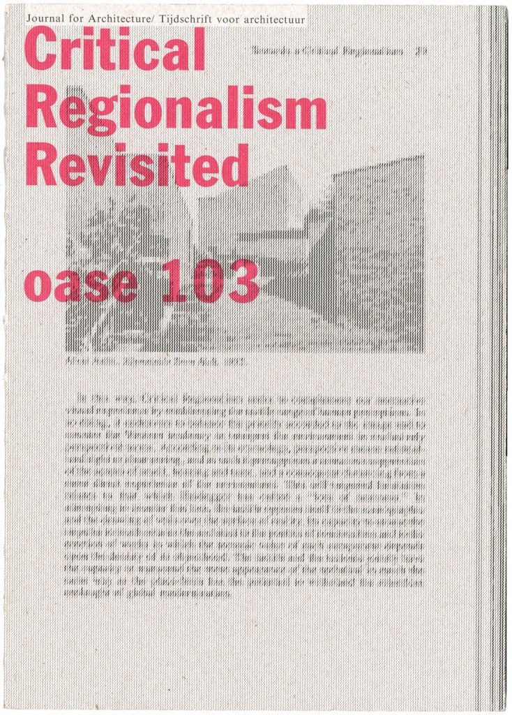
The latest issue of Oase, the journal of architecture, is worth getting hold of. It is devoted to a discussion Kenneth Frampton’s theory of ‘critical regionalism’, which he published first in an essay of 1983. In this special issue of Oase, the original article is reprinted in facsimile, with Dutch translation added; there is a retrospective interview with Frampton, and discussions of the critical regionalism theory by other, younger practitioner-historian-critics: the combined role that Frampton has himself exemplified in his now long career.
The issue is of course designed by Karel Martens, working with his daughter Aagje Martens (the colophon has ‘Martens and Martens’). It seems like a return to the early issues that he designed, in the 1990s, with well-judged typesetting – not always so when Oase was co-designed with Martens’s students. The material qualities of the production (paper, binding) are exemplary.
Frampton and Potter
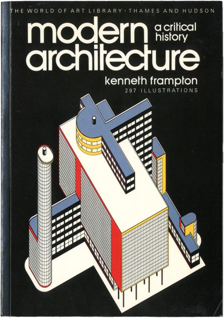
Kenneth Frampton’s book Modern architecture: a critical history was first published in 1980; I bought and read much of it in the summer of that year. I was just then working with Norman Potter on a new and much extended edition of his book What is a designer, which we published late in 1980. The original edition of the book, from 1969, had had no pictures in it, and this was a point of principle: images introduce unwanted specificity and also distraction from a book that wants to encourage thought and imagination. As we worked on the new edition, Norman wondered whether pictures might not help find readers. He had an idea: he would ask a number of architects and designers to choose examples of work that they had liked, from the 10 years since the book’s first appearance – in other words, from the 1970s. We would publish the results as a section inserted within the new edition, perhaps printed on coated paper.
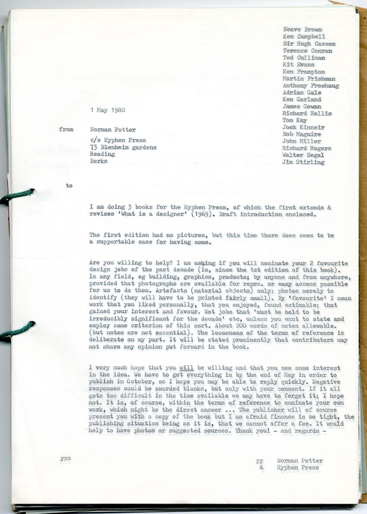
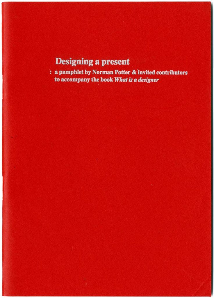
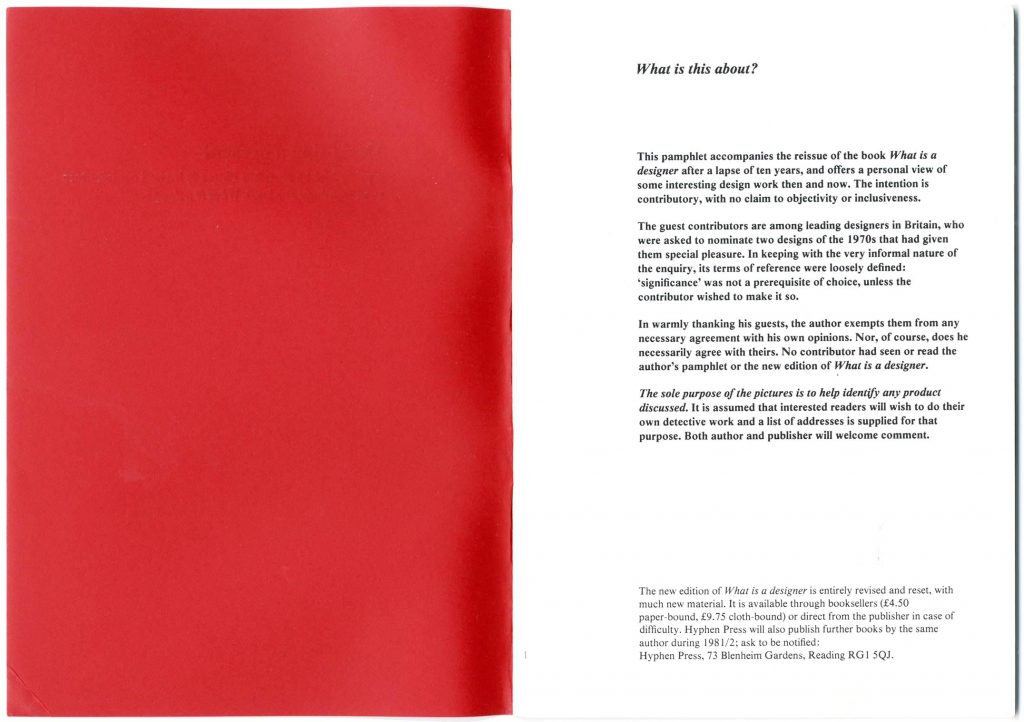
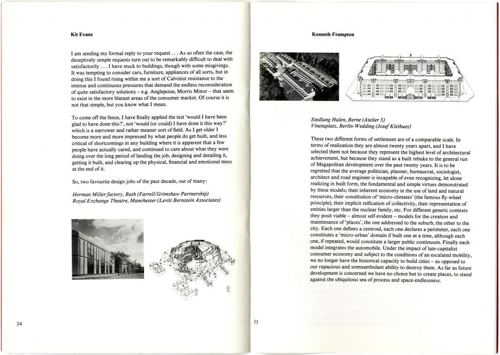
We sent out a letter, dated (characteristically) 1 May, to 20 people – most of them people that Norman had known in the 1960s, during his time teaching at the RCA and then at Bristol. (All of them were men: a bias that we tried to correct later, without success.) The project proved hard work: the more canny among them replied quickly to say that they couldn’t do it; others didn’t reply at all. We found others to ask, beyond the original group. Eventually we had just enough contributions, but Norman had decided that he didn’t want these pictures and texts in his book. The work chosen was too dull or even just horrible. The 1970s hadn’t been good for design. We changed tack. At high speed, Norman wrote an essay to make a pamphlet, called Designing a present, within which we would publish what we had gathered from the guests. The 40-page booklet had the same format of the new What is a designer, and we hoped it would be seen as an appendage to it, though it was sold separately.
Among the old mates that Norman invited was Kenneth Frampton, who in 1965 had moved from London to live and work in New York. Frampton had not replied to our letter, but when, in August, Norman tried him on his old London number, he just happened to be visiting the flat and picked up the phone. Frampton was persuaded to write something, which he did, by hand on a sheet of paper, lined and with punched holes for loose-leaf binding (written on his knee in some airport lounge, I always imagined).
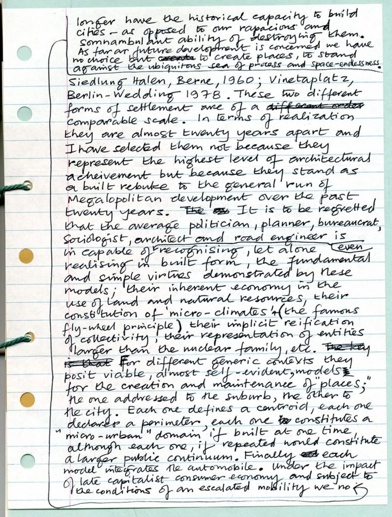
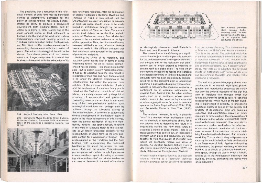
Kenneth Frampton nominated two buildings that featured in the last chapter of his Modern architecture: the Siedlung Halen in Berne (Atelier 5, 1960) and Vinetaplatz in Berlin (Josef Kleihues, 1977).
Modern architecture
Designing a present
For Norman these were among the dull choices: buildings without character. I found them exciting and was proud to publish this brief and very compact exposition of Frampton’s thesis:
‘Each one defines a centroid, each one declares a perimeter, each one constitutes a “micro-urban” domain if built one at a time, although each one, if repeated, would constitute a larger public continuum. … As far as future development is concerned we have no choice but to create places, to stand against the ubiquitous sea of process and space-endlessness.’
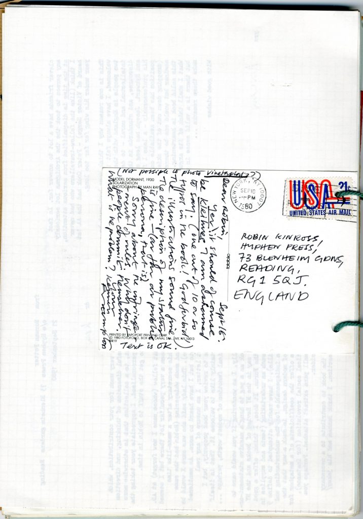
Kenneth Frampton asked if he could see a typed version of his text, which I sent him for approval. In my covering letter I wrote: ‘Thank you very much – it’s very good to be able to publish this – most of the others have avoided committing themselves to anything much.’ He replied with a postcard: ‘Why don’t people commit themselves. What is the problem?’
The modern
In December 1980, we launched the new What is a designer and its associated pamphlet Designing a present (and with them, we launched Hyphen Press) with a reception at the Architectural Association in London. The debate over modernism and postmodernism had been coming to the boil. In May of that year, Frampton had resigned from the jury of the Venice Biennale’s ‘Presence of the Past’ exhibition, which would help to usher in architectural postmodernism (this is documented in Oase 103). For Norman Potter, the modern movement had been a constituent part of his life, as a sustaining belief, for 40 years or more. The new edition of his book included quite lengthy expositions of what it was and what it meant. A generation younger than him, I too was a committed modernist, as part of a whole political view of the condition of Britain. I remember thinking then that the architects and designers whom you had known as modernists were switching, almost overnight, to postmodernism – along the lines of Don Siegel’s film The invasion of the body snatchers.
Architects who had worked with structure and enjoyed exposing it, whose plans followed patterns of use, were suddenly building symmetrically, with façades that employed pillars and porticos. 1980 was when Terry Farrell split from Nick Grimshaw, the former going postmodern, the latter sticking with ‘high-tech’. James Stirling was perhaps more slowly going neo-classical and polychromatic.
In that year, 1980, Jürgen Habermas delivered his Adorno Prize lecture in Frankfurt, and he gave it again the next year in New York. It was published in English translation, as ‘Modernity and postmodernity’, in New German Critique (no. 22, winter 1981) and I read it when it came out; one could buy copies of that journal in the basement of the old Compendium Bookshop in Camden Town. Later, in 1983, Habermas’s text was the lead contribution in the anthology titled (in its US edition) The anti-aesthetic, edited by Hal Foster. It now had the title ‘Modernity – an incomplete project’.
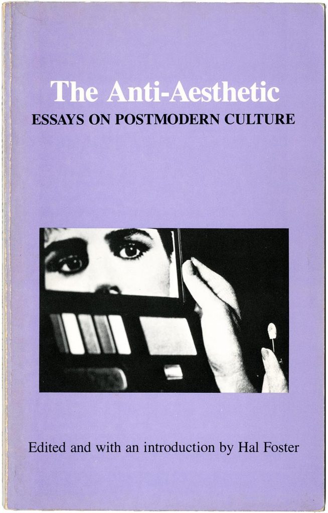
After years of living in culturally deprived Reading, I moved to London and looked for discussion, joining a reading group of politically committed artists. After working our way through Adorno’s Aesthetic theory (in its first, flawed English translation), a few pages every week, we went on, in 1985, to read Hal Foster’s anthology. Habermas’s essay opened the book and was followed by Frampton’s ‘Towards a critical regionalism: six points for an architecture of resistance’. Habermas and Frampton made a mutually reinforcing pair. Neither wanted to give up on ‘the modern’ and on modernity, rather they wanted to come to terms with it, to seek ways forward, to find points of resistance to the ravages of what would come to be called neo-liberalism (the world seen only in economic, transactional terms, run by competition rather than collaboration). One of the virtues of Frampton’s approach was and is that he points to specific examples that could be models for how to design and build now, as with the buildings by Atelier 5 and Josef Kleihues.
The idea of critical regionalism may be briefly outlined as follows. Modern architecture has become global and is an expression of rapacious development, driven by the values of capital accrual. The ground is razed, made flat, to build anonymous structures that offer no sense of place; cities and landscapes are shaped by the needs of the private motor car. One way out from here is to turn to images of the past, to make an architecture of image, especially one derived from pictures of classical buildings and plans – a scenography. This is what the neoclassical postmodernists do. Frampton, like Habermas, proposes to continue ‘the project of modernity’, but now with a critical dimension that is aware of what it is doing and can adapt accordingly. This approach is regionally conscious, is not nostalgic or kitschy, but rather seeks to adapt to local conditions: to respect specific topographies and landscapes. Local climate is not denied by air-conditioning, and, where possible, light is natural rather than artificial. Frampton found his exemplars of this critical-regional architecture beyond the metropolitan centres, in Denmark and Switzerland; Alvar Aalto’s Finland gave him a forerunner. Kenneth Frampton developed this idea in the years that followed, giving further examples of contemporary critical regionalism from other places. He also came to focus on the constructional craft of architecture – work that culminated in his book Studies in tectonic culture (1995). Meanwhile his Modern architecture went through further revisions (1985, 1992, 2007) incorporating in concluding chapters his latest thinking, including critical regionalism.
Exemplification
In the mid-1980s, with some impulse from both Habermas and Frampton, I wrote my own book, Modern typography: an essay in critical history. The time-span of the book (from 1700 in France and England, to now) was a conscious reflection of Frampton’s book, and I started the discussion by referring to the Habermasian thesis of ‘the continuing project of modernity’. Resisting the lure of a publisher who wanted to make a large-format scenographic book out of it, eventually (in 1992) I published it myself, in a more modestly produced work.
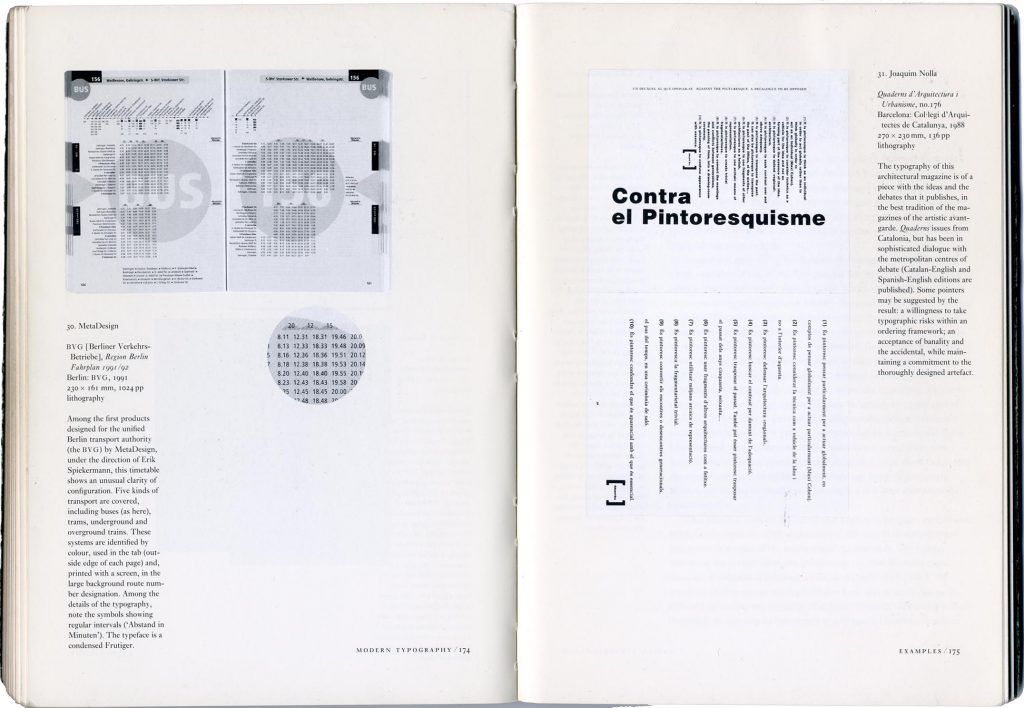
The illustrations were confined to a section at the end, which culminated in a Frampton-like proposal: here are some examples of current work that I think exemplifies the thesis of the book. How can we make work that continues the modern project? The examples that I gave were designed by Richard Hollis, Jost Hochuli, Hans Rudolf Bosshard, Harry Sierman, Erik Spiekermann’s MetaDesign, Joaquim Nolla, Karel Martens. With one exception, these were people whom I had met and or would soon come to meet. I think they could all be in some sense ‘critical regionalist’ in mentality. Whether graphic design and typography could ever qualify as ‘regional’ is questionable: unlike architecture, it is made in multiple copies that can be shipped around the world. But it seemed significant that some of these designers lived and worked away from the metropolitan centres of their countries: Hochuli in east Switzerland, Nolla in Catalonia, Martens in a village in the east of the Netherlands.
In January 1991 I had travelled to Arnhem to meet Karel Martens for the first time. He was working on the redesign of Oase: the first issue in this series (no. 28) carries the date December 1990.
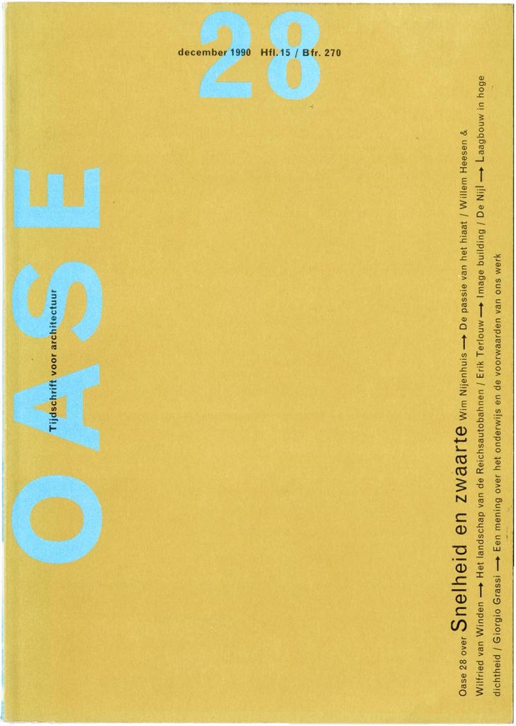
Among the nice bits of confirmation in our meeting, I saw that the new Oase would be changed from its old A4 page-size and have the 240 × 170 mm ‘Lexikon’ format that I was giving my book Modern typography: a standard size that comes out of a B2 sheet with no wastage. Martens became for me one of the clearest and most inspiring designers who were carrying on the ideas of modernism, in a critical and tempered way.
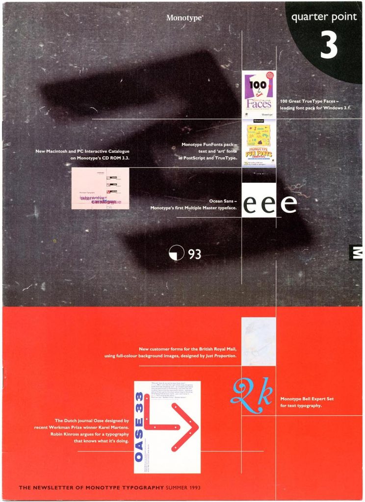
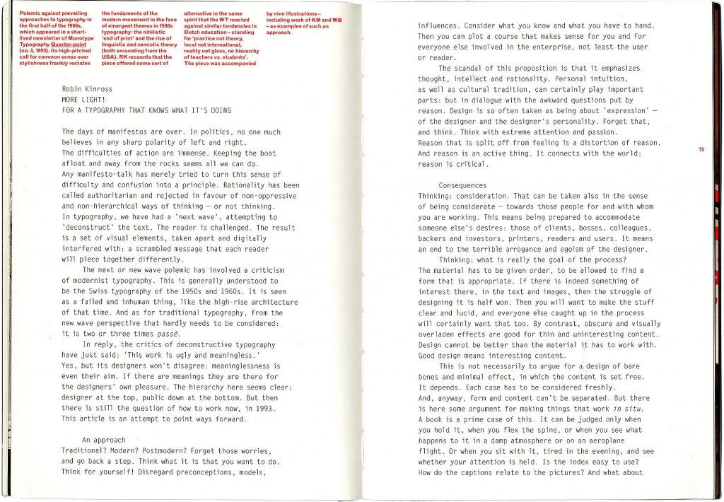
Through these years in the 1990s, the debates over modernism and postmodernism continued, sometimes even they raged. From time to time I wrote statements and articles, exemplifying the arguments with real examples, in the Frampton spirit. One of these, in 1993, was a short piece written for a short-lived magazine published by the Monotype company, Quarter Point. (The company was then known as Monotype Typography, and Andrew Boag, a serious information designer, was in charge of its publications.)
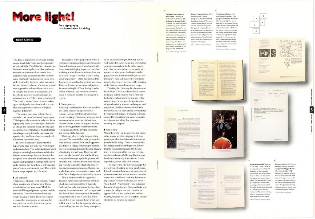
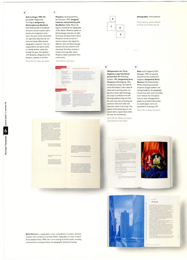
Under the title ‘More light!’ I called – in a rather shrill way – for a reflective, undogmatic typography, and chose work that I thought would exemplify these ideas. The designers invited were George Mackie, Ken Garland, Arlette Brouwers, Jost Hochuli, Wigger Bierma, Ontwerp Bureau Quadraat, Jack Stauffacher, Jerry Cinamon, and Karel Martens – a fairly unstarry lot with a high percentage of ‘old white men’. A count of all the participants’ nationalities shows: one Scottish, one English, one Swiss, one from the USA, one US expatriate, and four Dutch.
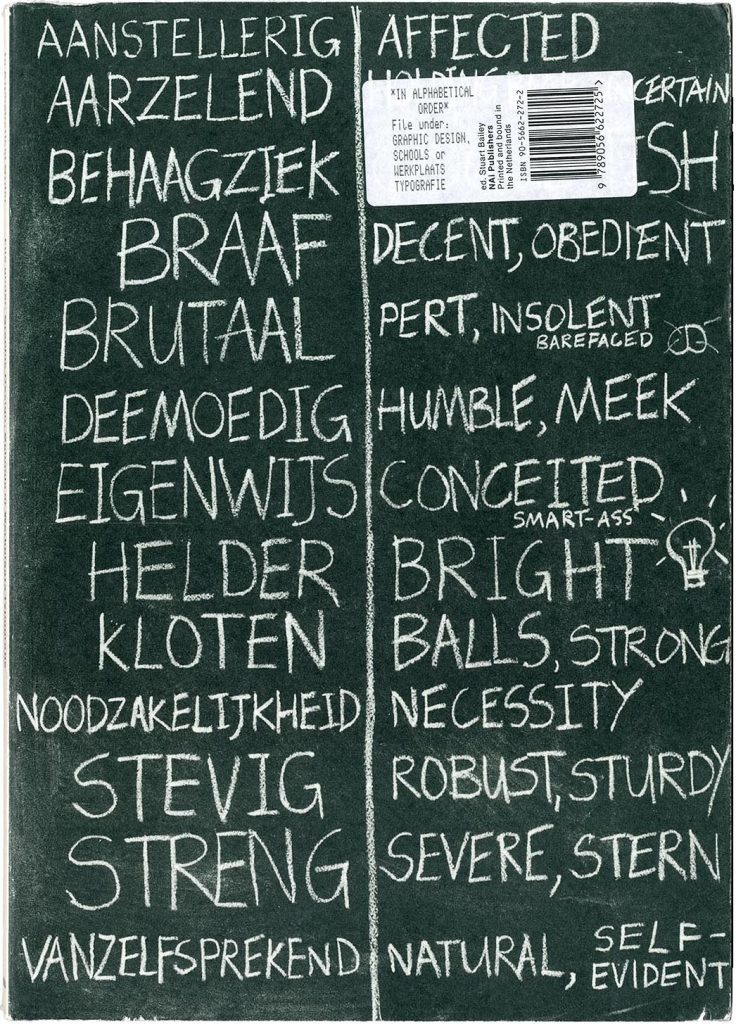
This anti-manifesto manifesto can’t have been noticed by many people (a company publicity publication was the wrong place for it), but at least one designer took notice, as he later told me. Stuart Bailey, then an undergraduate student at Reading, liked it. In 1998 as a founding ‘participant’ he joined the self-organizing postgraduate course at the Werkplaats Typographie, Arnhem, in its first years under the co-direction of Karel Martens and Wigger Bierma. In 2002, Stuart was the main figure behind the book In alphabetical order, which documented the first years of the Werkplaats. Among the texts in a small anthology of statements in this book was ‘More light!’
Note
For an earlier discussion of some of these themes, see here.
Robin Kinross