The typographer Alexander Verberne died on 27 May 2009. After a stroke in 1997, which was followed by further strokes, he had been seriously impaired and was living in a care-home in The Hague. He was born on 18 August 1924 in Den Helder.
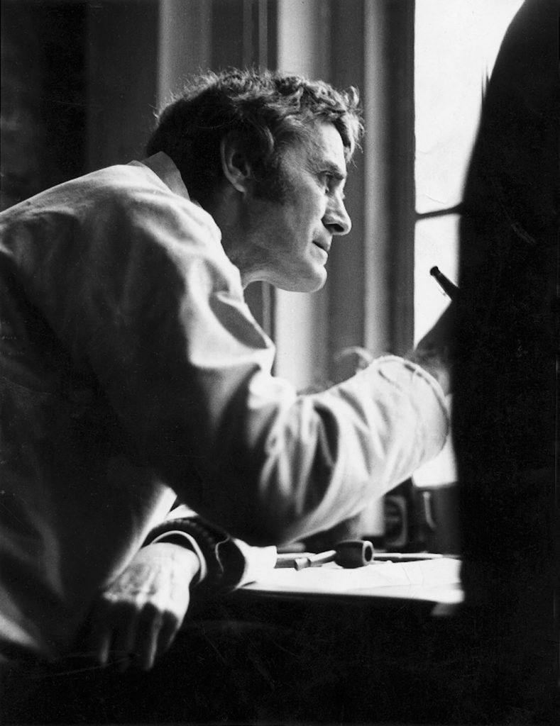
Alexander Verberne working at the machine that cuts the ‘book’ that drives a mechanical organ. The photograph, taken in January 1980 by William Malloch, is reproduced from Alexander Verberne: vormgever van boeken & muziek (The Hague / Amsterdam, 2008)
Alexander – whom I came to know personally in the early 1970s, through his ex-student and friend Françoise Berserik – was a special man, as well as being a special typographer. Once in conversation with Wigger Bierma, another of his ex-students-and-friends, a comparison between Verberne and Anthony Froshaug occurred to us. And the habit of some ex-students becoming friends was one thing they had in common, to the point at which, as Anthony once wrote of himself, ‘friends (= ex-students)’. Of course there were many striking differences between them, both personally and in their work. But making this comparison may help in trying to say something about Verberne, especially given the fact that hardly anyone outside a small circle in the Netherlands will know even his name – even fewer than will know Froshaug’s.
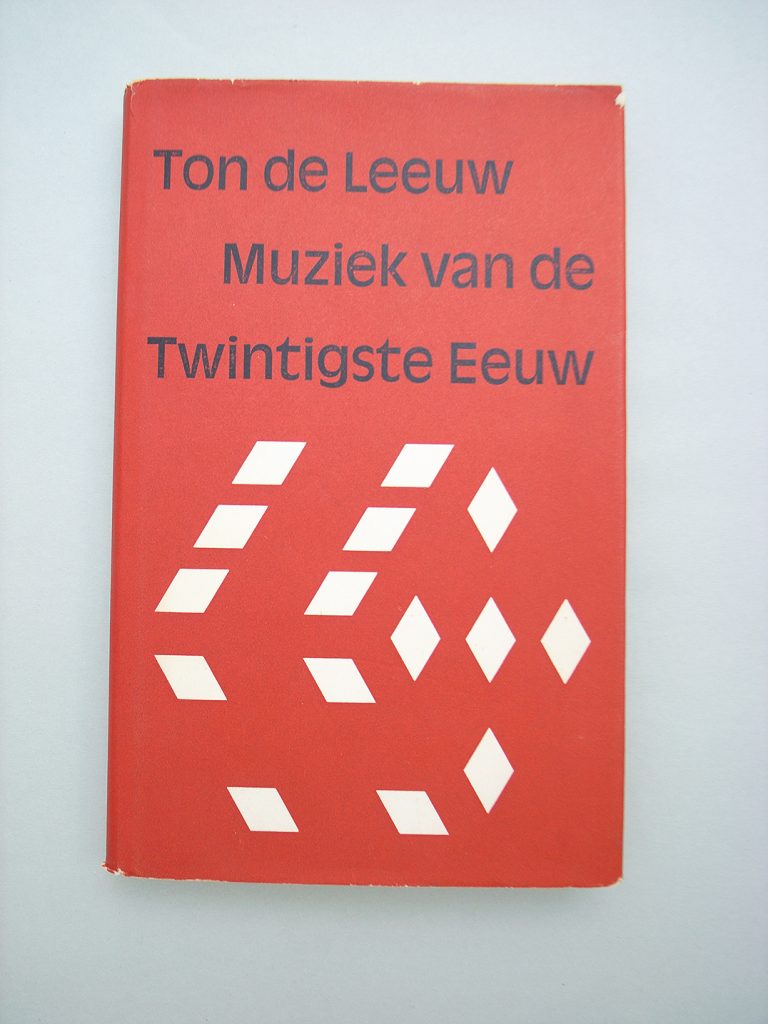
Anthony Frohaug at work, with Rapidograph pen, in his flat in London (1970s?). Reproduced also in Anthony Froshaug: documents of a life (London, 2000)
Both Verberne and Froshaug did their work with the fullest engagement. It was all or nothing, and (certainly for Froshaug) it was quite often nothing. After a learning period and then a time of considerable production as designers, showing that they could do it, they became primarily teachers. The work for which Verberne is most known, and which is an established part of the chronology of Dutch design, is the magazine Range, the house journal of the Philips company (1955–64: 24 numbers, the first 7 of the them done in collaboration with Ton Raateland).
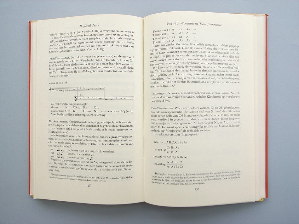
Cover and spread from the second printing of Ton de Leeuw, Muziek van de twintigste eeuw (Utrecht, 1970), designed by Verberne. The first printing (1964) carried a cover, also designed by Verberne, in a different style
In the time when I knew them, from the mid-1970s onwards, they were hardly doing typography. They were teaching typography – and, in Verberne’s case, also teaching formal writing – in a concentrated but sparing way, and living on small earnings in well-ordered, purposeful flats. Alexander lived in a block of artists’ apartments on the Rapenburgerstraat (no. 93), Amsterdam: each flat had a studio attached. He had been teaching at the school of art at Arnhem since 1964 (he would stop in 1981). Teachers are sometimes judged by what their students go on to achieve. In the case of Froshaug there are some illustrious names, and so too in the case of Verberne. I do not know enough about the history of Alexander’s time at Arnhem to be able to make a roll call, so will just mention those I know personally: Françoise Berserik, Marjo Starink, Wigger Bierma, Martin Majoor, Fred Smeijers – all of them still affected by him.
Even allowing for the rule that ‘a day’s teaching is two days’ work’ (one to prepare, one to travel to the place and then teach, and sometimes also a third to recover), much of their time could be given to work that used their typographic and designing intelligence, but was not ‘design’ as such. For Froshaug this was mathematics and investigation of digital processes in small computers (sometimes actually taking them to pieces). For Verberne it was preparing music for a mechanical organ to play: a process that started with checking and editing a score, over which he took huge care, and went on to punching the ‘book’ that drove the machine.
This was the organ called The Busy Drone, which in 1965 had been found by Alexander and Karel Beunis, another typographer and book designer. The Busy Drone was bought by De Bezige Bij, the Amsterdam publishers for whom Beunis mainly worked. They restored the organ, set up a foundation to look after it, and, as well as adapting existing music, they commissioned new compositions from contemporary Dutch composers, such as Gilius van Bergeijk, Louis Andriessen, Misha Mengelberg, and Willem Breuker. The Busy Drone was in the collection of the Stedelijk Museum in Amsterdam; it has recently returned to Amsterdam, to join the collection of the Orgelpark.
Froshaug had been a working printer. His relations with any machine that he used were always intensive: he wanted to know it, to adapt it, to explore it fully. Infinite pains were taken. He once told me, boasting, that he had first made a tool with which he could then repair the gas water-heater in his kitchen. (I remember Verberne, in the same spirit, learning to sew in a zip by doing a practice run on a piece of spare cloth.) For Froshaug the small computers of around 1980 were still devices that one could understand in every detail, and could modify. I imagine that the organs that Verberne loved, and catalogued, were similarly understandable devices, although it was Beunis rather than Verberne who got most involved with restoring The Busy Drone. His ‘books’ for the The Busy Drone resemble some of the tabulations and procedures that Froshaug wrote (literally wrote, with pen and ink) for his computers. In both there is the same pleasure in making a diagram; an abstract pattern that is yet full of meaning. Once one has found a system for how to make such a diagram, that’s the way it has to be – the pattern is determined by content.
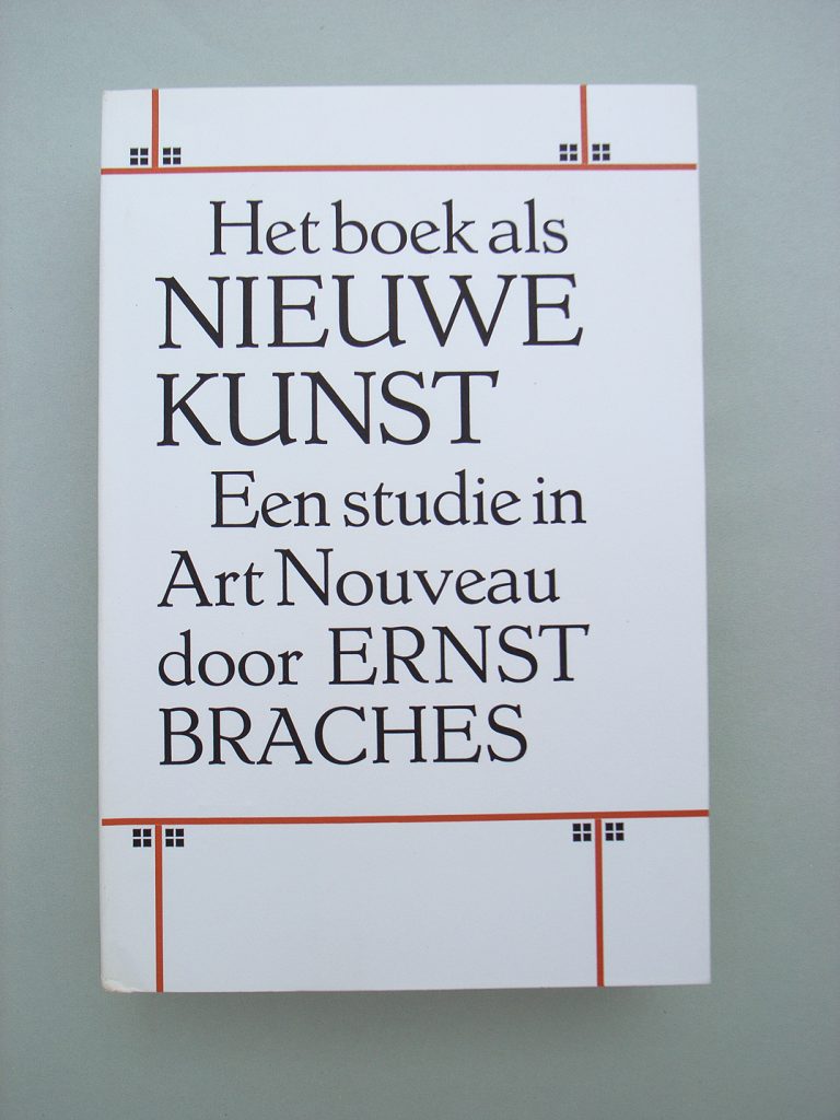
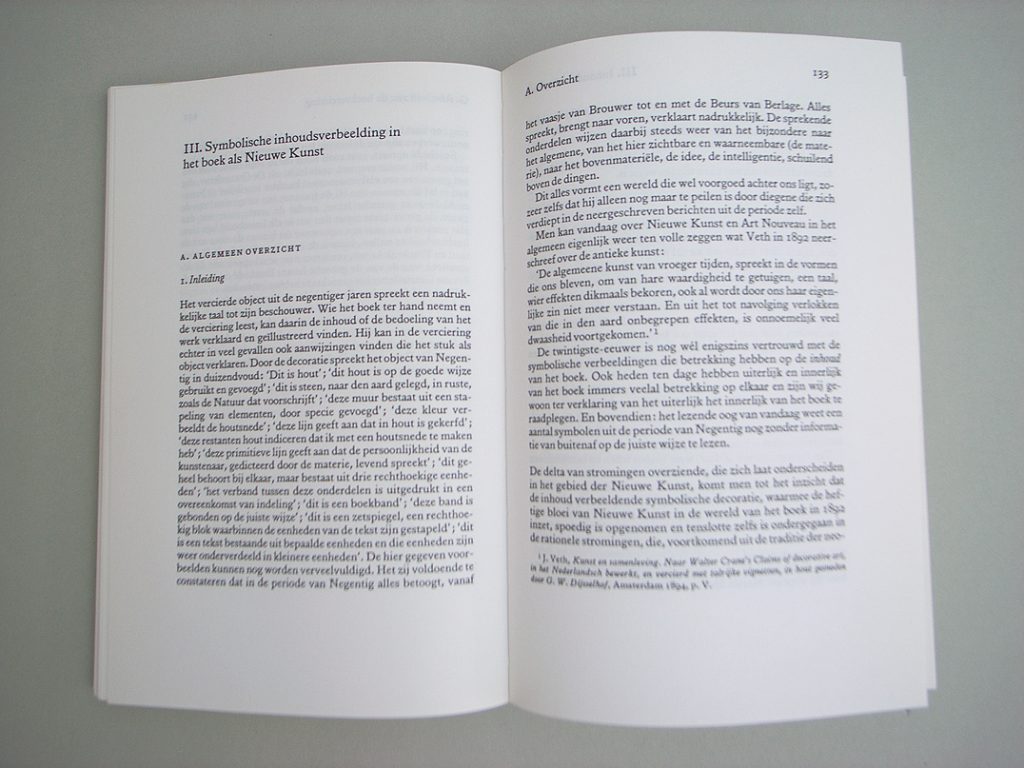
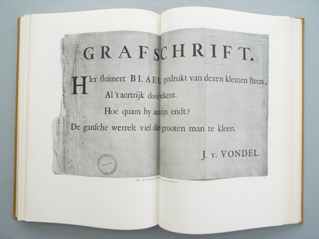
Cover and spread from Ernst Braches, Het boek als Nieuwe Kunst (Utrecht, 1973), designed by Verberne
As designers of text, both of them proceeded from the text itself: what did it say? what form did it propose to inhabit? Getting the text into good order was more than half the struggle of designing it. So design became a kind of editing, in the first place. And, in his often quoted remark (made in a published conversation with Dick Dooijes, 1964), Verberne said that ‘a book cannot be better than its text’ (‘Hoe langer ik in de ontwerperij zit hoe meer ik tot overtuiging kom dat een boek nooit beter wordt dan de kopij was …’). The implication is that many books are not worth bothering with, neither for their text and still less for their design.
Alexander loved indexes, lists, catalogues. I remember that he made an index to the Monotype Recorder devoted to Hans Schmoller: a handwritten document that I copied and gave to the issue’s compiler (Jerry Cinamon). He would give dates to everything. I remember that his collection of postcards carried dates of acquisition in his wonderful handwriting: very strong, and without the air of perfume or pretension that often comes with well-formed italic writing. So too, Anthony dated everything, and asked his students to do the same: as a matter of design procedure, to know what was done when, and to be able to put things in order. Even, or especially, a hurried note saying ’I’ve gone to the shops’ should carry a day and a time. Both of them kept notebooks of daily cash expenditure – a low-income habit carried into the age of the credit card.
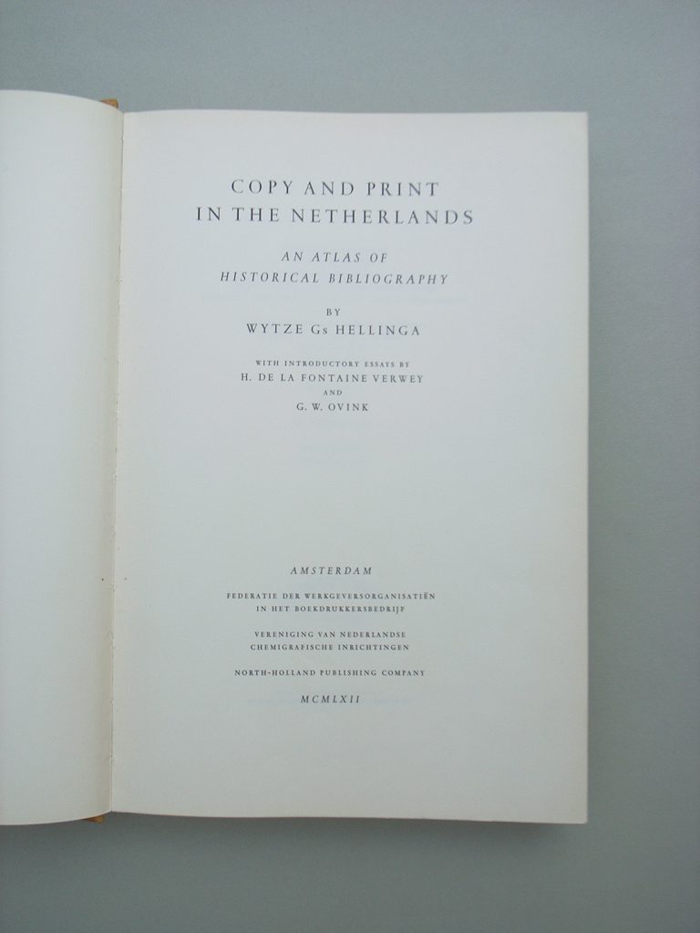
Title-page and spreads from Wytze Gs Hellinga, Copy and print in the Netherlands: an atlas of historical bibliography (Amsterdam, 1962), designed by Verberne
Alexander Verberne’s masterwork as a designer is the book by Wytze Hellinga, Copy and print in the Netherlands: an atlas of historical bibliography (Kopij en druk in de Nederlanden: atlas bij de geschiedenis van de Nederlandse typografie), published in Dutch and English-language editions in 1962. It is indeed a book full of well-ordered content: the product of a ‘historical bibliographer’ writing the text and locating the items reproduced, and a typographer helping find the form for this, but also – evidently – playing a collaborating editorial role. The form of this book is absolutely strong, with great dignity and clarity.
Here, in outward appearance, one might find a difference between Verberne and Froshaug. The former might be seen as a classical typographer – certainly Copy and print suggests that – while the latter was a lifelong modernist. The difference is partly a consequence of their different contexts. Verberne worked in a country that had from early in the century a strong modernist spirit; Froshaug worked in a backward country (England) in which, when he started, to be a modernist was also part of a whole social attitude – a view of the world – as well as a way of working. Verberne could do outwardly modern things too. But his work, like those of some other Dutch typographers of his generation (Harry Sierman, for example) went beyond any particular style, and it did this by fixing on content.
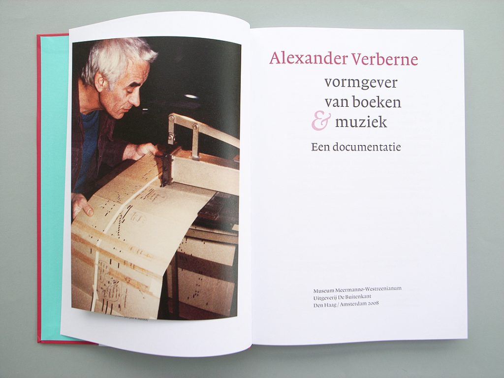
Title-pages from Alexander Verberne: vormgever van boeken & muziek (The Hague / Amsterdam, 2008)
Last year Verberne was the subject of a book made by the bibliographer Ernst Braches, who had been a student of Hellinga. Alexander had designed Braches’s Het boek als Nieuwe Kunst, 1892–1903: een studie in Art Nouveau (1973): another work that exemplifies this designer’s approach of letting the form find itself, and another book with its designer evidently working as editorial collaborator. Alexander Verberne: vormgever van boeken & muziek is, as its sub-sub-title says, ‘een documentatie’: a documentation. In this it gives a truly sympathetic account of its subject, being made up of lists, numbers, quotations, and being provided with a solid index. I can add that my Anthony Froshaug (2000) took a similar approach. This is another book based on an archive, and which is propelled by the documentary spirit.
In no contradiction to his documentary habits, Alexander was often very funny indeed (Anthony also): the opposite of dry or dusty, as documentalists certainly can be. His humour came out of the moment. I remember him observing that the loop on a bell-pull at the door of an old shipping office in Amsterdam must have been made for sailors with hooks for hands. It was often, I think, a caustic sense of humour: quite abrasive. But he once said ‘one has to be naive to get anything worthwhile done in this world’ (perhaps I am overinterpreting: it is a distant memory). I think this was why he was such a good teacher – and why Froshaug was, equally. They had great natural authority, based on skill and experience, while at the same time having no pretensions or ceremony. In some ways they remained always naive, hopeful, and so could be on a level with any student who wanted to learn.
Another passion was Chinese: Alexander learned to write Chinese characters, to I think quite a high degree of skill, and he went on trips to Hong Kong, Seoul, and elsewhere in the Far East. I remember him especially from the time of this enthusiasm, wearing not just a Mao jacket but also blue worker’s trousers from China, and a t-shirt. (I remember Froshaug in a Chinese jacket too – so too, later on, Karel Martens: another of this special kind.) This man in worker’s clothes was the designer of Copy and print, a book that one might place beside some of the great productions of Christopher Plantin.
Robin Kinross