We get quite frequent enquiries about Typography papers: which issues are still available? how best to try to get hold of out-of-print numbers? contents of the back numbers? And, from subscription agencies: please send us the issue for 2010! We do our best to tell this last kind of enquirer that, from quite early on (after the third issue), Typography papers stopped trying for annual publication and adopted a ’continuing but not annual’ approach: it would appear as and when enough good material had been gathered and the editorial-production group had the time and energy to bring it out.
Typography papers was conceived and developed by Paul Stiff, at the Department of Typography & Graphic Communication, University of Reading. He edited all the issues up to 8, apart from numbers 3 (edited by Christopher Burke and Sue Walker) and 4 (edited by Robin Kinross and Sue Walker). Paul died in 2011 (see here). Issue 9 (2013) is edited by Eric Kindel and Paul Luna. The Department of Typography published issues 1 to 5. In 2004 Hyphen Press took over as publisher and has, so far, published issues 6 to 9. Editing and production of these issues has remained in the hands of the Department of Typography.
What follows is a list of contents, and a note of whether copies are still available anywhere.
(Updated at 2013.12.17)
—————
Typography papers 1
(1996)
Maxim Zhukov:
The peculiarities of Cyrillic letterforms: design variation and correlation in Russian typefaces
Paul Stiff:
Instructing the printer: what specification tells about typographic designing
Margaret M. Smith:
The typography of complex texts: how an early printer eliminated the scribes’ red
Yateendra Joshi:
Design specification for tables: a case study
Andrew Boag:
Typographic measurement: a chronology
Alan May:
Roman bronze inscriptional lettering: a note on methods of production
—————
Typography papers 2
(1997)
James Mosley:
French academicians and modern typography: designing new types in the 1690s
Richard Southall:
A survey of type design techniques before 1978
Michael Twyman:
Engelmann’s Landscape alphabet
Robin Kinross:
Type as critique
Gerrit Noordzij:
Reply to Robin Kinross
Ole Lund:
Why serifs are (still) important
Christopher Burke:
Willy Wiegand and the Bremer Presse
Richard Hollis:
Review of Graphic design (Jobling & Crowley)
Hendrik D.L. Vervliet:
Review of Counterpunch (Smeijers)
—————
Typography papers 3
(1998)
Hendrik D.L. Vervliet:
The italics of Robert Granjon
Gerard Unger:
A type design for Rome and the year 2000
Fiona Ross:
Translating non-Latin scripts into type
Michael Twyman:
Nicolete Gray: a personal view of her contribution to the study of letterforms
Frances Spalding:
‘A true statement of a real thing’: Nicolete Gray’s promotion of modern art
S.J.M. Watson:
Hans Schmoller and the design of the one-volume Pelican Shakespeare
Robin Kinross:
Review of Wim Crouwel: mode en module (Huygen & Boekraad)
—————
Typography papers 4
(2000)
Paul Luna:
Clearly defined: continuity and innovation in the typography of English dictionaries
Christopher Burke & Robin Kinross (ed.):
The dispute between Max Bill and Tschichold of 1946, with a later contribution by Paul Renner
Max Bill:
On typography
Jan Tschichold:
Belief and reality
Paul Renner:
On modern typography
Peter Burnhill:
Type spaces
Richard Southall / Peter Enneson / Andrew Boag / Hrant Papazian:
Replies to Peter Burnhill
Paul Stiff:
Spaces and difference in typography
Peter Burnhill:
Response
—————
Typography papers 5
(2003)
Edward Ragg & Paul Luna:
Designing the Oxford Shakespeare: an interview with Paul Luna
Paul Shaw:
A recent discovery in Trajan’s Forum: some implications for understanding bronze inscriptional letters
John Morgan:
An account of the making of Common worship: services and prayers for the Church of England
Eric Kindel:
Recollecting stencil letters
Ole Lund:
The public debate on Jock Kinneir’s road sign alphabet
—————
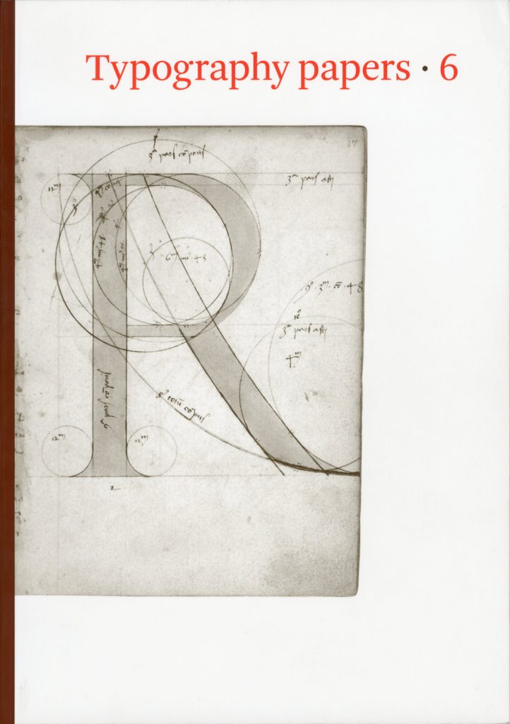
Typography papers 6
(2005)
Nicolete Gray:
The Newberry alphabet and the revival of the roman capital in fifteenth-century Italy
The Newberry alphabet
with a note on provenance by Paul F. Gehl
Giovanni Mardersteig:
Leon Battista Alberti and the revival of the roman inscriptional letter in the fifteenth century
Paul Stiff:
Brunelleschi’s epitaph and the design of public letters in fifteenth-century Florence
James Mosley:
Giovan Francesco Cresci and the baroque letter in Rome
—————
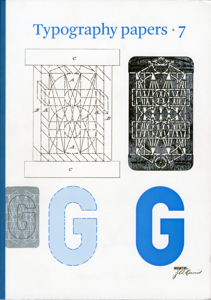
Typography papers 7
(2007)
Hendrik D.L. Vervliet:
The young Garamont: roman types made in Paris from 1530 to 1540
Justin Howes:
Extreme type: progress, ‘perfectibility’ and letter design in eighteenth-century Europe
Eric Kindel:
The ‘Plaque Découpée Universelle’: a geometric sanserif in 1870s Paris
Sue Walker:
Letterforms for handwriting and reading: print script and sanserifs in early twentieth-century England
Linda Reynolds:
The Graphic Information Research Unit: a pioneer of typographic research
Giovanni Lussu:
The form of language
—————
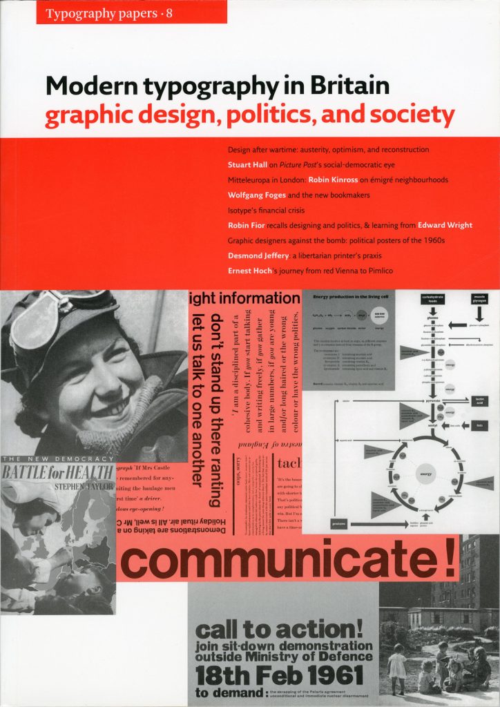
Modern typography in Britain: graphic design, politics, and society (Typography papers 8)
(2009)
Paul Stiff:
Austerity, optimism: modern typography in Britain after the war
Stuart Hall:
The social eye of Picture Post
Robin Kinross:
Design in central-European London: interactions between émigrés and natives in the 1940s
David Lambert:
Wolfgang Foges and the new illustrated book in Britain: Adprint, Rathbone Books, and Aldus Books
Matthew Eve:
Isotype in trouble, 1946–1948
Robin Fior:
Recollections of designing and politics in London, 1957–1970
Call to action: political posters of the 1960s by Robin Fior, Ken Garland, and Ian McLaren
Ian McLaren:
Designing for CND
Paul Stiff and Petra Cerne Oven:
Ernest Hoch and reasoning in typography
Robin Fior:
Working with Edward Wright
Sally Jeffery:
Desmond Jeffery the printer
Index
—————
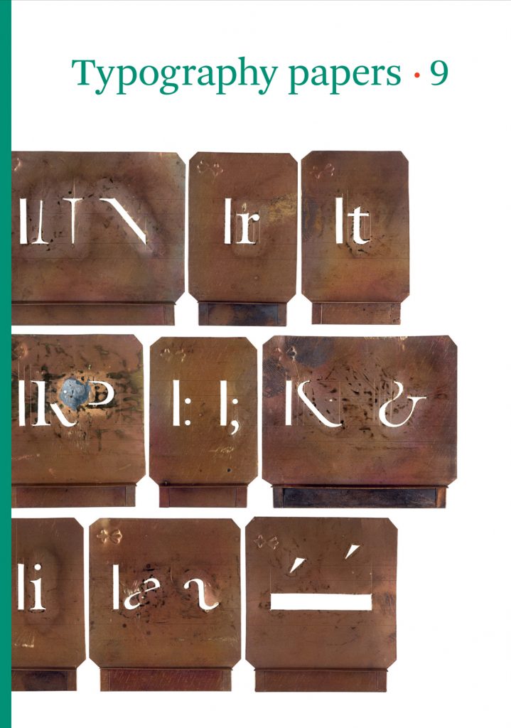
Typography papers 9
(2013)
Gerard Unger:
Romanesque capitals in inscriptions
Eric Kindel:
A reconstruction of stencilling based on the description by Gilles Filleau des Billettes
with two appendices by Fred Smeijers
Eric Kindel (ed.):
The description of stencilling by Gilles Filleau des Billettes: transcription and translation
James Mosley:
A note on Gilles Filleau des Billettes
Maurice Göldner:
The Brüder Butter typefoundry
William Berkson & Peter Enneson:
Readability: discovery and disputation
Paul Luna:
Picture this: how illustrations define dictionaries
Titus Nemeth:
Simplified Arabic: a new form of Arabic type for hot metal composition