As any long-term reader and watcher of Penguin Books knows, the company has always cultivated its own history, seizing the chance of an anniversary to make an exhibition or put out a book celebrating its own story. And, as with any history, a full account – one that takes in the downsides and the incoherencies and failures – is always more interesting, as well as truer, than a story that looks just at the high sunlit pastures. This more rounded account will also be more complimentary than the bland self-celebration: one sees the great achievements in the context of difficulties overcome.
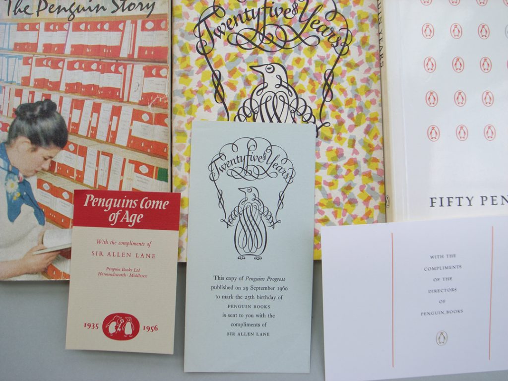
Penguin celebrated itself with these books in 1956, 1960, 1985; with compliments slips.
History
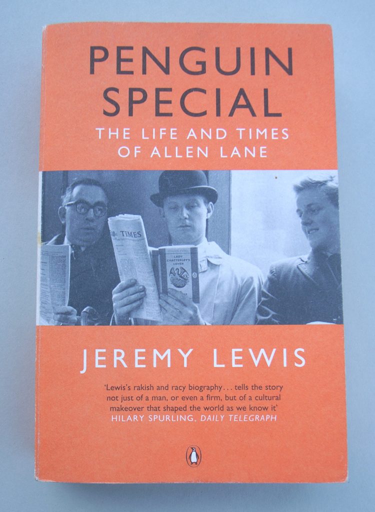
Jeremy Lewis’s Penguin special, a biography of the company’s founder Allen Lane, served to remind us of the difficult passages of the firm in its first incarnation, as a family business. Within hours of Lane’s death in 1970, ownership passed into the hands of the firm of Pearson Longman, which later became the larger conglomerate called just Pearson.
In the great years of Penguin, from the later 1940s through to the later 1960s, the firm had become a British institution that one could seriously compare to the BBC. And yet it had been started in 1935 almost on a whim, but with some necessary sly commercial opportunism: the first Penguins were middle-market titles whose publishing rights were available and inexpensive. Allen Lane himself was, even more than most successful publishers, an instinctive operator. He did not need to spend time reading the books he published, and his own reading tastes were middlebrow, to use a term of his period. But he had a sure touch in knowing what to do, and who could do it: the series editors, desk editors, graphic designers and typographers, production people, promotion people, warehouse workers. Lewis’s Penguin special is a page-turner, and one may well finish it in tears – of affection for the mysterious figure of Lane, and of a sense of loss for the world that disappeared in the brutal economic and cultural climate that was making itself felt as he died.
Covers
Penguin books, from the start and continuously thereafter, were consciously designed. The recognition of design, not as an add-on but rather as an integral part of the publishing process, was one of Allen Lane’s marks as a publisher. And it is why one can write a coherent history of the firm by looking at the covers of the books. This was the achievement of Phil Baines’s Penguin by design. Baines’s book, like Lewis’s, was published by the firm itself, and – we congratulate them – it is an honest history, with some description and analysis of the downs as well as the ups.1
Stretching anniversary custom a bit, Penguin by design covers seventy years of work. The seventieth birthday was also marked by the Penguin 70 project, in which seventy short texts by Penguin authors were published as a set, with spines coloured to form a rainbow (with distant memories of Suhrkamp’s great Edition Suhrkamp series). The covers were designed by a long list of people, each of them paid £70 for the job. The texts themselves were chunks extracted from longer works, or sometimes intact short fictions.
The Penguin 70 set echoed the Penguin 60s of ten years previously, and marking that sixtieth anniversary. These were texts taken from books on the Penguin list, put into small (138 × 105 mm) format. For a time they did very well as commodities and achieved the success of being talked about and being seen with. The 60 pence price matched the disposable feeling that the books bore with them: OK for a train journey and reading on the hop, but they weren’t really items for the bookshelf. As embodied texts, I think they were by definition unsatisfactory: leaving a reader with the sense of having only part of a larger thing, with the rest missing. But the Penguin 60s were at least a straightforward publishing venture. They rediscovered the initial impulse of 1935 not by some parodic imitation of old appearances, but rather by fresh thinking about the conditions of their own time.
It seems to have been the Great Ideas series of 2004 that started the present wave of awareness and self-awareness in Penguin cover design. This was again a project of publishing extracts from existing Penguin titles. But this time concerted design effort was put into the covers (by in-house art director Jim Stoddart and in-house designer David Pearson, working with a small handful of out-house designers). These covers broke sharply with the usual Penguin covers in both image and material qualities. Since about 1980, the old sense of style in Penguin cover design had disappeared in a free-for-all of over-sophisticated but visually weak image-manipulation, of identities borrowed from an initiating hardback edition, of film and TV image-links, of gold-embossing, of airbrushing, of 3-D effects, of – in a word – schlock. (Only the Penguin Classics were given a stable identity: an image from a museum-art source under a standard setting of the author and title.) In that context the Great Ideas books seemed fresh. The covers used just black and red on white uncoated stock, were largely typographic, with the text-image impressed deeply into the paper by a raised plastic printing surface. This simulation, in fact exaggeration, of letterpress printing matched the historical-style approach of these covers. Penguin Books was shortlisted for the Design Museum’s Designer of the Year award in 2005. Puritans, such as the present writer, objected that this was all too self-conscious and precious, that the imitation of letterpress is a refined sort of kitsch, and that the real issue of the ordinary monthly output of new titles was untouched by this outbreak of design consciousness.
Now
After the success of the Great Ideas books, and in the wake of the birthday books of 2005, cover design has gone to the head of the company. But again, this is not to speak of the everyday output, which remains – for reasons of commercial and structural necessity – indifferent and very varied in its design. Rather it is a seemingly desperate search for a new sensation. Consider the following happenings.
2006. Commemorating 60 years of Penguin Classics, six (or was it just five?) designers were commissioned to design covers for limited editions (in 1,000 copies) of classic texts.2 Apart from the fact that the limited edition is a contradiction of Penguin values, the people chosen to do these covers were Designer-designers (Manolo Blahnik, Ron Arad, Paul Smith, Fuel, Sam Taylor-Wood). These image-makers inhabit different points on the present art–design scale, but none of them is a humble graphic designer. One might say that this was an attempt to engage with the complex fragmentation of modern visual culture, in which art and design intermix. But then why limit it to 1,000 copies, and why case each book in a perspex box? The thing was launched with a piece of familiar, breathless puff from one of the cultural pundits. A year later it seems to be forgotten.
2006. My Penguin was launched. Thirteen titles have been published with just white covers, and you, the reader, are invited to design your own cover-image. Maybe your cover will make it to Penguin’s website gallery. One might rationalize this project as another way to address the issues of present-day visual culture, now pursuing the MySpace generation in dialectical juxtaposition with the exclusivity of the Designer Classics.
2007. Joining Phil Baines’s Penguin by design – and Victoria Beckham’s That extra half inch – in the ‘Coffee table classics’ category is Seven hundred Penguins. After a short introduction by Jim Stoddart, the book presents 700 images of Penguin covers. That’s it.
2007. Penguin Celebrations has repackaged thirty-six of the ‘best books of their kind to be published in recent years’ in the guise of the Penguins of the late 1940s. But the setting of the text pages is unchanged and indifferent. The format is the larger B format, not the smaller A format of the Tschichold Penguins. And the typeface used on the covers is Futura and not Gill Sans. Perhaps all this is intended as a subtle unsettling of our visual senses, enabling a deeper awareness of both Penguin history and the present visual landscape. Or perhaps the Futura was a mistake. Whatever.
And what next? One might urge the company to really learn the lessons of its history, not through visual imitation and self-reference, but by cool analysis of present needs and possibilities. But in a firm of the size and complexity of Penguin Books that is hardly possible.
Notes
1 For contrast, one can refer to another recent book: one of wearying hyperbolic praise (and not published by Penguin Books). Richard Doubleday’s Jan Tschichold, designer: the Penguin years proceeds on the unquestioning assumption that the typographer Jan Tschichold worked a total revolution in his time with Penguin Books (1947–9). This monotonous praise undoes truth (quite apart from the large number of misspelled words and clumsy approximations in its text). Only a critical account, which also showed the state of Penguins before and after Tschichold’s work for the firm, could make his great achievement clear.
2 Penguin speaks of ‘six world-class designers and architects’, but the set consisted of only five books. Maybe the Fuel duo made the number six.
Robin Kinross