Comments on the picture-sharing service Instagram (here and here) have pointed to an interesting detail in Harry Carter’s book A view of early typography. Our edition of this work was a facsimile reprint of the book published by Oxford University Press in 1969, with added editorial matter. On page 80 (line 18) of the original book, and of our edition too, one of the word-spaces has risen to the height of the type, been inked, and has left an impression on the paper. This was a not uncommon occurrence in metal typesetting and letterpress printing, and, like a slip in Freudian analysis or a clue in a detective story, it can tell us something. In fact we published a book that took risen spaces as its starting point: Peter Burnhill’s Type spaces.
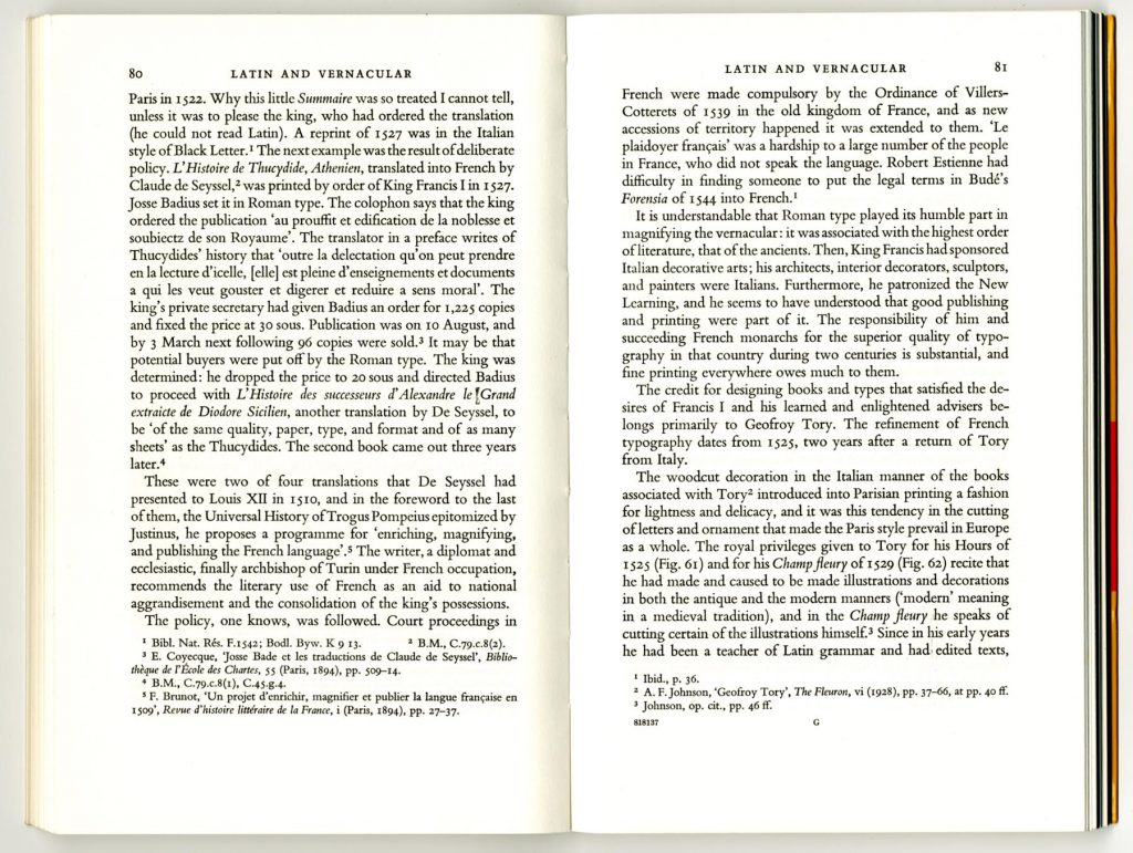
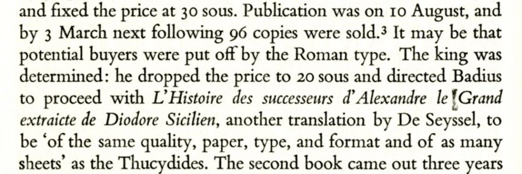
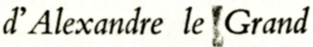
The commenter on Instagram – Gaspereau Press – notices that there seem to be two spaces between the words ‘le’ and ‘Grand’: one risen and printed, and – preceding this – one that kept its place on the bed of the type and was not printed. How come two spaces were set together in the Monotype process, in which the space bar would only be hit once between words?
Is this an indication that an Oxford University Press compositor put this machine-composed line into his stick and corrected or improved it, and that whatever he did inadvertently left the line a little loose and caused it to work-up during printing?
I suspect that this is indeed what happened: the line was corrected by hand, and, after the main setting had been done, two spaces were inserted here to achieve the justification. The changes to this line left the type slightly loose, and that is why one of the spaces rose.
The Gaspereau commenter goes on to wonder why this imperfection was not corrected by us (eliminated from the scan that we made from the original page), and whether this was a case of ‘benign neglect’. I have no clear memory, but I think that we noticed this, and had no hesitation in leaving the risen space there. Our approach in making this edition was to leave the text exactly as it stood in the original book, and to provide a ‘corrigenda and addenda’ separately.1 The one important change we made was to group all the pictures in one sequence at the end of the book, where in the original they had been placed in the text at intervals in four-page sections: this we explained on page 15 of our additional matter.
In the comments by others on Gaspereau’s Instagram remarks, someone from Incline Press writes: ‘It’s a no-brainer here! If presenting a photo-reprint of an historical document, you leave the original alone.’ Yes, exactly. I remember the struggle to make a facsimile edition of another important typographic book from the 1960s. We were sure the right policy was again to reprint in facsimile and add corrections and improvements separately, on other pages. In this case the son of the deceased author wanted to improve his mother’s book by replacing some unsatisfactory photographs in the original by better ones (it would have meant trying to photograph buildings that had been altered or were long ago demolished). The argument went on for a couple of years. Eventually we gave up, and that book remains out of print.
————————————————————
Robin Kinross
————————————————————
Note