This review of the book ‘Wim Crouwel: mode en module’, by Frederike Huygen and Hugues Boekrad, was written for and published in an issue ‘Typography papers’, now out of print.1 The Crouwel book, as it was often referred to, was issued only in a Dutch edition, which sold out quickly.2 Since then, Wim Crouwel’s renown has only increased. Most recently his work has been celebrated in a major exhibition (at the Design Museum, London, 2011, and on show from this month at The Lighthouse, Glasgow); in The Hague he has been awarded the Gerrit Noordzij Prize (2009, with an exhibition following in 2012). ‘Wim Crouwel: mode en module’ is now something of a fabled work, with large prices asked for second-hand copies. Given the continuing absence of an English-language edition of the book – which would surely be a tough translation, editorial, and production job, as well as an expensive one – this review may be worth resurrecting, as a marker of a moment in the discussion of graphic design. This version of my text is essentially as published in ‘Typography papers’, with a few updating remarks added in the notes.
Background
Wim Crouwel is one of the notable Dutch graphic designers of his generation. In his leading role in the firm of Total Design (hereafter ‘TD’), from its foundation in 1963 through to the 1980s, Crouwel worked at the heart of Dutch design in the years when this phenomenon began to crystallize and to gain international recognition. If one applies the test of design for the national airline, it may be some measure of Dutch cultural reticence that around the time of the sharp upswing in the post-1945 prosperity – from 1958 – the new identity for KLM (‘Royal Dutch Airlines’) was designed at F.H.K. Henrion’s studio in London; but soon such jobs would go to TD. For example, from the mid-1960s this young firm was at work on the signing for Amsterdam’s Schiphol Airport (designed by a group under the direction of partner Benno Wissing), and thus TD’s lowercase-only sanserif typography contributed to the first impressions of the country for anyone flying in. (The calm interiors at Schiphol – still surviving, although the signs are now being replaced – were designed by Kho Lang Ie, with whom Crouwel had worked in partnership in the 1950s.) And from 1963, after the retirement of Willem Sandberg and the accession of Edy de Wilde, Crouwel and TD became designers to Amsterdam’s Stedelijk Museum: both a local municipal institution and by then an important component of the international art scene. As critics of TD’s work and its hegemony came to suggest, it took a sharp eye to distinguish between the logotypes that Crouwel designed for this museum and for the practice of which he was part; granted, the initial letters were different.

Logotypes designed by Wim Crouwel for Total Design (1962) and the Stedelijk Museum Amsterdam (1964), reproduced from the book under review (p. 142). The joke about these may have been put into print first by Piet Schreuders in 1983, in a review of the book Ontwerp: Total Design. An English translation of this review appeared in Information Design Journal, vol. 4, no. 2, pp. 166–70. The piece was reprinted in the revised edition of Schreuders’s book Lay in – lay out (Amsterdam: De Buitenkant, 1997), which brings up to date his pamphlet of this title (1977), attacking the Dutch designer culture, of which Crouwel is now seen to be just a passing representative, and not the worst. In her essay on TD, Huygen gives a historical account of the several controversies around Crouwel’s and TD’s work in the 1970s, including this accusation by Schreuders and others that its apparent stylelessness was a style nonetheless and in fact a ‘new ugliness’.
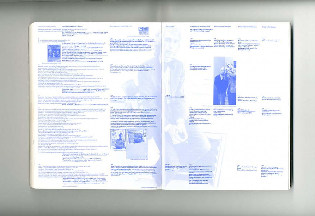
By the 1970s, TD seemed to be acting out all the meanings of its title, not just the ‘cross-disciplinary’ implication. From early on in his career, as part of his own ‘total’ approach to his profession, Wim Crouwel has sat on committees and juries, delivered addresses and lectures, written articles, and held academic positions (notably at the Technische Hogeschool Delft). This tireless public work reached its apex in 1985 when he took up the directorship of the the Boymans van Beuningen Museum in Rotterdam.
In 1993, aged 65, Wim Crouwel retired from his position at the Boymans Museum. In advance of this, early in 1990, Frederike Huygen, then curator of design in that museum, began to make plans to write and produce a book about Crouwel. It would mark his retirement, not with a simple celebration, but rather with a sophisticated and critical discussion. It is remarkable that Wim Crouwel should have put himself and his archive – then acquired by the Stedelijk Museum Amsterdam – at the disposal of the researchers, with no strings attached, no attempt by him to interfere or control: this unusual willingness to become the subject of a critical experiment helps to explain the nature of the book that was finally made.
The project of the book and its methods
Wim Crouwel: mode en module attempts something new: to document and discuss at length and with full historical and critical consciousness the work of a living graphic designer. Even dead and safely ‘in-the-past’ graphic designers have not yet received this treatment. By comparison with the present book, other monographs are slight affairs or, where less than slight, tend to be overblown and uncritical. On a first encounter with it, the Crouwel book certainly gives an air of thoroughness: a solid squat paperback, weighing 1250 gm, pages packed with text and many photographs, a seemingly exhaustive illustrated catalogue of work that extends to almost 200 pages, a lengthy ‘biographical overview’, full bibliography, two indexes. The design of the pages tends to agoraphobia, with very narrow margins and column widths, and notes to both pages on a spread placed in the far left column of the left page. But the book’s marvellously strong and flexible binding lets this work: pages can open out flat, providing a single field of information.
It has to be said that the book over-eggs its information-provision. Where anything can be strung out and put in sequence, then we get that list – lovingly shaped by the book’s designers, Karel Martens and Jaap van Triest. Thus the list of ‘literature consulted’ (writing that impinges on the themes of the book, but which may well not impinge directly on Crouwel’s work) is given twice: alphabetically – this might be useful – and chronologically as part the ‘biographical overview’ – which is information as decoration. In fact the design of these ‘overview’ pages reinforces this decorative aspect, by setting the bibliography in a lighter weight of type, so that it recedes visually, and by reprising photographs used in the main body of the book, but now given in percentage tint and run wallpaper-like behind the text.
The one list I miss is of literature about Crouwel; and if such a bibliography had been given chronologically, it would tell us something about the ebb and flow of the public profile of his work.
The essays by Frederike Huygen and Hugues Boekraad – separate compositions, entirely different in manner, and with the smallest cross-reference from one to the other – are as follows: a three-page meditation on some of the issues of writing such a book (HB), 30 pages of biography (FH), a 12-page placing of Crouwel as a graphic designer (HB), 60 pages on his work as a ‘three-dimensional’ designer (FH), 50 pages on Total Design (FH), and then three short pieces (about 20 pages in all) by Boekraad on ‘design and communication’, ‘design as cultural production’, and on Crouwel’s work for the Van Abbe Museum at Eindhoven and the Stedelijk Museum Amsterdam.
Frederike Huygen’s essays are consistently informative and enlightening, and are grounded in obviously extensive archival research and interviews with witnesses. It is here that the book’s freshest contribution lies. Wim Crouwel’s early work in exhibition-stand design seems to have been formative, taking him out of what would have been the designer-as-easel-painter assumptions of his art-school training. We can understand him as an exemplary instance of Le Corbusier’s injunction to architects: ‘you are an organizer, not a drawing-board stylist’. Crouwel’s talent lay in the human processes of design, in dealings with commissioners and with colleagues working on the job. Huygen takes the direct route: she asks old colleagues what he was like to work with; then she tells us. Here is a sample of this approach:
For fellow workers and assistants he was pleasant company. He also gave them freedom in which to move, and responsibility. He was generous, loyal, and a good colleague. The people in his team got opportunities to break through. He tried hard to keep good employees in the office and he stood up for them. Thus in 1971 he argued for Jolijn van der Wouw to be taken into the direction of TD, in line with the conditions of her entry into the office. Alas, the formal rules seemed not to allow this, and the other directors were not (yet) emancipated enough to let a woman into their midst.3
We are then referred to the evidence for this: a letter written by Crouwel on 28 November 1971, and notes of a TD board meeting.
Huygen was a frequent contributor to the Dutch design press in the 1980s, playing a leading and formative role in the magazine Items, and her writing shows the benefits of this experience as a reporter. It is not too much to say that the messy, worldly business of design requires a strong element of journalism for adequate analysis, and that the more a discussion of design (and perhaps any human activity) strives for theoretical patterns and interpretations, the more ham-fisted it becomes and the less responsive to its subject. Though she refrains from much overt judgement of quality or effect, one could cite these essays as instances of the kind of critical journalism for which Rick Poynor has argued.4 In addition to her sensitivity to the personal, Huygen does also point her enquiry out to the larger context of the work: to the debates and the issues of the times. We also learn, for example, about the finances of Total Design, and see that a distinction of the firm was its conjunction of purely business skill – in the persons of two founding partners, the brothers Dick and Paul Schwarz – with the ‘aesthetic’ skill of its other early partners: Crouwel, Friso Kramer, Benno Wissing, Ben Bos.
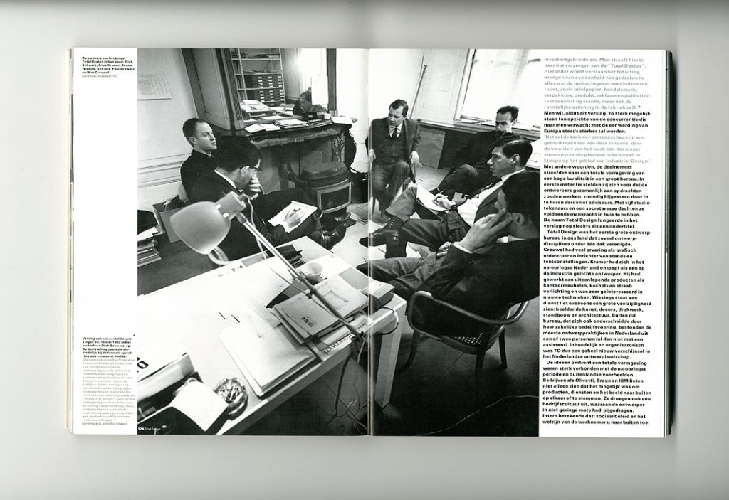
These six men can be seen in a photograph by Jean Versnel, c. 1965, in the Herengracht office of Total Design – an old canal house with discreetly modernized interiors – sitting in Le Corbusier bentwood chairs around a stove, rather than the table, which is to one side, and which holds a clasp-fixed designer’s lamp, papers, and a stray empty ‘kommetje’ (small bowl, for coffee or tea), with a beached teaspoon in it. One sees the mix of business and aesthetics, formality and informality: the particular energies that animate Dutch society. Crouwel was lucky to work within such a strong photographic culture, using it both as part of his work and also in recording what he was doing. The photographs are one of the remarkable components of this beautifully printed book. (The essay pages use an intense black ink on white coated-but-not-glossy paper; in the catalogue pages, four-colour process printing is used; in the concluding list pages, just a Crouwellian blue is used – as also in the divider pages between sections.)
These pictures bring one of the book’s surprises. It seems that one can speak of an ‘iconography’ of Wim Crouwel the man. Fashion-conscious from adolescence, this dimension of him flourished in his golden years of the later 1960s and early 1970s, when rationality was also fashionable, and when the West-European economies were booming. ‘Mode en module’ is the book’s subtitle: ‘fashion and module’.
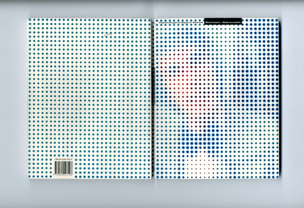
This conjunction is brilliantly captured in the cover image, which reduces a photograph of Crouwel from those years (long, groomed hair; bow-tie) into a pattern of dots of seemingly precisely varying diameter.
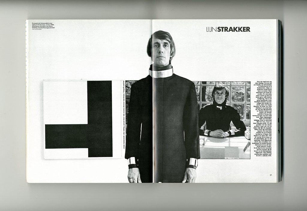
The ‘mode’ aspect of Wim Crouwel reached an extreme when, in 1969, he modelled some unisex costumes (including shirts made of ‘space-silk’) for a magazine feature. Alice Edeling, the designer of these clothes, was a girlfriend of Crouwel’s, so Huygen informs us. She also tells us that Paul Huf, who took these pictures, had something of Crouwel’s physique, shared his interest in clothes, and that they frequented the same tailor in the Leidsestraat. Such details, in my selective account, may seem to be straying from the serious path of critical history. But I think they help to build a realistic account of this work in its full context.
In contrast to Huygen’s essays, Hugues Boekraad’s contributions are wayward and frustrating. Boekraad’s background is in philosophy and literature. He worked as an editor with the SUN publishing house in Nijmegen, helping to see it develop, from its roots in the student socialist movement of the late 1960s, into a distinguished radical publisher. The SUN was distinguished not least by the form of its books, notably those designed by Karel Martens (the book under review is thus in one aspect a reunion). The design of the SUN books formed the topic of a long essay by Boekraad, which brought together social-historical and visual discussion in a way that had hardly been attempted before in design criticism, the field that he then entered.5
There are two essays here by Boekraad – on ‘the position of Crouwel’ and on Crouwel’s work for museums – where there is some promise of a helpful critical account of the book’s subject. A few pages in the first essay (pp. 46–51) do bring some exact illumination to the place of the young Crouwel in relation to older Dutch graphic designers, especially Dick Elffers and Otto Treumann, and his early contacts with Swiss designers. If only the essay could have continued in this vein, through to the end of Crouwel’s career as a graphic designer. But then Boekraad moves on to consider the larger phenomena of Swiss typography and systematic design, and specificity is displaced by a vaguer analysis.
In his essay on Crouwel’s design for museums, Boekraad returns to some analysis of Crouwel’s activities. But it is brief, and the writing falls into tired enumeration. For example, in a sentence that constitutes one paragraph: ‘After a short time, the format of the SM [Stedelijk Museum] catalogues was enlarged to 18.5 cm wide by 27.5 cm high.’ (p. 200) While, just on the preceding page, we encounter a seemingly impeccable generality: ‘The catalogue is like a newspaper in its serialization: it is numbered and is explicitly one part of a series. Just as with a newspaper there is no preliminary matter, no endpaper, no title page. Open a catalogue and you fall, with the door, into the house, without a hall or an entrance to pass through.’ This may seem nicely put, but it is just not true of most museum catalogues: and especially not nowadays, if one thinks of the countless thick art-exhibition catalogues that are ‘books’ in all but name, with no aspect of the series about them. Yes, it may have been partly true of the Stedelijk Museum catalogues, which have indeed been numbered, and which did indeed, when the director Willem Sandberg was designing them, resemble a series – but which, even then, certainly had title pages. But Boekraad does not tell us how his theoretical description works out in the case of the material he is writing about, or what it was about the SM that encouraged or required the kind of catalogues that have been made for it. Maybe the series-catalogues of the SM somehow derive from its status as a municipal museum? We are left to speculate in the dark. Concerning the essays here on ‘design and communication’ and ‘design as cultural production’, I don’t think it is just my low-level Dutch – Boekraad writes at quite a high level of abstraction – that lets me think they have wandered in from another book: yes, they touch on Crouwel, but it could be any designer of his generation and type; there were quite a few of them.
Hugues Boekraad’s introduction to the book opens with a puzzling and – despite his protestations – unhelpful detour into the phenomenon of the writer Anna Blaman, and with ways that were found of writing about the work and life of this writer, who died in 1960. Anna Blaman was a lesbian in an intellectual catholic milieu. What has this to do with the heterosexual, practical Crouwel from protestant Groningen? On the face of it, as Boekraad concedes, not much. There is one important issue that could be drawn from this comparison, and which I have touched on already in reference to Frederike Huygen’s journalistic methods: how do you write historically about the near past, when so many of the people involved are still alive and still involved. But the lessons that Boekraad goes on to draw from his complicated parallel come as a let-down. He considers how a book about the work of a graphic designer could be written. A biographical approach isn’t enough, he says: the work and the activity have to be understood in a larger theoretical framework that takes account of how design functions in the social world. This is now no more than commonly accepted wisdom, if still with little in the way of worked example to demonstrate it.
Forms of writing about graphic design: the Dutch debate
The problem that faced Hugues Boekraad was to contribute to a monograph: a book about the work of a single human being. It is a form in which he does not really believe and especially not, as he suggests, for a subject as collaborative and socially embedded as the designer Wim Crouwel. One does not have to be a Marxist, let alone a 1970s-model Althusserian anti-humanist Marxist – a philosophy that Boekraad would have known intimately in his days at the SUN – to think he is right about this. His contributions might be taken most kindly as pointed alternatives to the monograph: the meditation on biography; the placings of Crouwel in context; the discussions of related themes. But, especially placed as they are alongside Frederike Huygen’s abundantly factual and to-the-point contributions, his essays seem like evasions and diversions.
At the back of Boekraad’s deliberations in his introduction is a debate about graphic design history, and one that has recently gathered pace in the Netherlands. The firm of 010, the publisher of the present book, has until now been essentially an architectural publisher (founded in 1983, it is one of the brightest and most productive in the world).6 010 has recently initiated a ‘Graphic Design in the Netherlands’ series of monographs, to be funded by the Prins Bernhard Fonds, a principal conduit for state subsidy of Dutch cultural production (architecture and design, as well as ‘fine art’). This would seem to follow on from their long-running ‘Monographs on Dutch Architects’ series. 010’s catalogue for 1997–8 announces the first book of the series: Otto Treumann by Toon Lauwen.7 The Crouwel book is also announced there, and described as a ‘foretaste’ to the series of monographs, but not part of it. Though also largely financed by the Prins Bernhard Fonds, Wim Crouwel was produced outside the brief of the new series, was published in a different format, and acquired by 010 only very late on in its production; and, as already explained, it struggles against the terms of the genre.
Before 010’s decision to publish the monograph series was taken, an investigation was made, under the auspices of the Vormgevingsinstituut (the Netherlands Design Institute) in Amsterdam, into the question of how to address Dutch graphic design history. A point of interim evaluation of this research came in November 1996, when a public debate took place on the occasion of the publication of a pamphlet whose title may be translated as ‘On graphic design in the Netherlands: a plea for history-writing and theory-forming’.8 This useful survey of the field, and of the larger problems of discussing graphic design, was published by 010 – and it argued not for monographs but rather for the publication of a serious magazine or journal, as a form that could do justice to the very complex and shifting nature of the subject. The initial suggestion of a magazine, rather than the more routine idea of a series of monographs, had been made at a preliminary meeting of the Vormgevingsinstituut group – by Hugues Boekraad. At the public debate in November 1996, Boekraad was not present, though the argument for a journal was well made by several participants; the single strong proponent of the monograph idea was Hans Oldewarris, co-director of 010.
By way of concluding this sketch of the small world of Dutch graphic design discussion, I should acknowledge that the contradictions of the Crouwel book – its monographic format, and its wish to criticize the constraints of the monograph – were pointed out in what may be the most acute review of the book to appear in the Netherlands.9 Its author, Koosje Sierman, is also the co-author of the pamphlet ‘plea’ for history and theory – and, as acknowledged in the book under review, she undertook the preliminary work of making an inventory of the Crouwel archive.
Postscript: close description
Taking a last look at the book itself, and at the methods its authors use to tackle their subject, one further tactic can be noted. This is announced in the most modest of explanations: ‘For a number of posters and catalogues in the list of work, a description by Hugues Boekraad has been inserted’. (p. 204) In these captions the critic who has opened the book by arguing that the old design-as-art methods are not enough, now looks hard at particular pieces of Crouwel’s work and interprets them as an unreformed art-critic might discuss a painting, attributing total control of an image to one author – Wim Crouwel – without reference to any of the many factors that can condition the work (budget, schedule, technical limitations, the contribution of colleagues, social climate). These long captions risk collapse into mere description, but they are also the best aesthetic advocacy that Crouwel’s seemingly unaesthetic work could find. For example:
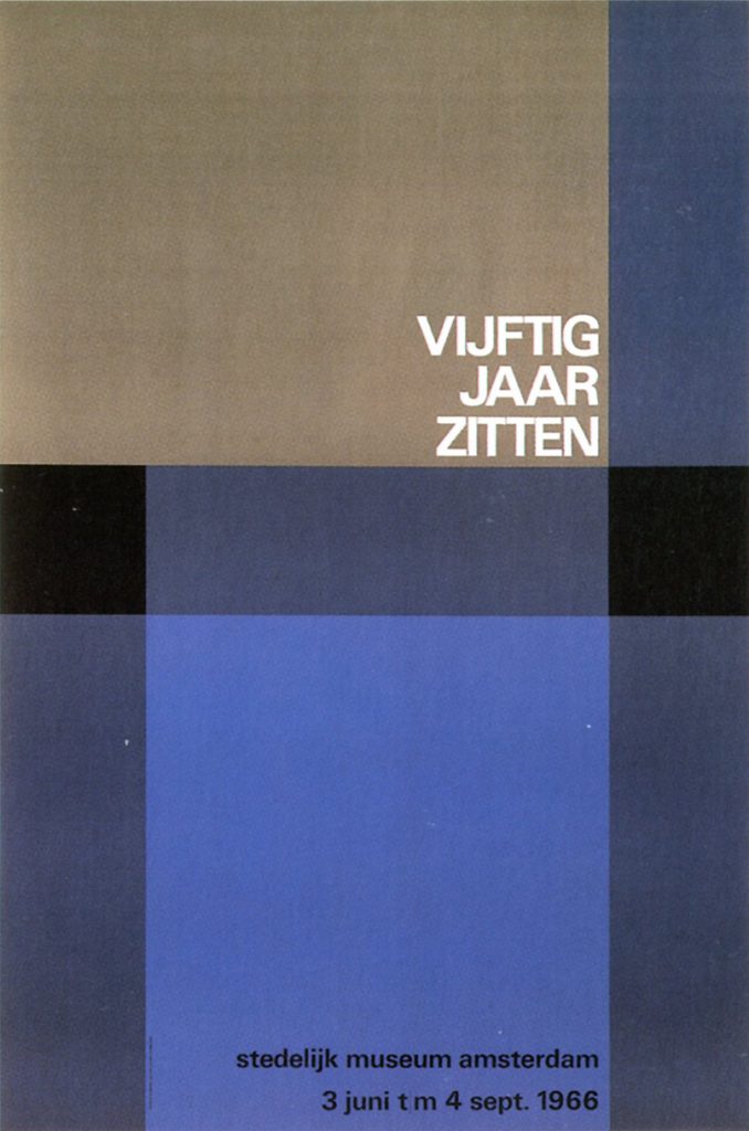
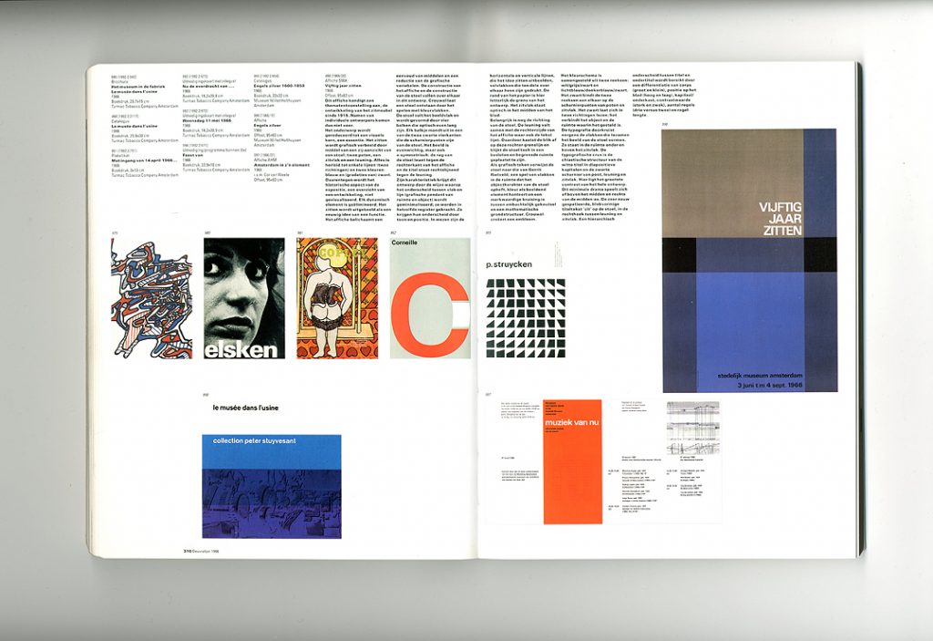
‘Poster SMA | “Vijftig jaar zitten” [Fifty years of sitting] | 1966 | Offset, 95 × 63 cm | This poster announces a thematic exhibition, on the development of seating furniture from 1915. So names of individual designers do not appear. | The subject is reduced to a visual core, an essence. Sitting is represented graphically by a side-elevation of a chair: two legs, a seat and a back. Everything is taken down to single lines (two directions) and two colours: blue and (gradations of) black. But the historical aspect of the exhibition – an overview of a development – is not visualized. Any dynamic element is eliminated. Sitting is represented as an eternal idea of a function. The poster embodies a simplicity of means and a reduction of graphic variables. The construction of the poster and the construction of the chair overlap with each other in this design. Crouwel lets a chair come into being through a play of colour areas. The chair fills the image area and is formed by four bars of optically equal length. Each bar ends in one of two black rectangles, which are the hinge-points of the chair. The image is balanced, but also asymmetric: the back of the chair leans against the right edge of the poster, and the title aligns on the right against the back. | This design derives its features from the way in which the difference between surface and line (graphic counterpart to space and object) is minimized; they are brought into the same register. They are differentiated by tone and position. The horizontal and vertical lines, which represent the idea of sitting, are essentially filled areas, in part printed over each other. The edge of the paper is here literally the boundary of the design. The sitting surface lies optically in the middle of the sheet. | The direction of the stool is also important…’ (pp. 310–11)
And the description continues in this vein for the same length again.
One could cite Boekraad against himself here. In an article published while the book was in preparation, he used the same slow descriptive approach to writing captions. But these captions were not so extended, and gained from that relative brevity: another instance of the benefits that the requirements of journalism can bring. The ‘Vijftig jaar zitten’ poster was also discussed in that article, and its caption came with this pointed conclusion (quoted here in its unpunctuated original English): ‘As a result of its minimal form Crouwel maintains the greatest possible distance from the visual language of marketing communication on the one hand and from the alternative design of the contemporary subculture on the other.’10 This abrupt movement from the visual to the social may be simplistic, but at least it tries to draw the formal analysis out towards a fuller discussion, to a dimension lacking in the long catalogue captions in the book.
If Wim Crouwel belongs to the international culture of design (the Alliance Graphique Internationale, and so on), and if his work belongs to what has been the graphic ‘uniform’ of quite a large sector of the Western world, he is also very much part of a particular national culture. This book is itself a hefty chunk of this culture, in its images and text, and in the exemplary industrial craftsmanship of its production. As Frederike Huygen details in her foreword, it was made with the help of a set of subsidies from state bodies, in addition to the Prins Bernhard Fonds support. Only, one supposes, in the Netherlands, where design is still taken to have social-cultural value, could such a book have been made.
Notes
1 Frederike Huygen and Hugues C. Boekraad, Wim Crouwel: mode en module, Rotterdam: Uitgeverij 010, 1997. The review was published in Typography papers, 3, 1998, pp. 139–46.
2 In December 2016 an English-language work by Frederike Huygen, Wim Crouwel modernist, was published by Lecturis in Eindhoven. While inevitably reprising much of the material of Wim Crouwel: mode en module, this is a different work. Hugues Boekrad’s contributions are absent, and the designer of this book is Lex Reitsma.
3 At p. 139; here and subsequently in this review, the translation is mine.
4 See, for example, his dialogue with Michael Rock, “‘What is this thing called graphic design criticism?’, Eye, no. 16, 1995, pp. 56–9. Poynor, ex-editor of the magazine Eye, has completed an MPhil thesis at the Royal College of Art, London, on Typographica magazine and the work of its editor, Herbert Spencer. It is a project that could allow for a fruitful infusion of journalistic awareness into extended historical discussion. [2013: This research was later published by Poyner in book form as Typographica, London: Laurence King, 2001.]
5 Hugues Boekraad, ‘Het gezicht van een uitgeverij: over het werk van Karel Martens bij de SUN’, in: Het ontwerpproces: grafisch ontwerpers en hun opdrachtgevers, Amsterdam: Gerrit Jan Thieme Fonds, 1986, pp. 69–81.
6 [2013: In July 2012 – in the rough climate of economic and cultural downturn – 010 publishers was merged with NAi (Nederlands Architectuurinstituut) publishers, to form a new entity: nai010 publishers. The NAi is now in the process of merging with two other Dutch cultural institutions, to become jointly The New Institute.]
7 [2013: This work proved to be long in the making. It was eventually published in 2001, in an overwhelmingly over-designed form that both salvaged it and destroyed it. See my discussion in Eye, no. 42, 2001, p. 78.]
8 Carel Kuitenbrouwer & Koosje Sierman, Over grafisch ontwerpen in Nederland: een pleidooi voor geschiedschrijving en theorievorming, Rotterdam: Uitgeverij 010, 1996. [2013: The Vormgevinginstuut had been founded in 1992; in 2000 it was closed and a year later it was officially disbanded. Some of its functions were taken over by Premsela, now one of the bodies being merged into The New Institute: see note 4, above.]
9 Koosje Sierman, ‘Anatomie op een levende’, Compres, vol. 21, no. 22, 1997, pp. 22–3, 25. [2013: The dry tone of this piece’s title is hard to capture in English translation: ‘autopsy on a living being’].
10 Hugues Boekraad, ‘Lines about the designer Wim Crouwel’, Affiche, no. 7, 1993, pp. 58–69 (quoted at p. 65).
Robin Kinross