When we were planning to publish music CDs, I tried to keep in mind that (since all the decisions were in our hands) it was a chance to think freshly and not – or not necessarily – use the reigning model of a plastic jewel case with printed ‘inlay’ sheet and booklet. I thought it would be good to try to do without plastic. It might cost a bit more money, but at least we could make a nice thing: more friendly than the jewel-case model, and perhaps more economic-elegant in its materials. This seemed important in the light of the burning question of ‘why make CDs anyway, why not just issue sound files for downloading?’ If you offer a pleasant and desirable thing, with material qualities that can never be downloaded, then it can be worth the effort and the cost of still publishing physical objects. The same set of thoughts applies, of course, to printed books and e-books.
I looked around for examples to follow, and knew of some already. The field of jazz and improvised music offers a few.1
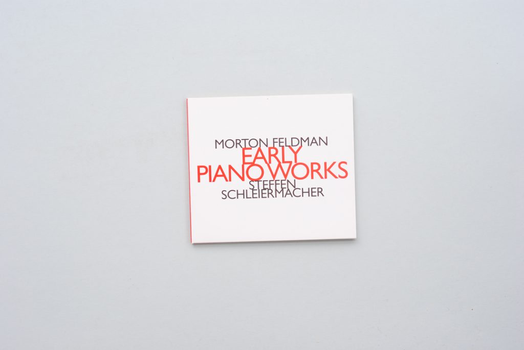
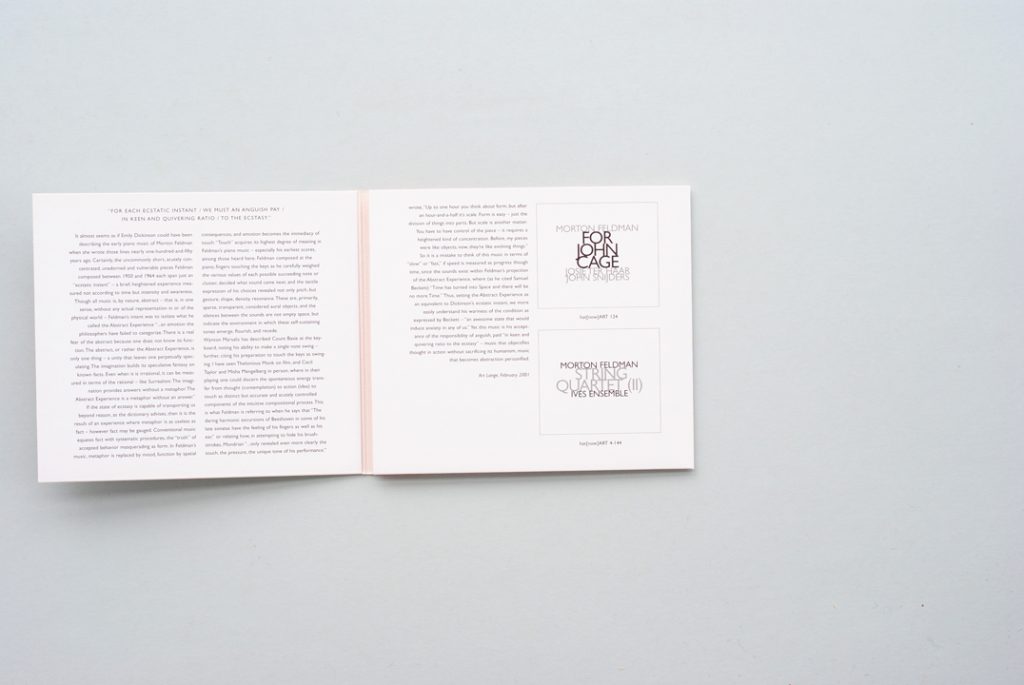
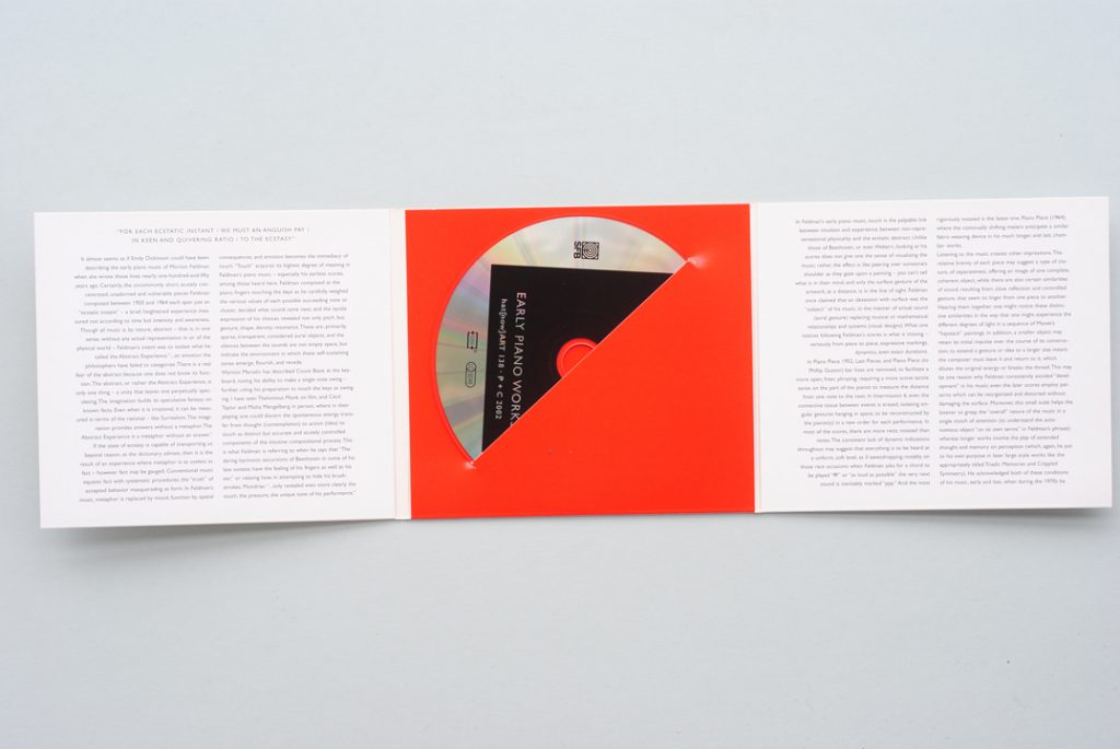
A Hat[now]Art series CD, designed by Stefan Fuhrer. The pack is made from just one sheet of card, printed in two colours only, to make three panels that can be unfolded in sequence.
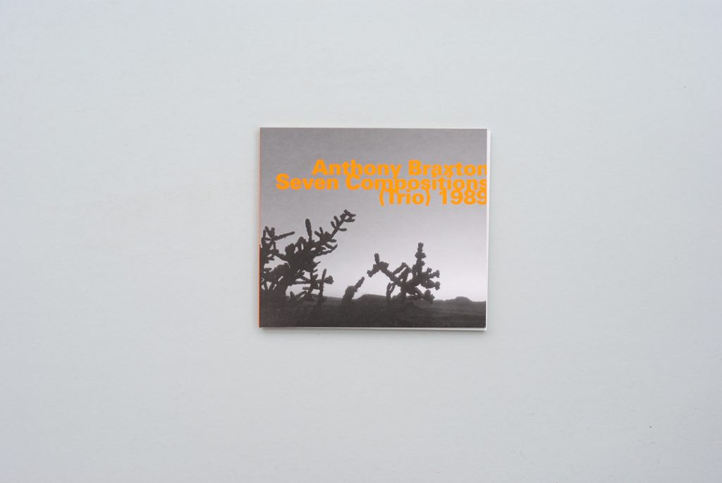
A CD from the Hatology series that publishes jazz and improvised music, alongside the contemporary-composed music on the Hat[now]Art series.
Both for their design and for the music they contain, I liked the no-plastic CD packets of Werner Uehlinger’s Hat Hut label (the Hatology and Hat[now]Art series).2 But these are simply card covers without any loose booklet, and I knew that for The Bach Players CDs we needed more room for text than this model offers – though in Stefan Fuhrer’s design for the Hat Hut packets a surprising extent of text is contained. Then I remembered a quite obscure, small set of CDs: the Free America series, which the Verve label put out in or around 2004. These CD packs had something of the spirit of the original LPs whose music they reissued: gatefold in format, with energetic paintings for their visual imagery.
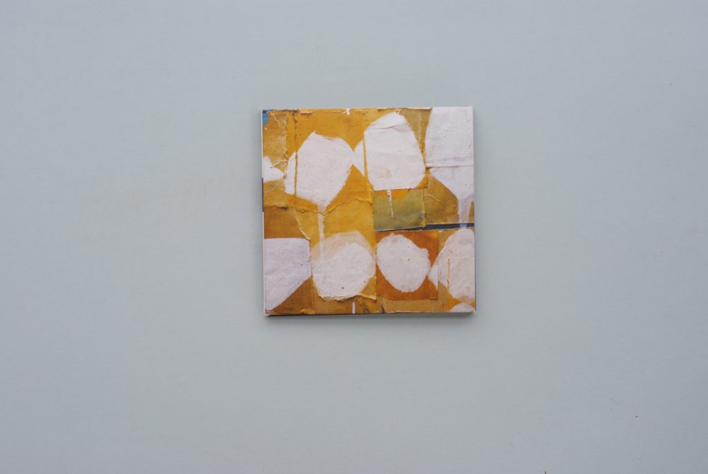
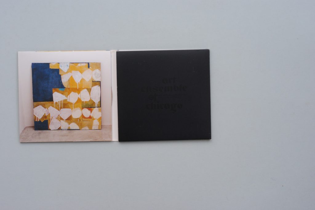
One of the Free America series CDs (‘Art Ensemble of Chicago with Fontella Bass’). CD and booklet are held in the two end sections. The back cover (not shown here) has personnel and track lists, and there is a spine with title information, but otherwise the pack is without text. The design (including the paintings) is credited to element-s, Gilles Guerlet and Jérôme Witz.
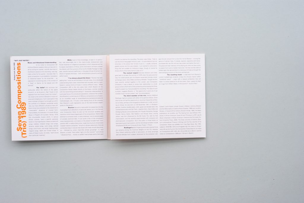
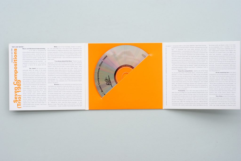
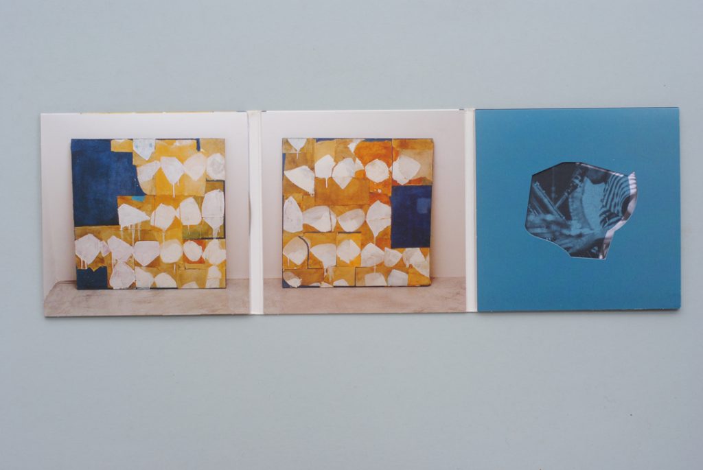
Working in conversation with Siôn Whellens at the printers Calverts Press, in London, we ‘reverse-engineered’ the first Hyphen Press Music packet from the example of one of these Free America CDs (unstuck it, laid it out flat, measured it). The two outer panels are left open at both ends, and both of them can hold something – either the booklet or the CD (kept in a paper sleeve). This ‘through-and-through’ design – a ‘cut-off strip’, with some subliminal suggestion of extended connection out into the world at large – would certainly have pleased Norman Potter.3 If the structure of our packet was the same as the Free America CDs, the graphics were different. Against their four-colour reproductive approach, I had decided to use just two colours for the packet and one colour (black) for the booklet. Seventeenth- and eighteenth-century European music needs a different graphic approach from that which fits Black American improvised music of the 1960s and 1970s; at the same time I was determined to avoid the habitual early-music CD pack with its period-art cover.
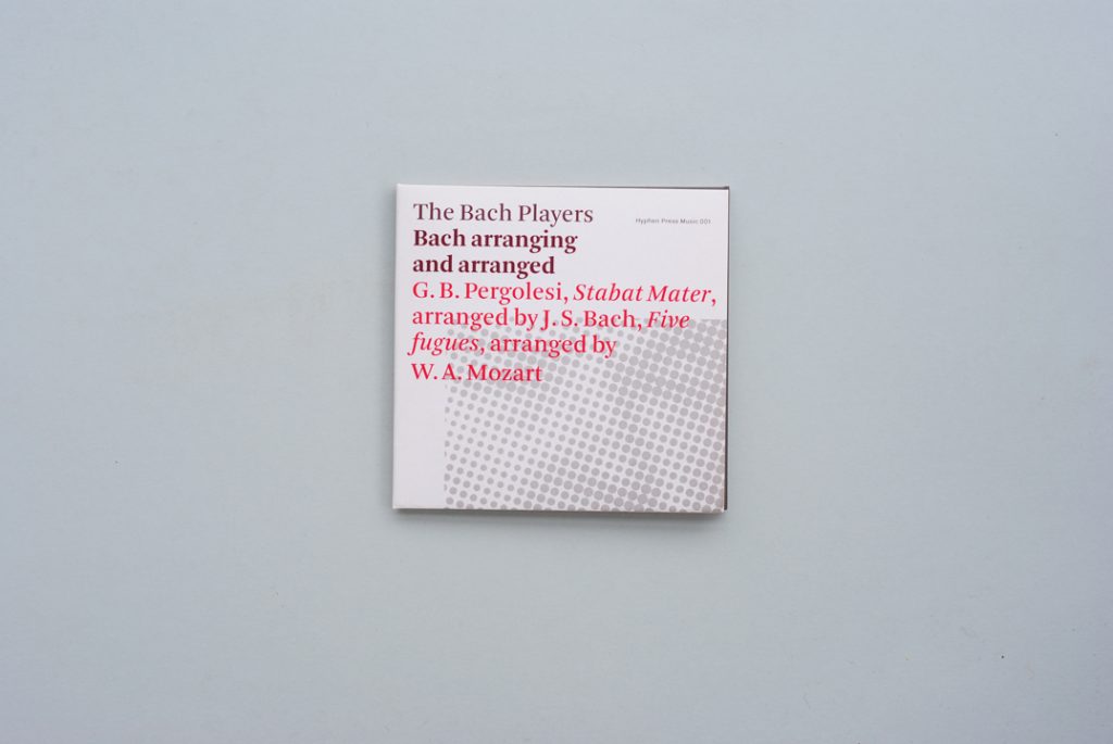
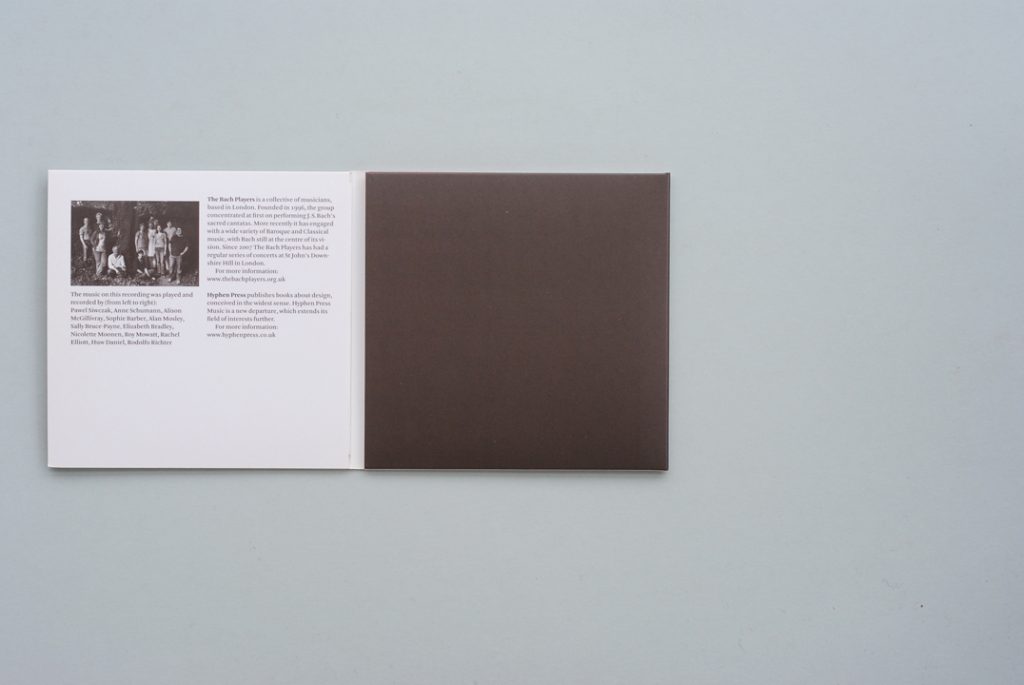
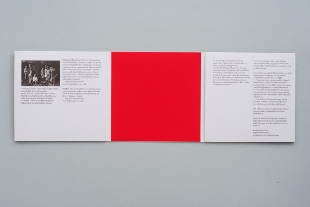
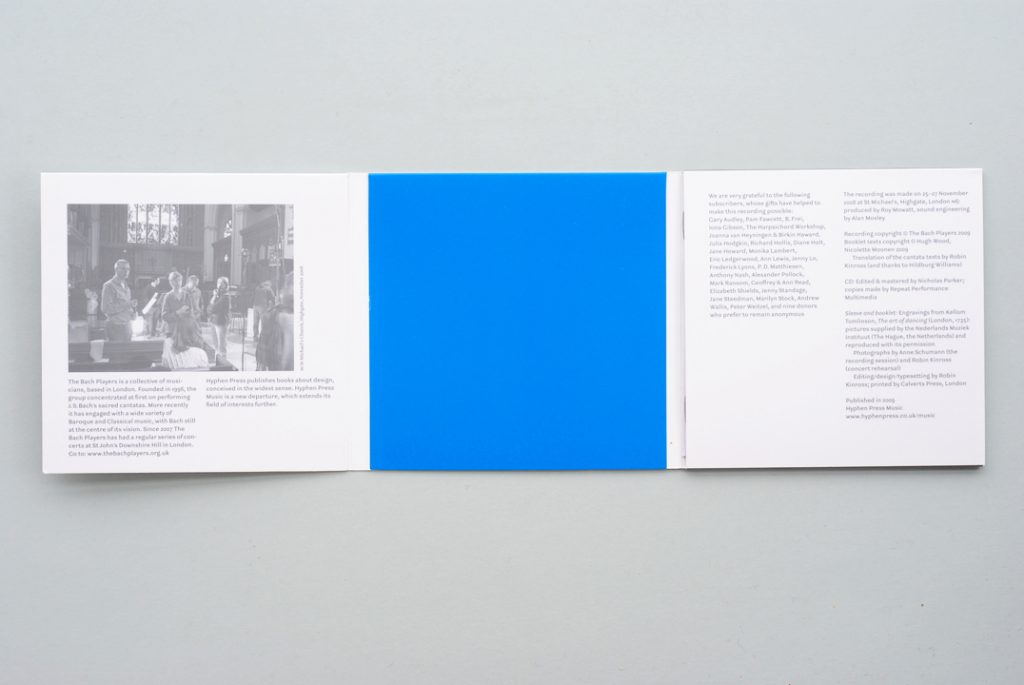
Our first CD, Bach arranging and arranged (2008). The construction follows the Free America model; but the packet is more informative, and more sober – printed in two colours only.
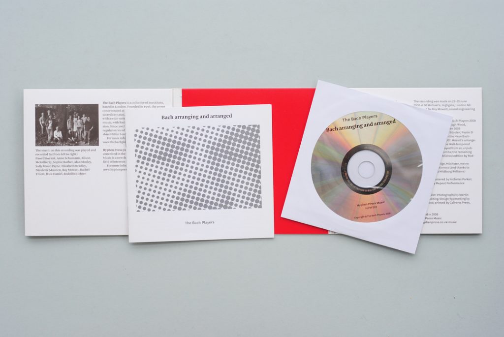
Booklet and CD are held in the two outer panels. It is hard to know which panel to use for which item.
Our first CD turned out quite well as an object. Buyers and subscribers – one meets them at concerts, and can talk with them – seemed to like it. But, watching some people open it up, I could see that it required a bit of learning and practice to be able to work it out. Perhaps it wasn’t so kind to arthritic fingers; but then neither is the jewel case. A warning sign came a few months on, when a critic wrote things in a review that he could not have written had he read our booklet: all the information that he sought was there. So I wondered if he had even found our booklet. Everyone expects a CD in such a packet, but I began to feel that the presence of a booklet should be more clearly signalled. For the Free America CDs this had been done by cutting a hole in one of the panels.
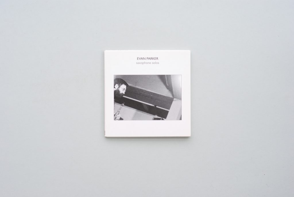
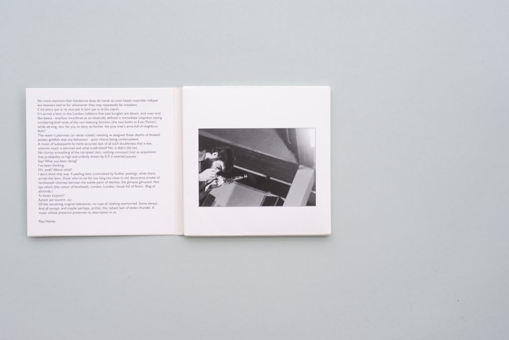
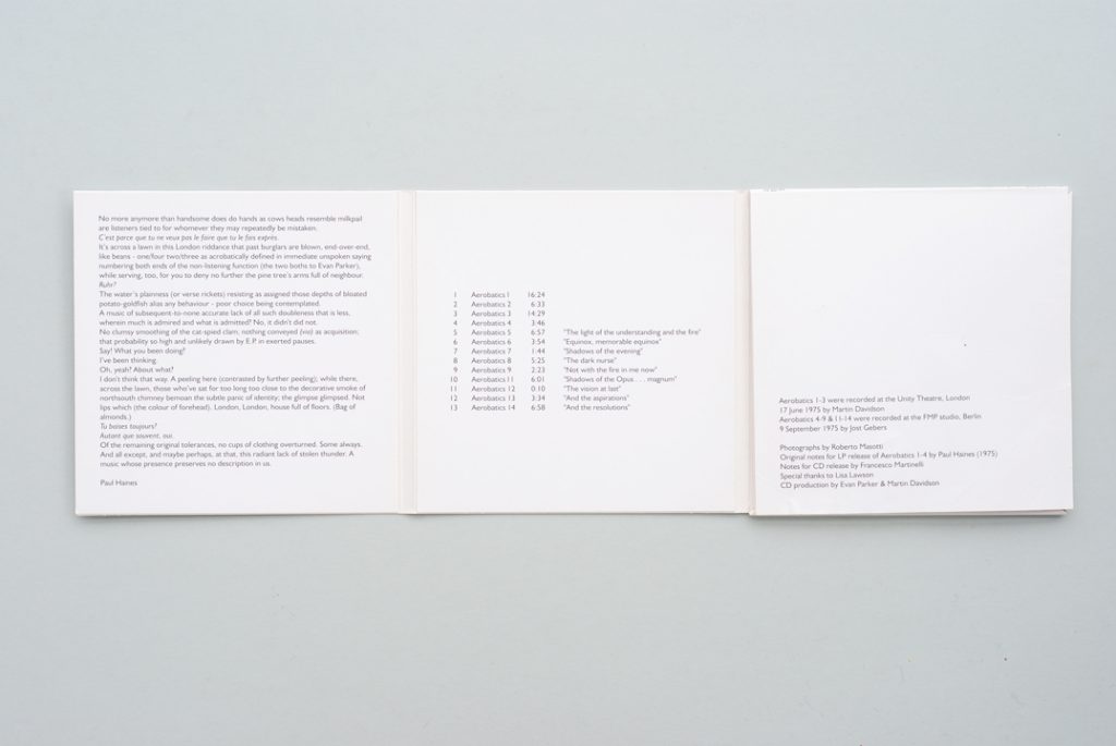
‘Saxophone solos’, published in 2009, is a reissue of music recorded by Evan Parker in 1975. The design is uncredited, but Parker’s presence is evident – judging by the design of the LPs and CDs with he has been involved as publisher. Both CD and booklet are kept in the rear (right-hand) panel, which is closed at the outer edge: a feature that does not make for easy retrieval of what is inside.
A modification was suggested when I saw a new CD from Evan Parker’s Psi label – this offered, again, the combination of improvised music and a designer thinking freshly and working for a small, self-determining label. This Psi CD had a packet very like the one that Siôn and I had devised, but now both CD and booklet were held in one of the panels, while the other was pressed flat. With CD and booklet held in the same place, the user was bound to find them both. So for the next HPM CD (002) Siôn and I adopted this variation, and I imagine we’ll go on with it for the rest of this open-ended series (the pun is intended).
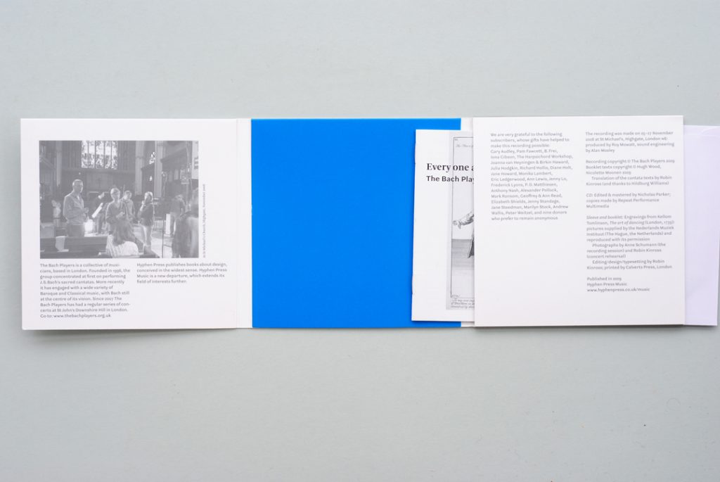
Our second CD, Every one a chaconne (2009) has a modification that develops the lesson of the Psi CD: both CD and booklet are held in the rear panel, but this is left open at both sides: retrieval of both items inside is easy. In the terms of Norman Potter’s analysis, we have kept the ‘through and through’ character of our first CD and avoided the closed-off or ‘dovetail’ element of the Psi example.
This story took a twist last week, when a CD turned up that closely imitates our first effort. So, the copier has been ripped-off!
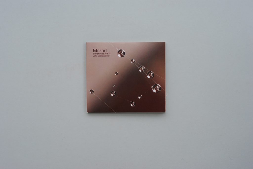
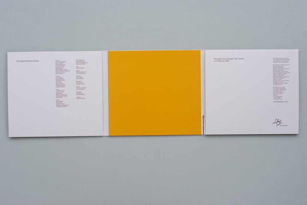
SDG’s Mozart symphonies are played by the English Baroque Soloists conducted by John Eliot Gardiner (but only the conductor gets credited on the cover). The construction of the pack follows exactly that of our ‘Bach arranging and arranged’. These apparent spot colours – both rather sickly, it has to be said – are in fact achieved by four-colour process printing.
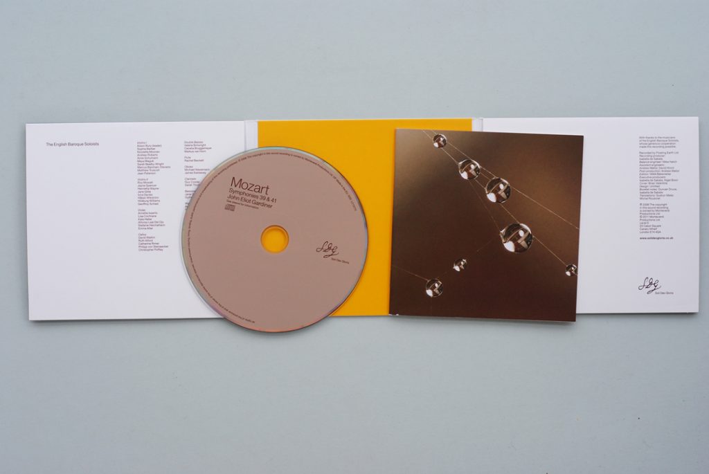
The booklet repeats the cover picture of the pack. Any relation between the music played and this image is hard to figure out, even by associated or transferred meaning.
This latest issue of Mozart symphonies from the SDG label uses our HPM 001 model very exactly, not just in the structure of the packet but also in its two-colour printing and disposition of inks. However, when one looks closely, the two-colour printing turns out to be four-colour printing – it’s a deception. Soli Deo Gloria is the label of John Eliot Gardiner’s choir and two orchestras. Run by Gardiner’s wife, Isabella de Sabata, who has a background in the record industry, this is an independent, musician’s label, able to explore its chosen paths, free of corporate meddling. SDG’s great achievement so far has been the issue of the recordings made in the year 2000 of Gardiner’s Bach Cantata Pilgrimage project. The design of these CDs, which has played a large part in their success, is in the hands of the youngish London design practice Untitled, which has a lineage that one can trace back to the firm of Pentagram and which offers a highly finished glow of upscale cultural modernism.4 Untitled is the designer of the Mozart CD.
There is a history to the Mozart CD that helps to explain its form. This is a live recording of the first part of a concert given at the Cadogan Hall in February 2006. As the second part of the concert proceeded, a recording of the first part was burned onto CDs, which were inserted into pre-printed packets; this raw, limited edition CD recording was issued to audience members as they left the hall. The printed packs were quite primitive and not well finished; but they show some of the idea now realized in the Mozart symphony packet.
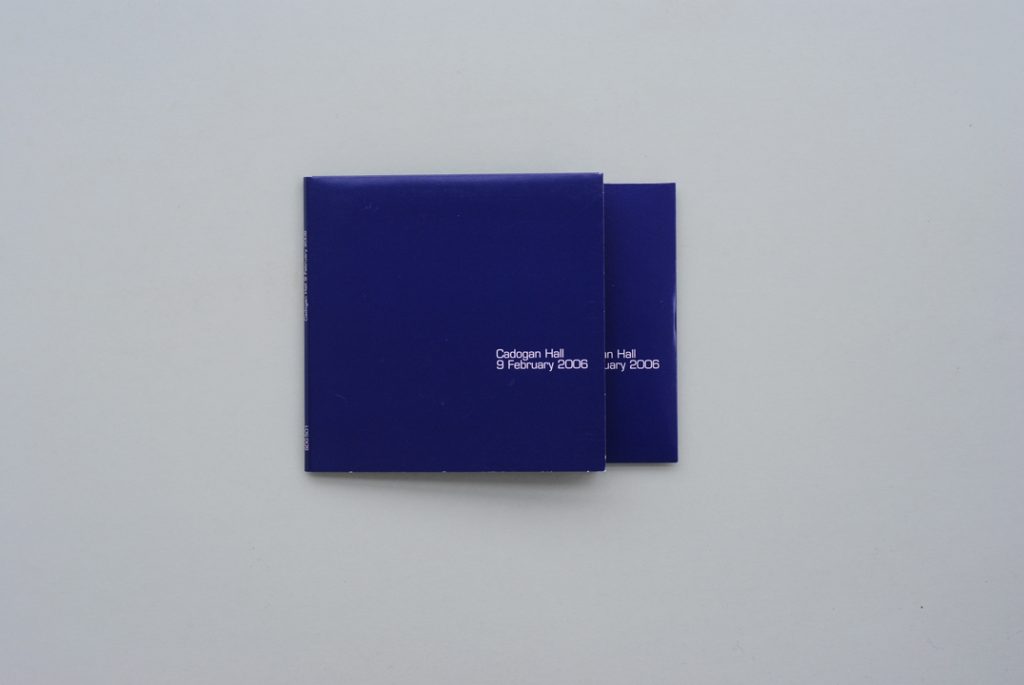
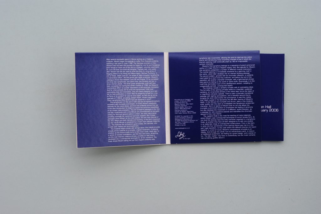
The limited edition prototype from 2006 for this year’s SDG Mozart symphony release. The CD is held in a card envelope, which in turn is placed in the right-hand panel of the card pack. Notes are on the pack itself. No designer is credited.
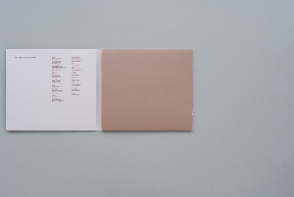
My guess is that SDG will think of this thin card packet as appropriate for their low-budget recordings only: a number of other live recordings have been signalled. Certainly it contrasts with the heavy-duty packets devised for the Bach Cantata recordings and for their other issues. But I hope they take the packet further. It is nice to welcome them to this small band of independent labels following the minimum-materials path: Free America, Hat Hut, Hyphen Press Music, Psi.
Notes
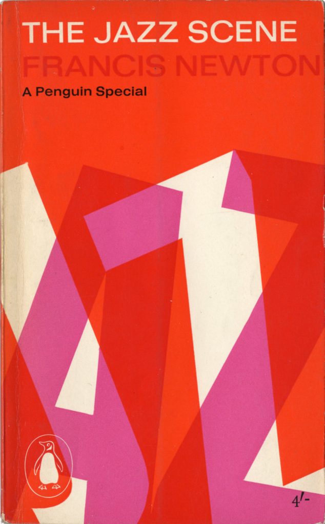
1 The connection between jazz and the conscious design of its recordings is notable, and there is an explanation for it. Eric Hobsbawm suggested this in his book The jazz scene (published under his jazz-critic pseudonym, Francis Newton, first in 1959, then in 1961 in a Penguin Books edition).
In the course of his very sharp discussion of the jazz audiences in different countries (‘The public’, chapter 13), Hobsbawm observed that the British jazz audience typically included a strong lower-middle-class element, for whom this music was a route into the sphere of intellect. He gives ‘commercial artists’ as typical of the fans of the early days of jazz in Britain (the 1930s), and this social element persisted in the audiences of the 1950s and 1960s, when Hobsbawm was writing. By then the commercial artists had transformed into graphic designers. A few of them were able to combine their love of the music with their work, by designing for record labels and music magazines.
2 Examples are now shown in the 2010 reprint of my book Modern typography (pages 228–9).
3 The idea runs through Norman Potter’s analysis of objects. For example in Models & Constructs he remarks (page 151) that ‘I would have preferred a comb/finger jointing system for its through-and-through character – dovetails would have been quite wrong’.
4 The design of Phaidon Press books under the ownership of Richard Schlagman, and under the art direction of the late Alan Fletcher, is a notable example of this style. Fletcher had been one of the founding partners of Pentagram. Phaidon has published Steve McCurry – the photographer whose images were used to such strong effect on SDG’s Bach cantata CD packs. (For some discussion of Phaidon as an architectural publisher, see here.) These notes come full circle when one sees that the designer of the Penguin edition of Hobsbawm’s Jazz scene, was the then thirty-year-old Alan Fletcher; on that book a parsimonious three colours were used, with a further colour generated by overprinting.
Robin Kinross