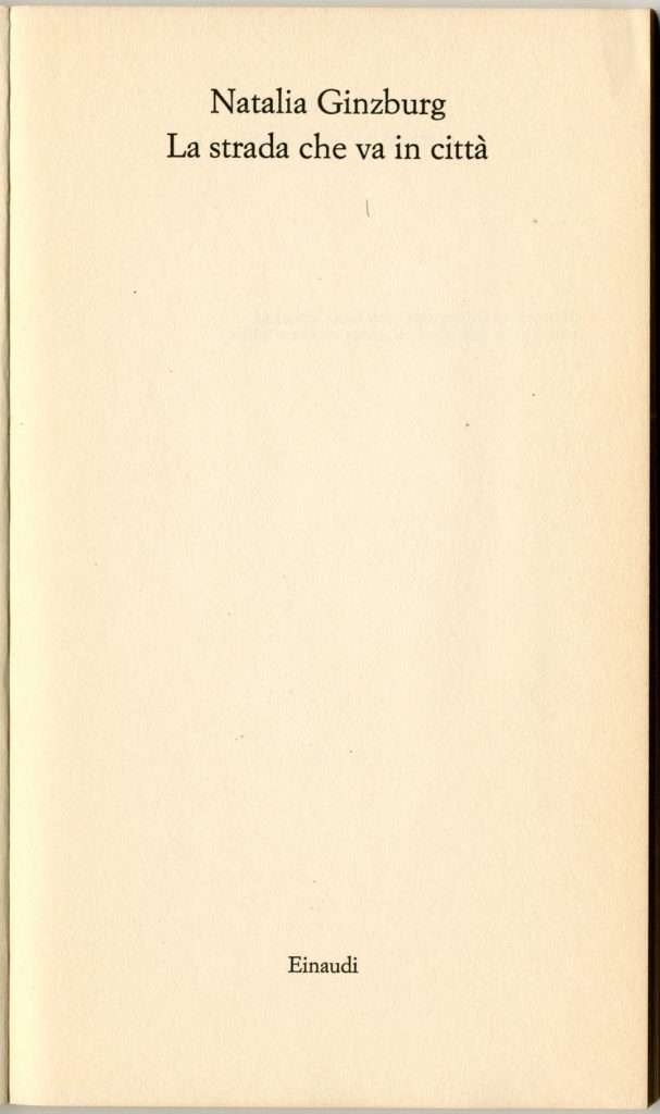
A detail of Hyphen Press style has sometimes caused puzzlement. We give the title of a book with initial capitalization only in the first word.1 Thus: The arrow of gold, rather than The Arrow of Gold. We have used this style in the text of most of the Hyphen books, and in their display typography too, in catalogues, and on this website. It is the style that I learned from Michael Twyman, who set up and then ran for years the Department of Typography at the University of Reading, where I was a student in the 1970s. It is still used at Reading, and I believe that Michael has used it in all the books he has had published. One finds it also used by other British writers on printing history – Philip Gaskell, David McKitterick – who trained as librarians. One sees it used in the catalogues of the great American and British national libraries (Library of Congress, British Library). It seems to be the norm now in science publishing – see the references to books in any science journal. But outside these spheres, in British and American (and indeed ‘world’) English-language publishing, capitalization of ‘important words’ (differently defined) is employed.
When I embarked on book-publishing in 1979/1980, with Norman Potter, to put out his book What is a designer in an expanded edition, I was still in the Department of Typography at Reading, and still freshly imbued with the spirit of rationality and enlightened practice that had developed there. I was also conducting myself through a New Left political education, and had become disatisfied with the ancient British – or Ukanian, as Tom Nairn wonderfully termed it – ways of doing things. I was searching for other ways – especially as practised in the languages spoken and written in continental Europe. Norman (a generation older than me) had been through this earlier and had long before reached some of the same conclusions about British culture – this was part of what drew me to his work – though he was an anarchist and more generous in temperament: a Danton, maybe, to my Robespierre. I believed in the role of the state – but just not in the way the British one was constituted (or wasn’t constituted). Anyway, he accepted that it could be What is a designer rather than What is a Designer. We both thought that unjustified, ragged text-setting was the only way to do it. He wanted informality and the conversational, direct tone of voice, and so did I. So he never objected to the title casing I proposed.2
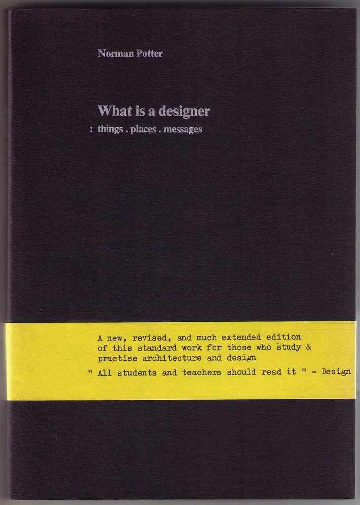
The cover of the second edition of this work, published in 1980. We added a yellow belly-band, to liven it up, and as another bow to Continental bookmaking. All of these bands were folded round the books by the publisher himself.
Our first book did its best to be French: it was a paperback with flaps, a format that was then hardly used in UK publishing. The sparse cover wasn’t French or German in flavour, though it was as severe as Gallimard or Suhrkamp. Although the text of the book was in English, and production had been done entirely in England, it felt as if we had lifted ourselves out of this country to settle in our imagined continental-European location.
The matter of capitalization seemed quite simple: the cool British librarians had shown the way.
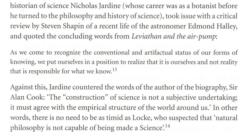
Here – in a fairly recent book – David McKitterick employs Continental orthography in his text, while the publisher enforces its house style on the title page.
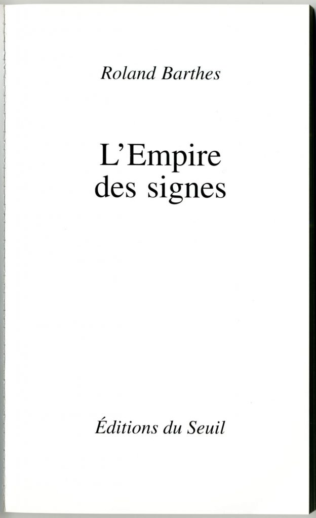
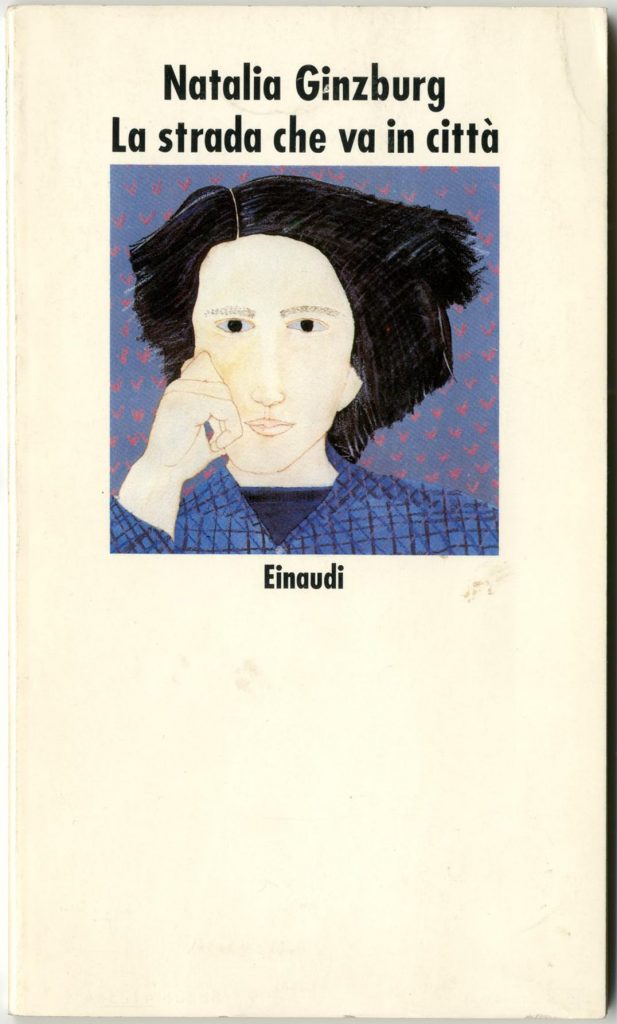
And further, the matter had been settled by the books in French or Italian or Dutch that I saw around me. The German style of capitalizing nouns within titles seemed at least clearer and more logical than the Anglo-American habit.
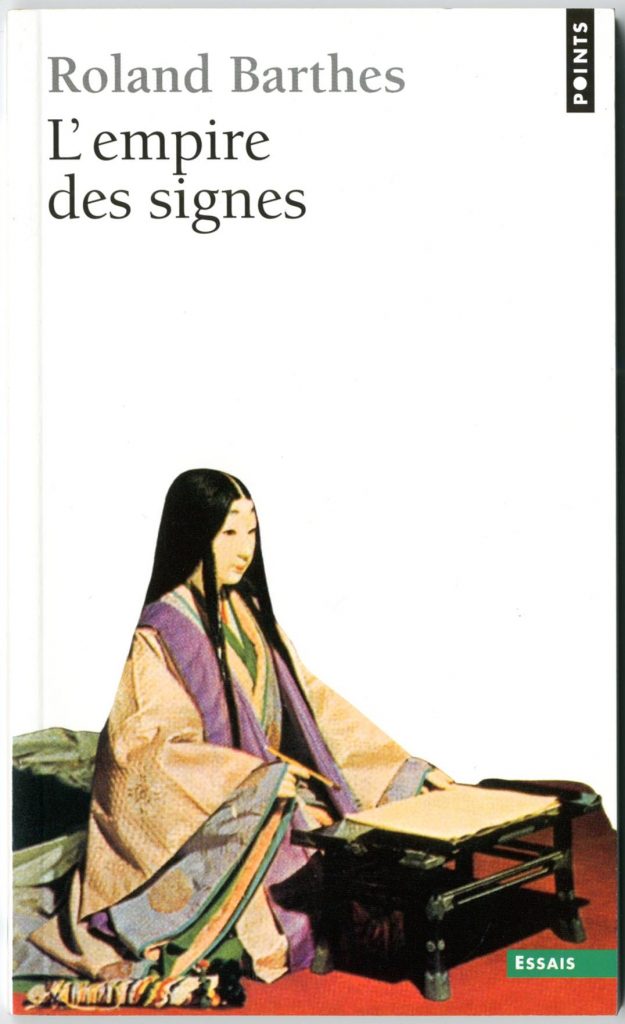
The different styles on the cover and title-page of the book show different approaches within French orthography, both of which have their rationality.
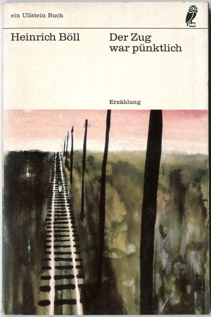
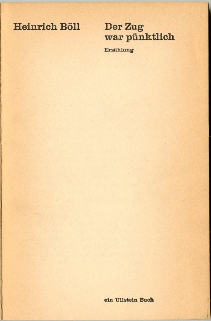
German orthography capitalizes nouns only – thus differing from the practice in other European languages.
Decisions over styling of book titles have ramifications: what do you do with titles of journals, exhibitions, plays, films, and so on? Journals are institutions, existing over time, and it makes sense to give them the honour of capitalizing every important word (The Journal of Beekeeping Science). Almost everyone seems agreed about that. For similar reasons I might capitalize exhibitions: ‘Painting the Modern Garden’ rather than ‘Painting the modern garden’. And I would capitalize the Thirty Years’ War like this. Plays are in the first place theatrical events, which last over time and repeated performance, and should perhaps be given initial capitalization. One might think of films like this too. Though it must be simpler to treat both to the rules of book-title capitalization. But we are talking about typographic language here, and there are other implements in the armoury to make the necessary distinctions: italic and roman, changes of thickness or width of character, changes of typeface, the use of quotation and other kinds of mark. The Guardian newspaper has for some years done without italics for the title, letting just the traditional British capitalization – and the context of the discussion – do the work of telling us that this is a book, film, play, etc.
The resistance of the British (and Americans) to a changed orthography is strong. The styles of written English that dominate in Britain would seem to derive from the regularization of the language that took place in the nineteenth century, with the industrialization of printing and the publication of language guides by the university press at Oxford. Now the expectation that The Arrow of Gold will be written like that is hard-wired into British perceptions, just as first-letter capitalization is part of the habitual perceptions of French, Italian, Spanish, or Dutch people. These other language-cultures pay us islanders the respect of following British style when they give English-language titles. Trying to change this British orthography produces a similar resistance to that raised when systems of measurement are changed: it can end in a fight. In the 1970s, as we entered the European Economic Community (as it was termed then), the United Kingdom adopted the metric system of the Continent and attempted to give up its old Imperial units of feet and inches, pints, miles; the currency was decimalized too, though not from first principles. Forty years on, we can see that the metric system is not well embedded. Even young British people seem to measure the height of a person in feet and inches, though they may measure the height of a table in centimetres; the speed of a car is still usually given in miles per hour; long distances are habitually given in miles; football commentators say ‘just outside the six-yard box’.
This is being written as the United Kingdom of Great Britain and Northern Ireland debates its relation to the European Union and to ‘Europe’, in the months before the in/out referendum to be held on 23 June.3 I have been re-reading some of the New Left writings that helped to form my political beliefs. One of the essential texts had been Tom Nairn’s essay ‘The Left against Europe’ (New Left Review, first series no. 75, September–October 1972) which I read first in the days after it came out in the autumn of 1972.
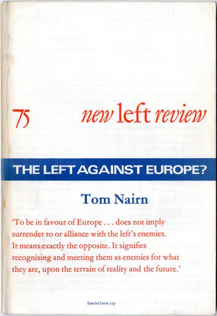
This month I re-read the text as published by Penguin Books in 1973.4
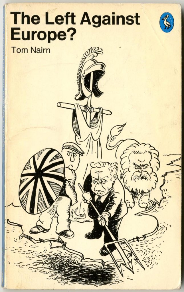
At the time I hadn’t liked the newspapery style of Les Gibbard’s cover illustration, but now the cartoon seems very effective. One could imagine Tom Nairn’s text being transposed to 2016. Now the Labour figures would turn into Conservatives. In place of Harold Wilson carrying the trident would be Alexander Boris de Pfeffel Johnson. The cloth-capped worker would be a white-van UKIP voter. The bearded lion (Karl Marx?) might be a bulldog. The scarecrow Britannia would be unchanged.
Incidentally, neither New Left Review nor Penguin ever adopted the Continental approach to capitalization, despite their Europhilia. If they had then the cover might have looked like this.
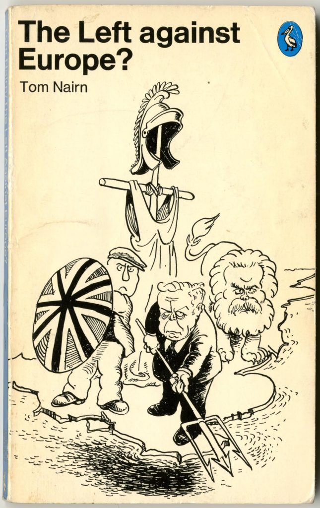
In the traditional British approach, ‘against’ should probably take an initial capital. It is bad manners to give short prepositions (‘in’, ‘on’) a capital; but ‘against’ has two syllables and so might be considered long. Also, one might feel that the word here has more weight than a mere preposition would have. Here the cool and rational Continental approach wins over Anglo-American muddle. It simply has to be lowercase. Any capitals in the title (‘Left’ and ‘Europe’) are then there for a purpose. This is one of the objections against the British style: words are indiscriminately capitalized and meaning is lost. Working for meaning rather than appearance is, indeed, a principle that Norman Potter cherished.
————————————————————
Robin Kinross
————————————————————
Notes
- Another detail of the Hyphen Press style of written English language is to use so-called -ize spellings, rather than -ise spellings. Often thought to be ‘American English’, this is nothing more than the purest Oxford English. It was another principle that I learned first from Michael Twyman, as a student at Reading.
- ‘Case’ comes of course from the cases in which metal type was held. The Wikipedia entry on ‘letter case’ is helpful.
- In a recent short commentary, prompted by these discussions, Jeremy Fox explains the radically different senses of law in Britain and the rest of Europe. This deep structure of mentalities must underly attitudes towards orthography too.
- In 1972 much of the Left in Britain – from mainstream Labour, to Left Labour (Michael Foot and Tony Benn), to the Communist Party and the Trotskyist parties – regarded the Common Market as a capitalist club to be avoided. They found themselves putting on the clothes of British patriotism, in affirmation, perhaps unwittingly, of the ancient and unreformed British state. Nairn argued that joining Europe was a way of recognizing the realities of the modern world, and of being part of the mechanisms of change. He went on to publish The break-up of Britain (1977), which foretold the end of the old Imperial state of Britain.