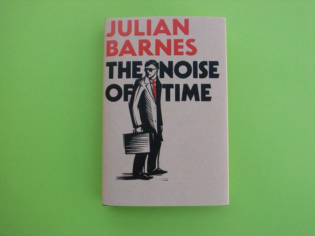
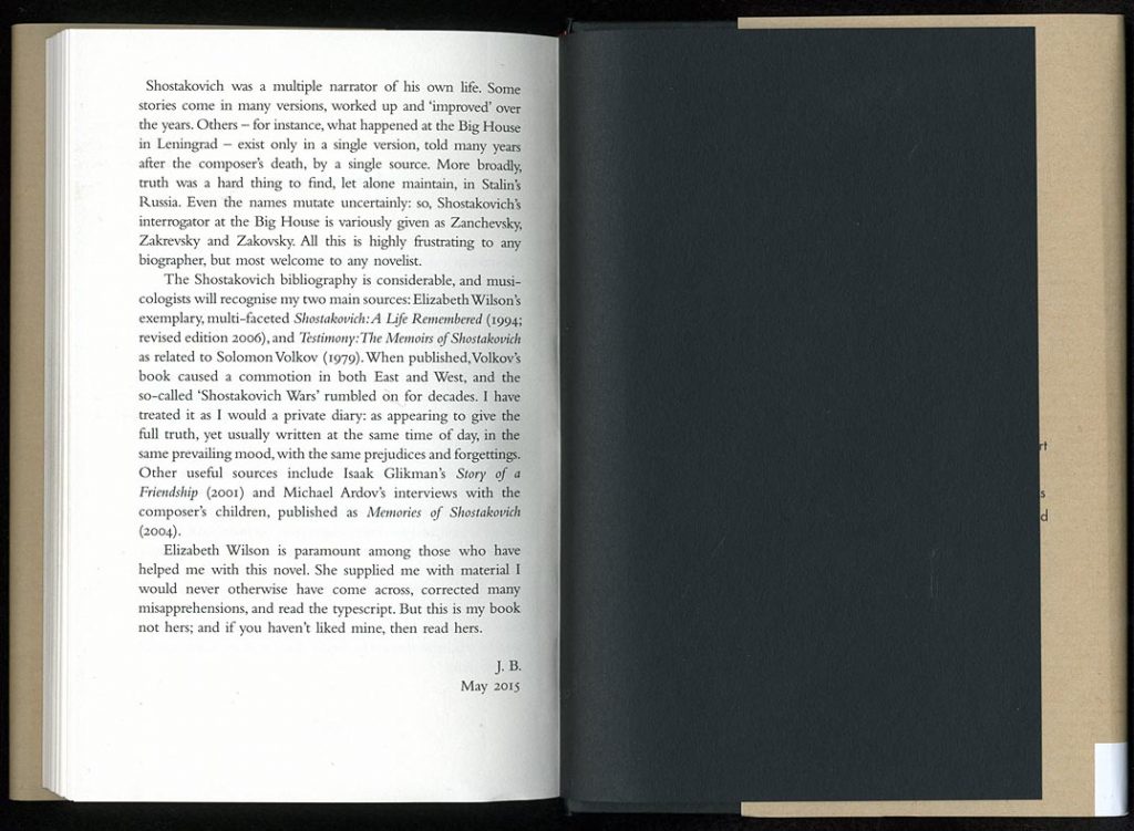
Julian Barnes’s latest novel was published in London a couple of weeks ago. This is mainly a note on its qualities as a physical object.1 The book is typical of present-day book production in the UK, and this is why it has been chosen for this commentary; although there are clear signs of an atttempt at something more ‘designed’: the sections of the book have been sewn (rather than cut and perfect-bound) and a headband has been applied at the top and bottom of the spine (it adds to appearances, but does nothing useful – except obscure the glue). The jacket illustration and design is pleasingly simple and tries (and inevitably fails – its materials and processes belong to a later, much plushier society) to summon up the aura of the Soviet culture that is the world of this novel. On the publisher’s website, one can find a conversation between Barnes and Suzanne Dean, the jacket designer.2 But they only talk about the jacket design.
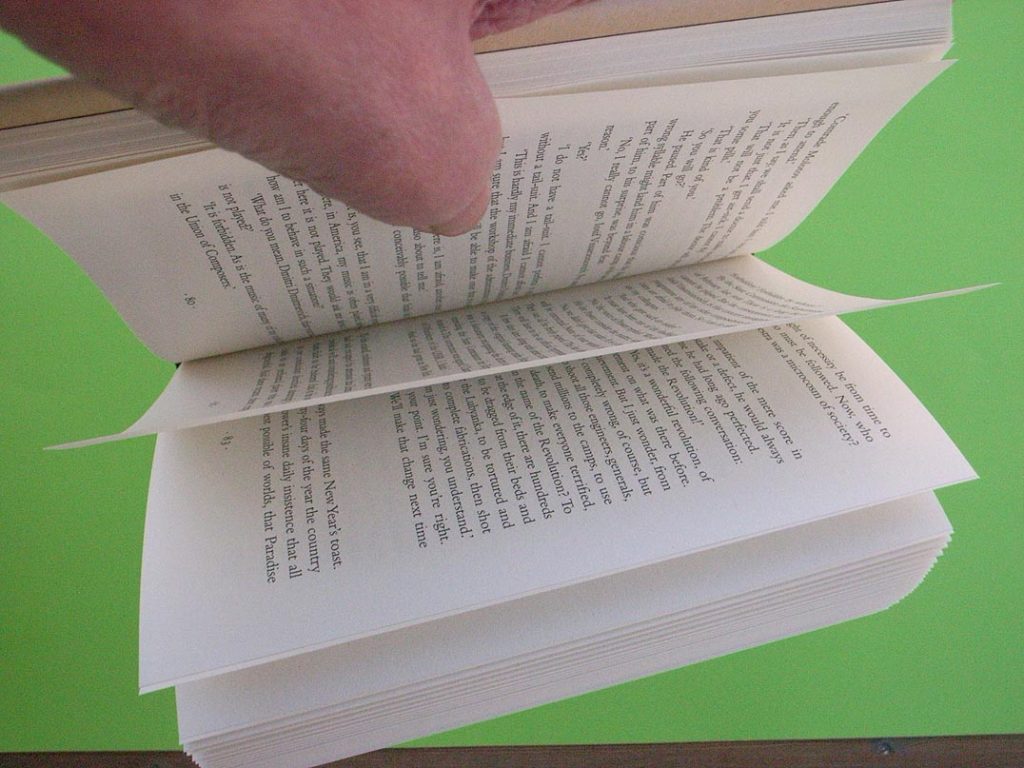
When you buy the book fresh from your local bookshop, it will work as in this movie.
Two things prevent the book from working properly.
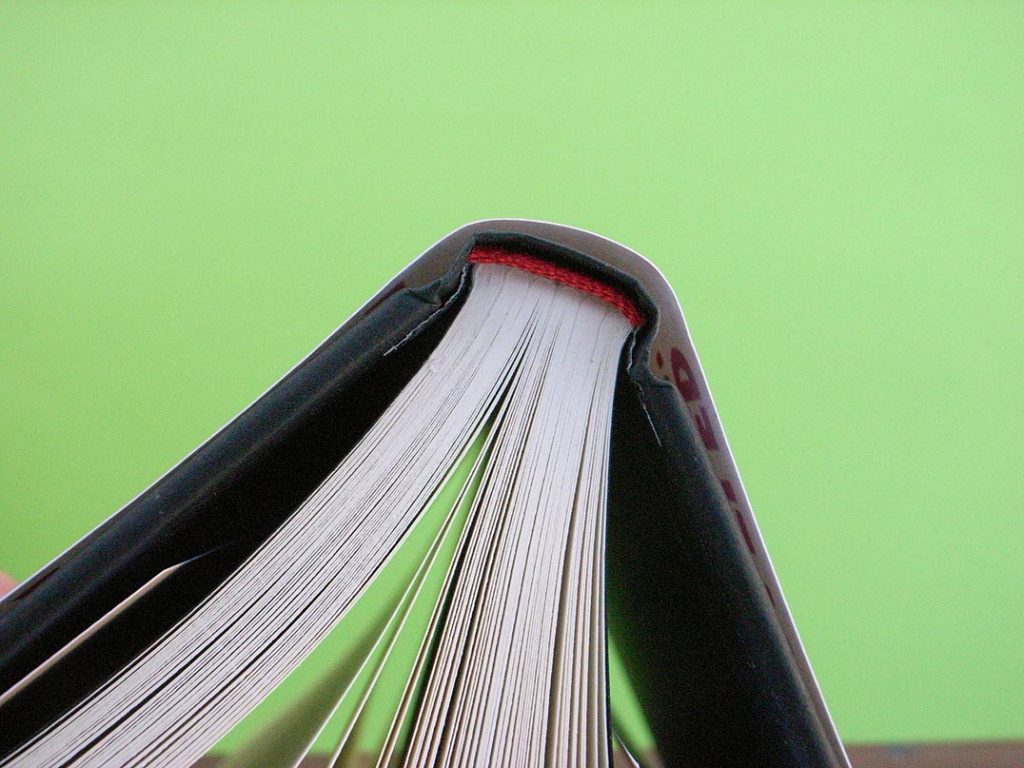
First: the sections are glued with polymer (rather than water-based) adhesive. This is why the book will not lie flat when first opened: only a water-based, cold-glue process will allow decent opening. Cold-glue is not now available in UK industrial book production, so if a book has to be produced in the UK, then this superior process is simply not available to a production manager.
Second: the grain of the paper runs horizontally, rather than vertically and parallel to the spine. This means that the pages tend to curl in on each other. In this book one sees a curious phenomenon: alternate openings draw together, as if the edges of the pages had not yet been cut. Even if the glueing had been better, the properties of pages made this way would spoil easy functioning.
Paper direction is an elementary and fundamental given of book production, and a printer might well be insulted if asked to check that the grain will be going the right way. Wrong paper direction is becoming a commonplace in the production of British literature.
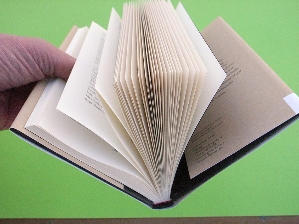
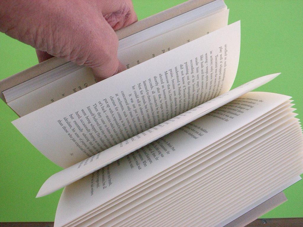
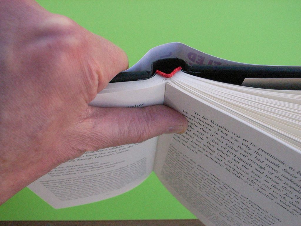
So the only way to get such a book to open and stay more or less flat is to take it in two hands and crack it open, as in this movie.
The text pages
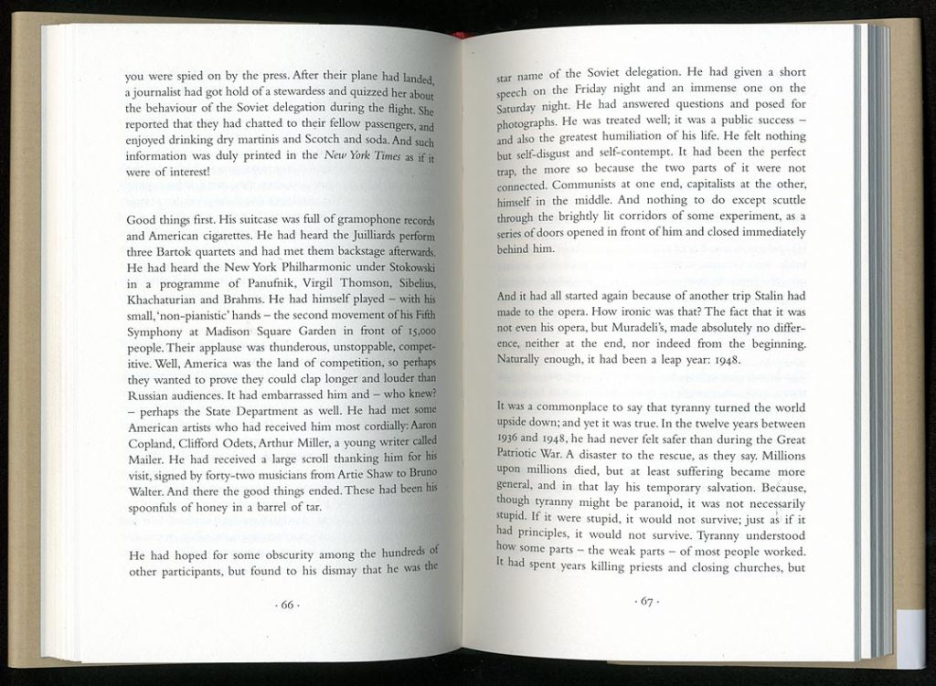
The setting of the text is conventional. The typeface used is an ungainly and thin digital Bembo, which seems to have become the British national letter. (For example, it is the typeface of the National Gallery in London, now even cut into the front of the building in Trafalgar Square, as James Mosley described.) Not many words are broken, giving lines with large word spaces. This is all unremarkable.
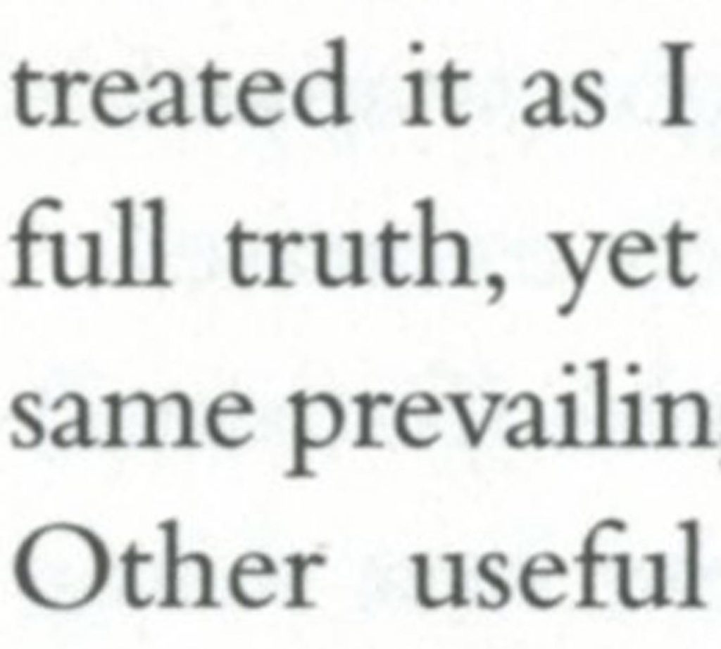
Top: detail of the digital Bembo used in ‘The noise of time’. Below: detail of Monotype Bembo, printed letterpress (Nicolas Barker, ‘Stanley Morison’, London: Macmillan, 1972)
But there is some trouble right at the end: the last page of the book is filled with text (polite and refined books leave that page empty).
This is the second page of the author’s note. There is no page number on this page – as if the book’s makers knew that having text there should be avoided. Turning back, one sees that there was space to start the author’s note on page 182, and let the last page of text be 183.
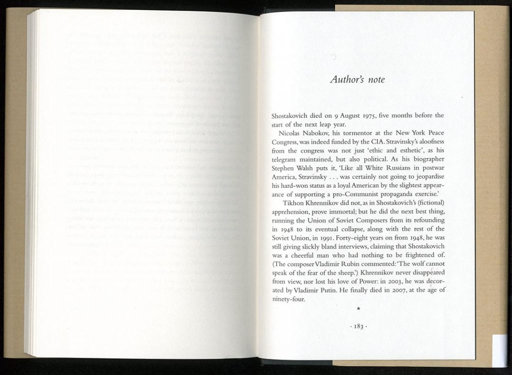
This would have contradicted the ‘start sections on a right-hand-page’ rule. But I think breaking that rule would have been preferable, especially as page 181 is empty, and provides sufficient pause before this appended text.
A limited edition
One can also note that, in the case of this work, there was made a ‘special limited First Edition … signed by the author before publication … comprising 100 copies only, printed on Logan Book Weave 150gsm paper. Numbers 1 to 75 are quarter-bound in Harmatan Yellow 30 goatskin leather with Atlantic Cloth sides …’ (and so on). Copies of the full-leather book cost £350, while the quarter-leather books sell for £175. The books of this edition would have been bound by hand, so presumably they use cold glue and thus open well. Both the full-leather books and the quarter-leather ones have now all been sold.
It is hard not to see this as a mirror of the wealth-unequal society of Britain: luxury goods for the rich, and poor quality for the rest.
Notes
1 This is part of an occasional series on present-day book production: its ills and its successes. See also here, here, here, here, here, here, here, here, here, and here.
Thanks to RR for the tip for this latest episode.
2 In the conversation between author and jacket designer, much is made of the brown paper of the cover, intended to summon up Soviet culture. But the paper of the jacket is white: the brown colour of parts of it is achieved through four-colour printing. The black and red displayed type is slightly raised and slightly glossy; this is achieved through hot foil printing – a world away from Soviet culture.
Robin Kinross