Peter was there in Stafford as a constant point of reference for me for about thirty years. I remember making what seemed like a pilgrimage from Reading to Stafford, in 1977, to meet him for the first time, and the others around him in the group that made and ran the typography course at the College of Art and Design. Before this, as an undergraduate in the early 1970s, I knew about him as a co-writer of a fundamental article in the journal Visible Language (‘Experiments with unjustified text’), as a presence in the thinking behind our course at Reading, and as one of the people on the network that I had begun to discover – of designers such as Anthony Froshaug, Norman Potter, Ernest Hoch. They were intellectual and practical father figures, who were all apparently ageless in their immediate democratic engagement with anyone: serious (and often very funny), dissenting and leftist, disseminating.
I found copies of the Stafford publications, and valued especially the two issues of Design Dialogue that were edited by students there. The first of these, published in 1969, reprinted Anthony Froshaug’s canonical ‘Typography is a grid’, and included extracts from Norman Potter’s book What is a designer: both these writings would eventually re-emerge in and within Hyphen Press editions. When, in 1980, our edition of Norman Potter’s book was made, its cover was minimal: silver text on matt black card. I had borrowed the idea from one of the Stafford publications, and Norman suggested that we credit Peter for this inspiration.
Another ‘finding’ (a word that Norman Potter liked) of that time was a letter that Peter had written to The Guardian (29 June 1980), which I posted on the wall above my bed. This, with pin-holes in the corners, is now the first item in my file of his letters:
Sir, – Peter Jenkins’s case against the campaign for a nuclear-free Europe boils down to the assertion that Labour Party support for that policy would render the party ineffective.
Jenkins is totally out of touch with CND if he thinks we pin our hopes on a Labour government in this matter. Jenkins seems to be too preoccupied with lefties in the Labour Party to see that most of us no longer have faith in politicians to work effectively against preparations for war without a massive kick up the ass from the public in general.
Yours faithfully,
Peter Burnhill.
22 Wolverhampton Road,
Stafford.
In the 1980s and 1990s, I valued Peter’s conversation and support – mainly given in his letters, now beginning to constitute a thickish file – in engaging with the froth of ‘free-floating meaning’ and other such sports. Typography, for him, was a means of embodying and articulating meaning, by a considered ordering of the visible means. At the same time I became more aware of his work as an artist: drawing and painting in the British tradition that looked to Cézanne, and would include Walter Sickert and later painters. I remember him coming to London to see exhibitions by Lucian Freud: eager to know the latest news of Freud’s production. I saw some of his own paintings and prints, and began to see better what else he was, as well as a strong and severe theorist of typography.
The process of publishing his book, the working title of which was ’Griffo’s grid’ but which we eventually called Type spaces, was heralded for me in April 1995, when Peter wrote asking why it was necessary to measure type size. This was a photocopied typewritten statement (I gathered he had sent it to a number of colleagues), with amendments in biro handwriting. The concerns of this statement were familiar from my upbringing at Reading, shaped by the ideas of Ernest Hoch and Maurice Goldring: why try to measure the fictitious ‘body size’ of type; why not measure something visible and which it might actually be useful to know. ‘In particular, the ability to refer to the visual size of the x-height ribbon of the character set is important.’ At the bottom he added this: ‘Would you agree with this? If so, could you tell me why it is necessary to have a “foreign” measurement at all in print?’
In reply, I wrote to him about trying to measure x-heights, and the way in which anyone working in a page-layout program could find an x-height measurement (‘2.75 mm’ was my example), even if that isn’t what the software makers imagine you want to do. I wasn’t sure what he meant by ‘foreign’ in this context. He responded by explaining: ‘I would rather think of x-height, not in terms of measuring it, but its value as a basic unit for stepping-out the void, together with sub-modular units based on halving. Then, I can establish the relationship between x.ht and line-to-line in a rational way; that is, in a way which allows line-to-line to change proportionately to change in x.ht.’ He explained further, and lost me more than a bit. I appreciated ‘stepping-out the void’ as a wonderfully vivid and suggestive phrase, which seems incidentally to act out Peter’s own process of thinking further. Here and in later letters I began to see that he was thinking beyond the essential but also narrow concerns of Hoch and Goldring (for example in the article ‘Type size: a system of dimensional references’ (1966), which we reprinted at the back of Type spaces).
After this we had a fairly regular correspondence. I was working on the Froshaug book, and brought Peter into it – both literally (an exchange of letters between him and Anthony is included) and by showing him bits I was working on. It’s clear that Froshaug had been fundamental for him in his thinking about typography. I can perhaps project from my own experience and say that for Peter, too, the encounter with Froshaug’s work was as if someone had turned on a light: suddenly it all looked clearer. I still remember a letter from Peter in Visible Language (vol. 5, no. 4, 1971, p. 376) protesting at the journal’s change of name from The Journal of Typographic Research:
To the Editor:
There is an important sense in which your change of title is a retrograde step: I refer to the meaning carried in the word typography which is not present in the words visible language. This meaning is set out in an article by the seer and teacher Anthony Froshaug (‘Typography is a grid’, The Designer, January 1967; and Design Dialogue 1, Stafford, 1969), which begins:
‘To mention both typographic, and, in the same breath/sentence, grids, is strictly tautologous. The word typography means to write/print using standard elements; to use standard elements implies some modular relationship between such elements; since such relationship is two-dimensional, it implies the determination of dimensions which are both horizontal and vertical.’
The words visible language carry no sense of the concept ‘co-ordination’, which is basic to communication in any form; nor of the technology involved in the control of the things which are required to be co-ordinated. Typography is loaded with both ideas.
Modern linguistics holds that meaning in language is a condition of the position of a word in a phrase. We can extend this by saying that in typography, meaning is a condition of the position of an event in space.
I may arrange:
the name of my dog is rover.
I may not arrange:
thena meof m y d ogisr o v e r.
Position – order in space – matters. When concern for position is relaxed, language becomes loose at the joints, disintegrates. To position implies the ability to position which, in typography, is a condition of the units of measurement built into the machines we use to assemble meaningless things meaningfully. It follows that interest in typography will be compounded of concern shared equally between the structure and use of language and the structure and use of machines. Simply looking at pages of text will reveal nothing of this relationship.
Peter Burnhill
Design Department, Stafford College of Art and Design.
22 Wolverhampton Road, Stafford, England
In a letter dated ‘Mid Feb 96.’ he sent me photocopies of pages from his Aldine edition of Seneca (1522), which he had bought from a second-hand bookshop in Stafford in 1957. I had sent him a copy of Anthony Froshaug’s Watford booklet of 1966 (Typography 1945/1965), which is set in two columns of justified lines, for reasons that had always puzzled me, since unjustified setting was almost always Anthony’s preferred way. (Alan Kitching, working with Anthony on the job, had told me this was a mistake: the trade typesetter they used had justified the text despite their instructions and they had noticed it too late.) Peter was now beginning to use his Seneca as a tool for thinking and discovery: ‘I have my copy of Manutius’ ‘Senica’ [thus!] open at the index and errata pages. Justification in this context seems necessary otherwise inter-column space would wriggle about like a snake.’
Now, cutting short quite a long and interrupted story, all these concerns – of type measurement, and going beyond measurement, and the structured use of space – got investigated and summarized in Peter’s book Type spaces. Finished copies arrived in London in October 2003, four years or so after we began to talk seriously about doing it. Despite my role as editor, indexer, co-designer (with Peter), image-scanner and DTPer of the book, I find it hard to summarize. It is in itself a sort of summary of Peter’s thinking about typography. Perhaps, as he liked to remember, it started in his elementary school in the 1930s, being taught to write by his teacher Mr Blunt. The Aldine ‘control system’ was ‘not unlike the width of the scribe’s square-ended pen which not only determined stroke-width but was probably used to pace-out the distance between writing lines (line-increments) and the dimension of such a basic parameter in the construction of the alphabet as the x-height.’ (Type spaces, p. 124)
The investigation made in Type spaces finds that the Aldine printing (the work of Aldus Manutius and his punchcutter Francesco Griffo, and their successors) used a set of exact ratios: line-increment (body size), x-height, and cap-height were each in simple proportion to the other. For the Greek type used in the octavo classics series, it went as follows:
line increment: 12 units
x-height: 4 units
cap-height: 6 units
This system applied through the design of lines and whole pages of these books: the ‘void’ was ‘stepped out’ with the module of line-increment dimension, to give order to the meaning of the text. The underlying harmony of the modular system could be, Peter suggested, the reason for Aldine pages singing so nicely to us, still. We did our best to match this system in making the pages of Type spaces. (He also observed that other books that I had worked on showed approximate Aldine ratios, but arrived at intuitively.)
The brilliant idea that provides the motor of Peter’s investigation is to look at, and measure, the risen spaces in Aldine printing. Here he was, I imagine, using the demonstration offered in Anthony Froshaug’s booklet Typographic norms (1964): that the spaces used in metal typography are vital parts of the system by which pages of text are constructed. Looking at these disregarded bits of evidence, and taking them very seriously, one can construct a theory of how Aldine printing operated typographically, and even – Peter wanted to suggest – structurally/syntactically. The talismanic qualities of Chomsky’s book Syntactic structures (1957) are part of this unholy, certainly un-Fine-Printing mixture. Some dashes of labour history were added in to the mix. The book is written and illustrated with Peter’s determinedly reasoning intelligence.
Type spaces is an exploration and a provocation, appreciated by those outside the field of Aldine scholarship, and so far ignored by or not yet even reaching the people within that field. Peter was always ready for a debate, and would fire off a letter to anyone who might be interested. But he was 80 when the book appeared and not in good health. He was out on a limb in Stafford, outwith the metropolis and the academy. But then that always had been his position, and it helped to shape what he did. It was part of his strength.
I find it hard to describe Peter much further. One of his old students once said to me, ’he’s a sweetie’, and with a jolt I saw that was true. I hadn’t quite noticed it, caught up in so much endless typography with him. I had always thought he was the most modest, most self-effacing man, and would have used that as the first description to someone who didn’t know him. Now that he is no longer there in Stafford at the end of the phone (always picked up with just ‘Burnhill’), I will especially remember him through the books he passed on to me – sometimes as seasonal presents, or just because he was weeding out his library and thought I would be interested. They are modest, well-worn, but each one is an extremely potent object: Syntactic structures by Chomsky (in a reprint of 1971, much annotated), Shelley’s socialism: two lectures by Edward Aveling and Eleanor Marx Aveling (published by Leslie Preger, Manchester, 1947; preface by Frank Allaun, later to become a stallwart left-Labour MP and CND campaigner), William Morris and the early days of the socialist movement by J. Bruce Glaser (published by Longmans Green, 1921, but this edition has a wrapper with ‘ILP Labour Literature Department, 308 Gray’s Inn Road, London’), and two copies of Mayakovsky and his poetry by Herbert Marshall (Pilot Press, London, 1942; I always wondered if a young Anthony Froshaug had had something to do with the cover design). This Mayakovsky book he gave me twice over on different occasions (and I already had a copy of my own). One he inscribed: ‘For Robin / May Day 1996 / Peter’. The other has just ‘for Robin’, and above this ‘Burnhill / Calcutta / 1944’.
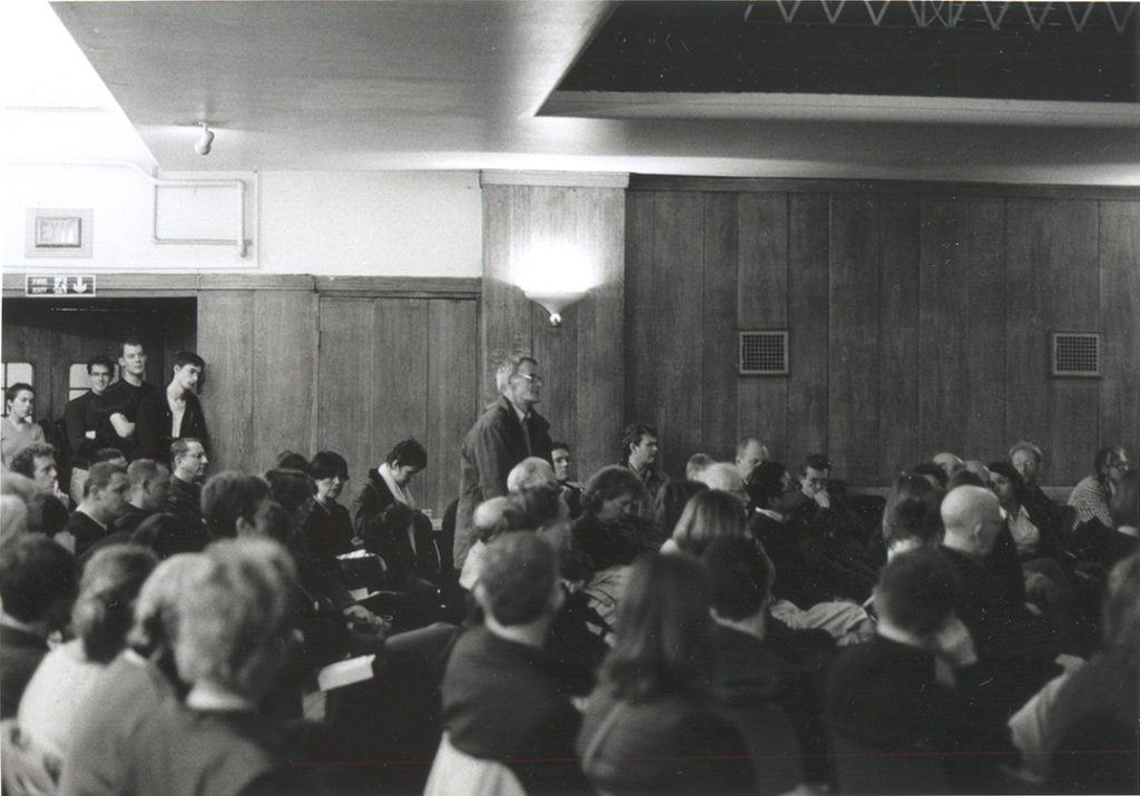
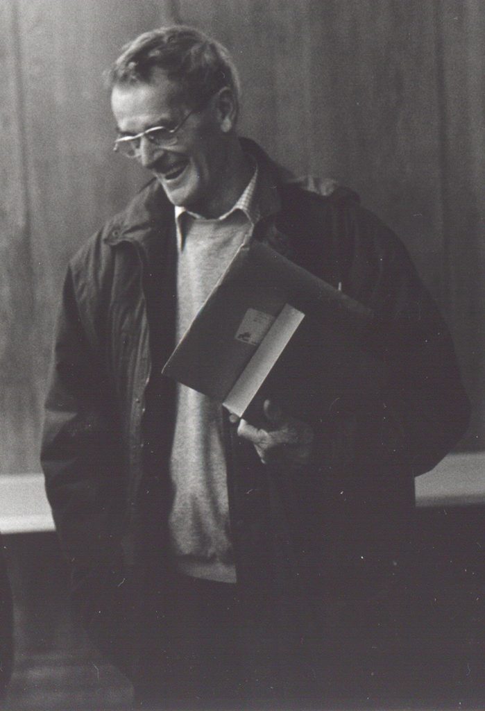
Peter at the meeting to launch the Froshaug book, Conway Hall, London, October 2000.
After the statements from the platform, Peter was the first to speak from the audience. He began: ‘The last time I was here was in 194?, at a meeting addressed by Harry Pollitt …’ (Pollitt was the long-running General Secretary of the Communist Party of Great Britain.)
Robin Kinross
—————
Photos by Françoise Berserik
Paul Stiff’s obituary of Peter is (in its fullest form) here and, as published in The Guardian, here.