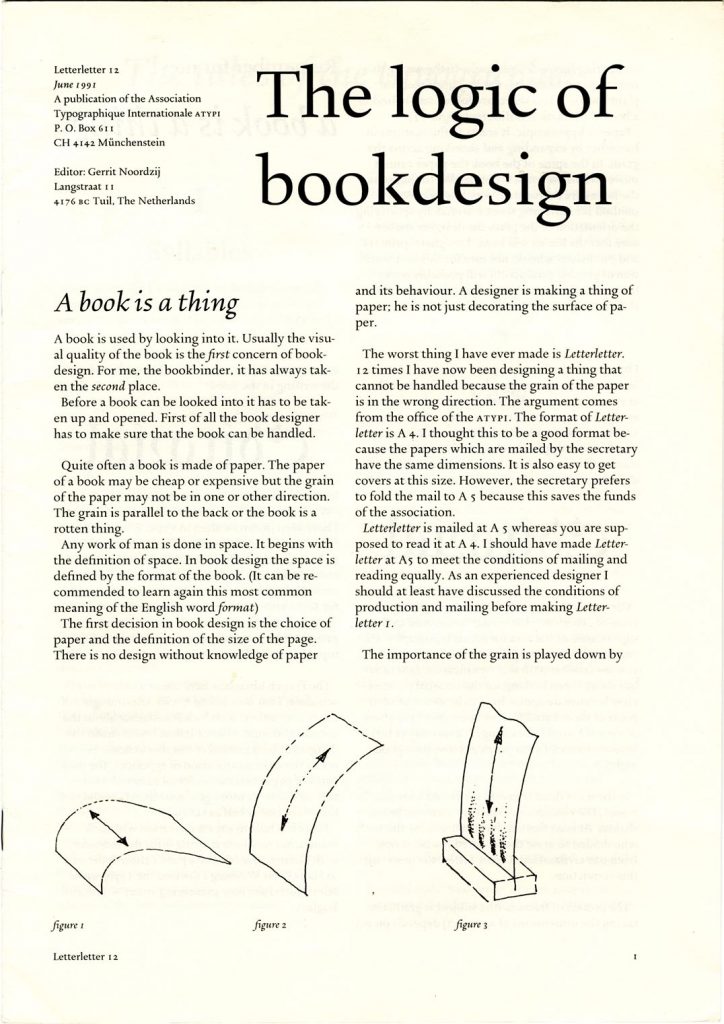
Gerrit died a few weeks ago, aged 90. Even more than most human beings, he was complex. He was simple, sophisticated, dogmatic, open, authoritative, anti-authoritarian, inquiring, certain, proud, humble, unpretentious, masterly, amateur. I did not know him well, but did encounter and engage with him and his work over many years.
Reading, 1970s
As a student at Reading I heard about Gerrit from Françoise Berserik, who in 1972–3 had joined our year-group as an ‘ad hoc’ student. Finishing at the art school at Arnhem and wanting a post-diploma year abroad, she came to the Typography Unit at Reading, as it was then still named. It was a breakaway from the university’s Fine Art department: we typographers pursued design for everyday life, without aesthetic nonsense. It was Gerrit who had suggested to Françoise that she go to Reading. He was a teaching colleague of her father, the artist Hermanus Berserik, at the KABK (Royal Academy of Art) in The Hague. Among her stories: Gerrit had engraved some words on one of the Berserik family’s wine glasses. In my memory of the story, he did this by way of demonstration.
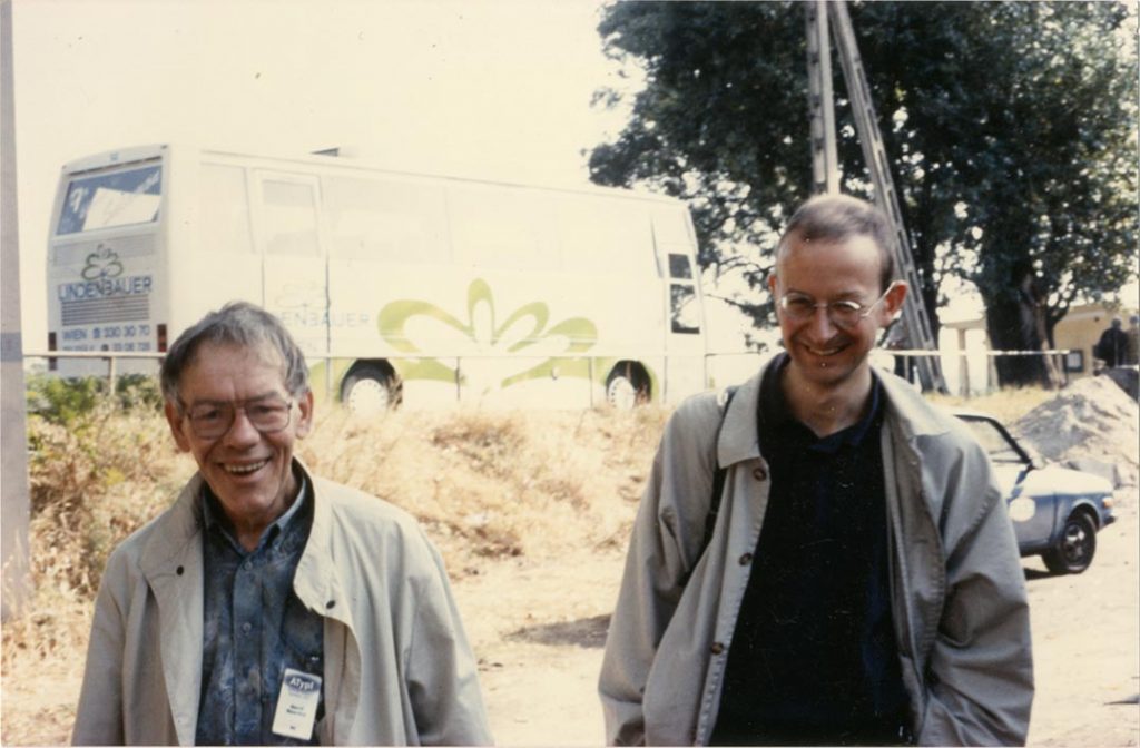
In July 1976 Reading was the host for ATypI’s ‘Working seminar on the teaching of letterforms’. By then a postgraduate student, I was able to take part in this meeting as an assistant to the class given by André Gürtler and Christian Mengelt (tidying the room, wiping the blackboard, and making sure there were enough working materials for the class members). This ATypI seminar was a foundational event for several of us, who were thrown in at once to the small world of international typography. I had some exchanges with guiding figures, including Jost Hochuli and Nicolete Gray. I remember Jock Kinneir’s lecture, and especially him arguing for indentation of turn-over lines on road-signs: against the formalist wish to align everything on the left, indentation helps meaning. Gerrit wasn’t giving any classes, but he was there. In a brief conversation, I told him that I was doing research on the work of Otto and Marie Neurath. He asked me the right question: what did I hope to find in this work from Vienna in the 1920s?
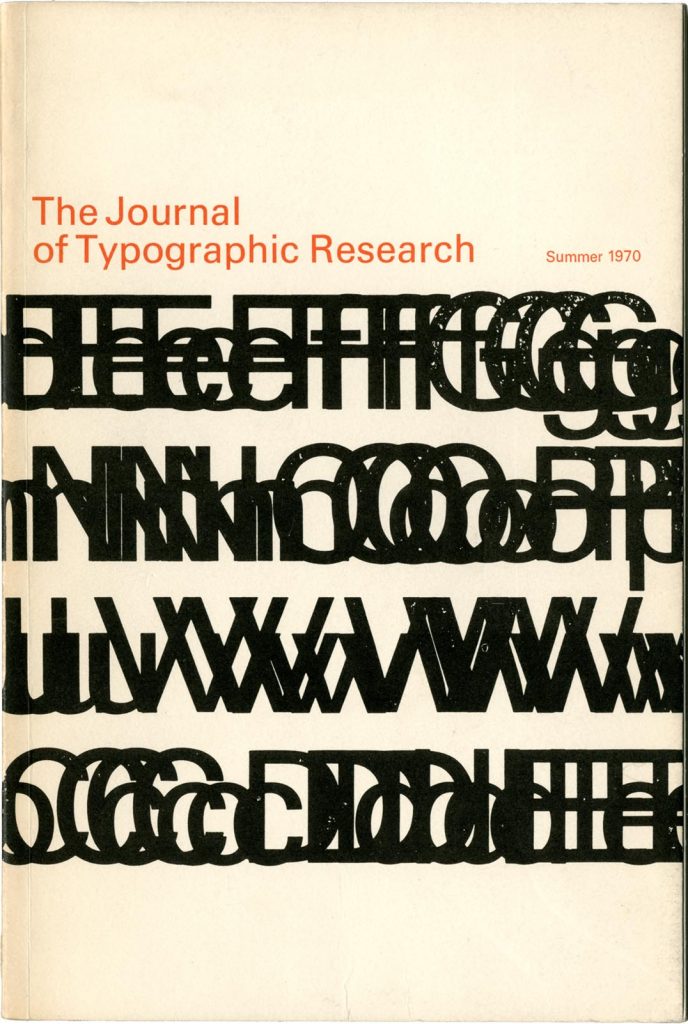
Journal of Typographic Research, vol. 4, no. 3, 1970 (229 × 152 mm).
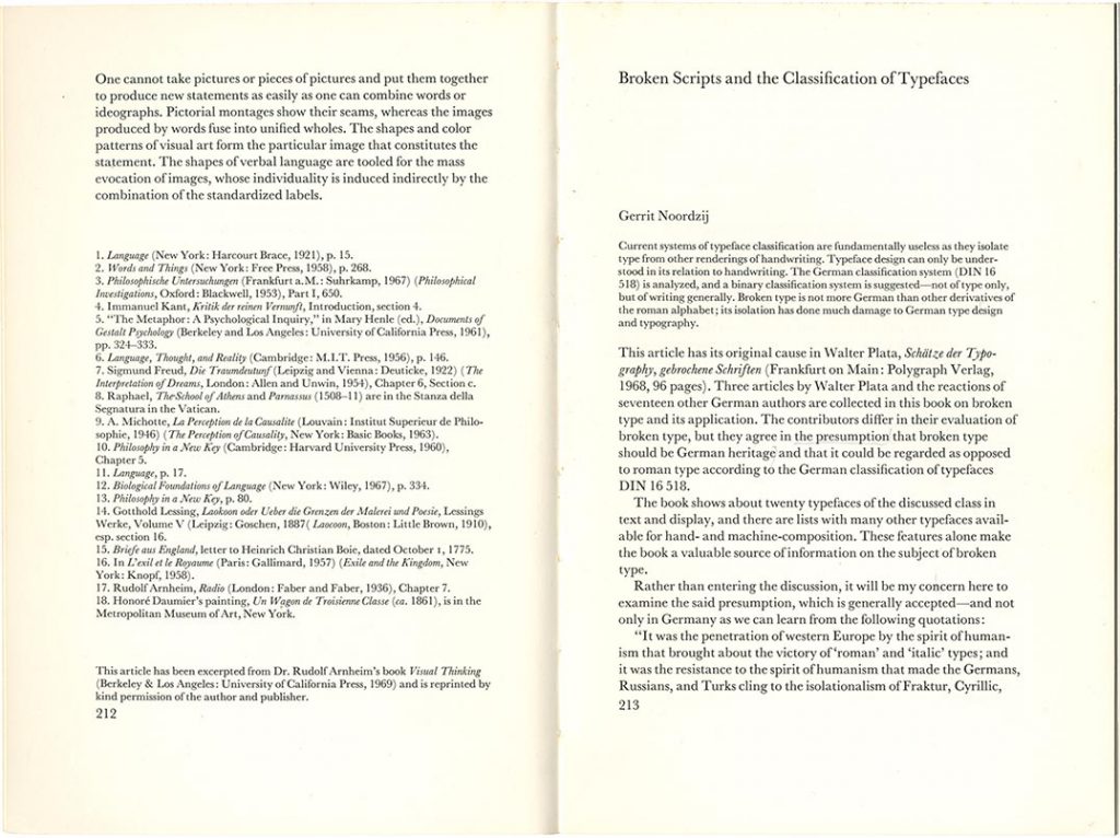
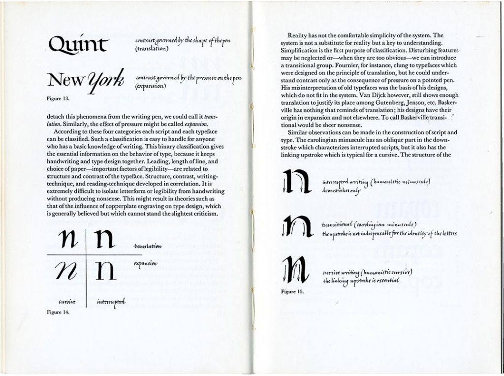
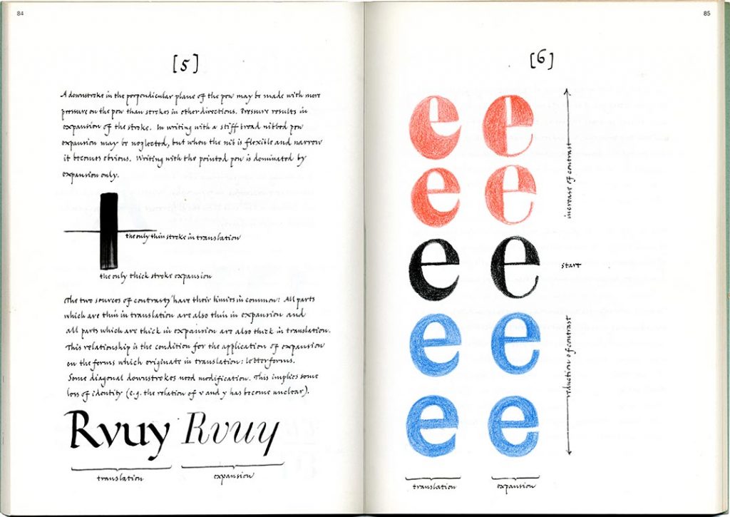
In these student years at Reading, some of us could not get enough typography. One of our extra-curricular efforts, in which Paul Stiff and I were the main movers, was a seminar discussion of writings on the subject. We gave some sessions to Gerrit’s first published discussion, ‘Broken scripts and the classification of typefaces’, published in the Journal of Typographic Research in 1970. (On a visit to Reading, the journal’s editor, Merald Wrolstad, had given any student who wanted it a set of back numbers.) Setting out as a book review, the essay becomes an exposition of Gerrit’s theory of writing and of letters, and we are introduced to the first published version of his binary divisions: translation (writing with a broad-nibbed pen) / expansion (writing with a flexing nib), and cursive (the pen is not lifted from the writing surface; in his English-language expositions this was then changed to running, from the Dutch lopend) / interrupted (the pen is lifted). As Gerrit would explain, this scheme might not be exhaustive, and one could produce and observe letters that mixed these categories. But this is a secure framework with which to generate letters and letterforms. It gives any student a foundation. It is a way of thinking that is on the side of the designer: it will help us in production. And, incidentally it will demolish after-the-event historians who will generate endless historical or formal or historical-formal categories to describe letters. Gerrit loved to oppose Stanley Morison and his acolytes, as being not much more than antiquarian collectors. (From another direction, but with the same intention, Anthony Froshaug suggested that Morison was the Stanley Gibbons of typography.)
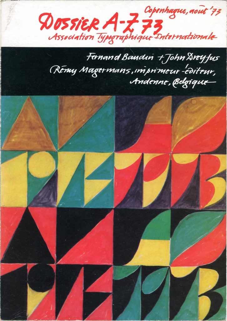
Fernand Baudin & John Dreyfus (ed.), Dossier A–Z, Andenne: Rémy Magermans, 1973 (297 × 210 mm).
Gerrit’s second published exposition of these ideas came in ATypI’s Dossier A–Z, edited primarily by Fernand Baudin and published in 1973. Contributors were asked to provide their own artwork for the pages, and they included a group of us Reading students with a statement on the value of studying historic letterforms. (We were democratically given this space by our teacher Michael Twyman: this was the 1970s.) Gerrit wrote out the text and drew diagrams for his own pages. This was perhaps the first instance of what became his method of publication, in which he wrote down the words himself; later, with his personal computers, he would be the compositor.
As the small book Gewone letters: Gerrit’s early models has shown, Gerrit developed these ideas and these ways of representing them in his teaching at the KABK, perhaps already in the 1960s.1 His passage from leaving secondary school, in 1948 (aged about 17), confirms my sense of him as a hand-worker, and a thinker who largely escaped organized education to teach himself through reading. After school he worked for a firm of bookbinders. Then after compulsory military service (1952–4) he practised as a book typographer, including a spell of work for the great firm of Querido. He continued to design books for the rest of his life. These early years of practice provided his formation as a designer. In 1960 he was invited to teach typography at the KABK and ten years later he took over the teaching of writing, type, and letterforms there. His classes became the laboratory for his theoretical practice.
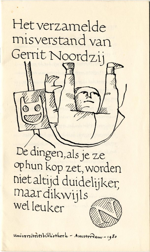
Het verzamelde misverstand van Gerrit Noordzij, Amsterdam: Universiteitsbibliotheek, 1980 (210 x 125 mm). ‘The collected misunderstandings of Gerrit Noordzij: things that, when you put them on their heads, don’t always become clearer, but often become much nicer’: a 24-page pamphlet of miscellaneous writings, presumably published on the occasion of an exhibition at the UB.
ATypI, 1990s
The ATypI meeting at Oxford in 1990 – branded ‘Type 90’ by its deviser Roger Black – was another epic event for many of us. I went as a reporter for Eye magazine, but became once again drawn into the world of international typography, now just beginning to explode through the young type companies (Adobe, Bitstream, Elsner+Flake, Font Bureau) and the first signs of independent designers selling their own fonts. Following Type 90 I made the effort to join ATypI as a member (one had to make a bank transfer in Swiss francs to the secretariat in Münchenstein). For me this was primarily a way of subscribing to Gerrit’s Letterletter, the bulletin of his thoughts that came free in the post to ATypI members.
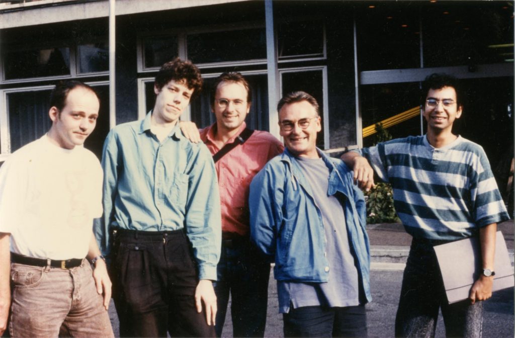
Typographers in Budapest, 1992. Above: Peter Verheul, Just van Rossum, Martin Majoor, Paul Stiff, Fred Smeijers. Below: GN, RK. (Photographer: unknown.)
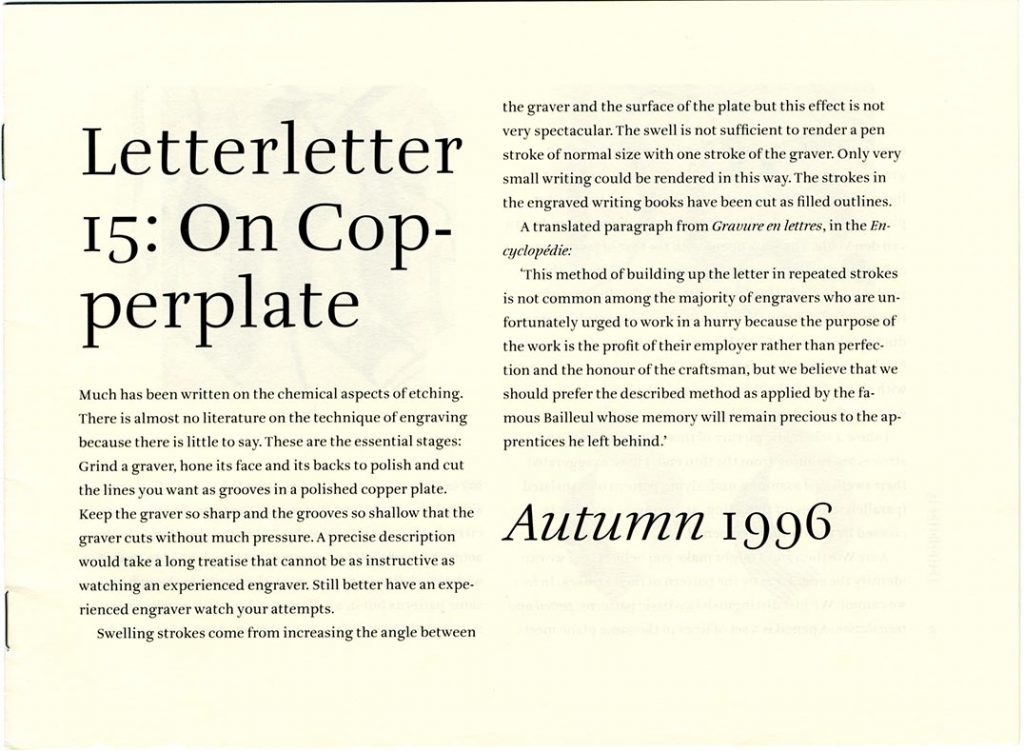
Following a week-long trip to the Netherlands in 1991, I began to get to know the Dutch typographers and type designers. Then in 1992, Paul Stiff and I were among those attending another ATypI education seminar, this time at Budapest. For Paul especially this was memorable for his conversations with Gerrit and Wilme Noordzij. In July 1993, following their Budapest discussions, Peter Matthias Noordzij, then beginning to develop his Enschedé Font Foundry, wrote to Paul and myself suggesting that we might take over the editorship of Letterletter, which was now being published by TEFF. Peter Matthias wanted to widen out the bulletin, with contributions from others. Until then Letterletter had been almost entirely written by Gerrit, with others – primarily Nicolete Gray and Fernand Baudin – occasionally sending communications for its pages; these external contributions were qualified by introductory remarks by the editor.
Paul and I accepted this challenge. The agreement to work together was made in Antwerp at the ATypI meeting of September 1993. Then followed more than a year’s worth of letters and faxes in which we worked to generate contributions and discussed matters with Gerrit and Matthias. Paul wrote a critique of Gerrit’s ideas (‘Writing and typography: what’s the difference?’), and Fred Smeijers wrote a piece on his subject of punchcutting (a topic that Gerrit never seriously engaged with). We also read and commented on a draft of Gerrit’s essay on mannerism. Half-way through this process, Gerrit confessed: ‘I used to edit Letterletter in the make-up. I filled the issue by shrinking or expanding articles, by inventing new things and inserting pictures. I do not know how I should do this without frustrating the editors.’ (letter to Paul Stiff, 22 July 1994) Finally in February 1995, with the new issue apparently stuck, Paul and I decided to stop trying to be editors; we preferred to keep the friendship with Gerrit. We accepted what we had always known but not wanted to admit: that this was Gerrit’s publication, one that he had to do all himself. The ‘mannerist’ essay (no. 14) was then published, and one further issue of Letterletter was made along the established lines before the bulletin ceased to appear.
Following this encounter, I wrote and published some discussion of Gerrit’s work. This was delivered as a lecture at a conference in New York in April 1997 and then published in Typography papers, no. 2. I used his theory of letters as a counter to the then current ideas of postmodernism in type and typography, suggesting that the Noordzijan analysis could suggest some norms – those of writing – and some material basis for judging letters and type. The discussion that Paul had written as a contribution to Letterletter was partly incorporated in his ‘Spaces and difference in typography’, published in Typography papers, no. 4.
Letterletter (297 × 210 mm, then 165 × 225 mm). The bulletin incidentally documented the changes in the technics of text composition in those times: handwritten (nos. 1–4, 1984–6), Monotype Lasercomp (no. 5, 1987), bitmapped fonts generated from a PC, with handwriting (no. 6, 1987; no. 7, 1988), outline fonts generated from a PC (no. 9, 1988, and following).
The stroke, 2000s
In June 1999 I emailed Gerrit to ask him about publishing an English edition of De streek. In 1991 I had bought a copy of the second publication of the book, soon after it had come out. I had found this, together with a fresh collection of his writings, De staart van de kat, in Valeton & Henstra in Amsterdam (the specialist graphic/art/photography bookshop that preceded the longer lasting graphic specialist shop of Nijhoff & Lee). De streek appealed to me in every way, and, now learning some Dutch, I was able to work my way through its text.
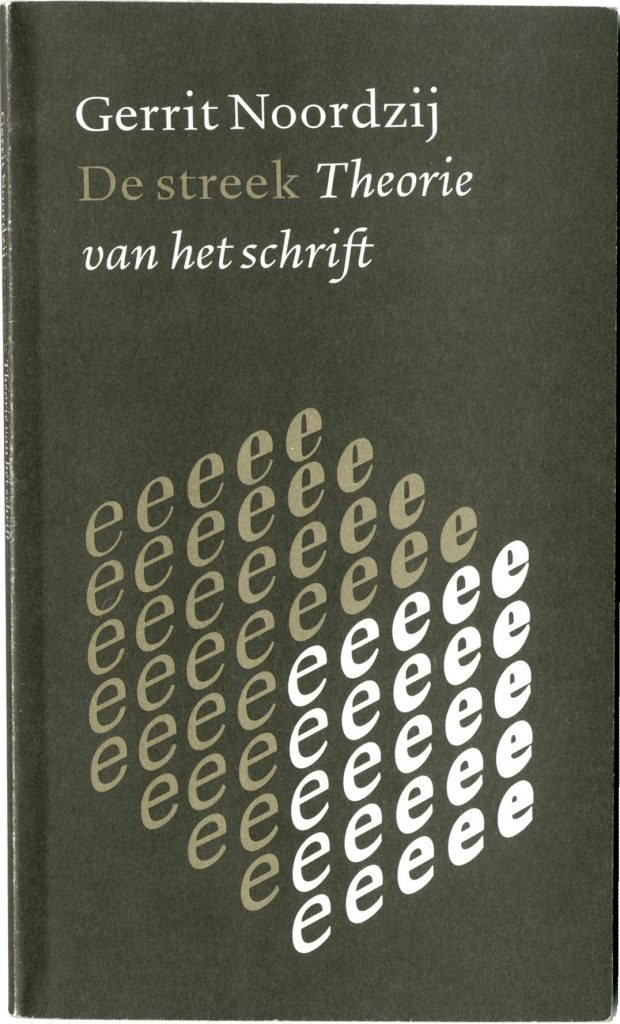
De streek: theorie van het schrift, Leersum: ICS Nederland, 1991 (210 × 125 mm).
When I began to think of a paperback series for Hyphen Press, which would issue or reissue works that had established themselves, De streek provided a model. This loose series, designed by Françoise Berserik in dialogue with me, was started in 2002 with the fourth edition of Norman Potter’s What is a designer. We gave it the format of De streek: 210 × 125 mm. There were other models in my mind, and when I showed the new Potter edition to a publisher friend, he said ‘so you are publishing Italian paperbacks!’ The slightly thin format of the Einaudi paperbacks was another inspiration.
Some years passed between this first approach to Gerrit about an English Streek and its realization as The stroke. I had been in email touch with Peter Enneson: Canadian and of Dutch family. Peter had become engaged in a dialogue with Gerrit about his ideas. This had led to Peter translating into English a sample (chapter 2) from De streek. This seemed to me to be a good basis for a translation of the whole work, though I wanted to stick to the published Dutch text rather than introduce modifications and developments, as Peter was tempted to do. The project of the English edition stalled – in 2000 I was busy especially with finishing my book on Anthony Froshaug.
But two Noordzij books were published in 2000. The Canadian publisher Hartley & Marks issued a fairly complete anthology of the Letterletter writings, with an introduction by Robert Bringhurst, evidently the inspirer of the edition. I didn’t take much notice of this publication until the moment, late in 2002, when it became the focus of an email list discussion. Convened by John Hudson in Canada and hosted by Letterror (Just van Rossum and Erik van Blokland) in the Netherlands, it arose out of the ATypI email list but admitted anyone who was interested. For several weeks we engaged in a quite intense debate: for and against, and with much ‘what does he mean with this?’ Occasionally the puzzle of meaning could be solved by checking against the original pages of Letterletter. For me this was a lesson in editorial competence and fidelity. Gerrit’s often cryptic and difficult words had sometimes been garbled when transposed into this book. The spelling mistake on the book’s spine (‘Gerrit Noordzig’) told a truth of this edition. As a contribution to the email discussion I compiled a bibliography of Gerrit’s writings (now here). The email debate came to a halt at the end of 2002, as if with a Christmas truce.
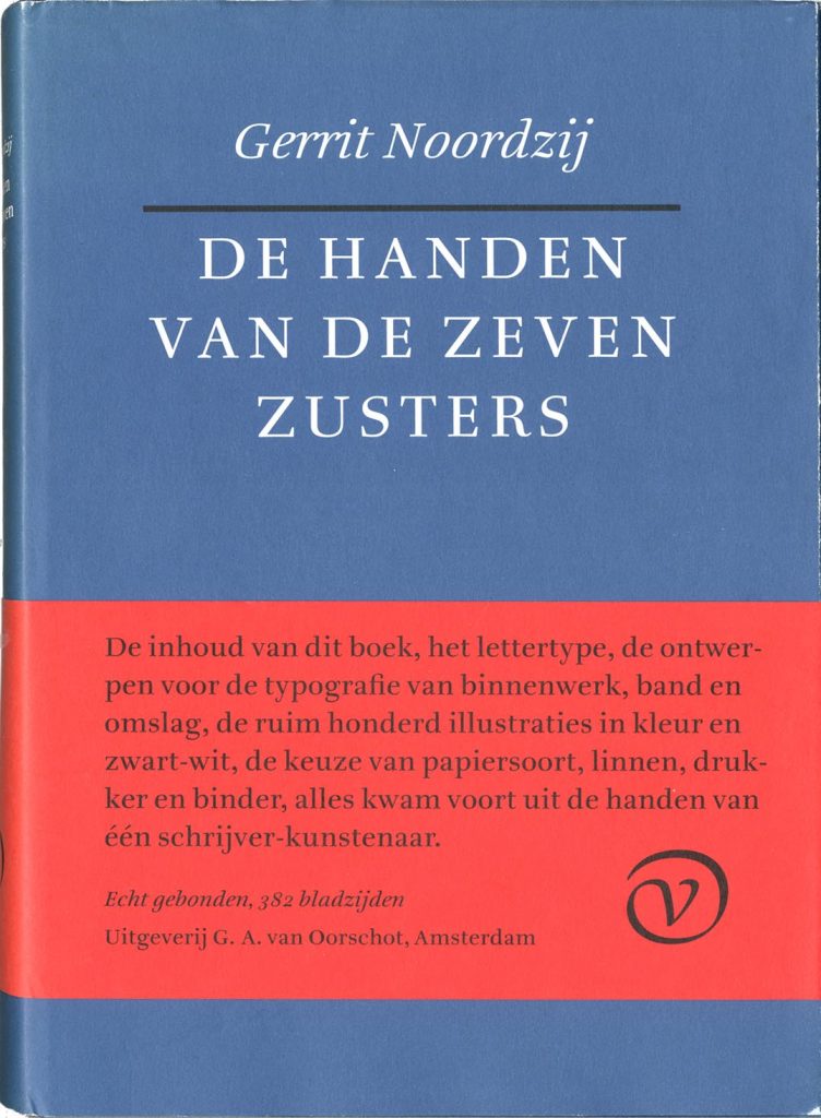
De handen van de zeven zusters, Amsterdam: Van Oorschot, 2000 (240 × 173 mm). The note on the belly-band reads: ‘The content of this book, the typeface, the design of the inside pages, band and jacket, the approximately one hundred illustrations, the choice of paper, binding cloth, printer and binder, all came from the hands of a writer-artist.’ The remarkably honest blurb on the back of this belly-band deserves to be read too.
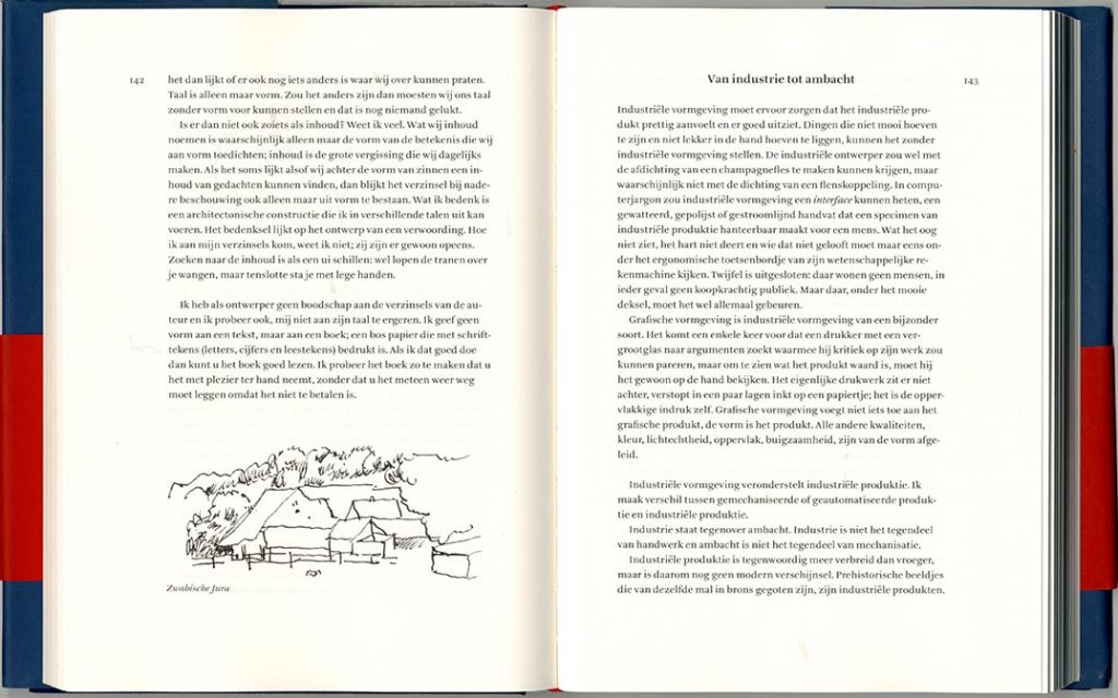
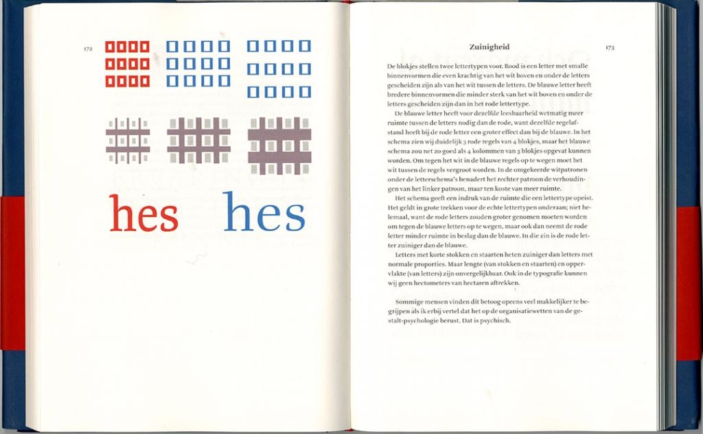
De handen van de zeven zusters, Gerrit’s magnum opus (certainly in the sense of size and weight [1050 g]), was also published in 2000, though it was presented at the KABK in February 2001 on a day of multiple celebrations, including also the opening of an exhibition of Gerrit’s teaching and the award of the Gerrit Noordzij prize to Fred Smeijers. For this last component I gave a laudatio (in Dutch!) for Fred. A few weeks later I went with Françoise to record an interview with Gerrit at his home in Hattem.2 The interview was as searching as I could make it, with me trying to press Gerrit on the development of his ideas. Later he apologized for not being very communicative, though he didn’t try to make up for it. One memory of this conversation: to check something, Gerrit took down a copy of Hartley & Marks’s Letterletter from his shelves. It seemed to be previously unopened. He said: ‘I suppose I’d better read it.’ For him it was always on to the next thing.
In November 2004, having absorbed the lessons of Hartley & Marks’s Letterletter, and with obvious continuing interest in a Noordzij publication, I picked up the idea of an English Streek . With intentional irony, I did this in a reply to an email that Gerrit had written me five years previously, on 7 October 1999. Agreements with author and translator were signed in March 2005. After quite a lengthy process of preparation, trying to improve and refine the translation, our edition was published at the end of 2005. Gerrit played almost no part in this process. But when the book was finished he acknowledged the result and congratulated our typesetter, Teus de Jong, for his work. I was pleased at this tribute, from one craft-worker to another.
Our edition of De streek has encouraged editions of the book to be made in several other languages. For some years I would get requests for permission to translate from these publishers. I always replied: good that you are interested, but you have to ask Gerrit Noordzij for this permission, and you have to translate from the Dutch text and not the English.
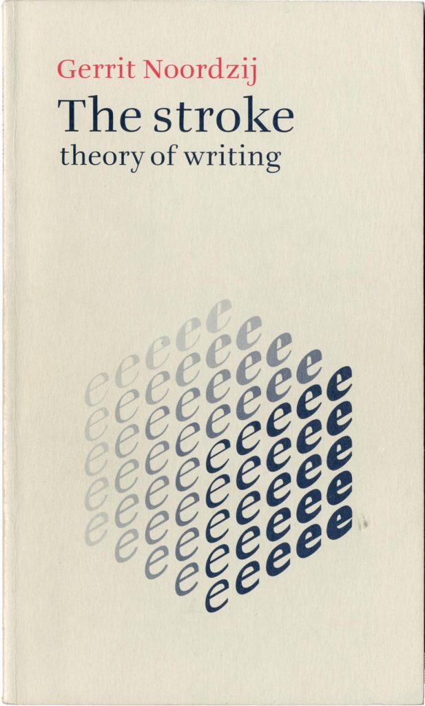
The stroke: theory of writing, London: Hyphen Press, 2005 (210 × 125 mm).
—————
I will draw these memories to a close with some more general reflections on Gerrit’s work.
He brought together sometimes matchless skill in hand-work and an apparently endless wish to express himself in words. The two dimensions supported and encouraged one another. I sometimes felt that those of us who were dazzled by the maker were too impressed by the philosopher. Occasionally voices from outside typography might be heard, subjecting this philosopher to reasonable scrutiny. One of these was Roland Reuß – a classically trained philologist and a self-taught, very competent typographer – who made a few incisive contributions to the Letterletter email debates. Another was the book-critic and -historian Lisa Kuitert who reviewed De handen van de zeven zusters for Vrij Nederland (the weekly magazine of political and cultural comment).3
De handen van de zeven zusters is composed in his familiar manner of mostly short reflections signposted by headlines, and apparently unrelated to each other. Some of these reflections, especially those on Gerrit’s home ground of letters and typography are quite substantial. For example, in the piece that gives the book its title, he engaged with an academic (G.I. Lieftinck, professor of paleography at Leiden), who had confessed in a scholarly article that he couldn’t distinguish the hands of the seven nuns who had (according to the book’s colophon) written out a fifteenth-century manuscript book: the commentary by Petrus de Herenthals on the Psalms. In a brilliant analysis, rooted in his theory of the construction of letters, he showed clearly that there were indeed seven different hands at work here. Gerrit’s disdain for dry academic knowledge is clear: ‘A tip for aspiring writing experts: learn to write.’ But other pieces in the book are no more than whimsical. Kuitert’s review, under the headline ‘Stokpaardjes en orakeltaal’ (‘hobby-horses and the language of the oracle’), suggested that De handen van de zeven zusters was more a show of design than of content. The book’s index, which runs to 34 pages, gives the impression that every noun in the book has been indexed. I imagine that Gerrit would have said this was a joke; but it also confirms my sense that the book is an exercise in self-congratulation. Apparently no-one at Van Oorschot was able to say ‘come on, Gerrit, you just can’t do this’.
His manner was indeed oracular: take-it or leave-it wisdom. His Christian faith was evident in his writings. As someone whose religious belief had been shed completely at the age of 15, I never felt the inclination or the competence to engage with him about this. But I feel he could be characterized as a Christian anarchist, without much time for the established churches: very ‘low church’ in English terms – or ‘Calvinist’ in Dutch or Scottish terms. I suppose that he liked the Bible for its oracular qualities: a book of wisdom, of parables.
One evening at the Budapest meeting of 1992 I was walking back to the hotel with Gerrit. He whistled a tune and asked me if I knew what it was. I didn’t know, and he didn’t give me time to reply (he hardly ever did). He said it was an aria from a Bach cantata. I think it was in this conversation – though it could have been in any conversation, because it was a deep theme for him – that he said his ideal or his dream was for an undivided society, in which there was no special place for art. Rather there should be a common culture in which art and design were open to anyone. Such societies did perhaps still exist in the time of J.S. Bach, in which folk art could be continuous with the art of the church or the court. This continuum has now gone. Perhaps it was going already by the time of Bach’s sons.
Although he could do formal writing as well as anyone, Gerrit doubted the term ‘calligraphy’. His own production was entirely without the perfume that issues from present-day (or almost all post Edward Johnston) formal writing. He was a graphic designer in a pure and strong sense. His design work for Van Oorschot, which he continued into old age, shows this well. It also shows that he was able to work with others, producing for their needs.4
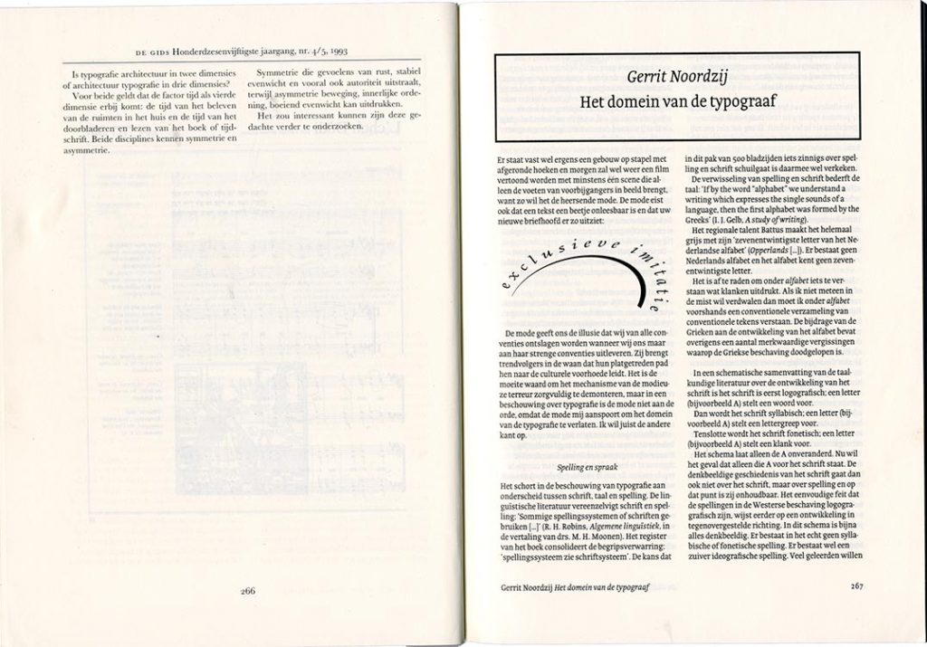
De Gids, vol. 165, no. 4/5, 1993 (245 × 178 mm).
But in his own writings, he wanted to do it all himself: edit his own text, write or typeset it, make it into pages. This was the lesson of our hopeless attempt to be his editor for Letterletter. In the article that he contributed to a special typography issue of De Gids, Gerrit was indulged by the editors: his piece ‘Het domein van de typograaf’ was set by the author in his own typeface. It stands out, isolated, and without visible connection to the rest of the publication. With one exception (Frank Blokland’s article) all the other typographer-authors were given the journal’s standard treatment. Gerrit’s pages were certainly more sharply designed than those of the rest of the journal. But this seems a sad state of affairs: a writer disconnected, and refusing to share in the common exchange of views and information.
In 2012, he wrote asking if I would be interested in publishing ‘a book on calligraphy, writing for its own sake, without caring for such conventions as legibility, but for the quality of shapes and patterns only’. He sent a sample spread: ‘The attached picture should show that it is still possible to draw generous strokes on a page of 12 × 20 cm.’ (email 30 May 2012) The sample spread has one letter per page: a g and an s (with comma after it), drawn exquisitely with a brush so that one sees the construction of the letter in minute detail. I liked the idea of a book that would be more purely about the material nature of writing and replied to say that I would be interested, but that I was also beginning to think of closing my publishing effort. The exchange stopped there. Perhaps such a book can still be made from Gerrit’s workings for it.
—————
Trying to get a word in, at the opening of the Wim Crouwel Exhibition, Gerrit Noordzij prize 2012, 9 March 2012 at the KABK. (Photo: Jo De Baerdemaeker.)
————————————————————
Robin Kinross
————————————————————
Notes
- Geen Bitter, Gewone letters: Gerrit’s early models, Amsterdam: De Buitenkant, 2013.
- The interview was transcribed and published in this anthology: Robert van Rixtel & Wim Westerveld (ed.), Letters: een bloemlezing over typografie, Eindhoven: Zoo: [ 2001 ]. It is now available on the KABK’s Type & Media website.
- Lisa Kuitert, ‘Stokpaardjes en orakeltaal’, Vrij Nederland, 20 March 2001, p. 65. For a flavour of this review: ‘ De handen van de zeven zusters is a book without a subject, unless that should be Noordzij himself. Is it then an autobiography? No, if only it was that. Where the author becomes autobiographical, the book at least has some gusto. For the rest, this collection of reflections is toe-curling. Not only concerning the choice of subjects – weak verses, a joke for his (grand)children – but also for the way in which Noordzij is unable to make his meaning clear to the reader. What do we do with humbug such as: “I dream the apriori of a scientific theory that converts Muslim determinism to the predestination doctrine of the African church”, or the confusion in this sentence: “The ‘content’ of the poem affects its poetic character, which is present merely in the design of the piece.” ’
- Gerrit’s work with Van Oorschot is recalled in an account by Jaap Blansjaar, the firm’s production manager since the 1990s. Blansjaar concludes thus: ‘Statements such as “the client himself usually has an idea, and then the art of the designer is to talk that idea out of the client’s head”, and “publishers very often busy themselves with the process; writers are completely mad; if you ask the writer what they think of the cover, then you are lost” may give the impression – not unjustly – that at Van Oorschot we had an obstinate and know-all designer on our hands. But what a pleasure it was!’