Robin Fior died on 29 September, in hospital at Mafra, outside Lisbon. This is not an obituary (his friend Richard Hollis has written a good one), but merely a set of memories of someone I knew, off and on, over twenty or so years. He was part of a certain network of designers in Britain, whose work has provided a main impetus for Hyphen Press.

Robin Fior in recent years (an uncredited and undated photograph, circulated on the internet).
—————
‘The secret of poesis is in the making.’1
Memories
Robin Fior’s name and his work I got to know in the 1960s: as a schoolboy, imbibing the fresh culture of graphic design in Britain, through paperback book covers, the colour magazines of The Sunday Times and the Observer, through TV and cinema graphics. With some school prize money I bought an early issue of the Design & Art Direction annual and noticed his work there. Then in 1968 I bought the first issues of the Black Dwarf as they came out, not really for their typography, though that helped. As a student of typography in the 1970s I began to meet people on the network – Anthony Froshaug, Norman Potter, Maurice Goldring, Peter Burnhill, Edward Wright, Ken Garland, then – later on – Richard Hollis, David Wild, and others. But it wasn’t and isn’t a network, so much as a loose array of designers who took great inspiration from the modern movement, and who connected that way of thinking and doing with a critical and dissenting attitude to British society. To different degrees and in different ways they were political: on the Left.
At Reading in the late 1970s, Paul Stiff and I had plans for a typography publication – a journal. It came to nothing apart from notes and some good meetings. Paul had come to typography partly through knowing the printer Desmond Jeffery – another one on the network. I remember that we wrote to Robin Fior, hoping for a contribution or at least contact. We knew he had moved to Lisbon, and had worked as a graphic designer for the revolution of 1974 in Portugal. I assumed then that he had gone to Lisbon to join the revolution. No answer came to our letter. I felt this as a rebuke from someone who I imagined to be severe.
Ten years later I was in London, had started Hyphen Press, had worked a bit for Pluto Press (Fior was their founding designer), and was writing design journalism. Somehow a meeting with Robin Fior was arranged – with the idea that I might write something about his work, for Blueprint or perhaps Eye, which Rick Poynor established from within the nest of the other magazine. I remember a rather cagey first meeting with Robin at a café in Islington, which served at least to dispel the ‘severe’ image. Rather, he was very funny; not aggressive but digressive. (We were too shy and British ever to say this, but I think that neither of us ever quite got over the sense that the other had stolen his first name – though much earlier he had used the name Reuben both personally and professionally.)
Then followed my attempt to interest Rick Poynor in Fior’s work. I remember a set of slides held in plastic wallets that we peered at. Rick, who hadn’t yet got going with his mission to recover British graphic design of the 1960s, gave the impression that this body of work wasn’t really good enough to be published. But I liked the man and the work, and wanted to know more. At the Type 90 conference in Oxford – a crystallizing event for the global typography scene – I hung out with Robin. I remember Matthew Carter saying to me ‘did I see you with Robin Fior?’ – and Carter too could be placed somewhere on this British network, before he went off to the USA for a proper employment of his talents.
In 1992 I went on holiday to Lisbon, and did meet Robin properly. (Here perhaps I was an early part of a small wave: go to Lisbon for a holiday and meet this expatriated figure of British graphic design in the 1960s.) In his office – in a very shabby, almost wrecked building (‘like Bosnia’, he said) – he showed me some of his more recent work. I remember the complicatedness of it, the semantic plays, the interest in materials and folding. Almost everything had some production flaw in it – typically, a fold in the wrong place. He said ‘that was printed in August’. It seemed that a lot of things had been ‘printed in August’.
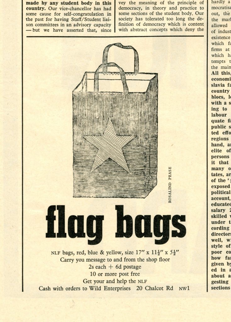
After this, the contact continued sporadically. I remember phone calls, faxes, then emails in later years, and occasional meetings in London. In 1998, when David Wild’s Fragments of utopia came out, another piece of the network-jigsaw fell into place. In 1968 Wild and Fior had made ‘flagbags’ to raise money for medical aid to North Vietnam – both were then connected to International Socialism, the Trotskyist group.
Advertisement for the flagbags, Black Dwarf, no. 2, 5 July 1968
Writings
In 1999 Eye, under the short editorship of Max Bruinsma, published a piece about his work, written by Richard Hollis.2. I think this attention must have helped in prompting the occasional reviews that were commissioned from him for the magazine by its new editor John Walters. One of these was a review of the anthology Graphic design & reading (Eye, no. 41, 2001). Fior wrote in his typically cryptic, critical, serious-funny way. Pointing to an absence in the book, he wrote:
What is surprising though, is the neglect of a (literary) translation model for the practice of graphic design, which is clear to any émigré designer (if it wasn’t before), or many designers outside of Anglosaxonia, who regularly work bi- or trilingually.
The editor of the book, Gunnar Swanson, then wrote a hurt email to the listserv group Typo-L. I responded to this, explaining and defending Fior’s piece. My letter survives (for the moment) in the archives of the list. The next issue of Eye (no. 42, 2001) carried a letter by Kenneth FitzGerald, a colleague of Swanson and a contributor to the book. FitzGerald seemed to be split between being unhappy that Fior had neglected to mention his essay and detestation of the English critic, evidently one of a coterie of which I, Richard Hollis, and other shady figures, were part. Fior responded in the following issue (Eye, no. 43, 2002) with a letter that put an end to the matter:
FitzGerald assumes that I am a British – and therefore insular – designer. In fact I have lived and worked in Lisbon for 29 of my 40-odd years of professional activity: working almost wholly in Portuguese, and writing, often gnomically, in that language. So ‘peninsular designer’ would be more precise.
Research
After this I heard from Robin about the work he was doing for a PhD thesis at the University of Reading, on Sebastião Rodrigues, the father of graphic design in Portugal. This built on his friendship with Rodrigues, and on the work that he had done for an exhibition of Rodrigues’s work in 1995 at the Fundação Calouste Gulbenkian in Lisbon with its catalogue (which I haven’t seen). The thesis – ‘Sebastião Rodrigues and the development of modern graphic design in Portugal’ – was finished in 2005.3
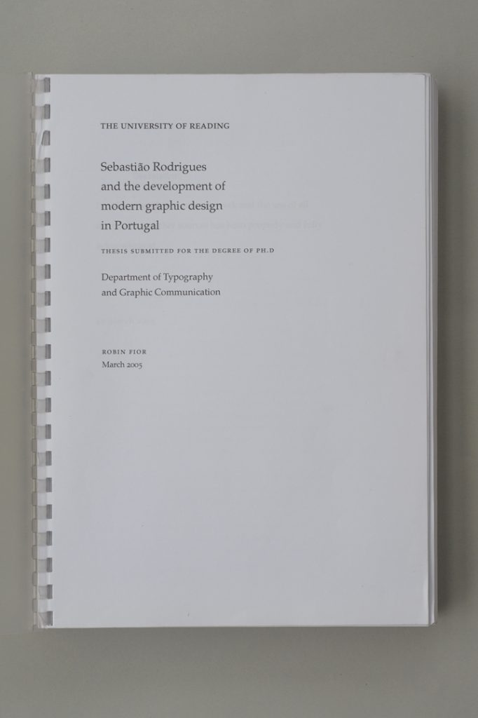
Robin sent me a copy, hoping that it could be turned into a book. A book in English on this topic would be a great thing, but I struggled with this document. It seems full of promise: a 30-page introduction sets the scene, including some account of the theme of Portuguese ‘backwardness’ and the idea for the country as a site of ‘critical regionalism’ (Kenneth Frampton’s term); there is a long – 150-page – pre-history of the topic; then the remaining 60 pages of the main work are devoted to Rodrigues. The idea of looking in detail at the work one person – exemplifying the larger themes in the microcosm – is always promising. The methological preamble promises much too: the model of translation is proposed, the Russian Formalists (first discovered by Robin in the 1960s, in his left-socialist days) are introduced. Politics and technics are strongly present throughout, as was typical of the way he thought. But, as it stood, my sense is that the work is opaque, rambling, and unmemorable. PhD theses are usually like that, almost by definition. I felt that it would take a long time and a lot of work on my part to put it into some sort of coherent shape. The pictures looked as if they would be another can of worms. I was pretty busy with several other things. So nothing happened.
Paul Stiff, who became the main supervisor of this PhD thesis, did better with Robin in later years than I was able to, though I believe he had to resort to threats to get things finished. In Typography papers 8 (2009), Paul’s special issue on ‘Modern typography in Britain’, there are a couple of pieces by him: ‘Recollections of designing and politics in London, 1957–1970’, and ‘Working with Edward Wright’. At the same time Sally Jeffery also managed to get a piece (‘Marylebone to Clerkenwell’) out of him for her book Late letterpress: the work of Desmond Jeffery (St Bride Library, 2009). Last year another short memoir was published: an afterword to the re-publication in the first issue of A Circular of a piece he had written in 1972 about the underground press (as it was called). These are delightful writings – sharply remembered details, exact technical descriptions, ironic reflections – which suggest what he could have done on a larger scale, given a lot of time and a more engaged editor than I was able to be.
Meaning
What was the quality of Robin Fior’s graphic design work, and where to place him? He worked with language, letting the meanings of the text be reflected in the form that words and images took. In this, his work joined a modernist stream of the twentieth century: the stream that followed meaning, rather than the stream that subjected meaning to grid-imprisonment. In Britain he found a place near to Edward Wright – 15 years his senior, and with whom he worked on a number of jobs. His posters for the Portuguese revolution in 1974–5 show a simple graphic strength that one finds also in the work of his friend David King (8 years his junior) for the Anti-Nazi League and other left causes and publications of that time. But Fior’s work for left-socialist publications and groups shows a delicacy and subtlety of form and colour that stands at some distance from the black–red agitprop style of King and others. His covers for International Socialism (shown here), which mostly used two colours, neither of which was black, are the notable instance here. He wanted to use all the resources of typography, even including small capitals. He was also skilled in formal and expressive writing (let’s not call it ‘calligraphy’), taking it seriously as a medium of human communication.
As a writer about graphic design, these concerns with meaning are also evident, and he found no contradiction – or only a fruitful contradiction – in always examining the technical dimension too. The brute specifications of type and of printing processes in his PhD thesis are a necessary part of his larger historical discussion. I am still not really sure what he meant by ‘the translation model’, but I guess it was something along the lines that Anthony Froshaug wrote about: ‘design consists … in translating all the problem, set of problems, into another language, another sign system’.4 So this ‘translation model’ would be a recognition of the semantic dimension, in analysing graphic design just as in doing it. The Russian Formalist theorists of the 1920s (Viktor Shklovsky and others) that he referred to had had the impetus of political revolution with them – briefly. One can see a hint of what this allegiance meant for him – in 1969 – in a review of John Berger’s book on the Soviet sculptor Ernst Neizvestny for the journal International Socialism. Fior proposes another idea of art from that of Berger and Neizvestny, who, he writes, hang onto ‘figuration as the talisman to give access to the people’. His alternative (one can surmise) is the utopian condition in which the boundaries are abolished: art – concrete, constructive art – will infuse everyday life. This utopia was, of course, well and truly lost in the all-invasive spread of corporate capitalism.
Some work
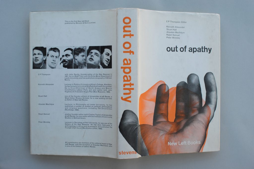
The jacket for E.P. Thompson (editor), Out of apathy. London: Stevens & Sons, 1960; 215 × 138 mm, 308 pp. This was the first and, in the event, the only publication in a projected series of New Left Books. The idea for the cover – a militant closed fist in red, and a generous open hand in black – didn’t quite work out in practice.
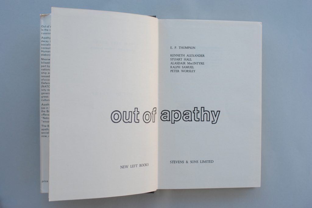
Fior’s unconventional approach is evident on this title-page spread, but in the pages of the book the design is that of a conventional printer or publisher
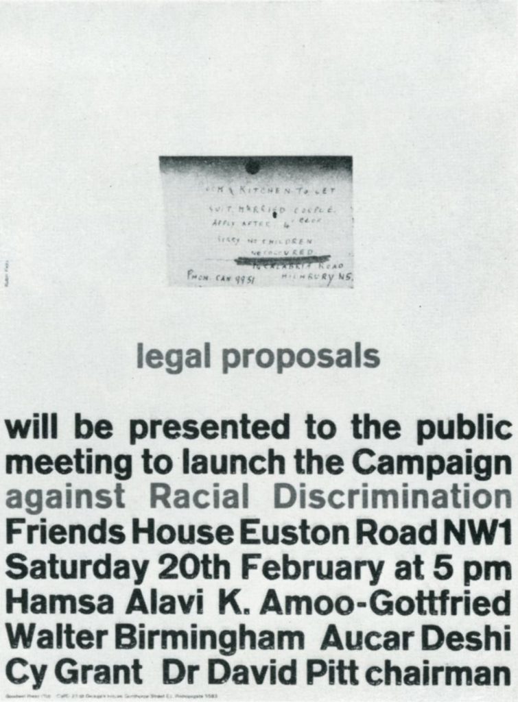
A poster for the Campaign Against Racial Discrimination, as reproduced in the Design and art direction ’66 (London: Studio Vista, 1966).
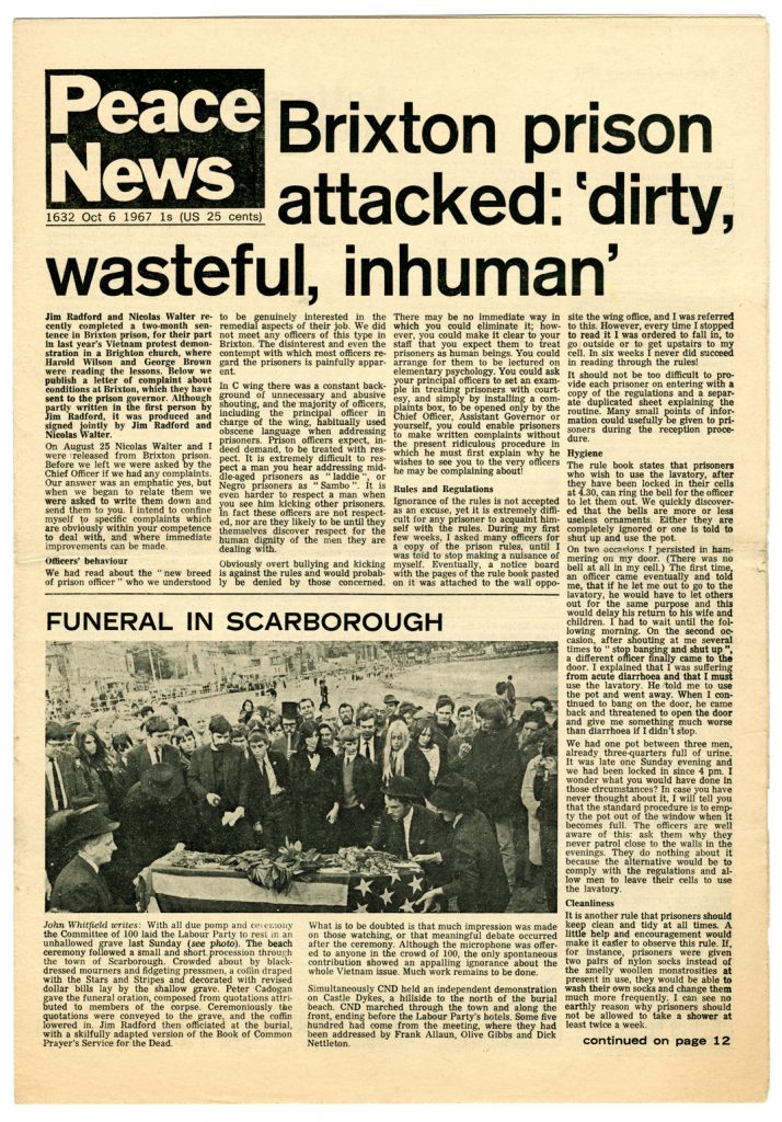
Peace News, 6 October 1967 (printer: Goodwin Press, 135 Fonthill Road, London N4); 386 × 267 mm, 12 pages. Robin Fior redesigned the paper in 1962, giving it this unmistakably continental-modern appearance, with headings in Akzidenz Grotesk, ranged left.
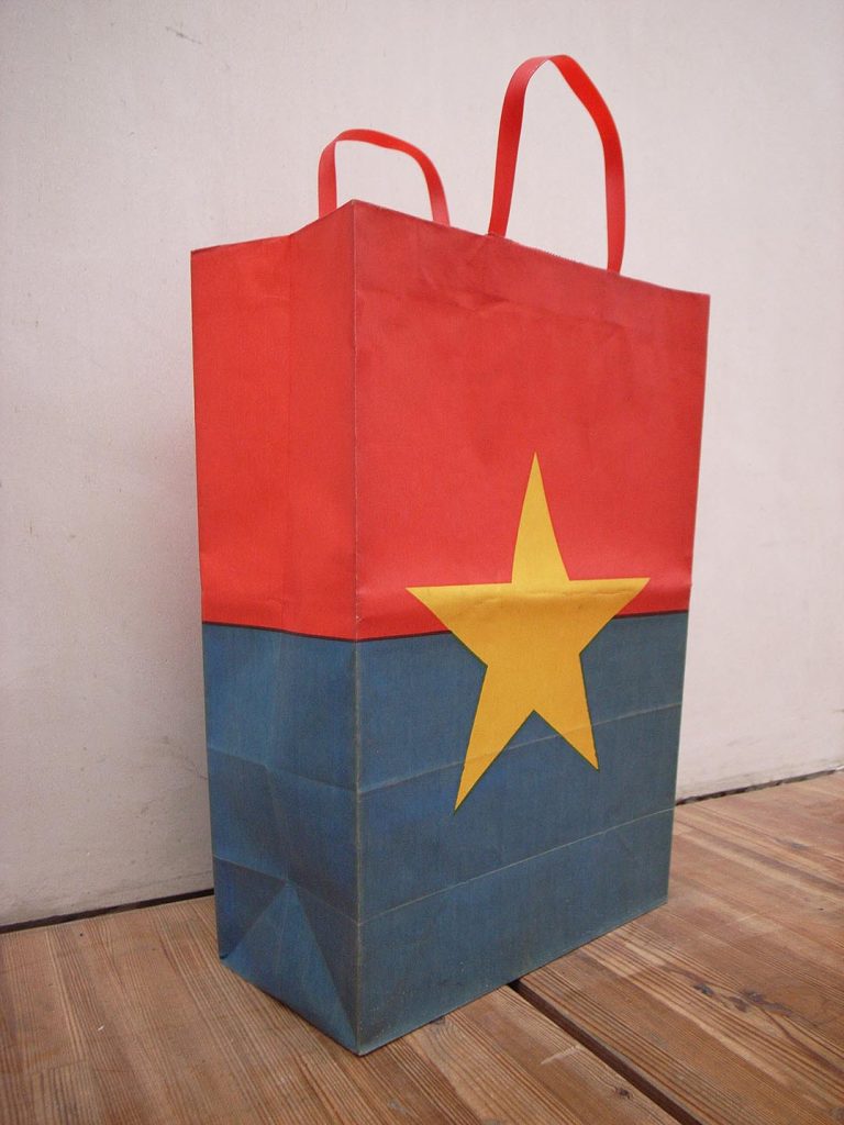
The NLF (National Liberation Front) flagbag: 435 × 290 mm (elevation) and 290 × 138 mm (plan). David Wild remembers that 20,000 were printed, and that all of them were sold.
The designer’s and printer’s credit on the base of the bag.
Letterhead for David Wild, printed letterpress; 297 × 210 mm.
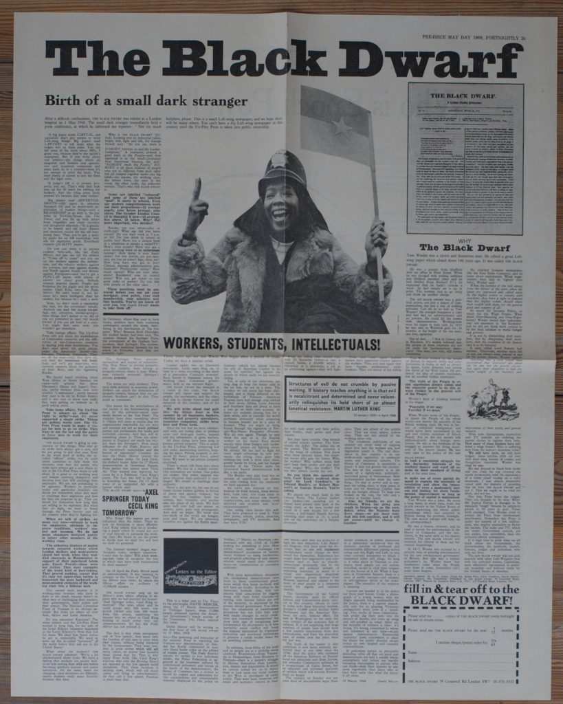
Black Dwarf, pilot issue, 1 May 1968 (printer: Goodwin Press, 135 Fonthill Road, London N4); 620 × 494 mm, 1 sheet.
The reverse side of this single sheet pilot issue.
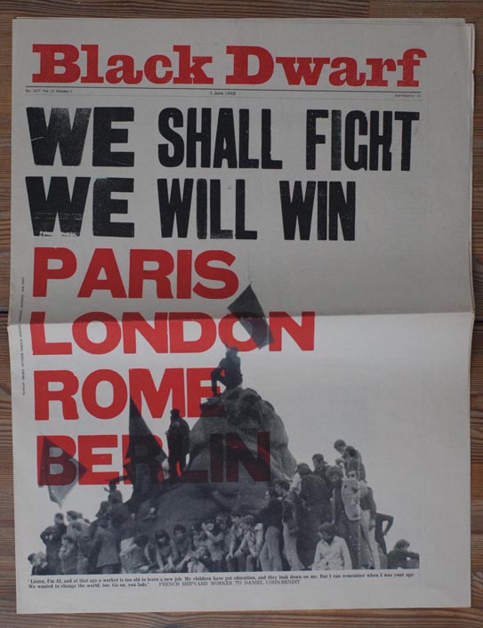
Black Dwarf, no. 1, 1 June 1968 (printer: Goodwin Press, 135 Fonthill Road, London N4); 510 × 380 mm, 8 pages. This is the now celebrated front page of the first issue. David Widgery (in his compilation The Left in Britain, 1956–1968, Harmondsworth: Penguin Books, 1976) described Black Dwarf as ‘multi-sectarian’. In 1970 the International Marxist Group members spilt from the paper, to start Red Mole. Black Dwarf folded in September 1970. It is only the issues of Black Dwarf in which Fior was involved – the pilot issue and the three issues following – that have any typographic distinction.
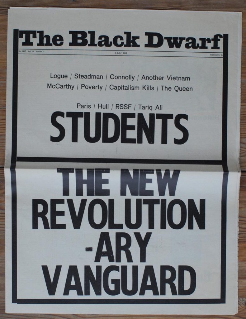
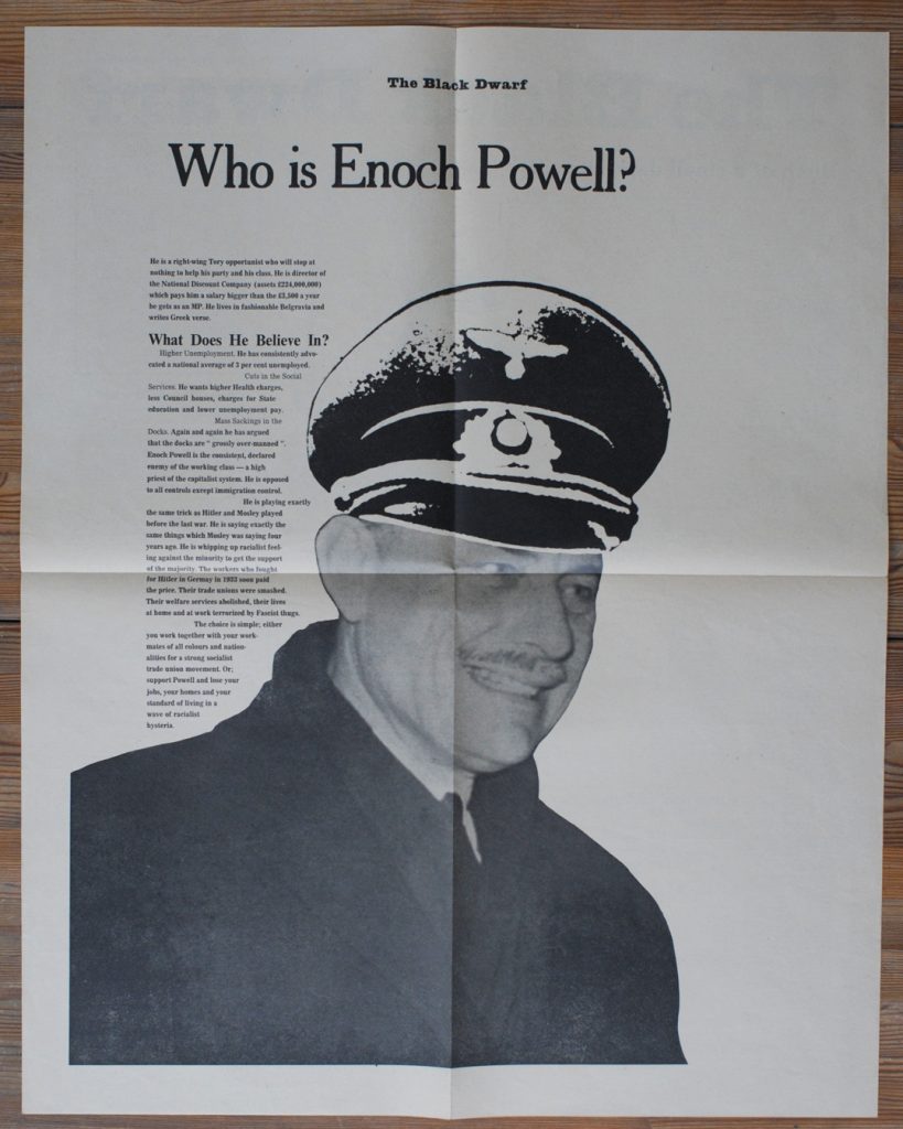
Black Dwarf, no. 2, 5 July 1968 (printer: Forward Printing, Tottenham, London N17); 510 × 380 mm, 10 pages
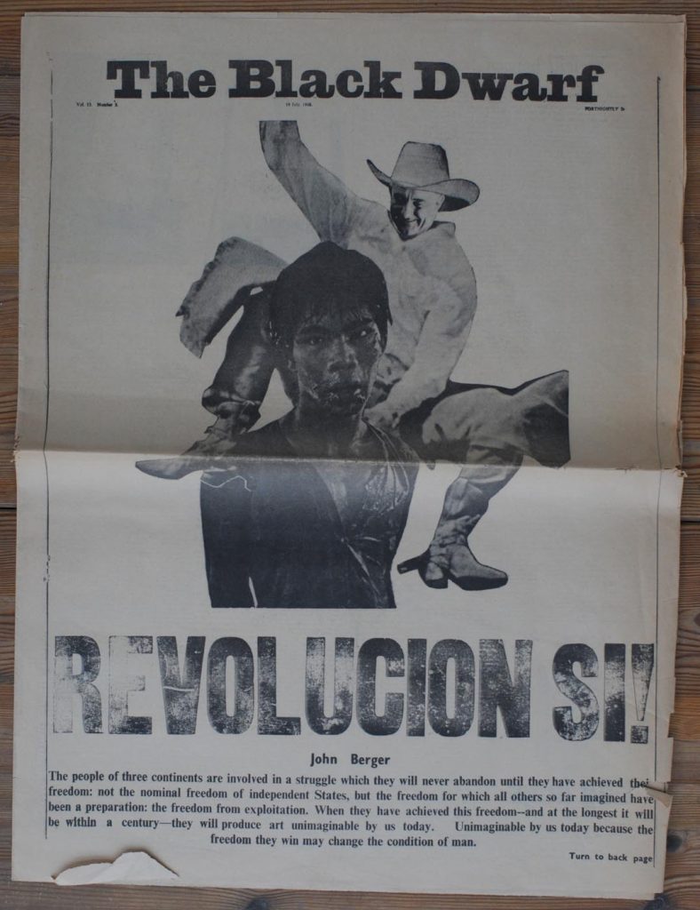
Black Dwarf, no. 3, 19 July 1968 (printer: J.C. Gregory, 16 Dufferin Street, London EC1), 595 × 440 mm, 8 pages. The photomontage was made by David Wild.
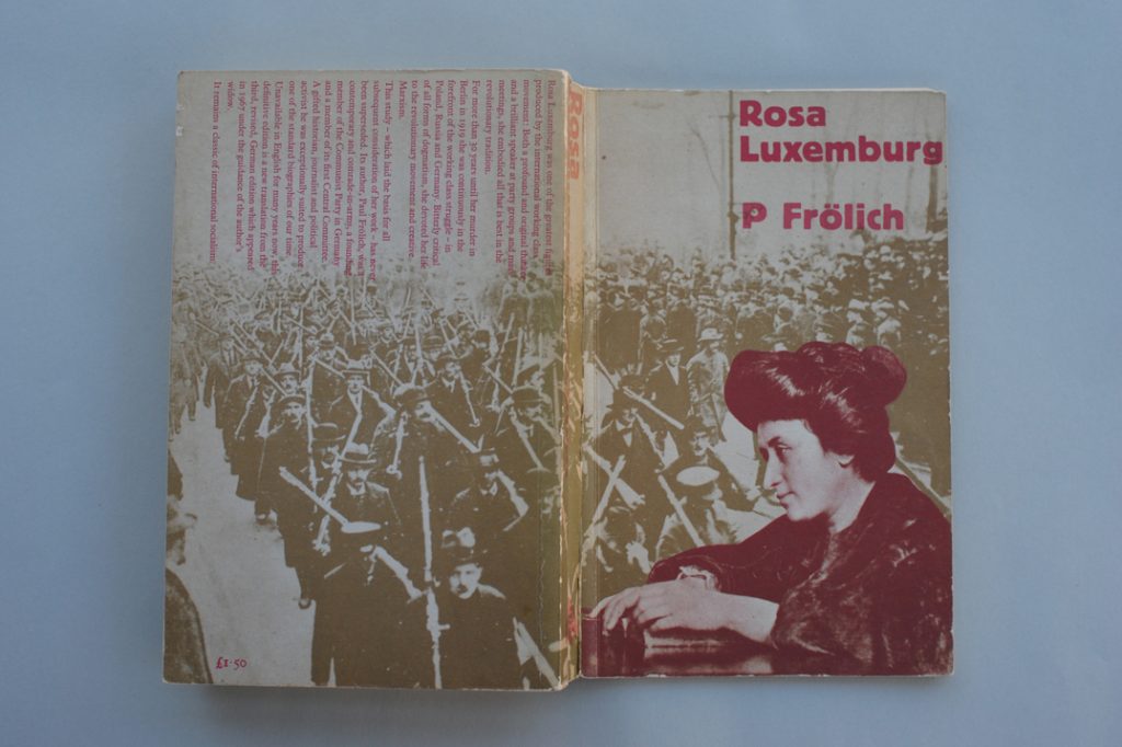
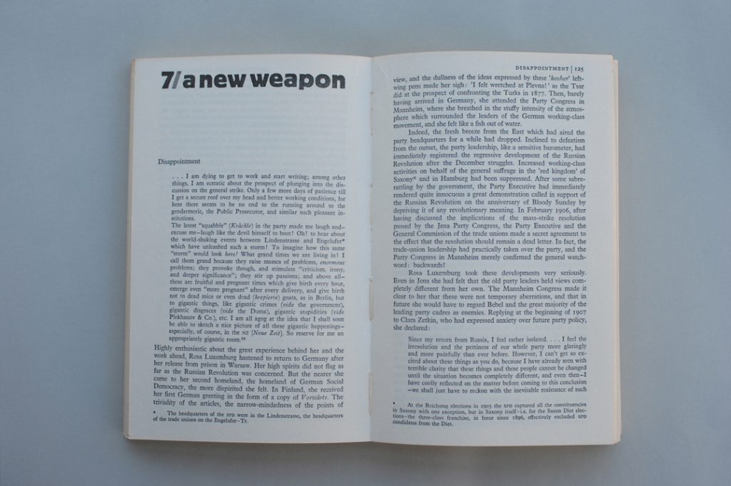
Paul Fröhlich, Rosa Luxemburg: ideas in action, London: Pluto Press, 1972; 215 × 138 mm, 332 pp. Printed in two colours only, neither of which is black. Fior had pursued this technique in his covers for International Socialism.
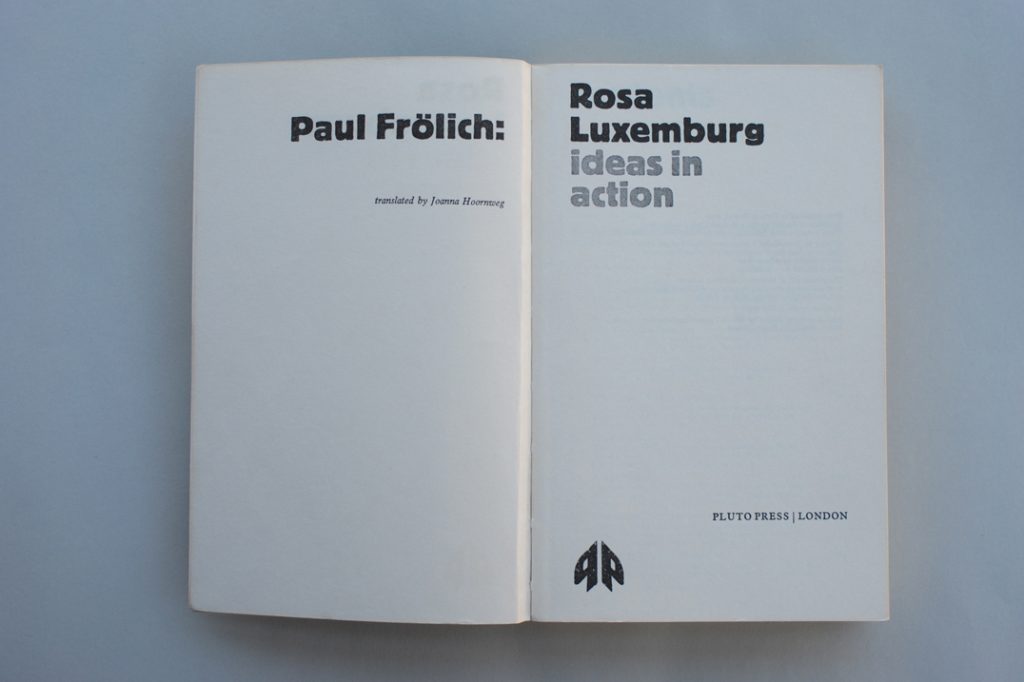
The Block typeface used on the cover, here on the title-page, and for chapter titles, must have been photoset then made as a line block for this letterpress-printed book. Note the ‘greyed’ character for lesser text (the sub-title here, and the solidus on the chapter openings).
Acknowledgement
Thanks to David Wild for the loan of the flagbag and the letterheading. All the other things shown here are from my own archive.
Update
See also Richard Hollis on ‘Robin Fior and graphic design of the Left’
————————————————————
Robin Kinross
————————————————————
Notes
- Robin Fior at the close of his ‘Recollections of designing and politics in London, 1957–1970’, Typography papers 8, p. 140.
- Richard Hollis: ‘Robin Fior: design in search of a revolutionary language’, Eye, no. 32, 1999, pp. 66–75. Hollis’s text may be online, but it is without pictures there: the original printed publication still needs to be consulted.
- In his Guardian obituary Richard Hollis gives the date of the thesis as 1995, but this was the date of the exhibition and catalogue that led on to the thesis.
- Anthony Froshaug, ‘Cybernetics’ (1964), reprinted in Anthony Froshaug: Typography & texts, Hyphen Press, 2000, p. 173.