The recent flourish of interest in the visual work of Otto Neurath – let’s call it Isotype – may be seen as a second wave, coming after a first period of discovery, which included exhibitions of the work in Reading (1975) and Vienna (1982), and an exhibition of the work of the Neurath group’s main artist, Gerd Arntz, in The Hague (1976). From this writer’s point of view, this phase of research culminated in a collection of all Neurath’s writings on the matter (1991).1 Significant contributions of the second wave include the book Bildersprache by Frank Hartmann and Erwin K. Bauer (2002), an exhibition shown in Brno, Prague, Vienna and finally at the Triennale in Milan (2002–3), and now (2008) the book Otto Neurath: the language of the global polis by Nader Vossoughian, with an associated exhibition and events at the Stroom gallery in The Hague. This book and exhibition have indeed been part of a veritable stream of happenings in the Netherlands, which includes a website of Gerd Arntz’s graphic work and a book Lovely language . Hyphen Press is due to contribute to this second wave later this year, with a book titled The transformer. By way of a warm-up for that book, and some clearing of the ground, here are a few thoughts prompted by the most recent publications.
What was this work and whose was it?
Today we would probably call it design work, but the term ‘design’ was not used by the people who made Isotype work. And this was team work: more than the result of any single person’s efforts. The charts, exhibitions, books, and later films, were made not by Otto Neurath alone, nor (as Max Bruinsma, the Arntz website author, has it) by ‘Neurath and Arntz’.2
In referring to one of the charts in the publication Gesellschaft und Wirtschaft, Bruinsma writes: ‘Arntz leaves the sphere character of the globe intact, and tilts the map a bit, to fit everything he wants to show in this graph.’ But this chart would have been made by several people: as well as Arntz designing the symbols (and perhaps with a hand in the typography of the piece), there was a cartographer giving advice – Karl Peucker. Above all, there was what the Isotype group called the transformer: principally Marie Reidemeister (later Marie Neurath) and Friedrich Bauermeister. The transformer was the real designer of Isotype work: the one who gave visual form to the material being worked on.
The first Isotype transformer was Otto Neurath: it was from him that Reidemeister, Bauermeister, and other more peripheral figures, learned. Neurath was usually around, in and among the team. It’s clear, from the testimony of those who were still there at the time of our first wave of research – principally Marie Neurath and Gerd Arntz – that Otto Neurath had a searching, questioning intelligence: very stimulating if you were strong enough to argue with him. This intelligence informed the design of the symbols too.
Evidence of the quality of Isotype work can be found by looking at the symbols on the Gerd Arntz website. There is a clear difference between those made by Arntz in partnership with Neurath, and those made after 1940, when he was on his own and working for the Nederlandse Stichting voor Statistiek. Thus the images towards the end of the arrays on the Arntz website are obviously from the years after 1945. I cannot imagine Otto Neurath accepting these much more ‘illustrational’ images, which have lost the unit character of the Isotype symbols. It was this ‘unit character’ that let these symbols be repeated satisfactorily, and let them be given as simple fractions (halved, very occasionally quartered) and yet remain recognizable.
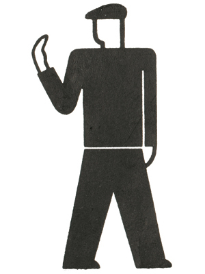
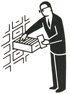
Typical examples of Arntz’s work with Neurath and the Isotype team (left), and of his work for the Nederlandse Stichting voor Statistiek (right).
Looking at the charts and diagrams that Gerd Arntz made for the Nederlandse Stichting voor Statistiek, the differences with Isotype are clear. The designing intelligence of Otto Neurath and Marie Reidemeister is not there, and is replaced by that of the Nederlandse Stichting voor Statistiek’s own staff, including now Arntz, who had learned about transformation from Neurath and Reidemeister. Although always visually tidy, the Nederlandse Stichting voor Statistiek’s work is quite often not more than that. Arntz’s drawing always showed terrific stylistic intelligence: compare the attempts by others to draw symbols in this vein (the book Lovely language provides evidence of this). The clearest difference between the two bodies of work is one of scope and reach. Neurath and Reidemeister were always engaged in a socially infused, historically aware work. The Nederlandse Stichting voor Statistiek was a bureau of statistics – and that gave it a clear limitation.
One can emphasize this by observing that the work of the Isotype Institute (set up by Otto and Marie Neurath in 1942 in England) misses Arntz. The transforming intelligence is there, undiminished and in fact developing. Some of the Isotype work of the 1940s and after, especially the ‘Visual Science’ and ‘Visual History’ series of books, shows an enrichment of the Isotype approach as it moved further into the wider field of visual explanation: something that had begun already in the 1930s, for example in work for the National Tuberculosis Association. But the Neuraths, as they were by then, never found another artist of Arntz’s great quality, and that showed.
To summarize: Isotype was not ‘Neurath’, nor was it ‘Neurath and Arntz’. One could perhaps say that Isotype was essentially ‘Neurath, Reidemeister, Arntz’. But this summary cuts too many corners – subject specialists often played a role (Neurath liked to speak of his ‘academy’ of advisors) – and it does not begin to describe the principles of the work itself.
Where did Isotype come from?
In Otto Neurath: the language of the global polis, Nader Vossoughian suggests that this work ‘was inspired by military cartography, early innovations in information graphics and the New Typography movement in Germany’ (pp.61, 63). Neurath certainly included military maps as among the elements in the visual culture that he developed for himself, from childhood onwards. About the part played by the New Typography, one can observe that Neurath’s visual work had started before this movement had begun to coalesce around a set of stated principles, and it seems unlikely that, in 1925 or before, he knew much about it, or took any great interest in it.3 About the ‘early innovations in information graphics’, Vossoughian names just one figure: Willard C. Brinton, who in 1914 had published the book Graphic methods for presenting facts.
The possible role that Brinton’s book may have played in the development of Neurath’s visual work is an old story and one that has almost no foundation. Certainly Vossoughian just asserts, without evidence: ‘Influenced by Brinton, Neurath meant here that every sign should represent a definite quantity and that as a given quantity increases, so also should the number of signs.’ (p. 63) The evidence (not cited by Nader Vossoughian) that Neurath knew about Brinton is just this: a copy of Graphic methods for presenting facts was among the books in the Isotype Institute’s library, acquired in England from 1941 onwards.
It is worth looking through Brinton’s Graphic methods for presenting facts. This is a survey of many possible methods. On the whole, over the course of a long book, Brinton prefers graphs and abstracted visualizations to pictorial methods. ‘If it is necessary to have a popular method, we can at least be accurate by portraying the data in the form of Fig. 41, not as in Fig. 40.’ (Brinton, p. 40)
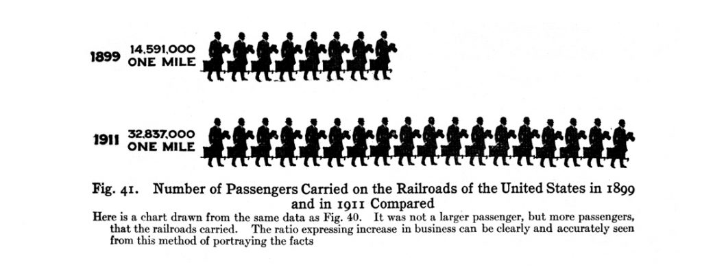
Brinton’s Fig. 41, as reproduced by Vossoughian. (But he muddles the point by reproducing a different counter-example: Brinton’s figure 26 is shown, rather than the directly comparable figure 40.)
So Brinton isn’t really in favour of pictorial methods, at least not for the businessmen who were his intended readers. Neither does he have any clear concept of a symbol standing for an exact value. In the row for 1899, the symbol seems to represent 1,023,075 passengers; in the row for 1911, the symbol stands for 1,024,277 passengers. Brinton then passes on to other possible methods of showing this kind of information.
The supposition is that Neurath got hold of Brinton’s book, published in New York in 1914, when he began making his charts in Vienna in the early 1920s, or perhaps even in 1918 in Leipzig at the war-economy museum he was working for. Neurath was certainly precocious and quick to discover things that interested him. But there is no need to postulate that he may have seen Brinton’s book.
It is becoming clear – if we hadn’t already surmised it – that Neurath grew up in a culture in which graphic presentation of information was widely present. Diagrams and charts of all kinds were published in magazines, newspapers, catalogues, atlases, almanacks of all kinds – in Austria-Hungary, just as much as in Germany, Britain, or the USA.4 I have seen one such set of charts, credited to Leo Hickmann and published in Vienna in 1898: Otto Neurath was 16 then, and at school in Vienna. A look into the catalogues shows that Hickmann was a prolific author of such work.
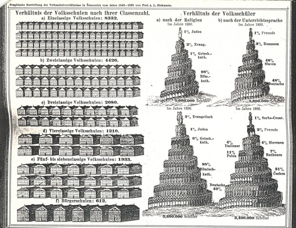
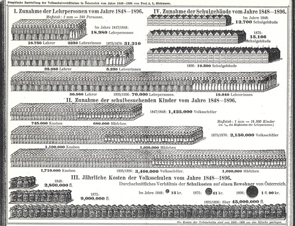
From: Zur Geschichte und Statistik des Volksschulwesens im In- und Auslande (Vienna: Verlag der Sonderausstellungs-Commission ‘Jugendhalle’, 1898). These pictures have been taken from photocopies that Marie Neurath gave me; she was sent these photocopies in the early 1980s by a friend in Germany. She was delighted to see this work, and said how beautiful it was. It is easy to agree with her.
In conclusion to the Brinton-and-Neurath story, it is worth looking also at Brinton’s second book, Graphic presentation, published by the author himself in New York, 1939. This repeats, amplifies and extends the material of the first book. Brinton now brings in (and dedicates his work to) William Playfair, and in several respects the book allows us to see Brinton in the honourable tradition of information designers, and as a worthy forerunner of Edward Tufte: another self-publisher, and another with a base in business-graphics. As in Graphic methods, Brinton stopped briefly at the pictorial bar-chart in his tour through the whole territory of visual presentation. This time he showed a chart from 1916 that looks – much more than his previous Fig. 41 – like an Isotype chart.
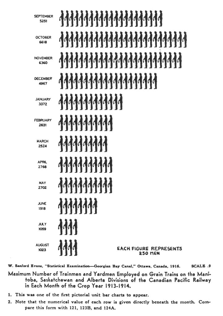
From: Willard C. Brinton, Graphic presentation (New York: Brinton Associates, 1939).
By 1939, for those interested in such things, Neurath and Isotype were familiar presences in New York as well as in Europe. It seems odd that Brinton should not have made any reference to Neurath or Isotype – although his view in this book is definitely parochial (North American). And if Willard C. Brinton felt he had some claim to having influenced Neurath, one might have expected him to say something about that in 1939.5
Methods of cultural history
Nader Vossoughian’s book derives from his PhD thesis, written within the Graduate School of Architecture, Planning and Preservation at Columbia University. The chapter (‘Democracy’) that focuses on Otto Neurath’s visual work falls between two outer parts. The first part (‘Community’) discusses the growth of Neurath’s ideas, his encounters with intellectual mentors, especially Ferdinand Tönnies, and his engagement in the housing movement that grew up after 1918 in Vienna and Austria more widely. In the third part (‘Globalism’) Vossoughian looks at Neurath’s relations with another encyclopedist, Paul Otlet, and at his encounter with CIAM (Congrès International d’Architecture Moderne). It is good to see the visual work being discussed as part of this continuum of activities: a refreshing shift from the more familiar engagements of Otto Neurath, in fields that have been been more available to commentators. With this I mean particularly the philosophy (or rather, the anti-philosophy) of the Vienna Circle and the Unified Science movement that followed on from it.
In his first part, Vossoughian sets up a familar contrast between Gesellschaft and Gemeinschaft, as elaborated by Ferdinand Tönnies, to whom Neurath was drawn into something that resembled a father–son relationship. The first term, Gesellschaft or ‘society’, indicates the more abstract, colder and larger entity: typically, the ‘society’ of the state. The second term, Gemeinschaft or ‘community’, indicates something closer, warmer and smaller. Neurath’s work can be construed as an attempt to deal with the world developing – modernizing – around him, seen through the ‘lens’ of these two terms. So, in the later 1920s and the 1930s, in the arguments with architects and planners, Neurath stood for the informal, closer-knit world of the garden-city and estate-housing development – as against the colder, abstract, master-planning approach of (most notoriously) Le Corbusier. Yet in the arguments that took place during and after the CIAM meeting of 1933, over ‘The Functional City’, Vossoughian portrays Neurath as taking a materialist, overtly left-wing political position, against the humanist and aesthetic/romantic views of Giedion, Moholy-Nagy, Van Eesteren, and Le Corbusier. By this time Neurath’s Gemeinschaft allegiances were (Vossoughian lets us think) embedded in the visual work of his museum, whose symbols gave the proletariat a medium for communication and international understanding.
What is missing here in Vossoughian’s account is any real understanding of the qualities of the visual work of the Neurath group. Neurath could be confident in his arguments at the Functional City meeting because by 1933 his Gesellschafts- und Wirtschaftsmuseum in Wien,6 and its extension as the ‘Mundaneum Wien’, was producing work of outstanding quality. It was evidently superior to that of the architects around him. To see this, one needs to drop a history-of-ideas approach and look at the material and how it works, visually. But Vossoughian is unable to make judgements of value here, and sticks to the discussion of ideas – as if it was the ideas that make things happen.
As an example of this ideas-driven explanation, with its assumption of ‘influence’ as a key motive force, take this. Nader Vossoughian writes: ‘In the 1930s, Neurath began to espouse a more measured perspective on cultural reform that strongly suggested the growing influence that Soviet Socialist Realism was beginning to exercise on his work’ (p. 138). No visual illustration is given to support this assertion, and I cannot think of any Isotype work that would support it.
Vossoughian misrepresents the work done by the Neurath group in the USSR. He writes (p. 113) that the Gesellschafts- und Wirtschaftsmuseum established a branch museum in the USSR, the Isostat Institute. The ‘Institut Isostat’ was not a branch of the Vienna museum; it was a purely Soviet body. Neurath and his colleagues went to the USSR as advisors and consultants. This was another adventure for Neurath – just as, later in the 1930s he would travel to work as a consultant in the USA and also Mexico. Unlike his Communist and Left-Radical friends and associates (including, I would suggest, Gerd Arntz), Neurath went with few illusions. In 1934, the contract with the Soviet body was abruptly terminated, with payments not honoured.
This episode too has to be given a theoretical gloss by Vossoughian. To introduce the idea of politicized art, Walter Benjamin’s essay on the work of art in the age of mechanical reproducibility is referred to (p. 113) – as if the idea of politicized art in the 1930s is not well enough understood to stand alone.
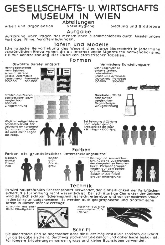
A chart on the methods of the Gesellschafts- und Wirtschaftsmuseum, made in 1925 or 1926. The section on ‘technique’ can be translated as follows. ‘For the most part, scissor-cutting is used; this ensures the unity of the area of colour that is essential in achieving the desired effect; the letter-like abstract character of the symbols becomes clearly apparent. Scissor-cutting is easily learned and has been taken up by the teaching programme of the modern school. Geographical and anatomical charts are also produced by this technique.’
Another typical instance of this tendency to drive a historical account by ideas, despite the material evidence, comes in Vossoughian’s discussion of the principles of the visual work. He quotes from an early diagram of the methods of the work (too confidently dated by him as ‘1925’), in which cutting with scissors is advocated as the best way of making the symbols. The text on this method chart suggests that scissor-cutting is very suitable also for use by children in schools. Vossoughian then generalizes this: ‘Neurath felt that cut-outs allowed the masses to feel as though they were participating in the production of knowledge, which was central to his reform in general.’ (p. 65) But Neurath was just talking about schools and children, not ‘masses’.
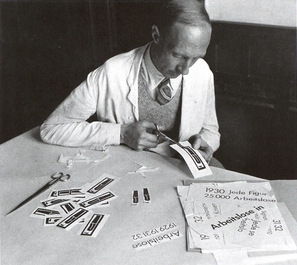
Assistant Skuravy cutting out linocut-printed symbols for assembly in a chart; about 1932.
Then, Vossoughian shows a photograph (which dates from about 1932) of one of the team at the Gesellschafts- und Wirtschaftsmuseum, in the act of cutting out some symbols that were by then printed from linoleum blocks: the practice of forming the symbols by scissor-cutting had been left behind a few years previously, when Arntz started work. Linocutting could produce more rounded, more human forms, which were at the same time more standardized: given permanent form as a printing block and thus able to generate identical copies. Vossoughian does not understand that the use of linocutting meant that scissor-cutting of the symbol-forms had been abandoned by the Neurath group. He persists with his ideological explanation, in the face of the contrary evidence shown in the photograph. His caption reads: ‘Neurath felt that cutting out and mounting individual pictorial signs made the sharing and preparing of knowledge more interactive and convenient’. (p. 65)7
Ideas certainly did infuse this work and it is right to bring them into a historical account of it. But in the pages about Neurath’s visual work, Vossoughian has no firm grasp of what he is writing about: ideas are picked up, polished a bit, taken out of context, and applied to things that have simpler explanations – if you attend to the abundant evidence.
The other recent book, Lovely language, has less historical ambition than Nader Vossoughian’s work: it is much more of a book for designers, and its own designer, Ed Annink, plays an author’s role together with Max Bruinsma. (Most pages exhibit nice examples of ‘Dinglish’, that idiom used by clever Dutch people who suppose that their good English is even good enough for publication: ‘Visual language has grown up; everyone understands its basics, but individuals vary on it to compose their own visual poetry’, or ‘Remarkable is the fact that European cities are dramatically denser than American cities’, etc.) Apart from Annink & Bruinsma’s persistent mistake of seeing ‘Neurath and Arntz’ as the designers of Isotype, the book disregards the deeper lessons of this work. For example, in its list of the languages of the world, spread over 6 pages to form a wallpaper display, colour is deployed – but without any meaning. Here information does indeed become pretty wallpaper. A look at the source of this information shows that this list could have been coded by colour and spatial configuration to make a point: for example, the languages could have been grouped by region, rather than by the meaningless alphabetical order used here.
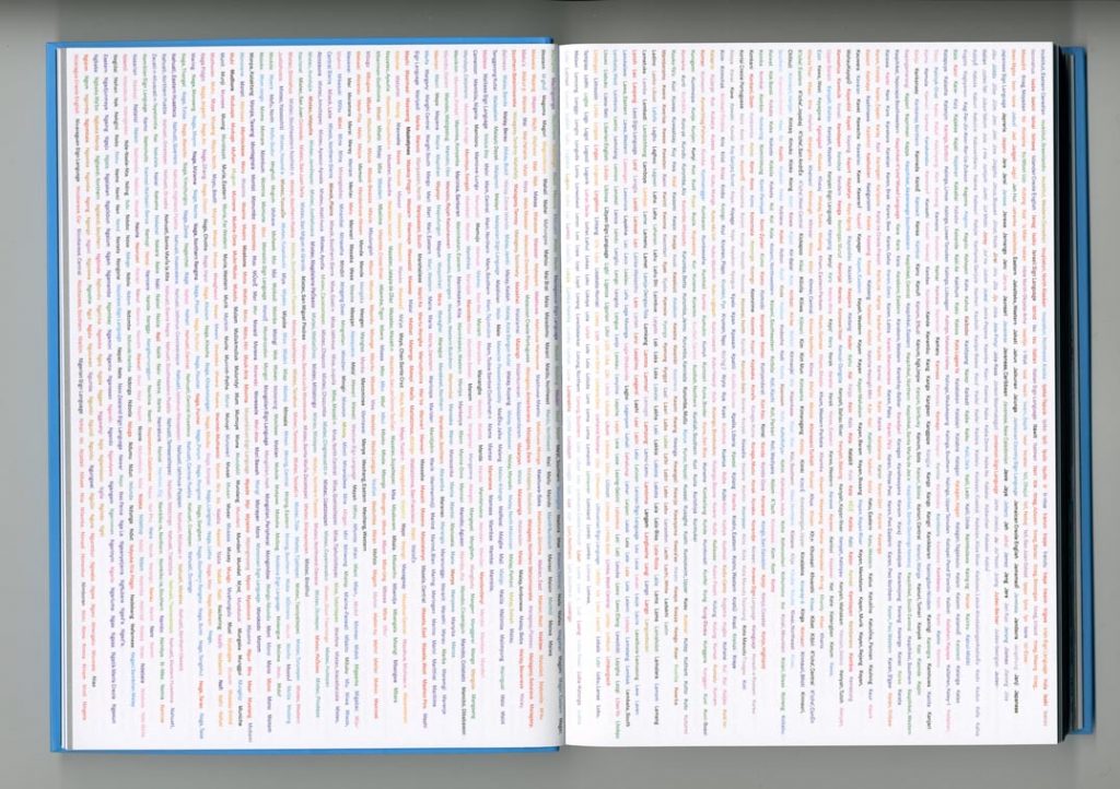
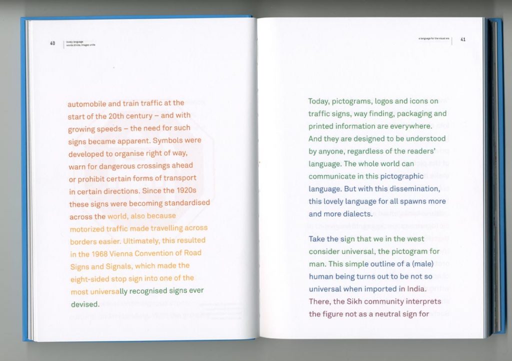
Spreads from Lovely language, with colour abitrarily applied to a list of all the world’s languages (top) and to the main text (bottom).
More research
It is customary to end a review or an essay with the often wishful mantra ‘more research is needed’. In ending this piece the mantra can be repeated, but with good reason to think that it isn’t wishful. A research project, ‘Isotype revisited’ is under way at the University of Reading, home of the Otto and Marie Neurath Isotype Collection. In the words of the project’s prospectus: ‘It aims to clarify better-known dimensions of the Isotype movement, explore its less well-understood interests and innovations, and evaluate its legacy up to the present day. It seeks to make known the progress of Isotype and re-calibrate its significance, and that of Otto Neurath, to communication design history and to present-day information visualization.’
Notes
1 What I write here is based on my own research, especially the work done for an MPhil thesis at the University of Reading, 1979: ‘Otto Neurath’s contribution to visual communication (1925–45): the history, graphic language and theory of Isotype’. In 1991, the Gesammelte bildpädagogische Schriften, edited by Rudolf Haller and myself, was published in Vienna by Hölder-Pichler-Tempsky.
2 In the book Lovely language , Max Bruinsma describes Arntz as the ‘design director’ of Isotype; Arntz was sometimes referred to as the ‘head of the graphic department’, in the busiest days of the group, when several artists were employed. But our term ‘design’ (then still purely an English word) was not a word or concept known to the Neurath group, certainly not in their Vienna days, and it needs to be used carefully here. In one especially weird caption (p. 94, figure 3.4), Vossoughian annotates an Isotype chart with the words ‘signage by Gerd Arntz’ – as if this was a building, and as if the symbols on this piece were designed by Arntz as opposed to one of the other artists of the group. For more on this question, see my review of a further book by the authors of Lovely language , here.
3 Vossoughian seems to borrow the idea that Neurath was influenced by the New Typography from Michael Twyman’s essay in the University of Reading catalogue of 1975. But where Twyman speculates, Vossoughian states without qualification.
4 See these two articles:
Marija Dalbello, ‘Franz Josef’s time machine: images of modernity in the era of mechanical photoreproduction’, Book History, vol. 5 (2002), pp. 67–103.
Marija Dalbello & Anselm Spoerri, ‘Statistical representations from popular texts for the ordinary citizen, 1889–1914’, Library & Information Science Research, vol. 28 (2006), pp. 83–109.
5 Brinton is distinctly parochial by comparison with his fellow-American H. Gray Funkhouser, whose survey of the topic, published two years before his second book, gave notable attention to Neurath’s Isotype (as well as to Brinton himself): ‘Historical development of the graphical representation of statistical data’, Osiris, vol. 3 (1937), pp. 269–404. If Brinton ever saw this article, then he would have known about Isotype.
6 Vossoughian usually gives his own English-language versions of German-language proper names. Thus the Gesellschafts- und Wirtschaftsmuseum in Wien is always referred to as the Museum of Society and Economy; and at one point (p. 104) he translates the abbreviation Ge-Wi-Mu as ‘Mu-So-Ec’. This approach is one, I would suggest, of historical untruth; certainly it has its absurdities. A picture of the title page of Max Adler’s book Neuer Menschen is captioned ‘Opening page of the second edition of Max Adler’s New Humans: Reflections on Socialist Formation’ (p. 57). But no such book was ever published: put it into your search engine and see. Imagine a German-language writer referring to the CIA as the ZdG – the Zentralbüro des Geheimdienstes.
7 Some of the more purely factual muddles in Otto Neurath: the language of the global polis:
- p. 56, caption to figure 2.5: this is not a letterhead.
- p. 57, Marie Reidemeister ‘eventually became a distinguished children’s book author’. What she ‘eventually became’ was a co-director of the Isotype Institute, established in England in 1942. There is no mention of this Institute in the ‘biographical sketch’ of Otto Neurath’s life (pp. 148–52). Instead it is suggested that in 1941 he ‘begins lecturing at Oxford University’: for two terms he gave a course of lectures on Logical Empiricism and the social sciences. (After 1914 Neurath had spent his life outside the academy.)
- pp. 74–6, the photographs in figures 2.22 and 2.23 show the same travelling exhibition, yet the captions suggest they are different things.
- p. 81: ‘Books that the Museum of Society and Economy designed included Bildstatistik (Pictorial Statistics), which could be found in the city’s Insurance Institute (Versicherungsinstitut).’ Bildstatistik was a thin, stapled periodical and not a book. What was the ‘Versicherungsinstitut’? Certainly there was no connection between any Insurance Institute and the periodical Bildstatistik.
- p. 87: Neurath is described as the sole author of a number of publications made collectively by the Gesellschafts- und Wirtschaftsmuseum.
- p. 87: ‘The exhibits of the Museum of Society and Economy were not especially inventive from a purely constructional or artistic point of view.’ A ‘purely constructional or artistic point of view’ will by definition miss the point and the quality of this work, which was deliberately neither ’purely constructional’ nor ‘artistic’.
- p. 91: ‘Artist Gerd Arntz standardized the typeface that the museum used for banners and text, adopting the futura font designed by Bauhaus artist Paul Renner’. The Futura type that the Museum used was acquired before Arntz came to work there. Paul Renner was primarily a type and book designer; he was not at the Bauhaus.
- p. 91 ‘Between 1931 and 1933, governments invited Neurath to establish “copies” of the Museum of Society and Economy in Moscow, Berlin-Kreuzberg, Amsterdam, The Hague and New York.’ The only ‘government’ to issue an invitation was the Soviet one, but this invitation was to act as a consultant to a Soviet institute, and to make fresh work. The other invitations did not come from governments.
- p. 110. ‘The Mundaneum Wien was responsible for establishing the Isostat Institute in Moscow (it was officially know as the Moskau, Boschok Komsomolski pereulok 9) … .’ It was not officially known by its street address! (In German transliteration this was: Moskau, Bolschoj Komsomolski pereulok 9.)
- p. 111. The photo shown as figure 3.18 is the exhibition at Drukkerij Trio in The Hague. It is not the International Foundation for Visual Education.
- p. 128. Figure 3.39 shows a diagram made for International picture language (1936). The caption says that ‘Neurath presented this chart at his August 1933 lecture in Athens’. In 1933 Neurath may indeed have shown a chart on this theme, but it cannot have been the one reproduced here.
- p. 148. Caption to the photograph shown on pp. 146–7: ‘Otto Neurath at the opening of the “World of Plenty” exhibit at the World Food Conference in New York, circa 1944’. But Otto Neurath did not travel to the USA in the war years. The photograph shows him at the opening of the ‘World of Plenty’ exhibition at the Astoria Cinema, Purley (just outside London), in November or December 1944.
Vossoughian’s book reproduces fascinating photographs, charts, and other visual material from the archive at Reading. It is a great shame that his annotation and interpretation of it goes so badly awry.
Robin Kinross