In summer of this year the Royal Festival Hall, on the South Bank of London’s river, was reopened after a major, two-year refurbishment. The auditorium itself was remade and restored, and the rest of the building was significantly remade/restored too. The spirit and the materials of the original building were respected, at the same time changes needed for the place’s new uses were made. The architects leading the work were Allies & Morrison, among the most convincing and least pretentious of the UK firms practising ‘modern architecture’.
The reopening of the RFH prompted Simon Esterson and John Walters at ‘Eye’ magazine to commission a piece about the restoration of an old sign, now installed or reinstalled on what North Londoners may think of as the back of the building, and what South Londoners (or anyone habitually approaching it from Waterloo Station) may think of as the front. In truth the building is multi-sided and multi-entranced: now more than ever.
My piece on the new/old signs was published in ‘Eye’, no. 65, and – though it doesn’t make much sense without the accompanying pictures – the text is now freely available. That brief article focused on the signs on the outside of the building, but several wider themes are entailed. The matter seems worth expanding on here.
Postwar
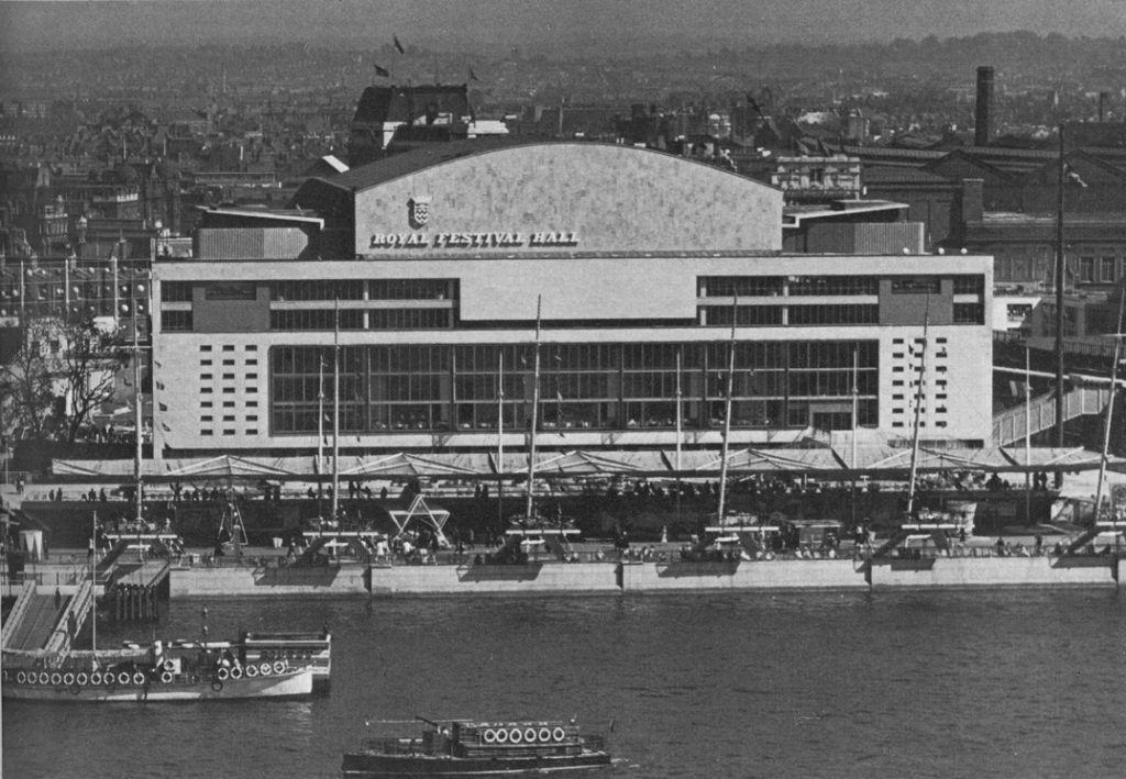
The Royal Festival Hall at the time of the South Bank exhibition of 1951. This is the river side of the building. The crest above the words is that of the old London County Council.
To start at the beginning: the Royal Festival Hall was completed in 1951 and took its place as one element – the most lasting and impressive – of the Festival of Britain of that year. As has now been thoroughly analysed, the style of the Festival was a special British brew of the modern, the revived, and the continued.1 Britain was late to modernism in the twentieth century. But the aftermath of the Second World War was a moment of assertion of the new – in the wake of a war that had left the UK exhausted and materially depleted, and yearning for a thorough change: both abroad in its Imperial possessions, and at home. What could be the outcome of this victory in war? Certainly not a continuation of the miserable British social system of before 1939. In July 1945 the people threw out their Conservative leader (Churchill). The state of things would now really have to change.
In the architecture and design of 1945 and after, the British way was various and tempered. For every distinctly modern project, such as the RFH, there were a hundred brick buildings with pitched roofs in carefully landscaped settings – decent North-European structures in the vernacular or Arts & Crafts manner. (The architect James Stirling, strongly Corbusian in his young days, summed it up with his remark that ‘William Morris was a Swede’.) A particular element of tempering was provided by the lettering used on the South Bank, and elsewhere in the Festival of 1951.
English display letterforms of the early nineteenth century had been rediscovered and revived, above all in the pages of the Architectural Review. Members of the journal’s editorial group (directed and intellectually fed by its presiding genius H. de Cronin Hastings) recognized the presence of these letterforms in the architecture of Britain.2 At that time, as even still now, one only had to walk around any town to find lettering that is (as far as anything is) native to the Isles: the term English Vernacular was later used to describe the loosely related forms that cannot really be termed a style, more an approach and an attitude: informality, vigour, with a willingness to let forms develop without reference to the (at that time hazily perceived) classical Roman norms. It was this interest in the local tradition that provided a pool of knowledge and examples that were picked up by the Festival’s designers, via the recommendations of its ‘typography panel’. The most typical Festival letter was the sloping Egyptian (so-called) – derived from nineteenth-century English models. It was this letterform that was used for the main signs on the RFH: on the river side (looking to the north-west) and on the other side (looking to the south-east).
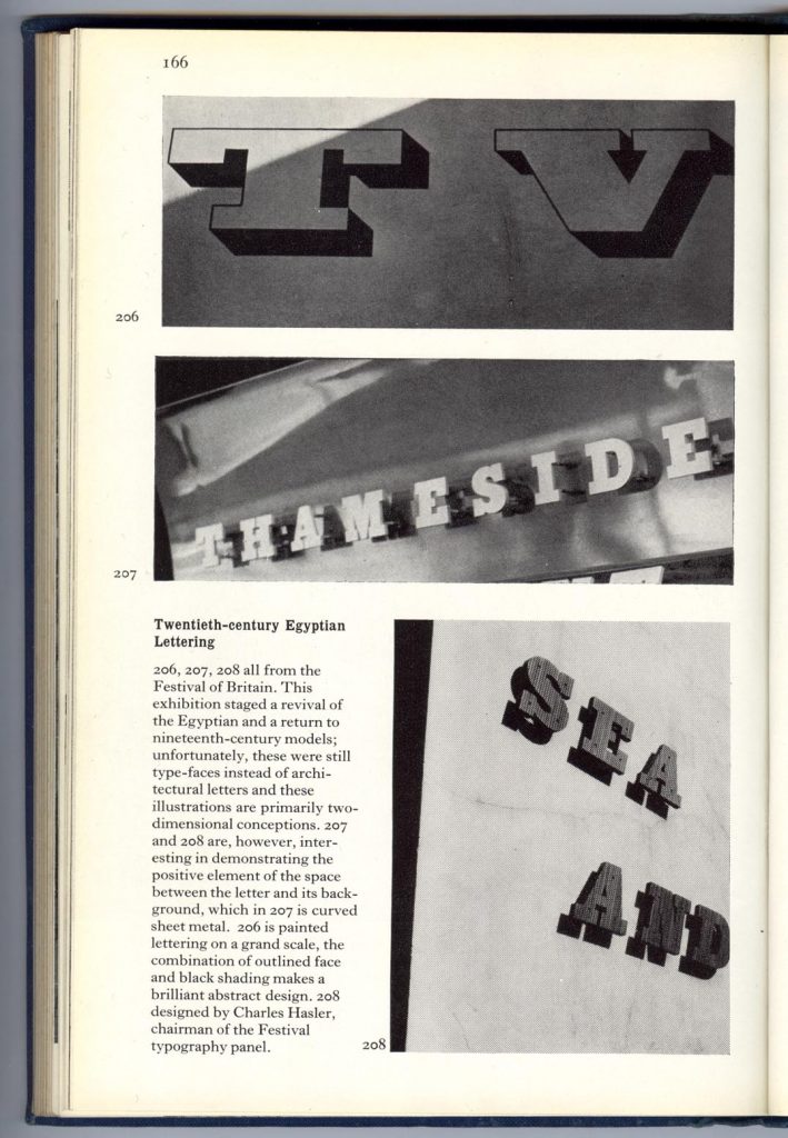
Festival lettering, as reproduced in Nicolete Gray’s Lettering on buildings (1960).
In 2007
Like any Londoner hurrying to the place for a concert, I hadn’t quite taken in the state of the lettering on the RFH in the summer of this year. But, after getting the request for a piece from Eye magazine, I looked closer and did some research. The following facts emerged:
(1) The sign on the south-east (Belvedere Road) side uses the lettering of 1951, and may even use letters from the original building. In 1951 this side had only a temporary façade (it can be seen here). The present sloped Egyptian sign has been up there for a while, and predates the reopening this year. On the evidence of photographs of this side of the building in 1951, one has to say that the original no doubt flimsy structure, with its eccentric canopy, had a visual richness that is entirely missing in the present remaking. The rediscovery of the original letters can’t make up for this.
South-east side of the RFH in summer 2007, with the letters of 1951 reapplied. (On top of the building are figures by the sculptor Antony Gormley: an outlying part of his Hayward Gallery exhibition then.)
Further: to be fully effective, the restored sign really needs to be illuminated. As it stands now, the effect after dark is quite flat.
South-east side at night, 2007.
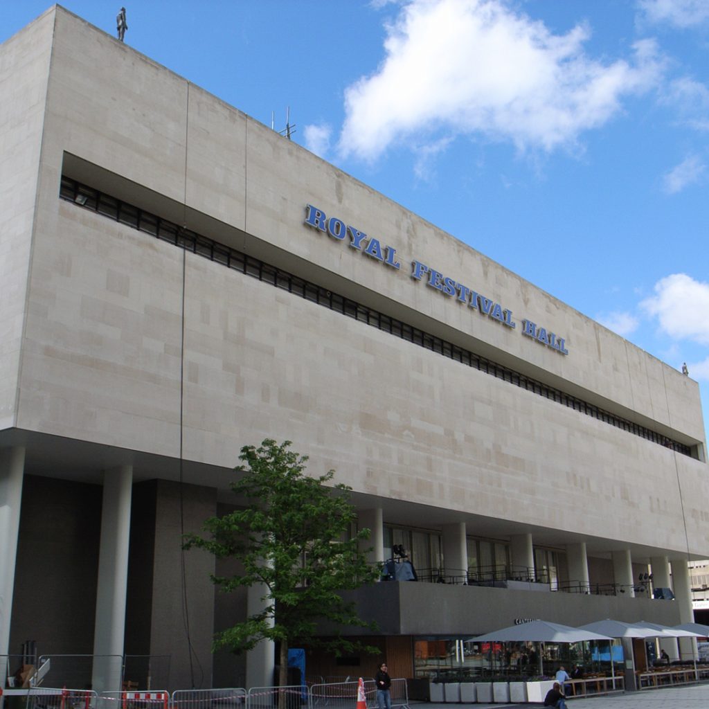
(2) The big sign on the north-west facade must date from the renovations of the 1960s. It uses a sanserif letter, fashionable then.
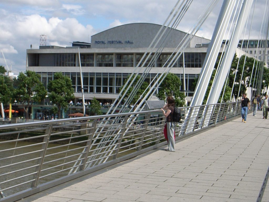
The north-west or river side of the RFH, summer 2007. (A Gormley figure stands on one corner.)
The river-side sign isn’t original, is pretty dull, and really ought to be replaced – in the spirit of the larger restoration. Understandably, and as the project manager of Southbank Centre says, such a replacement can’t be a priority. Lettering on buildings hardly ever is a priority for architects and project managers. Getting the structure up and functioning is naturally their first aim. But big signs on a building make a strong impression: they too are part of the job, quite as much as any panelling or carpeting.3 Plus, signs speak words in visually specific languages. In 1951 – unusually and wonderfully – this was understood.
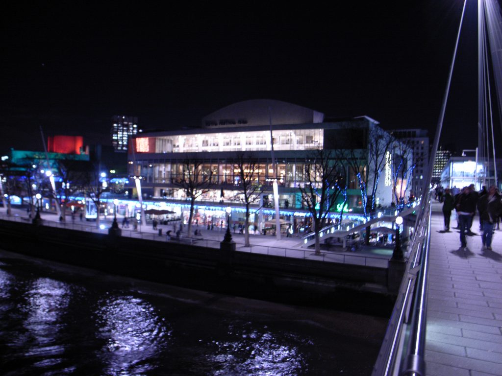
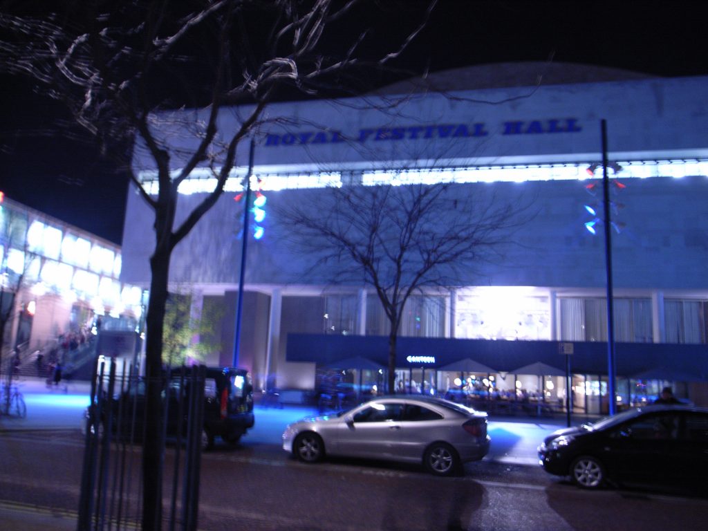
The river side at night, 2007. This sign, too, disappears after dark.
One can add this. To put a sign in the style of the original at the river side of the building would mean that the strangeness of the building was better respected. These letters are an essential part of the vision of 1951, fired by the distinctly unorthodox and anti-bland views of H. de Cronin Hastings and the designers and writers he encouraged and published (especially Gordon Cullen and Nicolete Gray).
Postscript
The RFH and its neighbouring halls – the Queen Elizabeth Hall and the Purcell Room, plus the Hayward Gallery – are now run by the body called Southbank Centre. For years, in fact ever since the exhibition of 1951 was closed, the site has lacked a coherent vision. After a long succession of plans and proposals, a vision is now being implemented. As revealed so far, the ideas for the place have much in them that’s encouraging. Of course, they can’t help showing the spirit of these times.
It’s a mood of cleaning, of modernization (as in the New Labour watchword), of branding – not with some rough, hot iron, but rather with a dose of killer bleach. Note the lack of a definite article in ‘Southbank Centre’. Just as what we knew and probably still know as ‘the Tate Gallery ’ is now just ’Tate’ (Tate Britain, Tate Liverpool, etc), and ‘the Wigmore Hall’ is now ‘Wigmore Hall’, so Southbank Centre must be referred to without ‘the’.
The way in which we talk about a public place, especially one for which we have affection, shows up here. ‘The Wigmore Hall’ suggests ‘that place north of Oxford Street with the splendid acoustic where you can get to hear young players without reputation as well as wonderful artists in their prime’. A pursed-lipped ‘Wigmore Hall’ suggests rather ‘that upmarket venue which puts on starry performers at high prices, booked out months in advance, and a seemingly infinite number of handsome, young, dressed-all-in-black string quartets’. It’s a move up the scale, towards a sanitized, less various, and rather prim state of affairs.
As part of the branding at the Southbank Centre venues, a uniform style of page design is used. Publicity booklets and programme notes are given the same bleached treatment: text set in a light sanserif that is markedly hard to follow in the dim light of the concert performance.4
Outside the RFH or QEH, don’t try to distribute leaflets for an event you might be putting on – now you will be moved on by security personnel and told that Southbank Centre doesn’t allow promotion of non-Southbank events within its territory: the pavements around the place too. You may apply for a license.
Yet these observations were made on the night of a wonderful concert given by an orchestra (John Eliot Gardiner’s Orchestre Révolutionnaire et Romantique) which probably wouldn’t have wanted to play in the old acoustically troubled hall. While the concert was going on, in one of the quiet, carpeted lobbies just outside the auditorium, I saw a group of people having a meeting around a table. Ever since the RFH was opened up through the day (in 1983, by the popular-socialist Greater London Council), it’s been a place where people running a club or interest group could hold a meeting: quieter and more comfortable than most pubs. Such small gatherings of people, pursuing their interests outwith both the market and the state, are the very definition of civil society. I just hope that these little meetings aren’t moved on too.
Notes
1 The main histories of the Festival in its architecture and design are:
– Mary Banham and Bevis Hillier (editors), A tonic to the nation (London: Thames & Hudson, 1976). Published as an accompaniment to a twenty-fifth anniversary exhibition at the Victoria & Albert Museum, and still a useful book;
– Twentieth Century Architecture no.5, 2001: an issue on the Festival of Britain, edited by Elain Harwood & Alan Powers. More learned and specialized than Banham & Hillier.
Two books published this year are:
– Charlotte Mullins, A festival on the river: the story of Southbank Centre (London: Penguin Books. 2007). Tells the story of all the elements that now comprise ‘Southbank Centre’;
– Paul Rennie, Festival of Britain: design (Woodbridge: Antique Collectors’ Club, 2007). Potentially valuable, but hampered by a text that feels it has to make academic gestures and by a stiff series design that cramps the pictures.
2 Hugh Casson is quoted as saying of Hastings: ‘He was my guru and certainly the guru of the South Bank Exhibition’. See the very informative article by Susan Lasdun, ‘H. de C. reviewed’, Architectural Review_, September 1996. Her text is available via findarticleds.com19007181.
In 1953–4, the AR published a series of articles by Nicolete Gray, including one on ‘Egyptians’, which she later resumed in her Lettering on buildings (London: Archtectural Press, 1960). A letter (15 November 1959) from Charles Hasler to her suggests that Gray cannot have been part of the inner circle shaping lettering policy on the South Bank (in his article in Twentieth Century no. 5, Paul Rennie writes that she was a member of the Festival ‘typography panel’). But her earlier work, notably the book Nineteenth century ornamented types and title pages (London: Faber & Faber, 1938), had laid foundations for the Festival’s typography; and it was indeed reprinted in that year. (Hasler’s letter to Gray is now in the Central Lettering Record at Central Saint Martins, London.)
3 For a good online resource, with clear analysis of the ways in which signs can work on buildings and in urban contexts, see here.
4 The typefaces used are Akkurat (for text) and Lutz (for headings) from Lineto, the young Swiss font foundry. The new Southbank identity was designed by Wolf Olins (‘the world’s most influential brand business’), with Kathrin Anderl working in-house at Southbank Centre.
Thanks
To Ian Blackburn (Southbank Centre) for helpful answers to my questions, to Catherine Dixon (Central Lettering Record, Central Saint Martins) for showing me Charles Hasler’s letter to Nicolete Gray, to Anne Odling-Smee for typeface identification.
Robin Kinross