Frampton, Potter, Martens – and exemplification
Hyphen Press / 2019.06.25
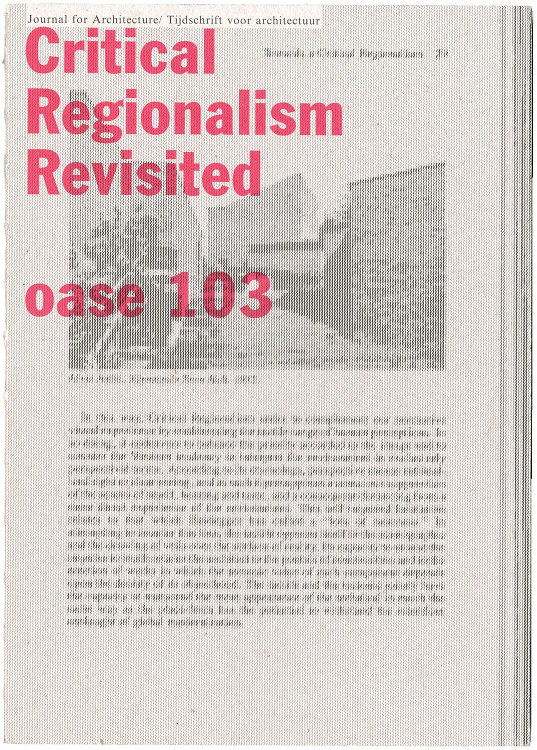
The latest issue of Oase, the journal of architecture, is worth getting hold of. It is devoted to a discussion Kenneth Frampton’s theory of ‘critical regionalism’, which he published first in an essay of 1983. In this special issue of Oase, the original article is reprinted in facsimile, with Dutch translation added; there is a retrospective interview with Frampton, and discussions of the critical regionalism theory by other, younger practitioner-historian-critics: the combined role that Frampton has himself exemplified in his now long career.
‘Subterranean modernism’
Hyphen Press / 2010.07.01
Idea magazine is pleasantly print-fixed: none of the words it publishes are put online, so anyone wanting a taste of it simply has to go out and find a copy. The current issue, no. 341, has an article that refers to Hyphen Press and its efforts. This essay, ‘Subterranean modernism’ by Randy Nakamura and Ian Lynam, is perhaps the first published piece by unconnected observers to address ideas that we’ve been busy with for now 30 years.
Cypher House, London N7
Hyphen Press / 2008.01.24
This building, designed by David Wild, is now very near to completion: it provides an artist’s studio and connecting top-lit rooms arranged in an interlocking L-shaped configuration.
Architectural positions
Hyphen Press / 2007.04.25
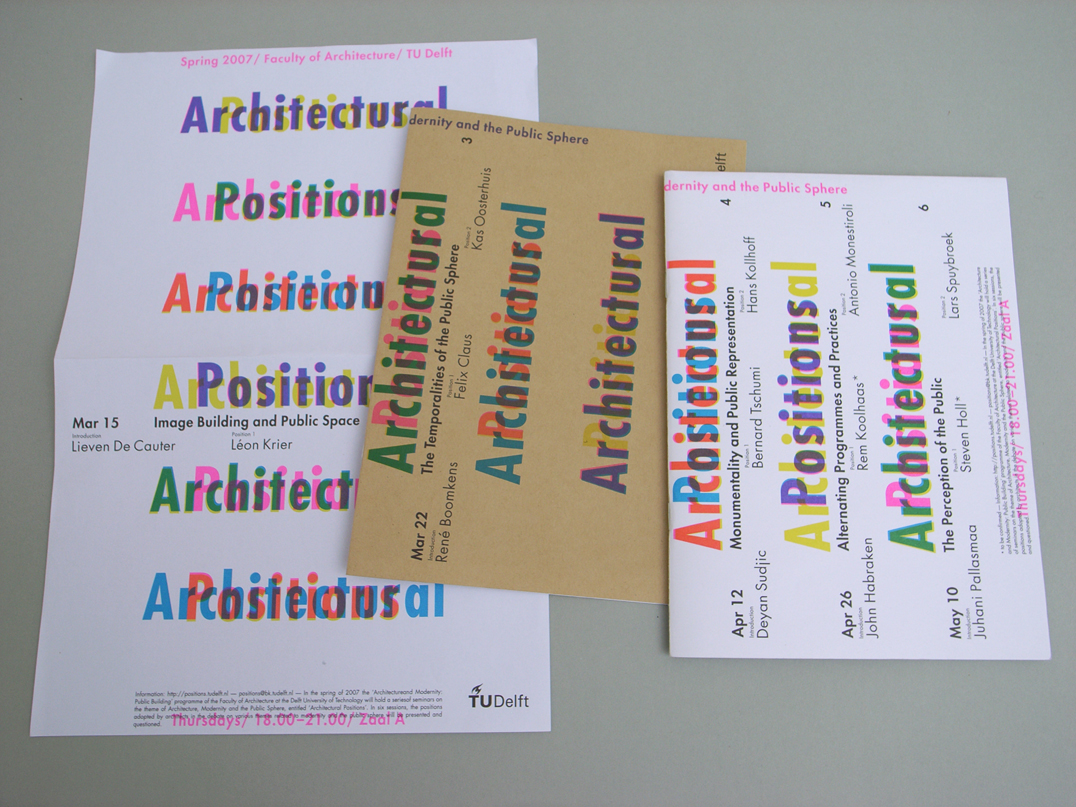
The faculty of architecture at the TU Delft commissioned Karel Martens to design booklets, flyers, stationery, and a poster for their series of six seminars this spring on ‘Architecture, Modernity and the Public Sphere’.
Domus reprinted
Hyphen Press / 2006.11.29
In a bravura act of publishing, Taschen Verlag has put out an extended selection, in facsimile, of the magazine Domus. This short review of the venture appears in the November issue of Architecture Today.
The architects of the book
Hyphen Press / 2002.05.22
Architectural and design publishing has seen remarkable changes in recent years. How does this sector of publishing work now? How did it come to have this structure? What part does the design of these books play?


