The faculty of architecture at the TU Delft commissioned Karel Martens to design booklets, flyers, stationery, and a poster for their series of six seminars this spring on ‘Architecture, Modernity and the Public Sphere’. Martens, working in collaboration with his daughter Aagje Martens, took up the implications of the title ‘Architectural Positions’, and the need to make flyers and booklets for the six occasions and for the series as a whole, but on a small budget. Just three printing plates were used for the colour printing, each containing two of the pieces; colour (cyan, magenta, yellow) was changed three times. In this way six different combinations or ‘positions’ were obtained. The black text is stable and clear. This patterning is enacted again in the website for the series. Not for the first time with this designer, the restrictions were embraced, with maximum effect.
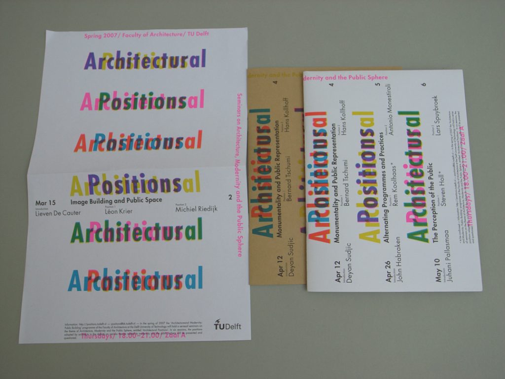
Some of the printings on the three papers used: flyer, individual seminar booklet, overall series booklet.
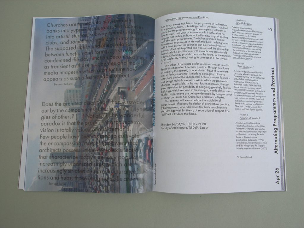
Inside the series booklet, the pages of text are interleaved with photos printed in coarse resolution on glassine paper.