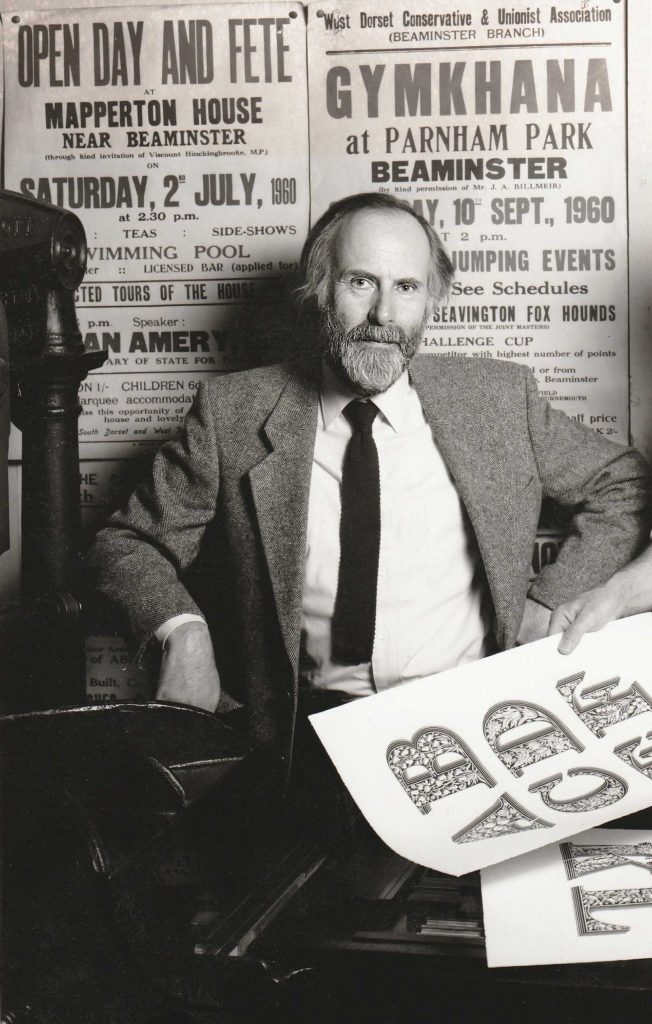
In the St Bride Library, 1990s? (The printed sheets, bottom right, show alphabets by Louis John Pouchée, which were published in 1992–3, in James’s collaboration with the printer Ian Mortimer.)
In the autumn of 1971 I joined the typography course at Reading University. At that stage the department went under the name of the Typography Unit: its status as the Department of Typography & Graphic Communication was granted in 1974. Among our first teachers was Gillian Riley: every week she gave us a simple design task, such as she might have done in her practice as a freelance typographer and book designer. After a while I understood that she was the partner of James Mosley, Librarian of the St Bride Printing Library and also a teacher at Reading (they married later, in 2000). I came to know both of them equally, first as teachers, then as colleagues and friends. From the beginning we were all on first-name terms, while Michael Twyman, the head and prime mover of the department, we students knew as ‘Dr Twyman’. I think it was only at the end of my undergraduate period that I found the courage to call him ‘Michael’. Now the three of them are gone: Gillian in November 2024, then in 2025, James (August) and Michael (October).1
So my first knowledge of James was at Reading in the 1970s, at his Saturday morning lectures on the history of type and letterforms. It was only later that I realized how exceptional he was as a lecturer. These were discourses, apparently improvised, using images – often his own high-quality photographs – as instances and stepping stones in a historical account. His lectures covered the whole history of Western letterforms, from Antiquity to twentieth-century modern.2 After the lectures, there was conversation, and then James, with Gillian, might drive on from Reading, perhaps further west.
Seeing letters in situ, on buildings, on monuments, on signs, was an important activity for him. In 1953–6 as a student at Cambridge (reading English) he had absorbed the materials published in the Architectural Review, notably Nicolete Gray’s articles on lettering on buildings, and he could have heard Nikolaus Pevsner’s Slade Lectures there. In October and November 1955 Pevsner gave the Reith Lectures for BBC radio on ‘The Englishness of English art’; the following year they were published by the Architectural Press as a book. James wrote deep scholarly contributions on the history of type and letterforms in Italy and France, and he was fluent in Italian and French, and acquired a good reading knowledge of German. But it seemed that his immersions in those cultures was not an escape, rather they were journeys from the country in which he was rooted and which gave him pleasure – England. In one of his many unpublished documents, he wrote: ‘For the record, I am one quarter Scotch by ancestry and have a wholly English identity.’ 3
Graduating from Cambridge, James at once found his perfect employment, as an assistant to the Librarian at St Bride’s, W. Turner Berry. He had already started to use the Library, and had got to know Berry, who invited him to apply for this position. Two years later, in 1958, Berry retired aged 70, and James succeeded him in the post. James was not a trained librarian, but he had strong qualifications for working in a library of printing: he knew how to set type and to print, and had made his first steps in printing as a child, with type acquired from the Adana company. At Cambridge he had worked as compositor and printer in a project that explored the possibilities of a hand-press, led by the bibliographer Philip Gaskell, who went on to become Librarian of Trinity College. James too was a librarian in the Cambridge-college mode: a scholarly figure, overseeing his library and its collections, directing a very small team of others who usually did have professional qualifications in librarianship. But further, the St Bride Library had emerged in the 1890s from the needs of the printing trade, then embedded in that part of London, on the edges of and within the City of London boundaries. The Library reflected the nature of the activity of printing – an indivisible blend of the technical, the practical, the historical, the humane.
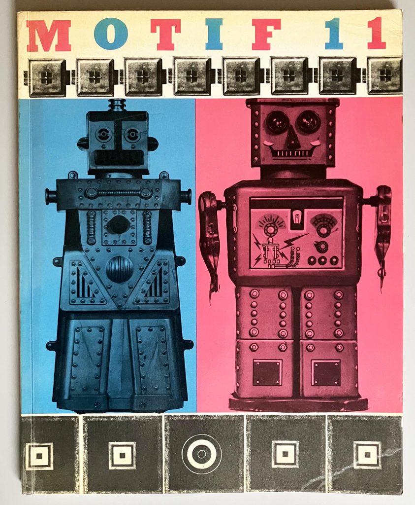
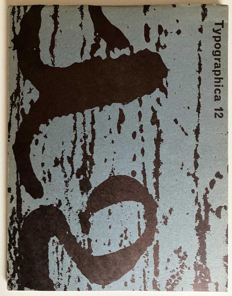
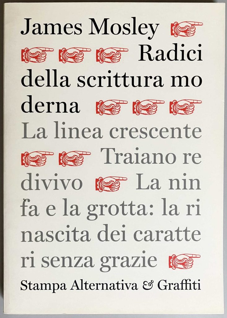
As a writer, James burst into the public world of typography in the mid-1960s with three substantial articles: ‘English vernacular: a study in traditional letterforms’ (Motif, no. 11, 1963), ‘Trajan revived’ (Alphabet, no. 1, 1964), ‘The nymph and the grot: the revival of the sanserif letter’ (Typographica, new series no. 12, 1965). These essays were both academically secure, but were written in plain and accessible prose that could reach anyone who was interested. They were also very well illustrated, with photographs by the author himself prominent among these pictures. The publishers of the three journals exemplified the indivisiblity of practice and theory in thinking about typography and letterforms. Each was published by an English printing firm priding itself on its high standards of design and production: Shenval Press in London (Motif), Kynoch Press in Birmingham (Alphabet), and Lund Humphries in Bradford and London (Typographica).4 Such cultural generosity from commercial firms is hard to imagine now.
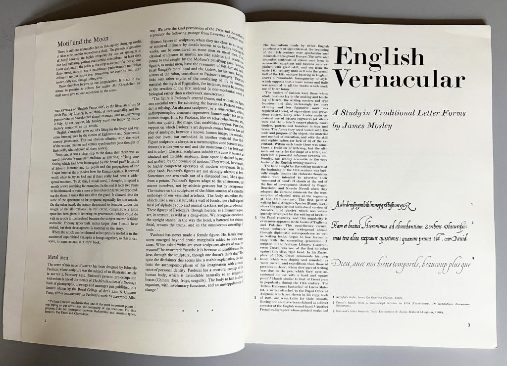
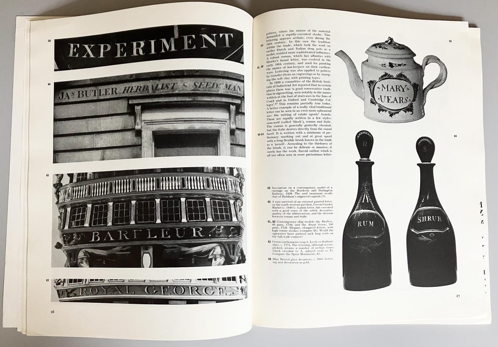
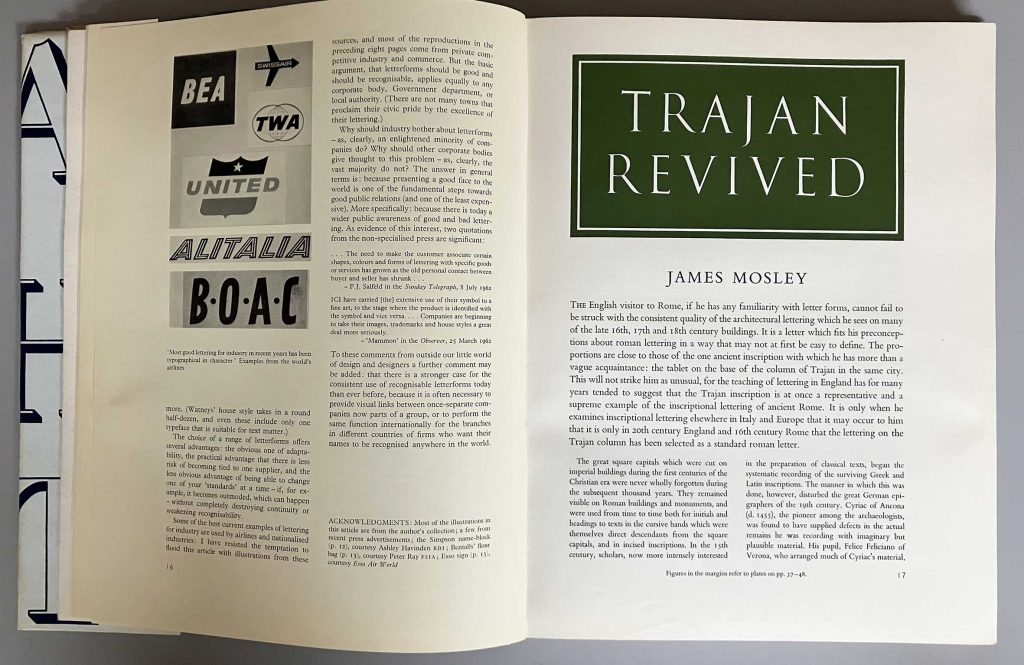
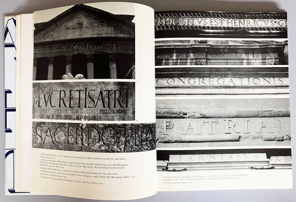
All these themes recurred in his writings, but the ‘English vernacular’ essay, in particular, proved to be the start of a continuing engagement: an exploration of a certain tradition of type and letterforms in England, which by the mid-twentieth century was endangered – pushed aside by a diluted Roman (as in Rome) letterform, often traceable to the forms on the base of the Trajan Column. Though never polemical, James was moved by preferences: for the vigorous forms, done with brio, and against the weak or merely geometric. (I could add that Gillian’s cooking was moved by the same set of preferences.) He had a strong and discerning visual sense, something that is not always evident in historians of type and printing. He preferred Giovanni Francesco Cresci to Giovanbattista Palatino; and certainly he preferred the original Trajan forms to their watered-down, modern interpretations. Among the English typefounders of the nineteenth century, he liked especially the types of Vincent Figgins – vigorous, generous – and, much later, gave the name of Figgins to his Flickr identity, as well as to the fat black cat that Gillian and he had for some years.
Tschichold / Froshaug
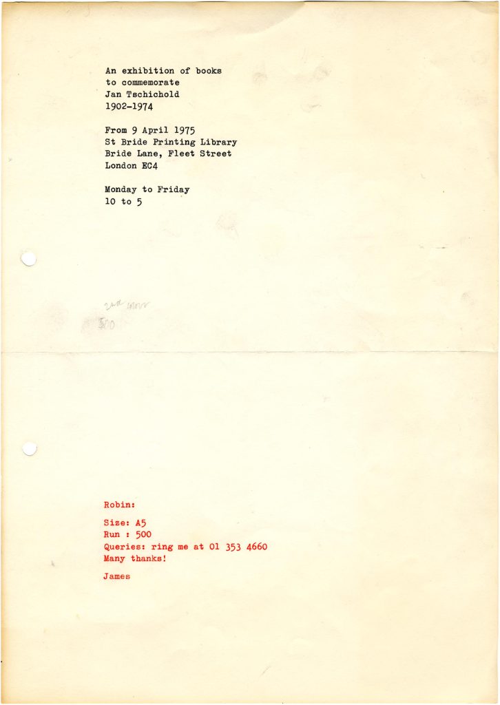
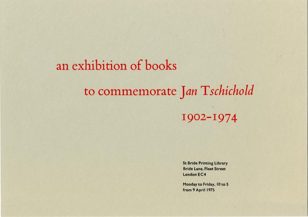
In 1975 the St Bride Library put on a display of the work of Jan Tschichold, who had died the year before and who was being celebrated in a book written by Ruari McLean. The job of designing a notice for the exhibition was given to me, then in my final undergraduate year; I did the typesetting, though not the printing. I had become preoccupied with Tschichold, teaching myself German to read his writings. Further, I had fallen under the spell of his sharpest English interpreter, Anthony Froshaug, becoming more of a Froshaugian than a Tschicholdian.5
I don’t know when James and Anthony first met each other, but it was almost certainly already in the 1950s. One person they had in common was the printer Desmond Jeffery, who had started as a follower of Froshaug. Jeffery’s wife and working partner of the time, Libertad, remembered of their workshop in London in the mid-1950s: ‘The workshop became quite a social club. Usually welcome were Anthony Froshaug, Romek Marber, Ivan Dodd, Alan Irvine, Robin Fior, Bob Miller-Smith, James Mosley …’.6
In 1957 Jeffery did literally follow Froshaug, in taking over his work for the St George’s Gallery when Froshaug left England to teach at Ulm. Jeffery, like Froshaug, was an enthusiast for certain nineteenth-century types, for example those of Stevens, Shanks & Sons. Both of them printed specimens for this typefoundry, for whom James worked in his summer vacation of 1955; among other jobs he did there was casting type by hand.
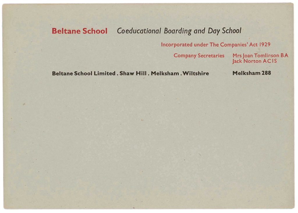
Another common factor: James had been a boarder at the Beltane School in Melksham, Wiltshire (c. 1940–6). This was a progressive school, co-educational, following Montessori principles, and with a significant number of German-speaking émigrés on the teaching staff. I might guess that James’s time at Beltane helped to bring out certain traits in him – a sense of democratic equality would be one of them. In 1949, Froshaug, designed and printed stationery for Beltane. Froshaug had moved in progressive, often émigré circles since his time as a student at the Central School – Beltane was a natural client for him.
In 1961 Froshaug returned to England from Ulm, to teach at the Royal College of Art, then in 1964 he had the opportunity to establish a new course at Watford School of Art. In an early move at Watford, the school showed an exhibition of his work: ‘Typography 1945/1965’. The work was displayed on a set of A2-sized black-fronted boards. After its showing was complete, Froshaug offered it for sale to the V&A, then to St Bride, for which James was glad to acquire it – paying £100 (as he told me). Froshaug and Jeffery were committed modernists, and James genuinely appreciated their work.
This touches on James’s attitudes towards the work being done by his contemporaries. I remember Anthony once saying that he wished James would express himself more openly (I think his phrase was ‘let his hair down’). I can see why Anthony felt this; I can also see why James was diplomatic about most of what was going on around him. He had an exposed position, was employed by the City of London Corporation, and had to deal with all kinds of people, across a very wide spectrum of views. But in the small world of English typography of the 1950s and 1960s, he quietly resisted the Morisonian orthodoxy, and showed his appreciation for other currents.7
Smeijers, Noordzij, Burnhill
I can explore this theme further in thinking about the work I began to do as a publisher with a number of typographers and designers who were developing strong theories. The first was Fred Smeijers, who I met first in 1991 and, fairly soon afterwards, began to work with towards the book we eventually published in 1996 as Counterpunch. I always felt that James was sceptical about Fred’s writing on making type in the sixteenth century. I think it seemed to him that Fred was going beyond the evidence, which was mainly in the surviving materials and not in any written statements – which were simply not there and probably never had been. Fred’s advantage over the scholars, even over those who could cast type (as James could), was that he was learning to cut punches, eventually making a complete set of them, from which a font of type could be cast.
James was in touch with the workers at the Imprimerie Nationale in Paris, who maintained the practices of type-making, mainly towards preservation and conservation, and he arranged for Fred and me to visit them. When we got to Paris he was there to introduce us and to interpret. So by then (1995?) he must have had enough respect for what we were doing, and wanted to enable this sharing of knowledge. That was typical of him.
Another practitioner and strong theorist was Gerrit Noordzij, with whom, together with Paul Stiff, I had begun to work in 1993–4. After some years of hesitation this process eventually led to an English-language edition of his book De streek. Gerrit and James knew each other through the forum of the ATypI conferences, but I think they hardly found any common ground. Much more than with Fred’s speculations, Gerrit’s theories about the production of letterforms were I think simply alien to James.
The third figure was Peter Burnhill, who had been an important source of ideas in the development of the course at Reading. When Peter began to develop his theories about the unitization of type in the printing of Aldus Manutius, and implicitly throughout the work of the early printers, I was attracted and wanted to know more. Others in the circle of typography at Reading (Richard Southall, Michael Twyman, Paul Stiff) were sceptical. James never engaged, but I felt his scepticism: there was no documentary evidence for this system of units. Like every other historian of type, his interest had been in letterforms, not in the mechanics of how pieces of type could fit together. It remains an almost unconsidered topic. Yet, until Peter published Type spaces, I don’t think that anyone had tried to explain how pieces of hand-made type were made to fit together.
Carter, Gray, Vernacular
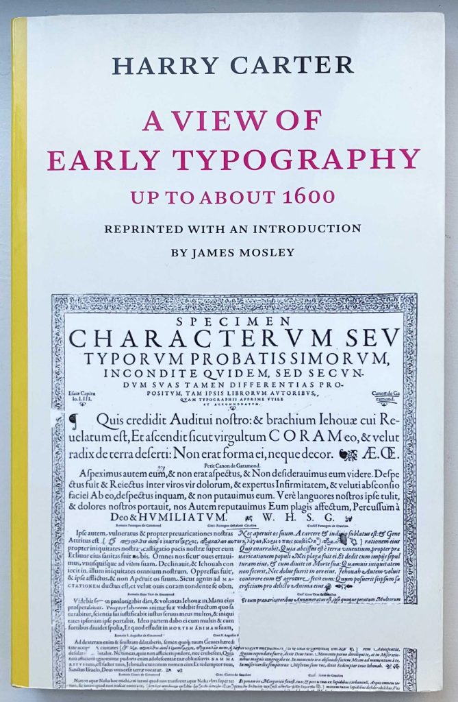
There were three Hyphen Press publishing projects that involved James in roles in which he was comfortable – as an editor of and commentator on the writings of others. The first, finished in 2002, was a reprint of Harry Carter’s A view of early typography, with a new introduction by James. The book had been published in 1969 by Oxford University Press, and had been out of print since the 1970s, when OUP had pulped remaining copies. We scanned a copy of the original and added the new introduction at the front of what was in effect a facsimile of the original book. This was a success, and our edition sold out in a reasonable number of years.
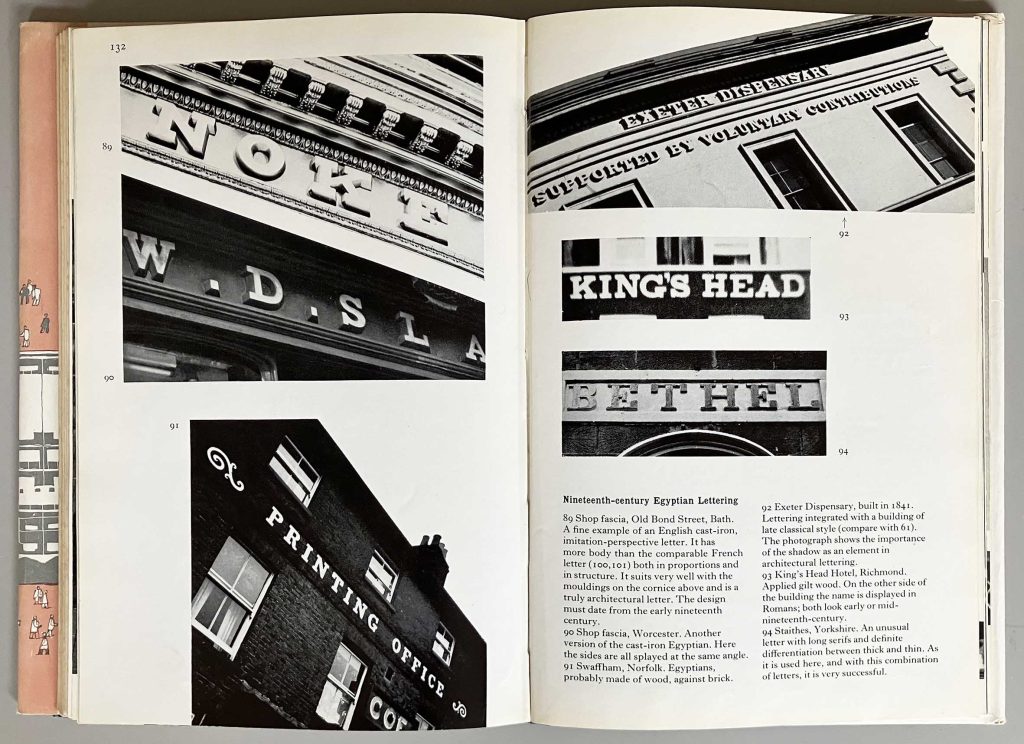
In 2002, soon after our Carter reprint was finished, I proposed a similar project: a reprint of Nicolete Gray’s Lettering on buildings. James agreed immediately to this suggestion, and we began to discuss the plan with Nicolete Gray’s son and literary executor Edmund Gray. The book had been important for James, and so it had been for me.8 It is a work of real, original thinking, which breaks with the orthodoxies of that time in Britain.
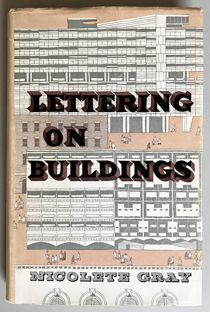
I have a thick file of the three-way correspondence from our attempt to make this new edition of Lettering on buildings. In one letter James wrote: ‘it is a work that I and many others found exciting and important when it appeared – though in fact, to be exact, I had known it since I first read the series of articles in the Architectural Review when they appeared in 1953–4, and one of the first things I did at the St Bride Printing Library when I went to work there was to get them as back issues.’ (Draft letter to Edmund Gray, 8 March 2004.)
From the start James said that we should follow the strategy we had adopted for Carter: a facsimile reprint, with new materials added separately. The book includes several photos of very poor quality. Edmund Gray, who had helped his mother with the original edition, wanted us to improve on these. The more I looked into finding or making improvements on photos of buildings that had long since been demolished or radically altered, the more I agreed with James. Our discussions went on for a couple of years, and the very last exchange in my file is from 2013. We could not reach agreement.
A third book project was proposed in 2006 by James himself. I can quote this passage from his email (28 February 2006), which had the subject line ‘A proposal’:
‘My first big essay was ‘English vernacular’ in Motif in 1963. It was followed by ‘Trajan’ in 1964 and ‘Nymph and grot’ in 1965. ‘Nymph and grot’ got a rerun in 1999, and again in 2001 in Giovanni Lussu’s elegant Italian translation (and elegant dress too), together with ‘Trajan’ and a linking piece called ‘The swelling line’ which was a kind of exposition of the essential theme of ‘Vernacular’.
Justin Howes made some suggestions about redoing ‘Vernacular’, and had scanned the original text, but the project had not progressed much when he died. So I wonder if it might be the sort of monograph, one that is concerned with a single overriding theme, that might fit your own kind of publishing. I am thinking especially of the monographs by Smeijers, Burnhill and Noordzij.’
A few days later (3 March) James had also written four pages of ‘notes for a new edition’. These start with reflections on the title of the original article:
‘ “English vernacular” … was a slightly jokey reference to one of the terms developed and used by the Architectural Review during the 1950s and which became a kind of private language among the left-wing design cognoscenti for which this journal was required reading. They included “outrage”, “functional tradition”, and so on.’
He wondered about finding another term for the title of this new book, though also seeing that it had become established and used by other writers in the field.
I don’t seem to have any record of my reply to this proposal, but I must have said ‘yes’. In October 2007 I emailed James with the thought that we ought to get on with it, and outlining terms for an agreement about royalties. Another item from the file is a layout for the book, dated 10 March 2008, by Françoise Berserik, book designer and letter-cutter, who like me had known James from student days in the 1970s at Reading. After this, the project lapsed, I suppose that each party had found other preoccupations.
James did pursue his ‘vernacular’ theme in the years following. In 2010 he published a reworking of these ideas and subjects in ‘Naming Victory’ (AA Files, no. 60). This piece would have been written at the suggestion of John Morgan, designer of AA Files, and another Reading graduate. From their collaboration followed the ‘vernacular’ lettering used in the architecturally adjusted Tate Britain (2014) and the historically appropriate lettering on HMS Victory, argued for in ‘Naming Victory’ and successfully implemented five years later (2015).
—————
I knew he was no technophobe, nevertheless James surprised me when he said he had started a blog. This was 2006, and the blogs I was used to reading were those devoted to hot political debate. He explained that a virtue of this medium was that one could go on correcting the text after its first publication. This wish for continual correction helps to explain why, even after his retirement from St Bride, he never devoted himself to a substantial book of writings. I remember Paul Stiff telling me that James had been almost scornful when he had suggested the idea of updating – or even superseding and replacing? – D.B. Updike’s Printing types. It was something he could have done – though he was critical of Updike’s work – but also something he just wouldn’t have done. His medium was the focused essay, and the annotation of historical texts and objects. One could certainly make a full collection, in a printed book, of these writings of his, and I hope that someone does.
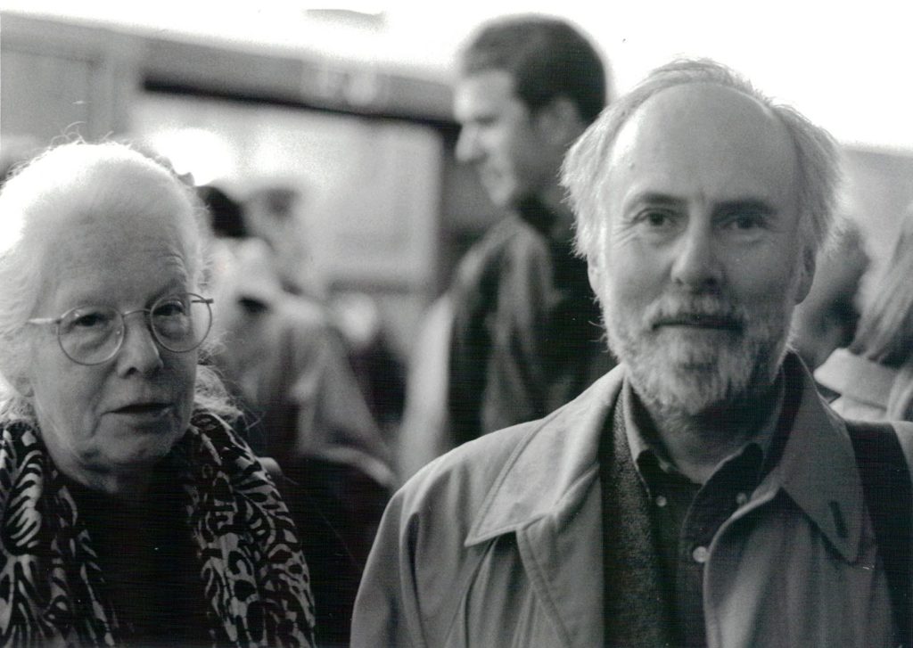
Gillian and James, at the launch of the Anthony Froshaug book, Conway Hall, London, 2000. (Photo: Françoise Berserik)
————————————————————
Robin Kinross
————————————————————
Notes
- See now these obituaries: Gillian, James, Michael. For James, see also Bob Richardson’s extended and helpful obituary in the Journal of the Printing Historical Society, 3rd series, no. 6, 2025, pp. 7–14, and Riccardo Olocco’s memories here.
- In 2020–1 he gave the lectures online, and recordings of these are now available on YouTube.
- ‘English vernacular, notes for a new edition’, dated 3 March 2006. Elsewhere in this text he refers to the Scotch Roman typeface – a style of letter that he was drawn to – and his use of the archaic ‘Scotch’ for ‘Scottish’ picks up on that association.
- Alphabet, more of a yearbook than a journal, ran to only one number.
- McLean’s book was launched with a talk at the St Bride Institute, with Edith Tschichold in attendance. I remember sitting next to Anthony at the back of the hall, an ancient and very hot heating pipe behind us. When it came to questions from the audience, Anthony rose to signal his intention to speak. The chair of the meeting – or perhaps it was Ruari McLean himself – said: ‘There is a question from the back of the hall.’ Anthony started: ‘This is the back of the hall speaking.’ He directed his question to both McLean and Edith Tschichold. McLean and Froshaug had known each other since the 1940s. After this, Anthony and his other companion rather ostentatiously walked out of the hall.
- Sally Jeffery, ‘Desmond Jeffery the printer’, Typography Papers, no. 8, p. 184.
- The printer and book designer Hugh Williamson once told me that in receptions and gatherings you had to look behind you, to make sure no one was listening, when you made any criticism of Stanley Morison.
- At school in Rugby in the 1960s I had borrowed a library copy and, under its inspiration, for a self-determined essay project had written a survey of lettering in that town, with my own photographs.