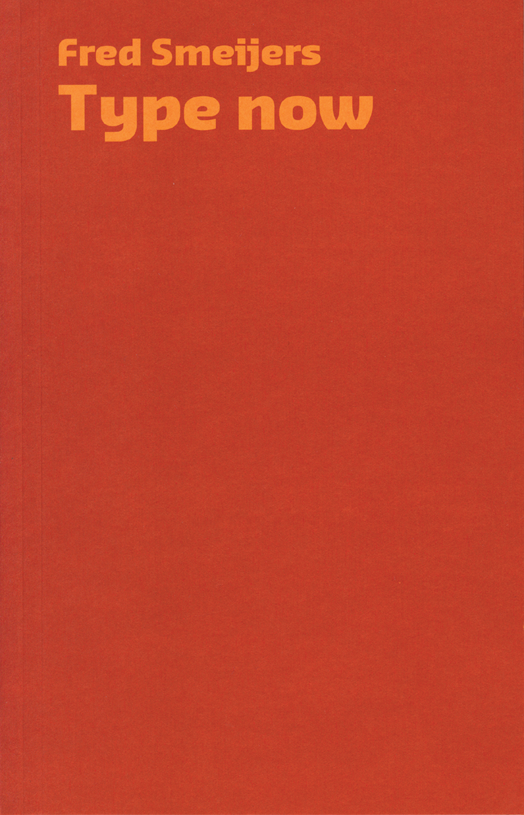
Type now: a manifesto, plus work so far
Robin / 2022.08.22
A short and strong statement of position by a type designer. The book takes a wide view, taking in the business of present-day font production, and the technics and the ethics of type as software. As always, Smeijers’s arguments are informed by a strong historical sense. The book also shows his own work as a designer, and is published as a conclusion to the award to him of the Gerrit Noordzij Prize.
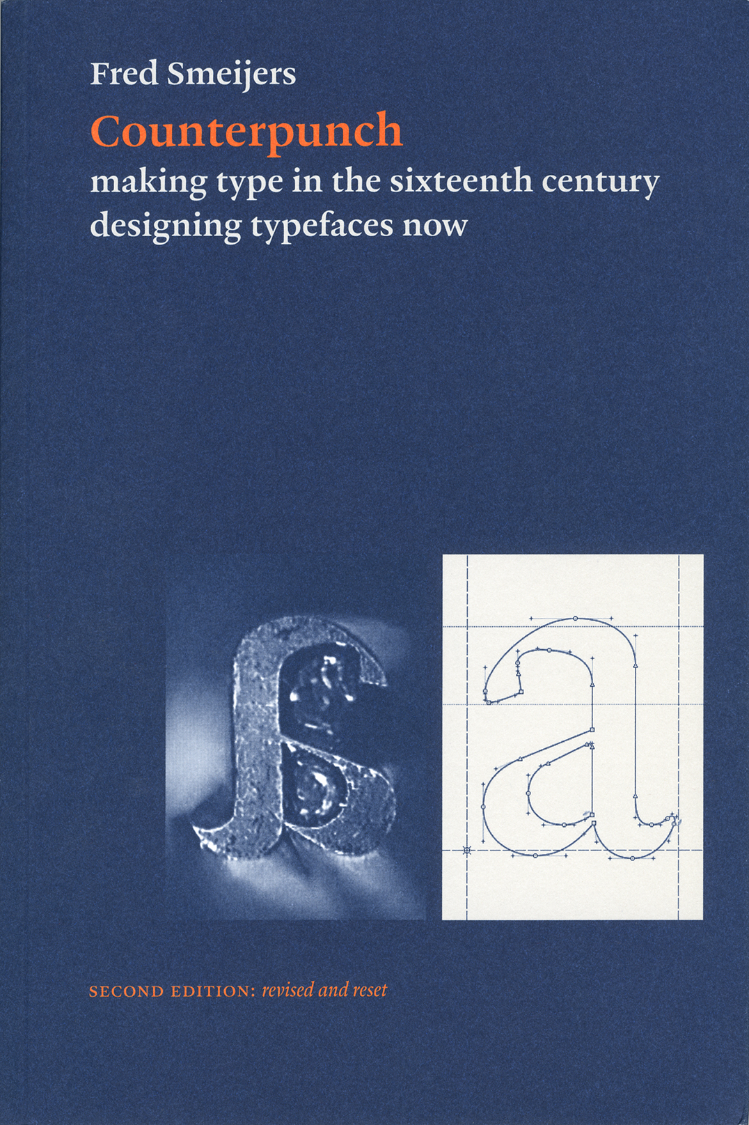
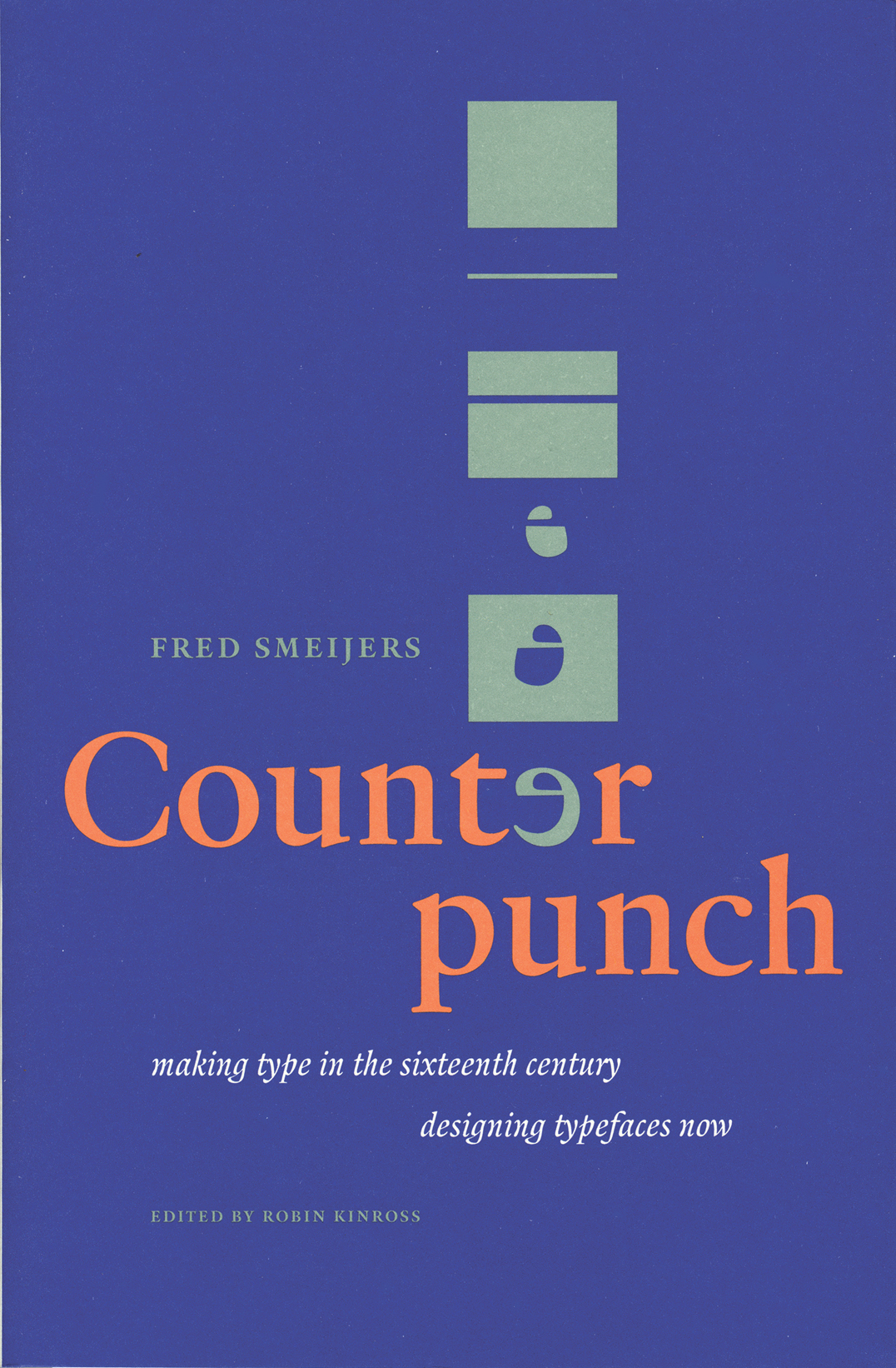
Counterpunch: making type in the sixteenth century, designing typefaces now
Robin / 2022.08.16
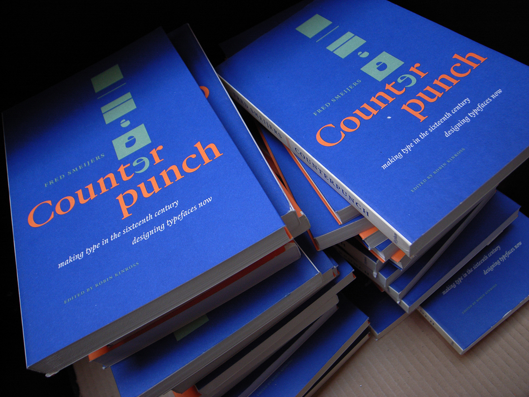
Counterpunch is packed with ideas. It is both an investigation into the technics of making metal type by hand, and a consideration of present questions in type design. The discussion takes in the fundamentals of designing and making letters, so that the book can be read as a guide to type and font construction in any medium. Lively, pointed drawings and photographs complement an equally fresh text.
Punchcutting at ATypI, San Francisco, 1994
Robin / 2018.10.08
In the 1990s the annual meetings of ATypI (Association Typographique Internationale) were often fascinating events. The organization was in transition. Formed in 1957, as a grouping of type manufacturers, it represented the industry’s attempt to regulate itself, and especially to prevent – without recourse to the courts of law – one company from copying the designs of another.
Karel Martens at the KABK
Robin / 2015.03.12
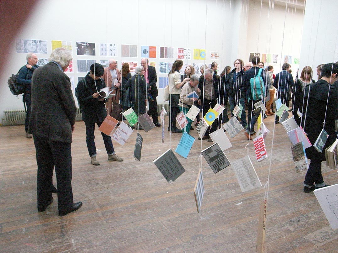
The Gerrit Noordzij Prize, organized by the Type and Media postgraduate course at the Koninklijke Academie van Beeldende Kunsten (Royal Academy of Art) in The Hague, is awarded every three years. Last week it was presented to the type designer Cyrus Highsmith, and the previous winner, Karel Martens, was celebrated in a seminar, an exhibition, and a book.
The work of Matthew Carter
Robin / 2011.11.01
On 13 October in Antwerp Fred Smeijers spoke some words of introduction at the opening of the exhibition ‘The Most Widely Read Man in the World: Matthew Carter’, on show until the end of the year at the Catapult gallery.
‘Counterpunch’: second edition at the printer
Robin / 2011.09.06
The long-delayed and much-anticipated second edition of this book is now in the last stages of production: it was printed yesterday and now goes to the binder. We expect that copies will go on sale in Europe at the end of this month.
Smeijers interviewed
Robin / 2011.06.07
Fred Smeijers interviewed, as OurType makes a deal with WebInk.
Antwerp talk
Robin / 2010.09.28
On the occasion of an exhibition about Jan I Moretus – the Moretus in ‘Plantin-Moretus’ – Fred Smeijers is giving a public lecture on ‘present-day typography’ at the Plantin-Moretus Museum in Antwerp on 28 October.
Price changes: good news
Robin / 2010.01.03
As from today we are reducing the price of Fred Smeijers’s Type now, from £17.50 to £10. The book was made on the occasion of the award of the Gerrit Noordzij prize to Smeijers and surveys his work up to then (November 2003).
Alexander Verberne
Robin / 2009.09.15
The typographer Alexander Verberne died on 27 May 2009. After a stroke in 1997, which was followed by further strokes, he had been seriously impaired and was living in a care-home in The Hague. He was born on 18 August 1924 in Den Helder.
Ludwig
Robin / 2009.03.25
This new typeface designed by Fred Smeijers has just been released by OurType. As its name promises, it is an echt-German production: recalling the early-nineteenth-century Grotesk letter.
‘Counterpunch’ discovery
Robin / 2008.06.12
Not for the first time in the history of publishing, a book that had been declared ‘out of print’ makes a return to availability.
‘Counterpunch’: the second edition
Robin / 2008.01.03
Prompted by this nice review, we can confirm that a second edition of the book is in preparation.
Is it possible to determine what typeface of the 1990s will become a classic in the future
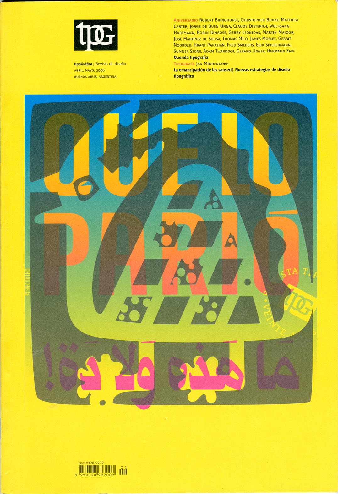
Robin / 2006.09.27
With its issue of April–May 2006 (no. 70), the magazine Tipográfica entered its twentieth year of publication. Published from Buenos Aires since its first issue of May 1987, the magazine is now established as one of the liveliest and most internationally minded design magazine.
Die S-Klasse
Robin / 2005.06.06
A pleasant report on Fred Smeijers’s class at the HGB Leipzig has been published in the heavy-duty weekly Die Zeit.
Smeijers further
Robin / 2004.04.09
Last month Fred Smeijers spoke about his work to an enthusiastic and packed audience.
Smeijers in London
Robin / 2004.02.17
On Tuesday 16 March at the St Bride Institute, London, Fred Smeijers will give a public lecture on the theme of ‘type now’.
OurType
Robin / 2003.12.18
Fred Smeijers’s dream of his own font label is now a reality. OurType will publish all his new typefaces, together with work by others, chosen by Fred and co-director Rudy Geeraerts.
Smeijers so far
Robin / 2003.10.15
Type now, made at top speed, was finished just in time for its presentation on 17 October at the Royal Academy of Art in The Hague.
Smeijers: exhibition and book
Robin / 2003.08.14
We are spending the hot summer indoors, working hard on new titles. The latest to be announced is Type now by Fred Smeijers. This will consist of an essay on the present situation in type design, fifteen or so years into the ‘PostScript revolution’, together with a colour section showing Fred’s own work as a designer.
‘Type spaces’ reviewed (2)
Robin / 2003.03.02
An appreciation of the book by Jacques André is published in La Lettre Gutenberg (number 29), with some lamentations about how such a work could not possibly be published in France.
ATypI, Rome
Robin / 2002.09.29
At the ATypI conference in Rome last week, three Hyphen authors spoke.
New Series
Robin / 2002.08.02
Andy Crewdson’s ‘New Series’ is now launched. This is a natural successor to his weblog Lines & Splines, which in its later entries had begun to move towards more extended discussions.
New typeface
Robin / 2002.02.13
The new edition of Norman Potter’s What is a designer is set in the typeface Arnhem, designed by Fred Smeijers. Arnhem was designed and developed from 1998 onwards for a redesign of the Nederlandse Staatscourant that was undertaken by the Werkplaats Typografie in Arnhem (thus the name).
Smeijers prized / Noordzij presented
Robin / 2001.02.16
The Gerrit Noordzij Prize 2001 was awarded to Fred Smeijers in a meeting at the Konklijke Academie van Beeldende Kunsten in The Hague. The prize was first given in 1996, to Noordzij himself, during the ATypI meeting there.
The nice and the good
Robin / 1998.12.30
Counterpunch is included in the exhibition ‘Mooi maar goed: graphic design in the Netherlands 1987–1998’ at the Stedelijk Museum Amsterdam.
New traditionalism
Robin / 1998.10.21
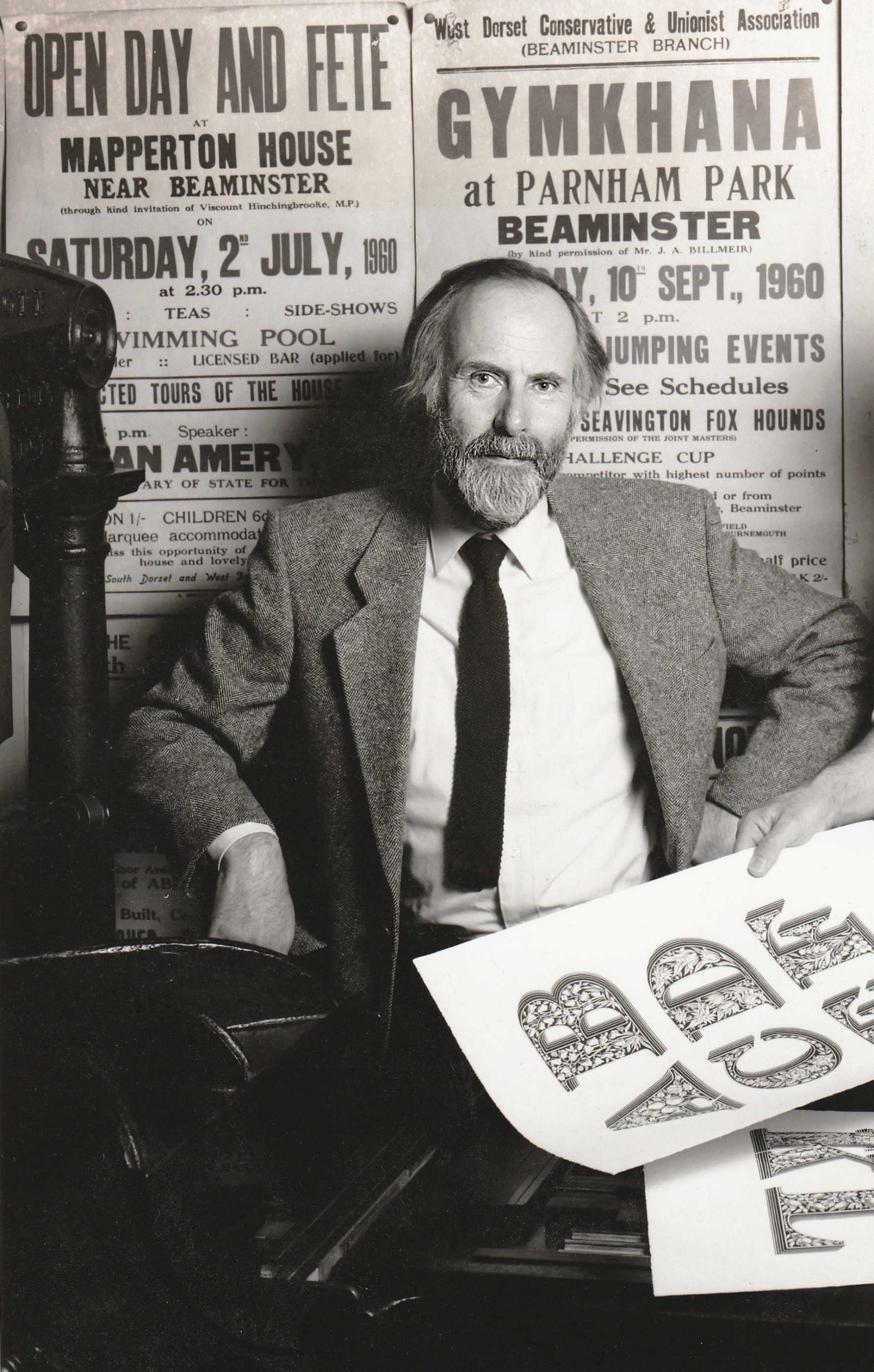
The October issue of Items, the Dutch design magazine for Dutch designers, carries an article by Jan Middendorp on the work of Fred Smeijers, complete with a designer-stubble photo of the subject.
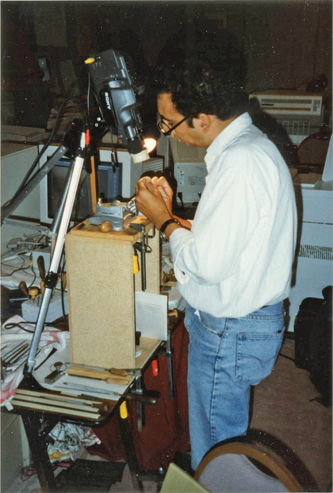
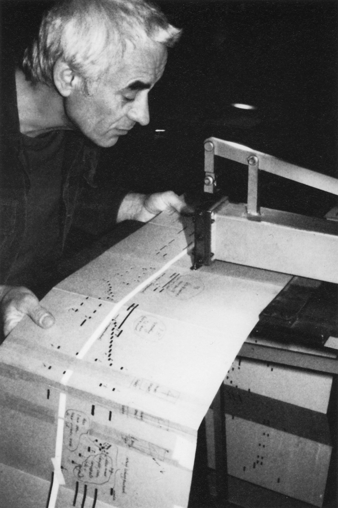
‘Counterpunch’: how the book was made
Robin / 1998.07.26
This article was written in October 1996 for the ‘Typelab Krant’. This was a laser-printed and stapled publication circulated at the ATypI meeting in The Hague in that year: it was published in the issue of 25 October 1996. We resurrect the piece now, because it gives some picture of the way in which Hyphen Press books come into existence.
Digital ‘Counterpunch’
Robin / 1998.07.23
Word is getting out that this book is for digital people too (or maybe it is mainly for them?).