Typography papers 9
Hyphen Press / 2022.08.22
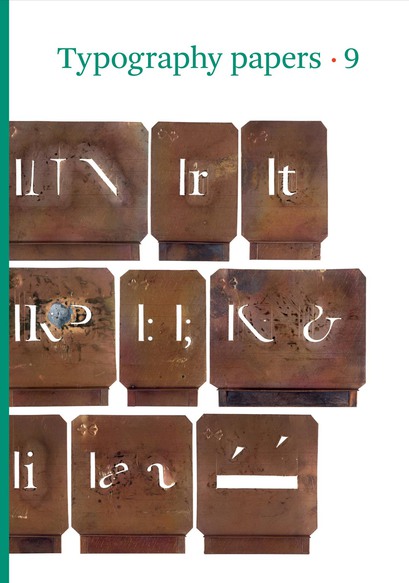
This latest issue of the series of Typography papers opens with a beautifully illustrated article by the type designer Gerard Unger on ‘Romanesque’ letters. A further installment of Eric Kindel’s pathbreaking history of stencil letters is published in contributions by him, Fred Smeijers, and James Mosley. Maurice Göldner writes the first history of an early twentieth-century German typefounder, Brüder Butter. William Berkson and Peter Enneson recover the notion of ‘readability’ through a history of the collaboration between Matthew Luckiesh and the Linotype Company. Paul Luna discusses the role of pictures in dictionaries. Titus Nemeth describes a new form of Arabic type for metal composition. The whole gathering shows the remarkable variety and vitality of typography now.
Typography papers 6
Hyphen Press /
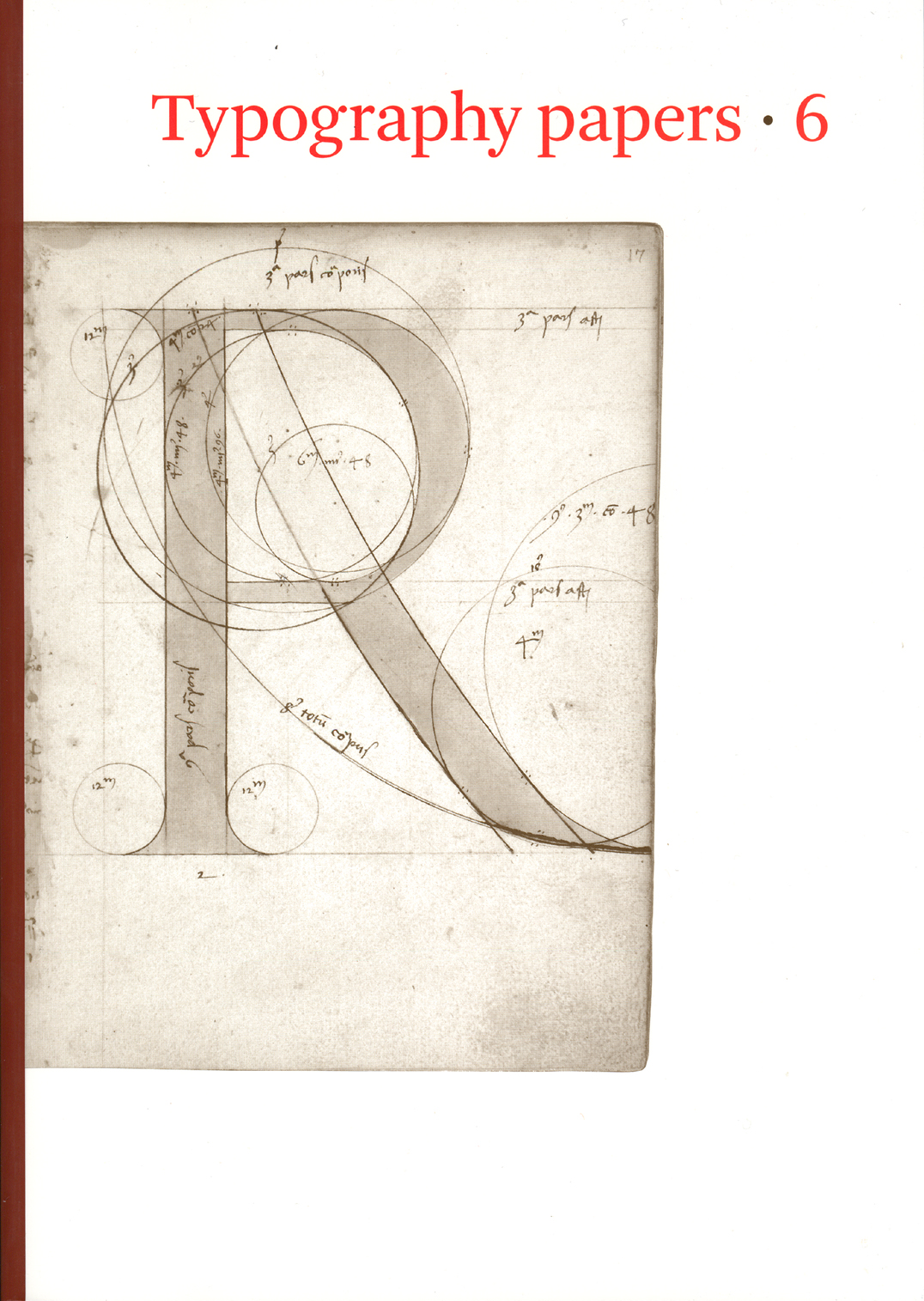
This occasional, book-length work is edited and produced at the Department of Typography, University of Reading, and is now published by Hyphen Press. It publishes extended articles on its subject, exploring topics to the length to which they want to go. Its scope is broad and international, its treatment – serious and lively.
Signs at the Royal Festival Hall
Hyphen Press / 2007.12.10
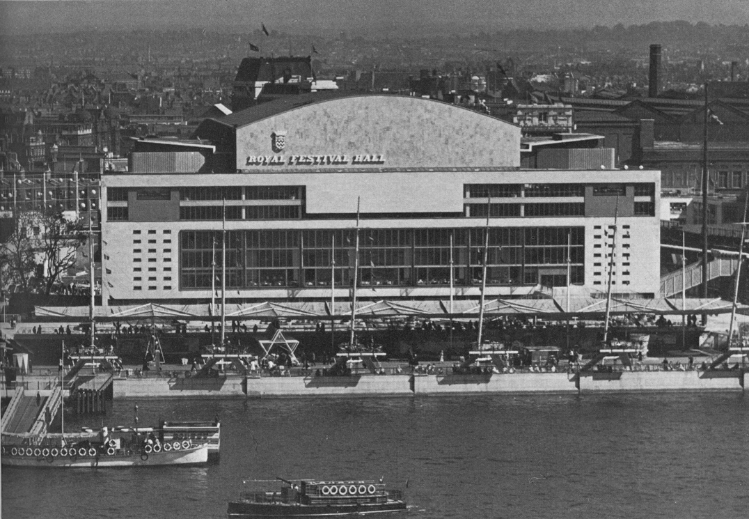
In summer of this year the Royal Festival Hall, on the South Bank of London’s river, was reopened after a major, two-year refurbishment. The auditorium itself was remade and restored, and the rest of the building was significantly remade/restored too. The spirit and the materials of the original building were respected, at the same time changes needed for the place’s new uses were made.
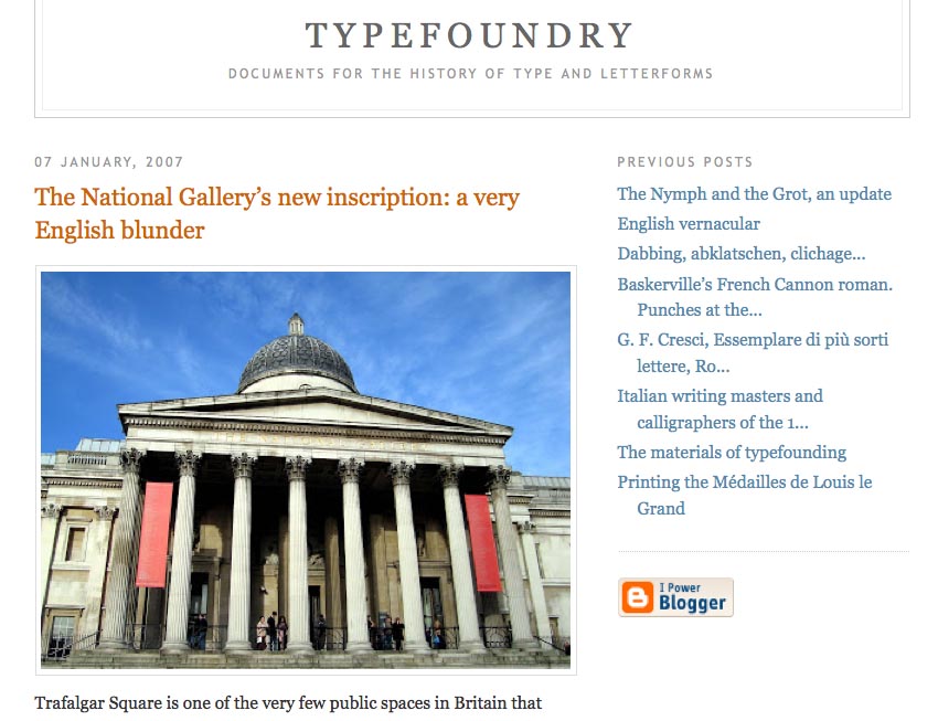
A very English blunder
Hyphen Press / 2007.01.09
James Mosley has welcomed the new year by adding two substantial posts to his blog Typefoundry: an update on his thesis about the appearance of sanserif letters in eighteenth-century Britain; and an explanation of why the inscription recently added to the National Gallery in London is all wrong.
