Active literature: Jan Tschichold and New Typography
Christopher Burke
In the first book on Tschichold to be based on extensive archive research, Burke turns fresh and revealing light on his subject. He sets Tschichold in the network of artists and designers who constituted New Typography in its moment of definition and exploration, and puts new emphasis on Tschichold as an activist collector, editor and writer. Tschichold’s work is shown in colour throughout, in freshly made photographs of examples drawn from public and private collections. This is not a biography, but rather a discussion of the work seen in the context of Tschichold’s life and the times in which he lived.
Out of print. Find out more
Anthony Froshaug: Typography & texts / Documents of a life
Robin Kinross (editor)
Presents the work and life of this essential typographer, until now too little known outside the circle of his friends and students. Froshaug was a deep and charismatic thinker-practitioner, whose insights return us to the fundamentals of typography. The book consists of two interacting volumes: the solid record of the work is placed against the contingencies of the life. A traditional monograph is unsettled by an exploration in documentary.
Out of print. Find out more
Asleep in the afternoon
E.C. Large
This is the novel first published in 1938 in London. We are publishing facsimile editions of this book and its precursor, Sugar in the air. A third book, God’s amateur: the writing of E.C. Large is being published alongside the two novels, as a companion.
Find out more and buy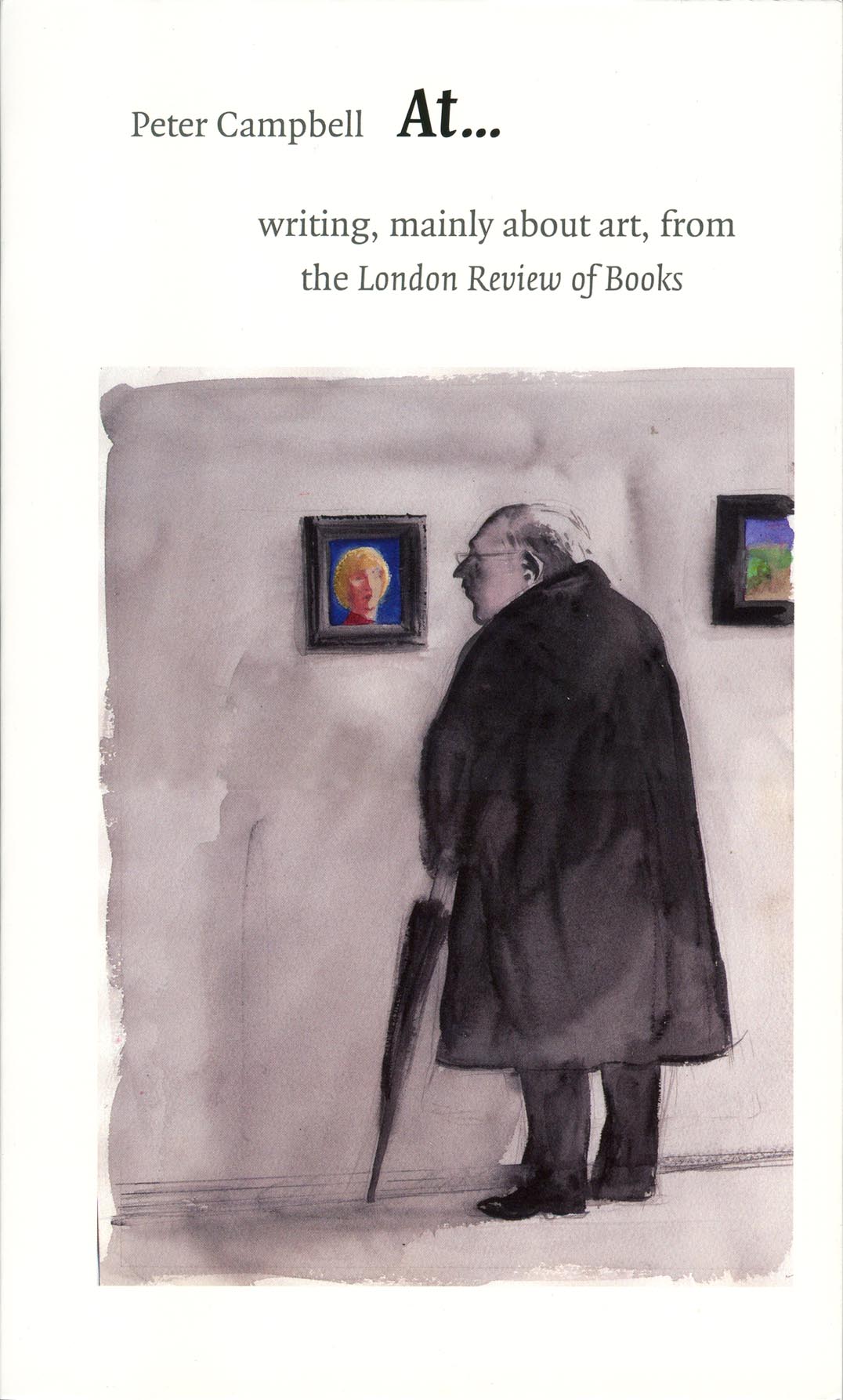
At …: writing, mainly about art, for the London Review of Books
Peter Campbell
For over ten years Peter Campbell has reviewed art exhibitions for the London Review of Books. His writing is distinctive: often closely descriptive, always inquisitive about technique, it is the product of an independent mind and eye. Easy evaluations are resisted: we are invited to consider the work on show in its present place – ‘at’ the museum or gallery to which the critic has travelled on our behalf. This generous selection of reviews covers a wide range of subjects, from Bellini and Titian to Lucian Freud and Louise Bourgeois, from Hawksmoor to Libeskind. Blockbusting shows are noticed, but so too are exhibitions of unfashionable artists, of photographers and applied artists. Reviews of buildings and pieces on the everyday urban scene add another dimension to this book. Campbell is a typographer and book designer, and is also the draftsman of the London Review‘s covers. His writing is of a piece with these accomplishments.
Out of print. Find out more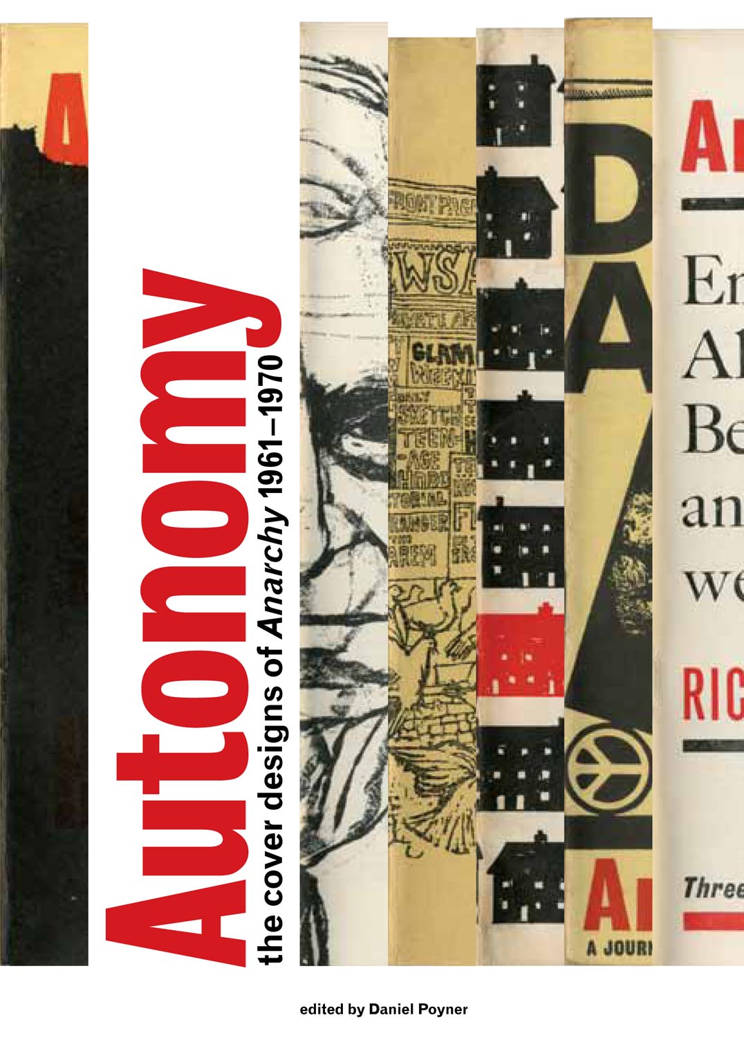
Autonomy: the cover designs of Anarchy, 1961–1970
Daniel Poyner (editor)
Anarchy was a journal of ideas published in London in the 1960s. Although its contributors were many and diverse, Anarchy was essentially the creation of one person, Colin Ward (1924–2010). With this journal, and throughout his work as a writer, editor, and activist, Ward proposed the idea that anarchist principles of mutual aid and autonomous organization outside a centralized state can be achieved here and now. This book gives attention for the first time to the covers of Anarchy, designed mostly by Rufus Segar. These little-known works provided the enticing entry to the plain text pages of the journal. The book reproduces all of the covers in a sequence that suggests, incidentally, something of the history of graphic design in Britain in those years. And it goes beyond the images, with an array of supporting texts that give a full picture of Anarchy and its context.
Find out more and buy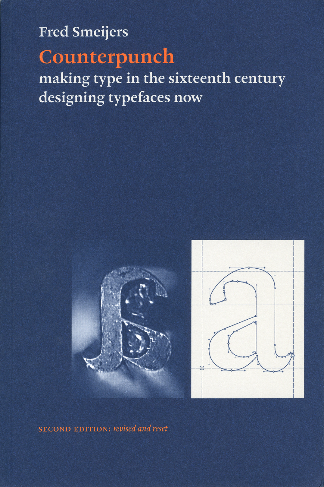
Counterpunch: making type in the sixteenth century, designing typefaces now
Fred Smeijers
Counterpunch is packed with ideas. It is both an investigation into the technics of making metal type by hand, and a consideration of present questions in type design. The discussion takes in the fundamentals of designing and making letters, so that the book can be read as a guide to type and font construction in any medium. Lively, pointed drawings and photographs complement an equally fresh text.
Out of print. Find out more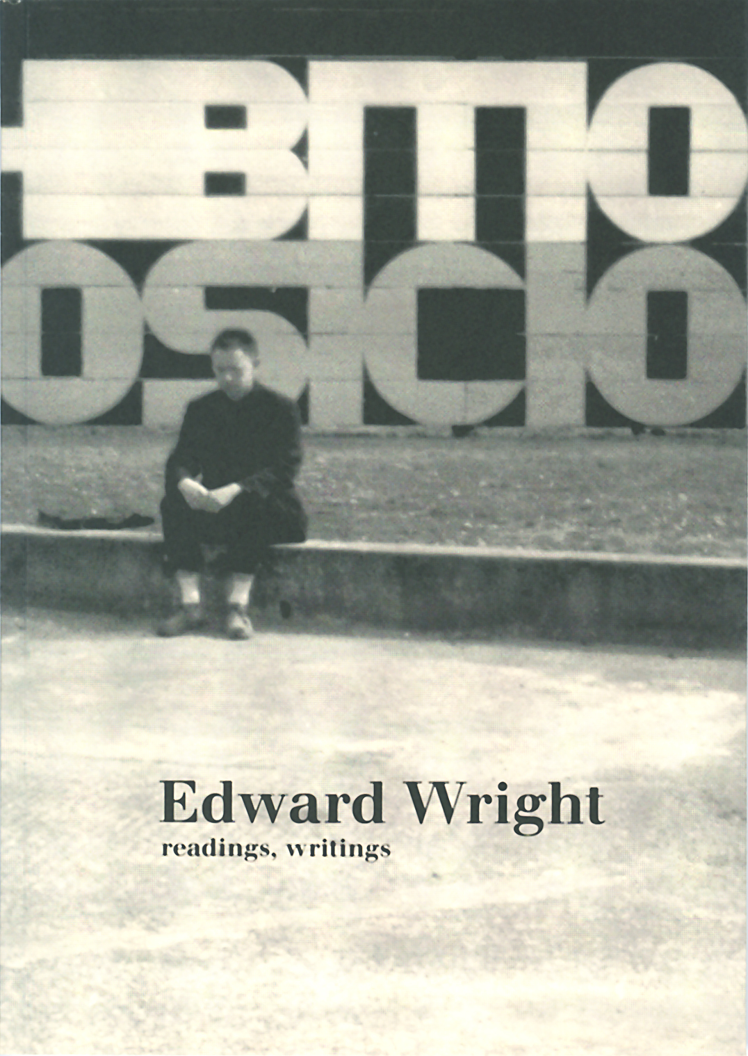
Edward Wright: readings, writings
Petra Cerne Oven (editor)
Born to South American parents, British citizen, cosmopolitan at heart, Edward Wright – painter and object-maker, typographer, writer, teacher – was an enigmatic presence in London’s post-War art and design scene. Wright has been described thus: ‘His subjects: human communication, the mundane, the street. His manner: sparing, self-critical, yet the work had vigorous attack and full conviction. His typical method: assemblage, with what was to hand.’
Out of print. Find out more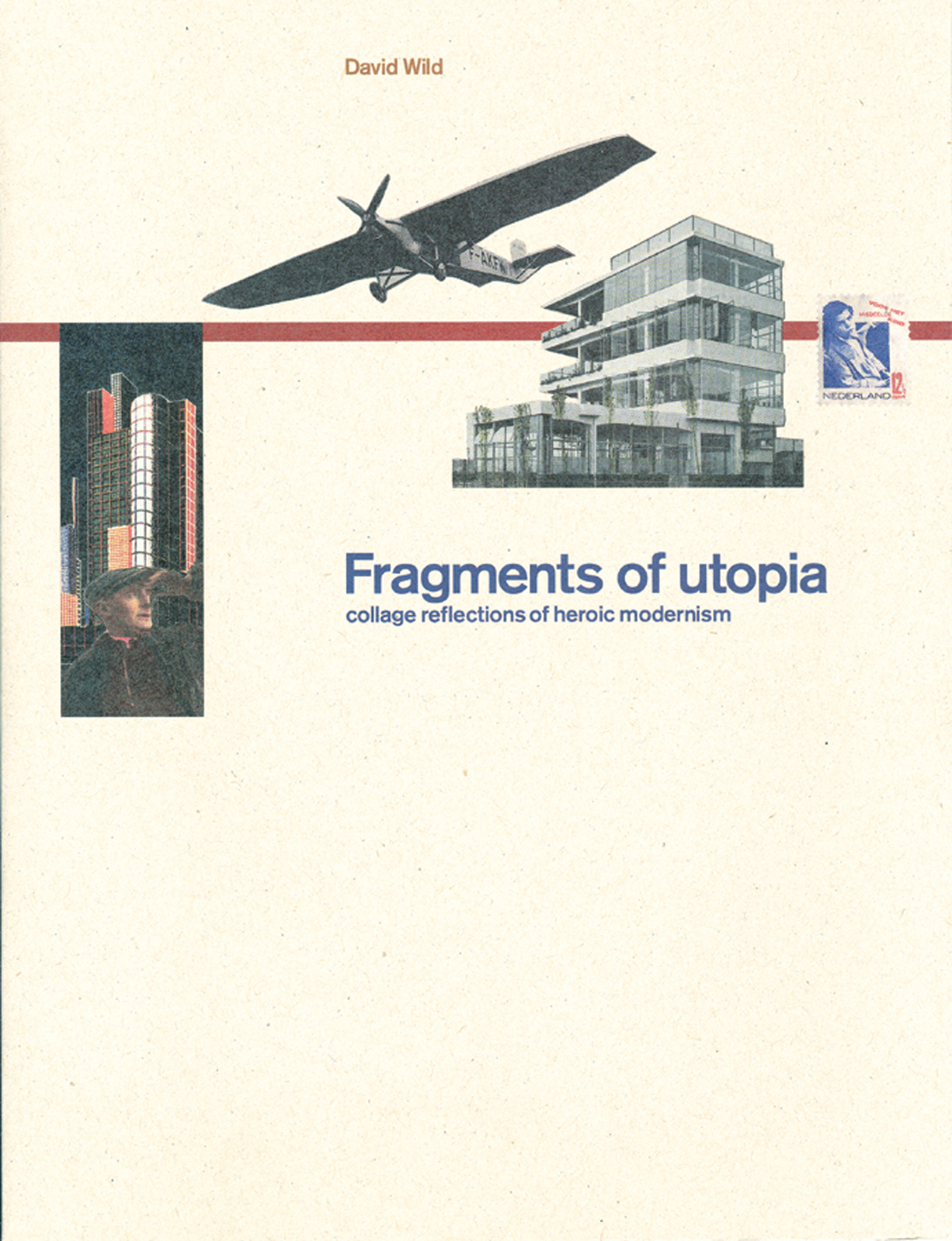
Fragments of utopia: reflections of heroic modernism
David Wild
A set of collages made from mainly contemporary sources, which recount episodes in modernist architecture in the twentieth century. This is a story of a fragile and occasionally noble dream, in the context of a history going violently wrong. These images are supplemented by short parallel prose meditations. Wild’s images have a wonderful rightness of form. But they are far from idealized: politically charged, they have a disconcerting sense of erotics and low humour.
Out of print. Find out more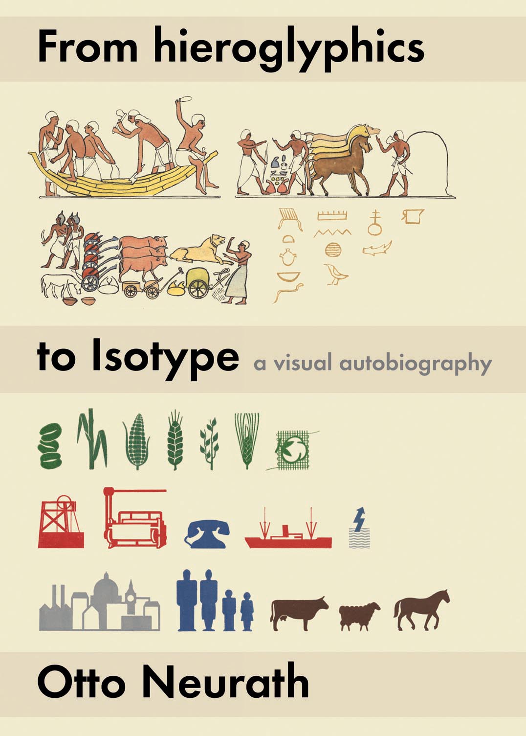
From hieroglyphics to Isotype: a visual autobiography
Otto Neurath / edited by Matthew Eve & Christopher Burke
Otto Neurath wrote From hieroglyphics to Isotype during the last two years of his life: this is the first publication of the full text, carefully edited from the original manuscripts in the Otto & Marie Neurath Isotype Collection at the University of Reading. Calling it a ‘visual autobiography’, Neurath documents the importance to him of visual material, from his earliest years to his professional activity with the picture language of Isotype. He draws clear connections between the stimulus he received as a boy – from illustrated books, toys, and exhibitions – to the considered work in visual education that occupied him for the last twenty years of his life. This engaging and informal account gives a rich picture of Central-European culture around the turn of the twentieth century, as well as an exposition of the techniques of Isotype. The edition includes the numerous illustrations intended by Neurath to accompany his text, and is completed by an extensive appendix showing examples from the rich variety of graphic material that he collected.
Out of print. Find out more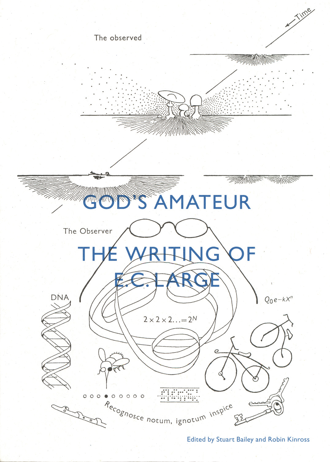
God’s amateur: the writing of E.C. Large
Stuart Bailey & Robin Kinross
A book of and about E.C. Large, which contains a selection of his shorter writings – travel essays, reportage, reveries, reviews, critiques, autobiographical pieces – and which reveals the extent of his achievement. These show a notably exact writer, with sane no-nonsense views, and yet with great imagination. Some unpublished texts are shown in facsimile. Also here is a bibliography of his published writings (both ‘literary’ and scientific), and an essay by Stuart Bailey, which sees his work with present-day eyes.
Out of print. Find out more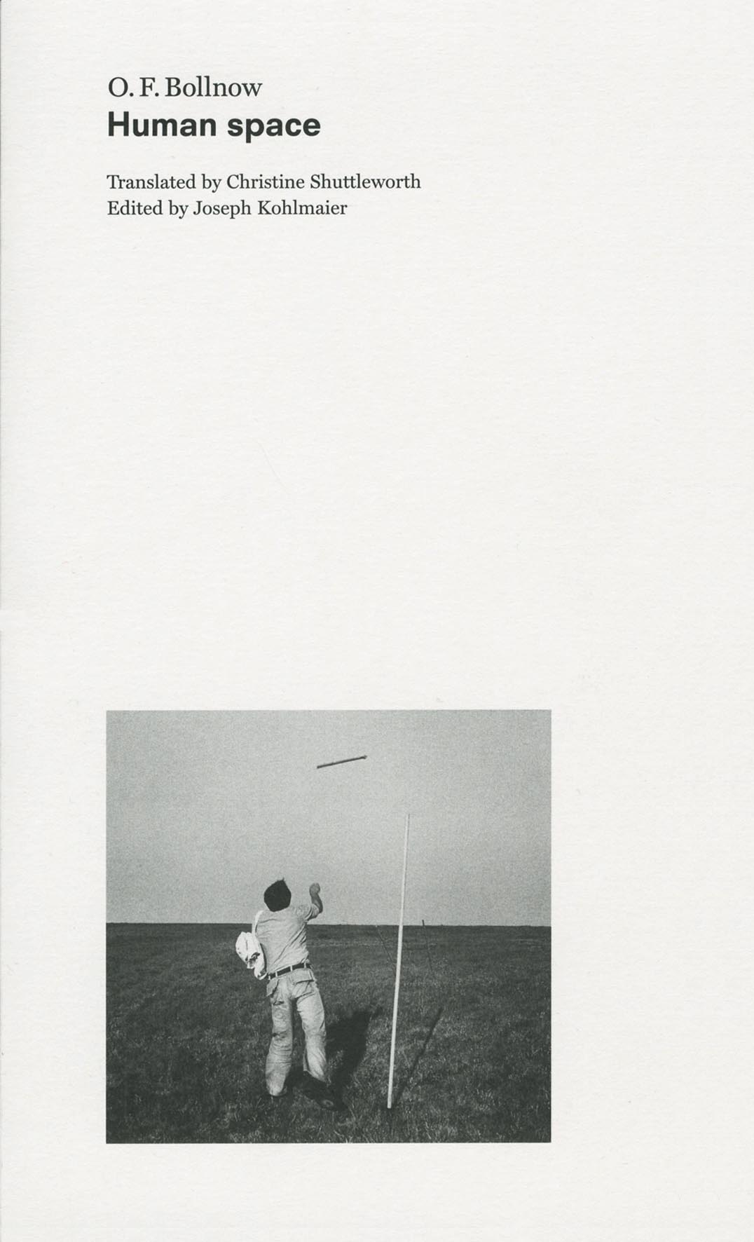
Human space
O.F. Bollnow
Human space is an English translation of one of the most comprehensive studies of space as we experience it. Since it was published in Germany in 1963, Bollnow’s text has become a key reading in architecture, anthropology, and philosophy, and has been kept continuously in print (in 2010 the German edition was issued in its eleventh impression). The book is serious academic research and something more – showing a great sensitivity to the near and the everyday. The text is enlivened and illustrated with many quotations, principally from German and English literature. Our edition is translated by Christine Shuttleworth and has an afterword by Joseph Kohlmaier, who places the work in its context of philosophical and architectural discussion.
Out of print. Find out more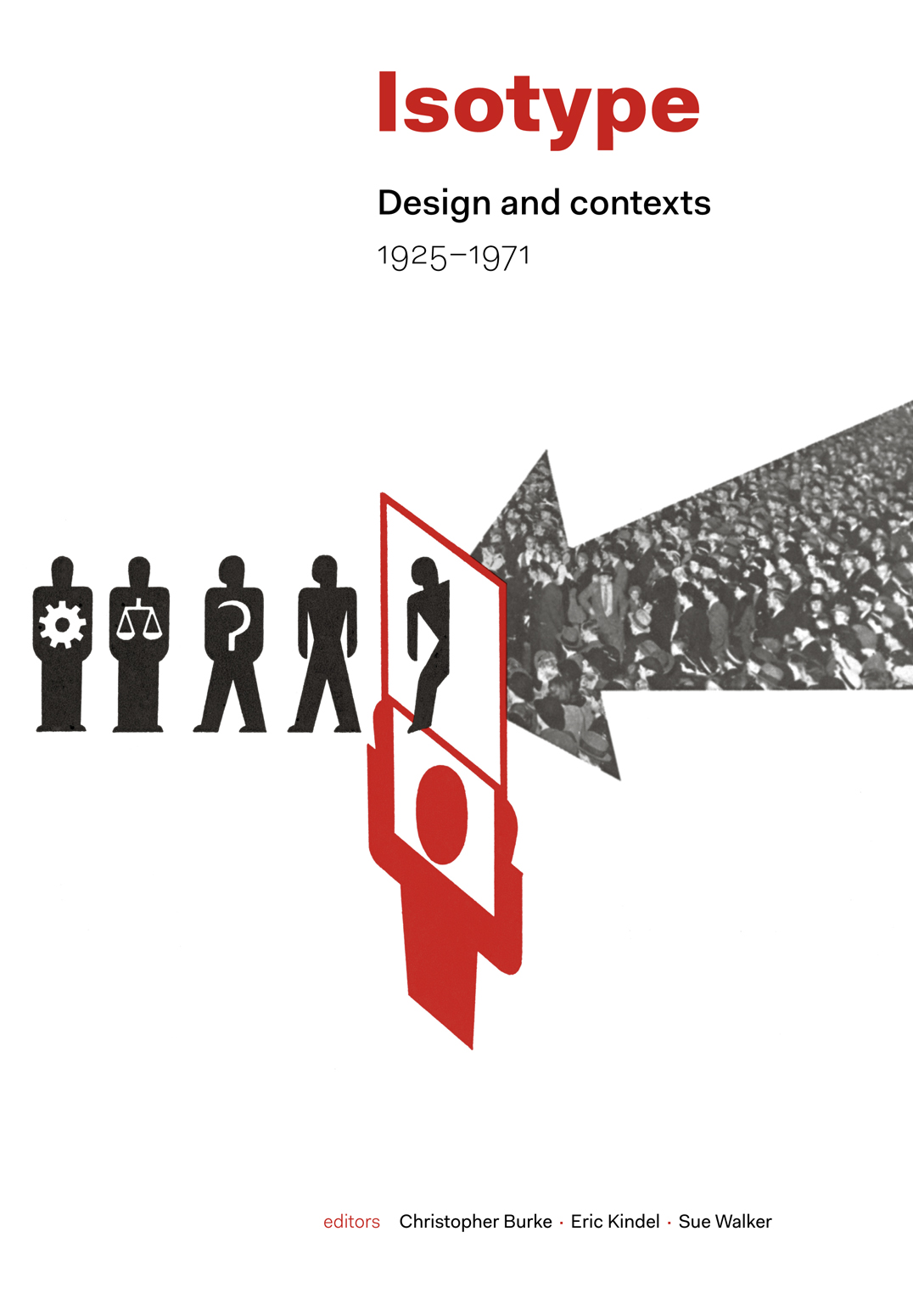
Isotype: design and contexts, 1925–1971
Christopher Burke, Eric Kindel, Sue Walker (editors)
The work in graphic communication carried out by Otto Neurath and his associates – now commonly known simply as Isotype – has been the subject of much interest in recent years. Conceived and developed in the 1920s as ‘the Vienna method of pictorial statistics’, this approach to designing information had from its inception the power to grow and spread internationally. Political developments in Europe played their part in its development, and production moved to the Netherlands (1934) and to England (1940), where the Isotype Institute continued to produce work until 1971. Bringing together the latest research, this book is the first comprehensive, detailed account of its subject. The Austrian, Dutch, and English years of Isotype are described here freshly and extensively. There are chapters on the notable extensions of Isotype to Soviet Russia, the USA, and Africa. Isotype work in film and in designing for children is fully documented and discussed. Between these main chapters the book presents interludes documenting Isotype production visually. Three appendices reprint key documents. In its international coverage and its extensions into the wider terrain of history, this book opens a new vista in graphic design.
Out of print. Find out more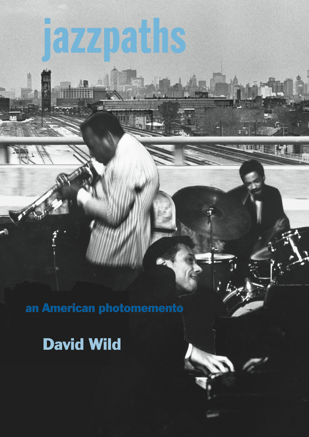
Jazzpaths: an American photomemento
David Wild
David Wild’s ‘photomemento’ tells an Englishman’s story lived to a soundtrack of jazz. At its heart are photographs made during a two-year stay in America in the mid-1960s, on a passage through New York, Chicago, Detroit, St Louis, New Orleans. These pictures, in turn, formed the basis of photomontages. Jazzpaths is a partial document of the jazz scene of that time, mixing remarkable pictures of musicians with biting images of life on the streets.
Find out more and buy
Karel Martens: counterprint
Karel Martens with Paul Elliman & Carel Kuitenbrouwer
Now that stocks of Karel Martens: printed matter are exhausted, we have published a short book that shows some of the uncommissioned printed work of Martens, with an essay on ‘The world as a printing surface’ by Elliman. This is very much an object-book, in which the work is not so much reproduced as bodied forth.
Out of print. Find out more
Models & Constructs: margin notes to a design culture
Norman Potter
The author was a ‘maker’ – in words as well as in materials – and, now that he is dead, this book must be his testament. It is an account of his life and work, assembling particular events and their material outcomes within a large vision of life. It is the work of a believer in material and existential presence, in form, in continuity, in change.
Out of print. Find out more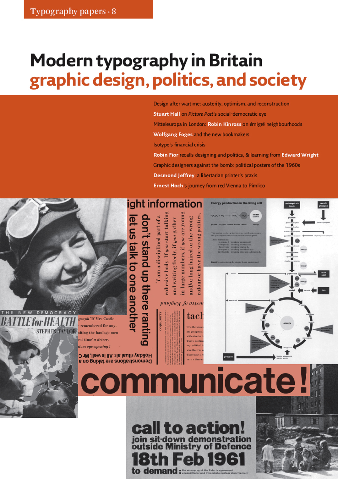
Modern typography in Britain: graphic design, politics, and society (Typography papers 8)
This remarkable volume is a collection of eleven essays and shorter articles which for the first time provide rich contexts – social, cultural, and political – for graphic design in Britain. Reaching from the Second World War to the early 1970s, they fizz with provocative interconnections: between print culture, photojournalism and publishing, the London of émigrés, political meetings and demonstrations, cultural cafés and art schools. From these disparate milieux emerged new ideas about designing: configuring and picturing the world of facts and processes, shaping them for understanding, learning, and action. Presented here are documents of the nation’s life in war, its reconstruction through the passages from scarcity to plenty, the seeds of later fragmentation, always fertile with multiple intersections between biography and history.
Out of print. Find out more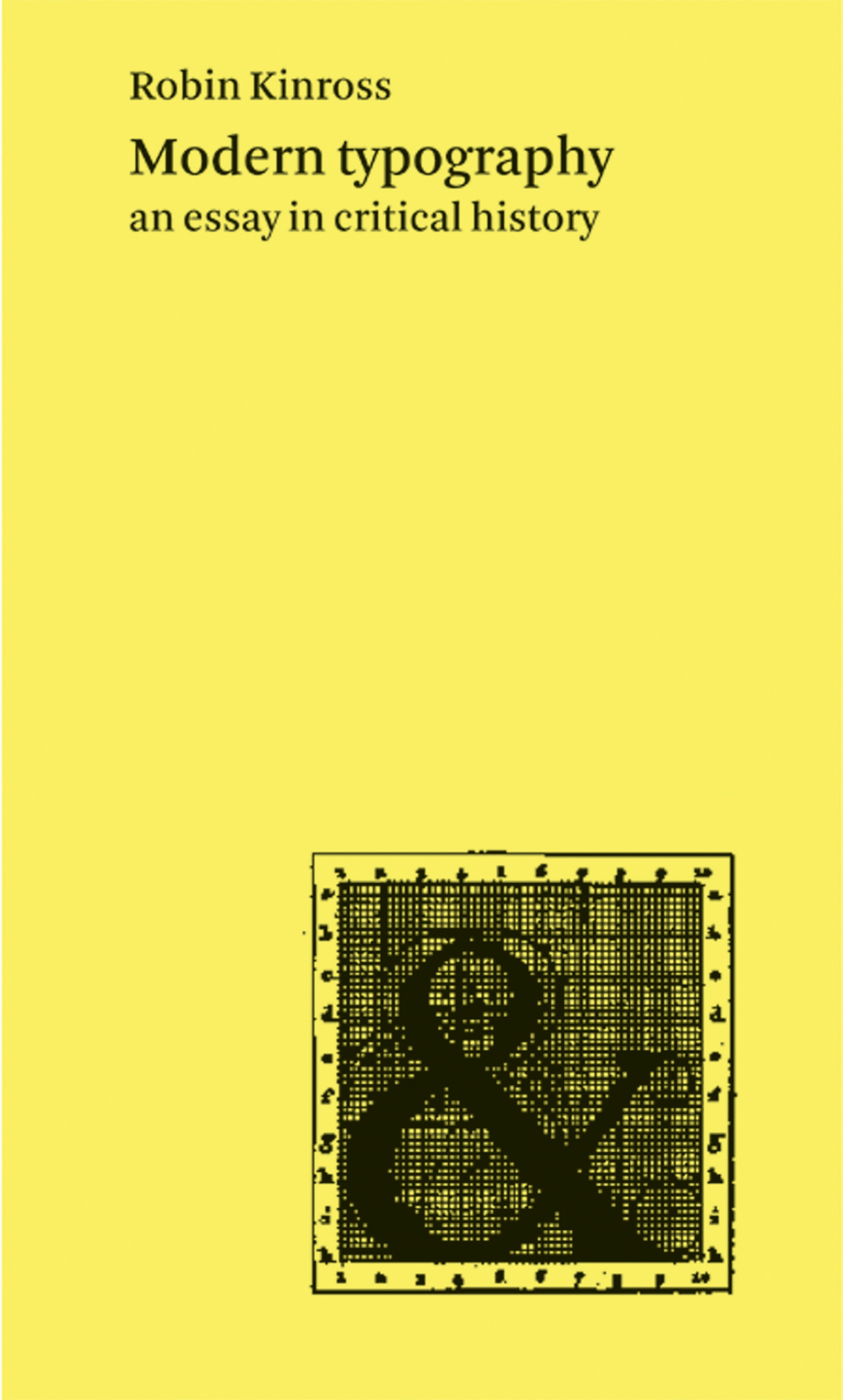
Modern typography: an essay in critical history
Robin Kinross
A brisk tour through the history of Western typography, from the time (c.1700 in France and England) when it can be said to have become ‘modern’. A spotlight is directed at different cultures in different times, to trace the developments and shifts in modern typography. Attention is given to ideas, to social context, and to technics, thus stepping over the limited and tired tropes of stylistic analysis. This is a reprint of the second edition, which has some variations in the pictures as well as corrections and updatings in the text.
Out of print. Find out more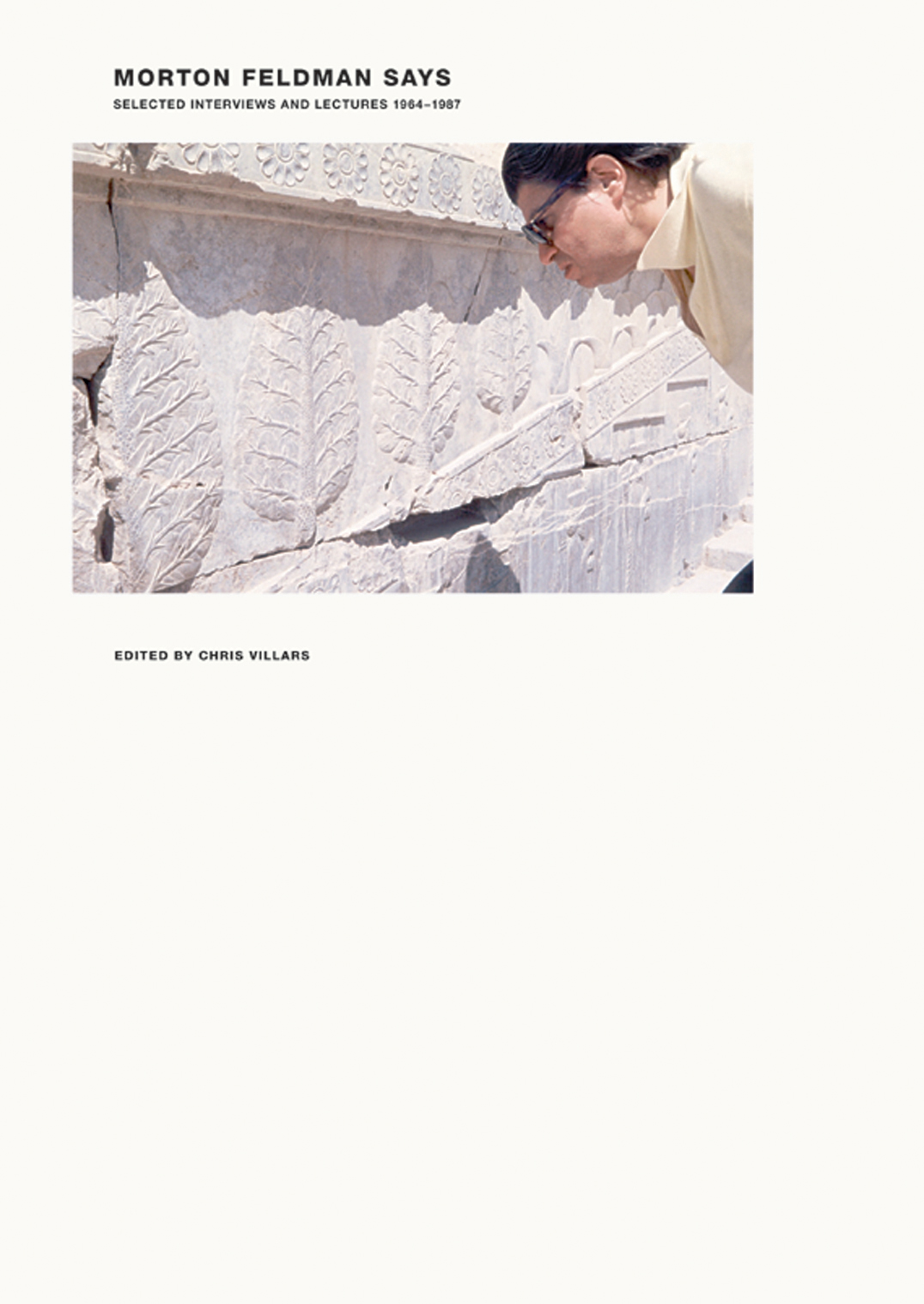
Morton Feldman says: selected interviews and lectures 1964–1987
Chris Villars (editor)
This is a book of thinking aloud – about music, about art, about making work, about life. Feldman was a wonderful talker, and much of the qualities of his conversation are captured in this book, both in its text and in its photographs. The book is essentially a documentary, with something of the same spirit as our Anthony Froshaug.
Out of print. Find out more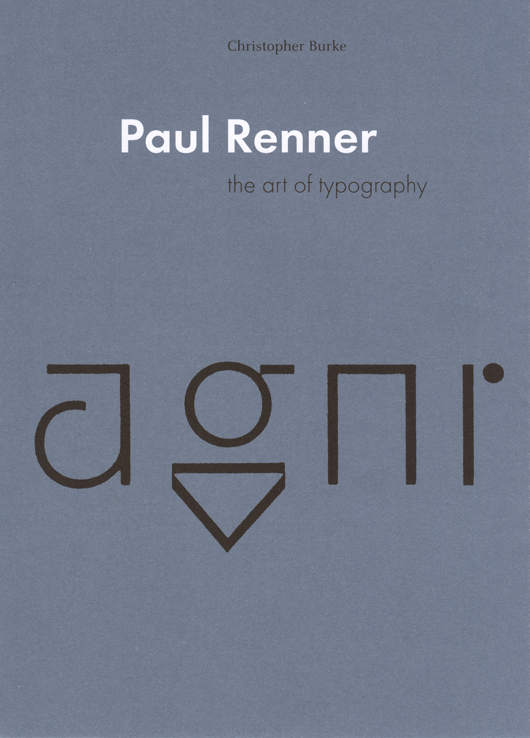
Paul Renner: the art of typography
Christopher Burke
The work and life of this German type and book-designer are, for the first time, presented at length and with full historical documentation. Renner lived through the first half of the twentieth century, and this book is, in effect, a history of typography in Germany in those years. It also speaks to present concerns in design, and especially to the search for a rationality deeper than one of easy rules of style.
Out of print. Find out more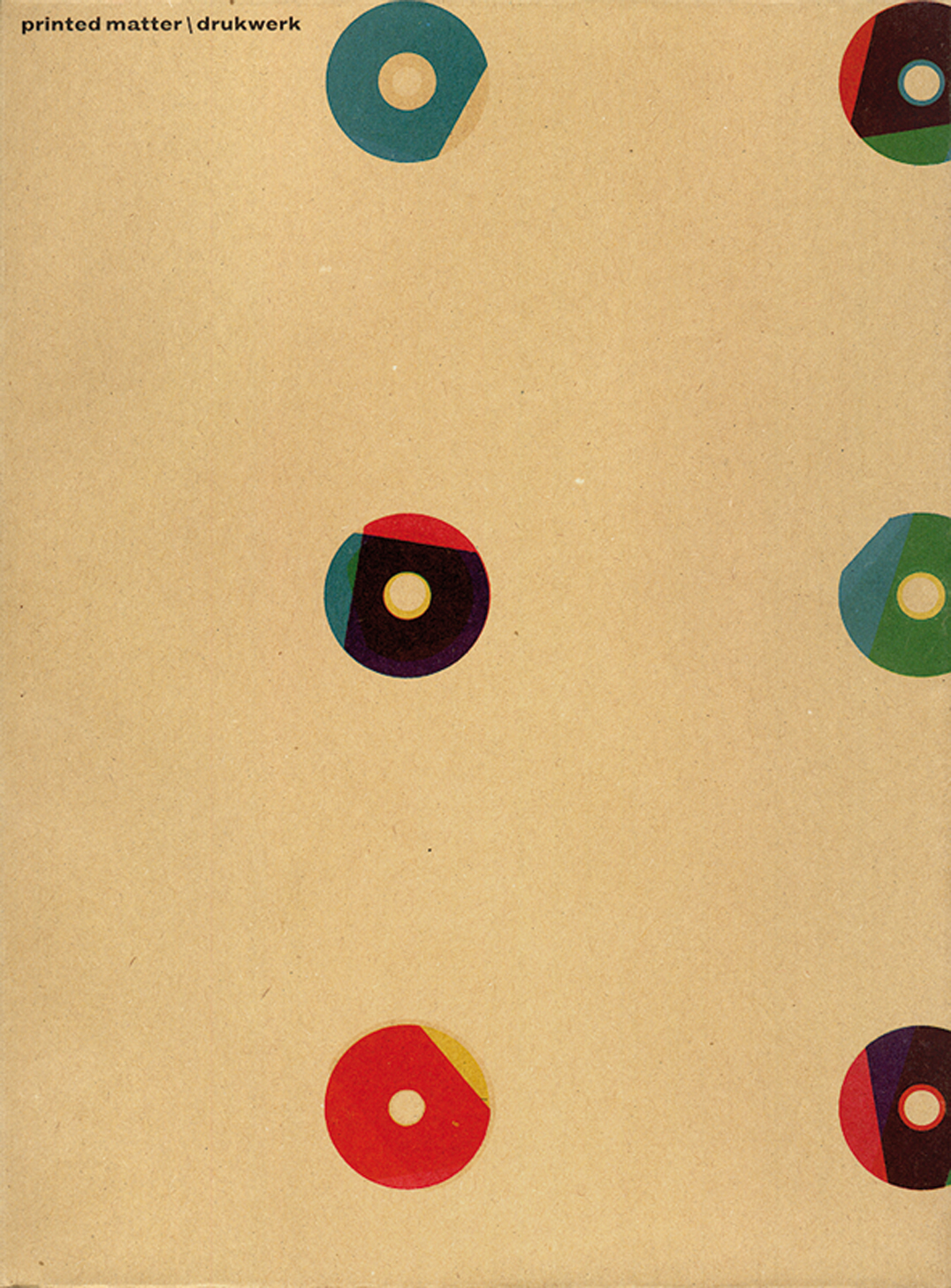
Printed matter / Drukwerk
Karel Martens with Jaap van Triest and Robin Kinross
The work of Karel Martens occupies an intriguing place in the present European art-and-design landscape. Martens can be placed in the tradition of Dutch modernism – in the line of figures such as Piet Zwart, H.N. Werkman, Willem Sandberg. Yet he maintains some distance from the main developments of our time: from both the practices of routinized modernism and of the facile reactions against this. His work is both personal and experimental. At the same time, it is publicly answerable. Over the now 50 years of his practice, Martens has been prolific as a designer of books. He has also made contributions in a wide range of design commissions, including stamps, coins, signs on buildings. Intimately connected with this design work has been his practice as an artist. This started with geometric and kinetic constructions, and was later developed in work with the very material of paper; more recently he has been making relief prints from found industrial artefacts. This book looks for new ways to show and discuss the work of a designer and artist, and is offered in the same spirit of experiment and dialogue that characterizes the work it presents.
Out of print. Find out more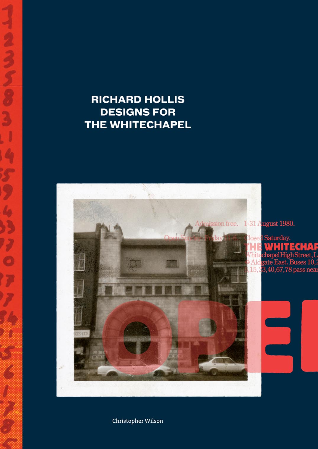
Richard Hollis designs for the Whitechapel: a graphic designer and an art gallery in twentieth-century London
Christopher Wilson
Richard Hollis was the graphic designer for London’s Whitechapel Art Gallery in the years 1969–73 and 1978–85. In this second period, under the directorship of Nicholas Serota, the gallery came to the forefront of the London art scene, with pioneering exhibitions of work by Georg Baselitz, Anselm Kiefer, Joseph Cornell, Philip Guston, Frida Kahlo and Tina Modotti, among others. Hollis’s posters, catalogues, and leaflets, conveyed this sense of discovery, as well as being models of practical graphic design. The pressures of time and a small budget enhanced the urgency and richness of their effects. Christopher Wilson’s monograph is an exemplary examination of a body of graphic design. This book matches the spirit of the work it describes: active, passionate, aesthetically refined, and committed to getting things right. As in Hollis’s work, ‘design’ here is a verb as much as a noun.
Find out more and buy
Sugar in the air
E.C. Large
This is the novel first published in 1937 in London. We are publishing facsimile editions of this book and its sequel, Asleep in the afternoon. A third book, God’s amateur: the writing of E.C. Large is being published alongside the two novels, as a companion.
Out of print. Find out more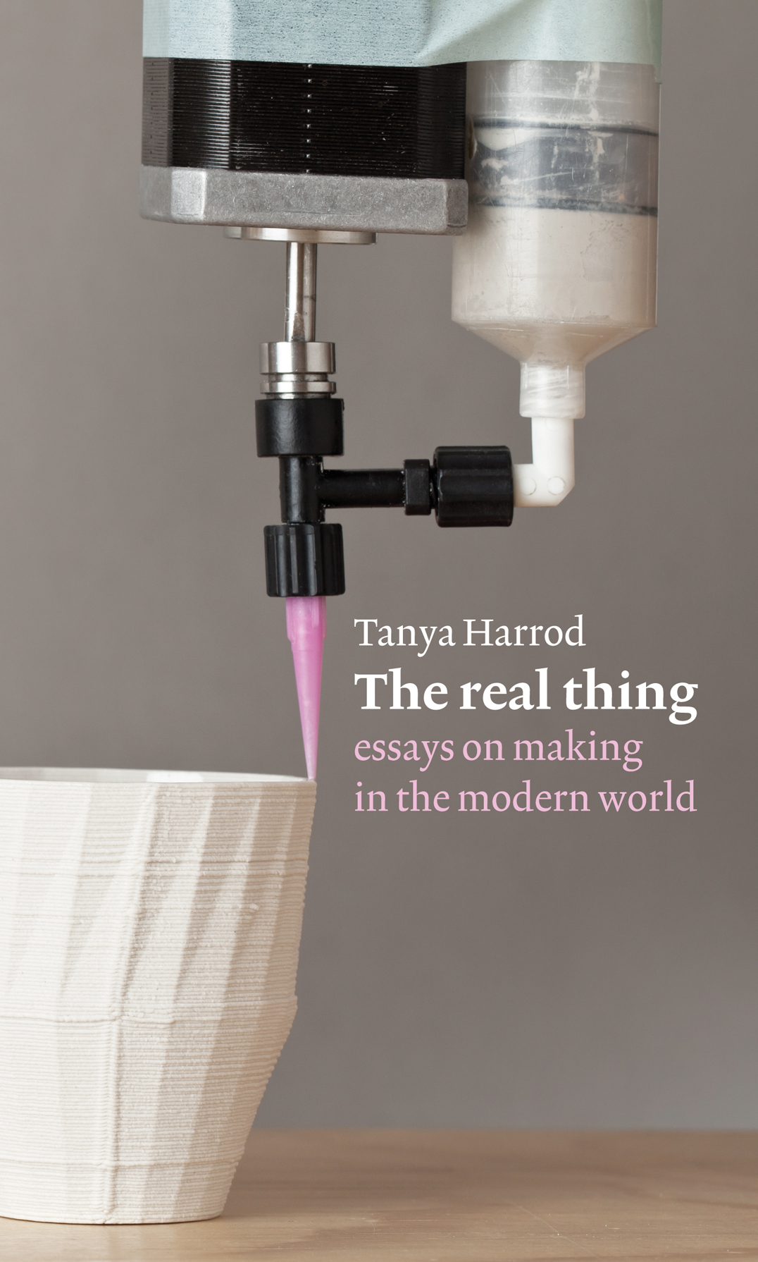
The real thing: essays on making in the modern world
Tanya Harrod
Over thirty years, Tanya Harrod has written on craft for newspapers, magazines, and journals. As these essays show, there are no boundaries in her vision: art is considered in the light of craft, and craft in the light of art; design is present too – developing and sometimes separating from craft and art. In part these essays document the development of these shifts, looking always at the particular, vivid embodiment. The real thing is a surprising and substantial contribution to the literature of ‘making’.
Out of print. Find out more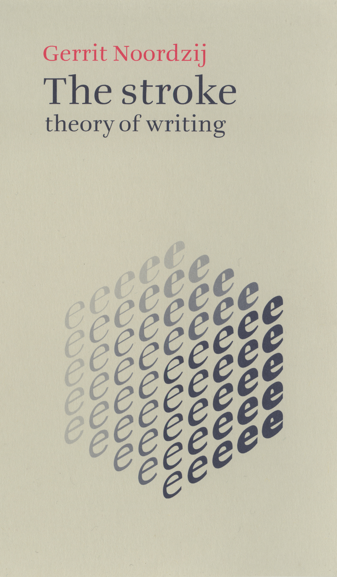
The stroke: theory of writing
Gerrit Noordzij
This is the first English-language edition of a major piece of thinking about writing (in its visual manifestation). Noordzij’s short and powerful text, illustrated with his own diagrams and examples, is the best exposition of a theory that is making a still growing impact on designers, and on those thinking about writing and letters.
Out of print. Find out more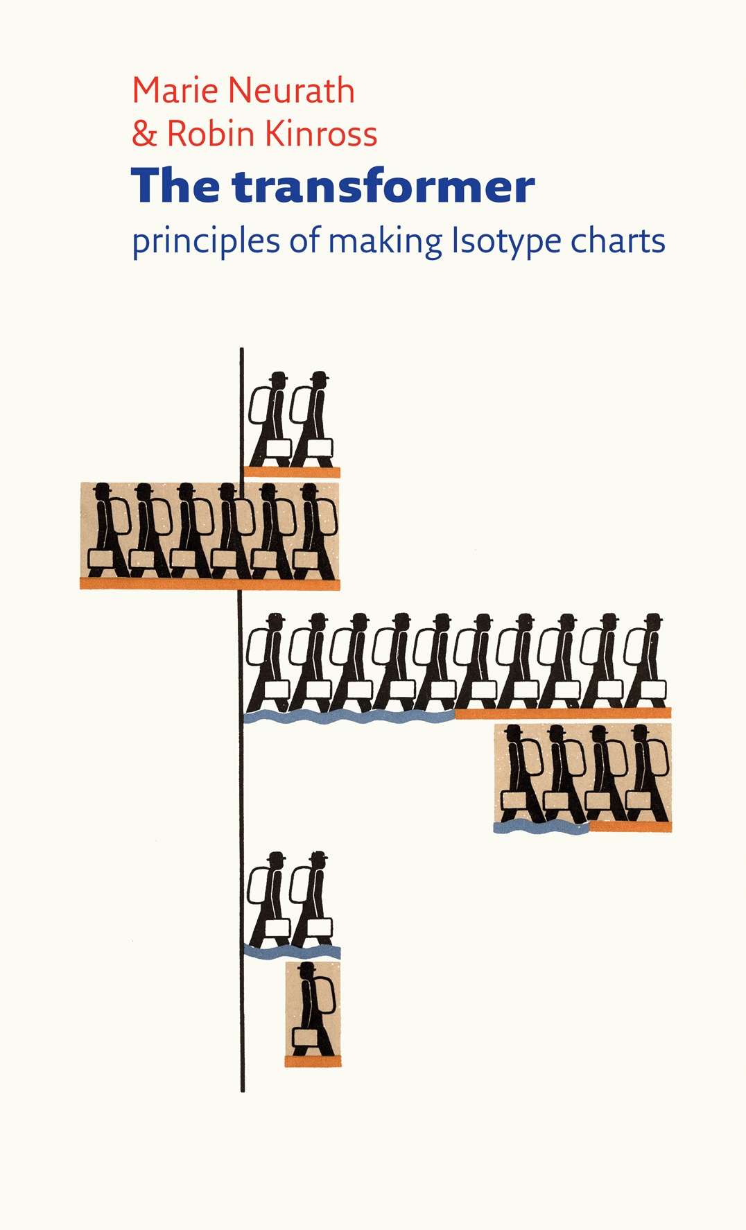
The transformer: principles of making Isotype charts
Marie Neurath and Robin Kinross
The visual work of Otto Neurath and his associates, now commonly known as Isotype, has been much discussed in recent years. This short book explains its essential principles: the work of ‘transforming’, or putting information into visual form. This deeper level of their work – which is applicable in all areas of design – is routinely neglected in the assumption that Isotype is just a matter of symbols and pictograms. At the core of the book is a previously unpublished essay by Marie Neurath, the principle Isotype transformer, which she wrote in the last year of her life. This is supplemented by Robin Kinross with commentary on illustrated examples of Isotype and other supporting short essays.
Out of print. Find out more
Type now: a manifesto, plus work so far
Fred Smeijers
A short and strong statement of position by a type designer. The book takes a wide view, taking in the business of present-day font production, and the technics and the ethics of type as software. As always, Smeijers’s arguments are informed by a strong historical sense. The book also shows his own work as a designer, and is published as a conclusion to the award to him of the Gerrit Noordzij Prize.
Out of print. Find out more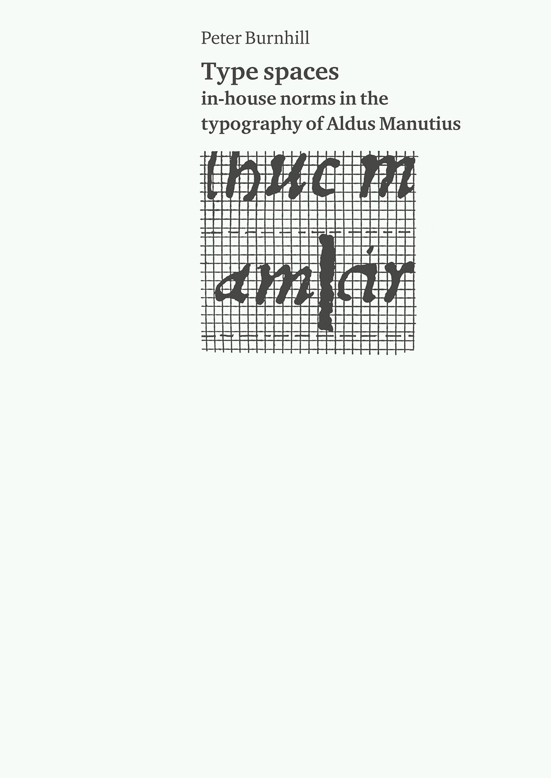
Type spaces: in-house norms in the typography of Aldus Manutius
Peter Burnhill
The books of Aldus Manutius possess an enduring appeal, for their sense of order and visual-semantic structure. After intensive examination of some Aldine books, Burnhill proposes a hypothesis about the co-ordination of the dimensions in type in this printing. It seems that a system of typographic measurement informed this work, two hundred years before such a system was made explicit in printing.
Find out more and buy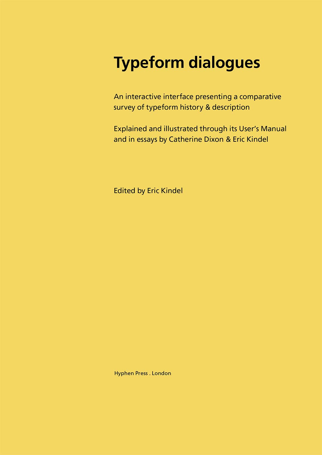
Typeform dialogues
Eric Kindel (editor)
We are publishing here materials from the ‘Typeform dialogues’ project carried out at Central Saint Martins College of Art & Design, London, in 1994–8 and afterwards. This is the second edition of the document first published on this website in 2012. The main change in this new edition is the addition of essays by Eric Kindel (‘Eminents observed’) and Catherine Dixon (‘Systematizing the platypus’). As in the first edition, the document contains the User’s Manual for the CD-based interface, which was the project’s main focus, together with various supporting materials that describe the project. The work is edited by Eric Kindel, with contributions throughout from Catherine Dixon.
Find out more and buy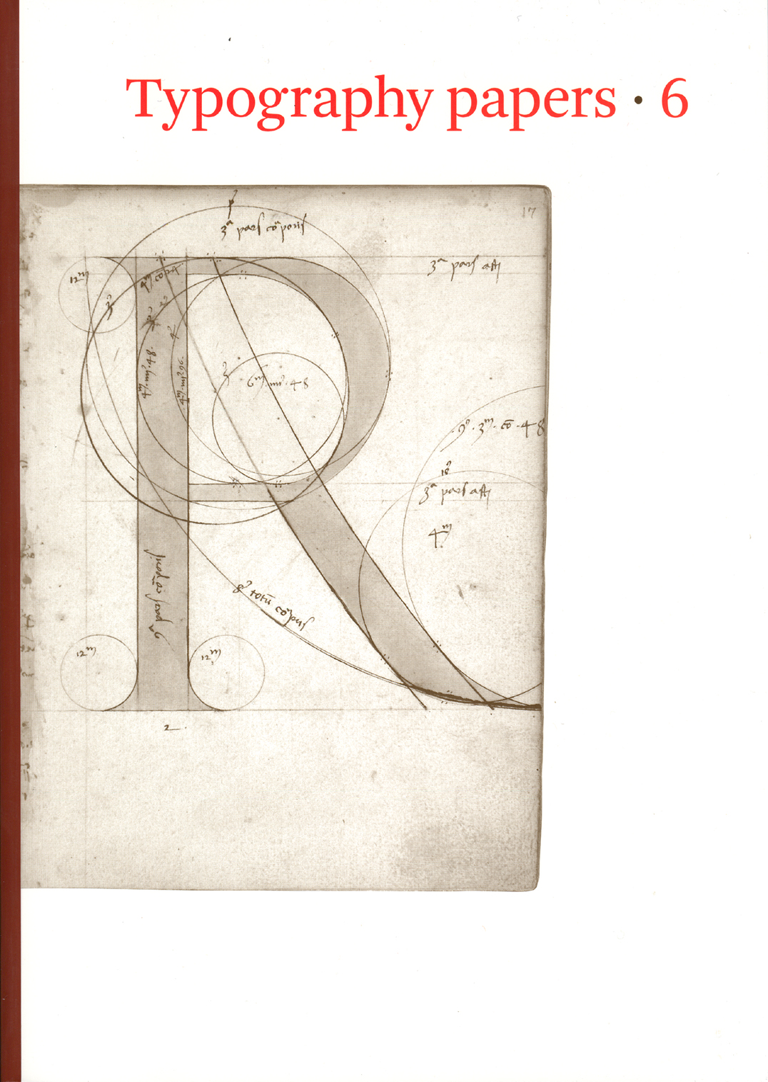
Typography papers 6
This occasional, book-length work is edited and produced at the Department of Typography, University of Reading, and is now published by Hyphen Press. It publishes extended articles on its subject, exploring topics to the length to which they want to go. Its scope is broad and international, its treatment – serious and lively.
Out of print. Find out more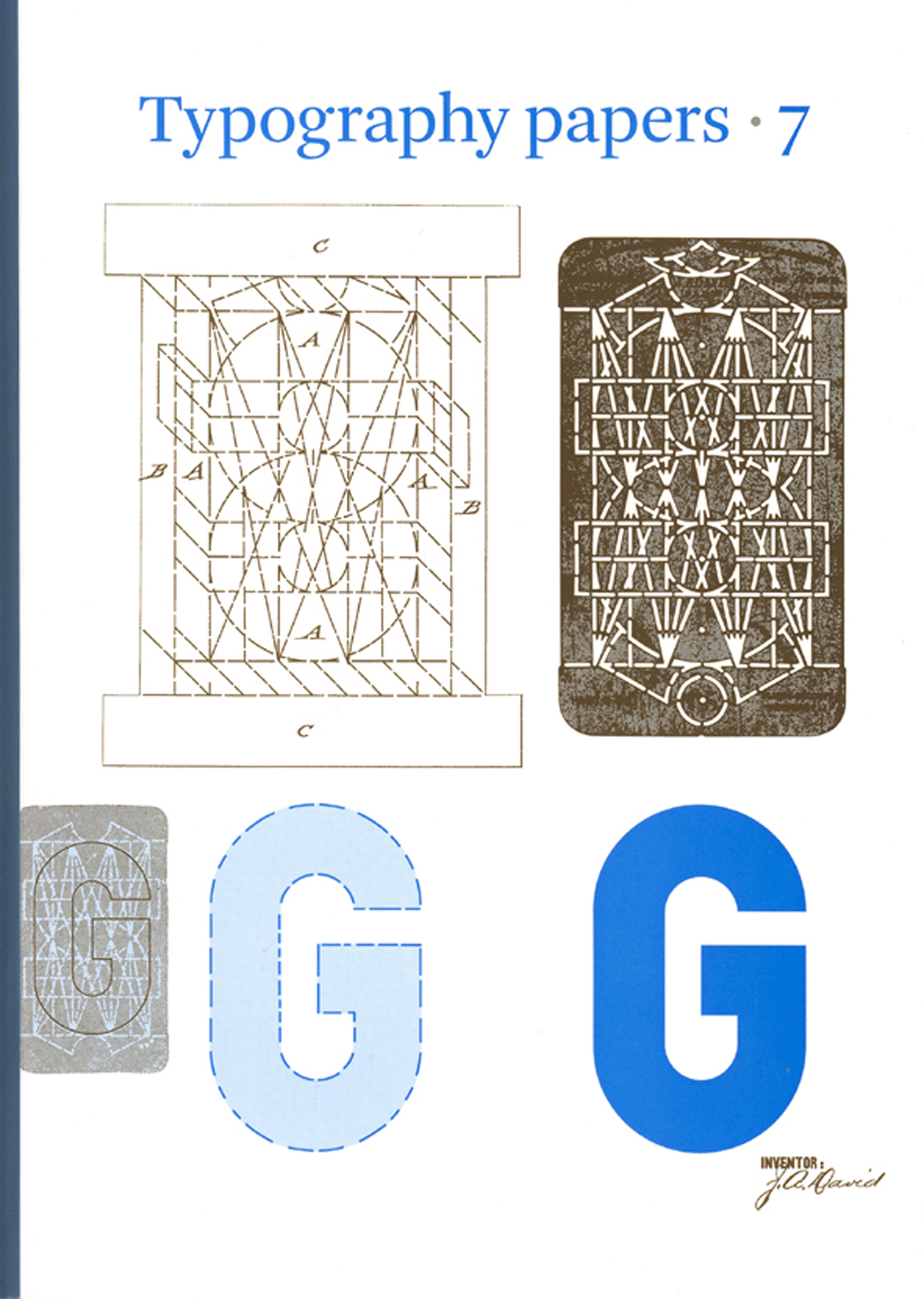
Typography papers 7
This occasional, book-length work is edited and produced at the Department of Typography, University of Reading, and is now published by Hyphen Press. It publishes extended articles on its subject, exploring topics to the length to which they want to go. Its scope is broad and international, its treatment – serious and lively.
Out of print. Find out more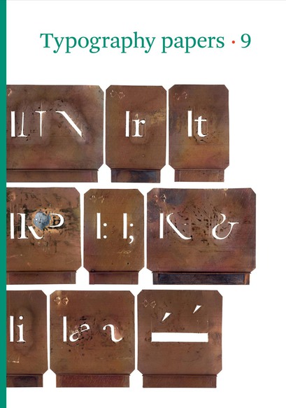
Typography papers 9
This latest issue of the series of Typography papers opens with a beautifully illustrated article by the type designer Gerard Unger on ‘Romanesque’ letters. A further installment of Eric Kindel’s pathbreaking history of stencil letters is published in contributions by him, Fred Smeijers, and James Mosley. Maurice Göldner writes the first history of an early twentieth-century German typefounder, Brüder Butter. William Berkson and Peter Enneson recover the notion of ‘readability’ through a history of the collaboration between Matthew Luckiesh and the Linotype Company. Paul Luna discusses the role of pictures in dictionaries. Titus Nemeth describes a new form of Arabic type for metal composition. The whole gathering shows the remarkable variety and vitality of typography now.
Out of print. Find out more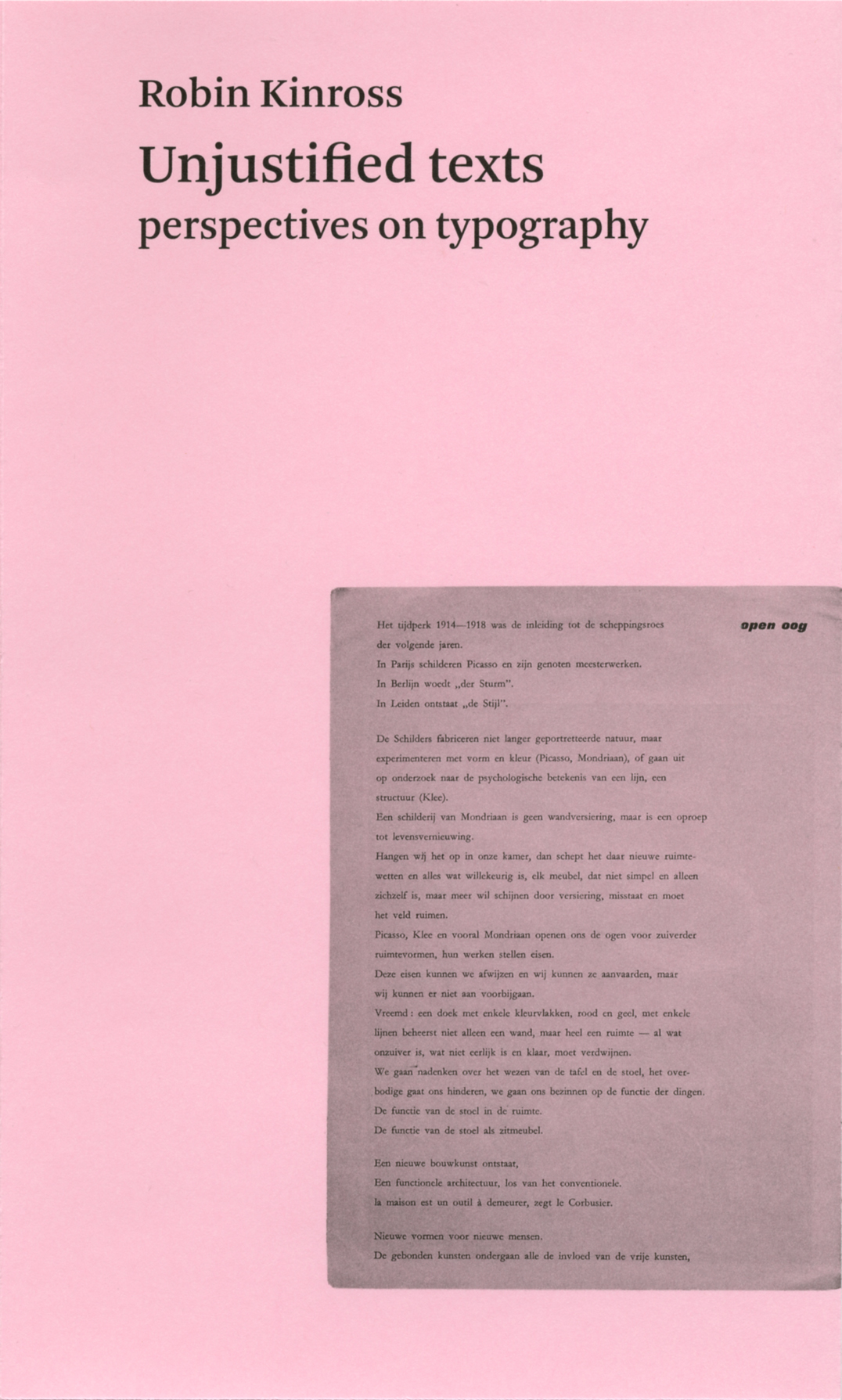
Unjustified texts
Robin Kinross
A book of writings from twenty-five years of engagement on the peripheries of both journalism and academic life, and drawn largely from small-circulation and now hard-to-access publications. Persistent themes include: editorial typography, the emergence of graphic design in Britain, emigré designers, Dutch typography, the work of critical modernist designers.
Out of print. Find out more
What is a designer: things, places, messages
Norman Potter
This long-established title shows powers of self-renewal, as new young readers find in it a stimulus to thought and action unavailable from more showy, duller items. An urgent book, it combines high-flown generalities with often striking specificity of reference. It addresses especially students at further education level in every design discipline, including architecture.
Out of print. Find out more
Winter light and other poems
Jane Howard
Winter light is a short selection of poems written over forty years, introducing us to a distinctive voice:
White light pierces / head on, dazzles, / scours the eye, / creating darkness
Out of print. Find out more