Typefaces of their times
Hyphen Press / 2007.05.15
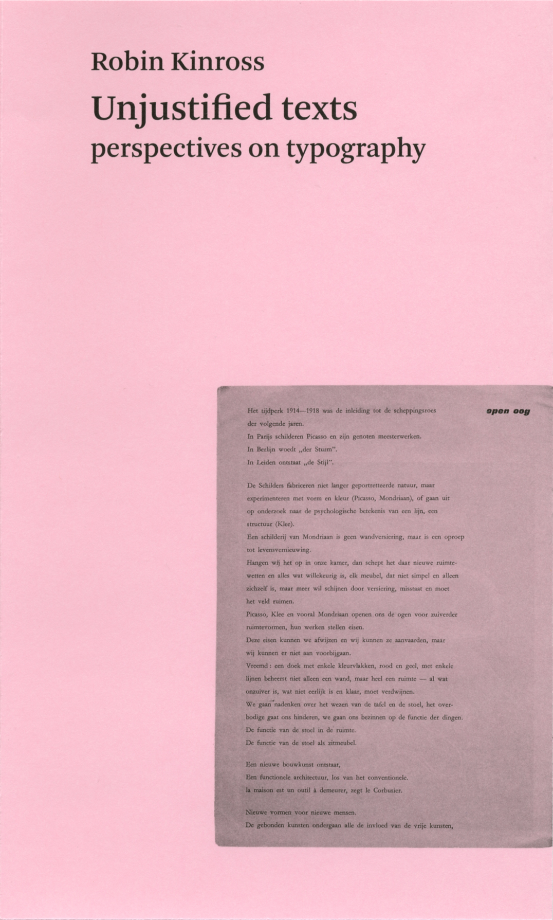
There has been much discussion in recent years about the typeface Helvetica, prompted by the book made by Lars Mueller and now a film by Gary Hustwit. In this connection, Erik Spiekermann has been active. Much of Erik’s work has been a wonderful effort in surpassing the unthinking, formulaic and bureaucratic approach that often entails the use of Helvetica. In 1991 Erik brought out his typeface Meta. With the great success of Meta, it came to be some sort of alternative to Helvetica: more subtle and humane than the essentially regularized-industrial forms of Helvetica. The tag ‘the Helvetica of the 1990s’ has become attached to Meta, and has sometimes been attributed to Robin Kinross.
Is it possible to determine what typeface of the 1990s will become a classic in the future
Hyphen Press / 2006.09.27
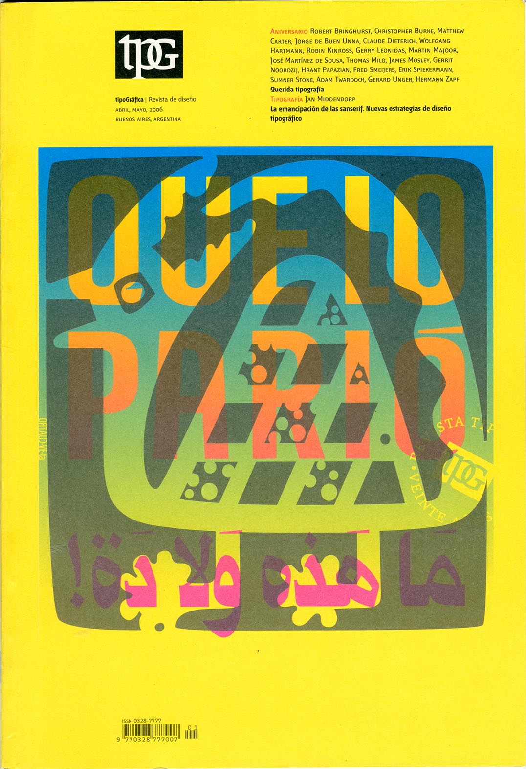
With its issue of April–May 2006 (no. 70), the magazine Tipográfica entered its twentieth year of publication. Published from Buenos Aires since its first issue of May 1987, the magazine is now established as one of the liveliest and most internationally minded design magazine.
Smeijers so far
Hyphen Press / 2003.10.15
Type now, made at top speed, was finished just in time for its presentation on 17 October at the Royal Academy of Art in The Hague.
An interview with Robin Kinross
Hyphen Press / 2000.08.21
This interview was recorded in London on 28 May 1999, and published in Slovenian translation in the cultural magazine Emzin’.


