This latest issue of the series of Typography papers opens with a beautifully illustrated article by the type designer Gerard Unger on ‘Romanesque’ letters. A further installment of Eric Kindel’s pathbreaking history of stencil letters is published in contributions by him, Fred Smeijers, and James Mosley. Maurice Göldner writes the first history of an early twentieth-century German typefounder, Brüder Butter. William Berkson and Peter Enneson recover the notion of ‘readability’ through a history of the collaboration between Matthew Luckiesh and the Linotype Company. Paul Luna discusses the role of pictures in dictionaries. Titus Nemeth describes a new form of Arabic type for metal composition. The whole gathering shows the remarkable variety and vitality of typography now.
Articles from Typography papers 9 are available as pdf files, free to download here
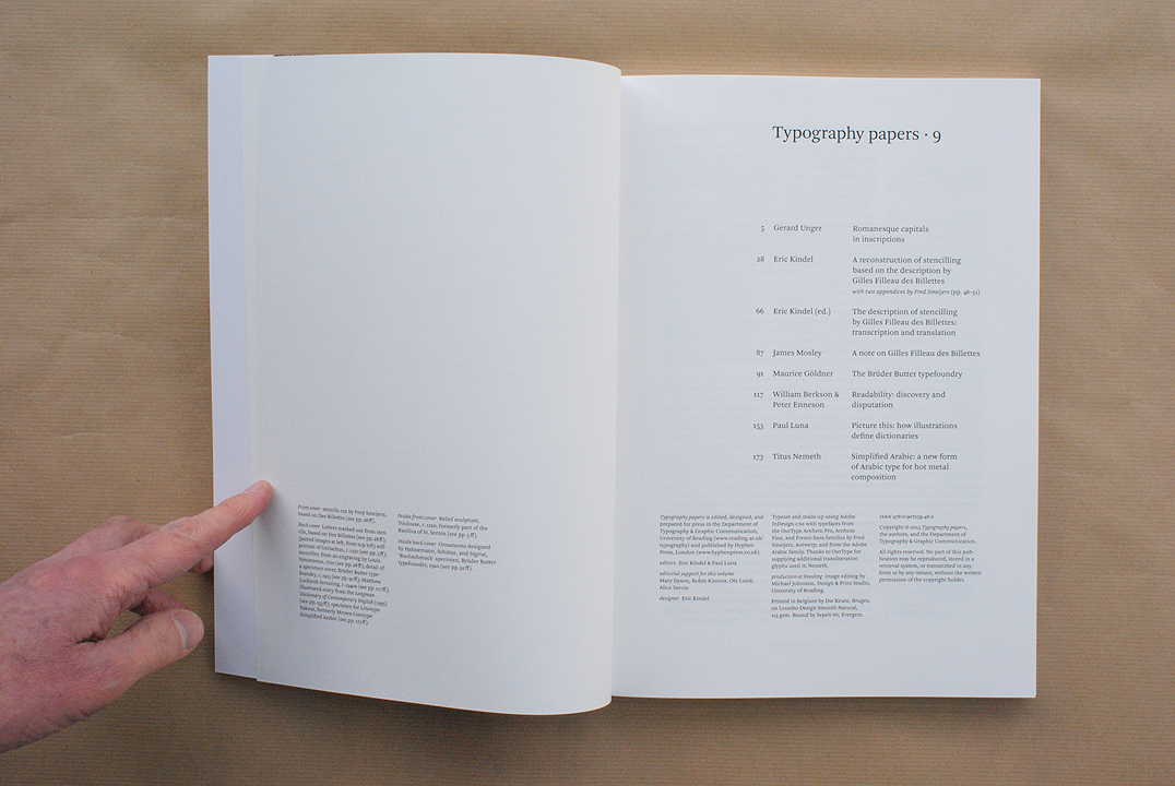
Contents
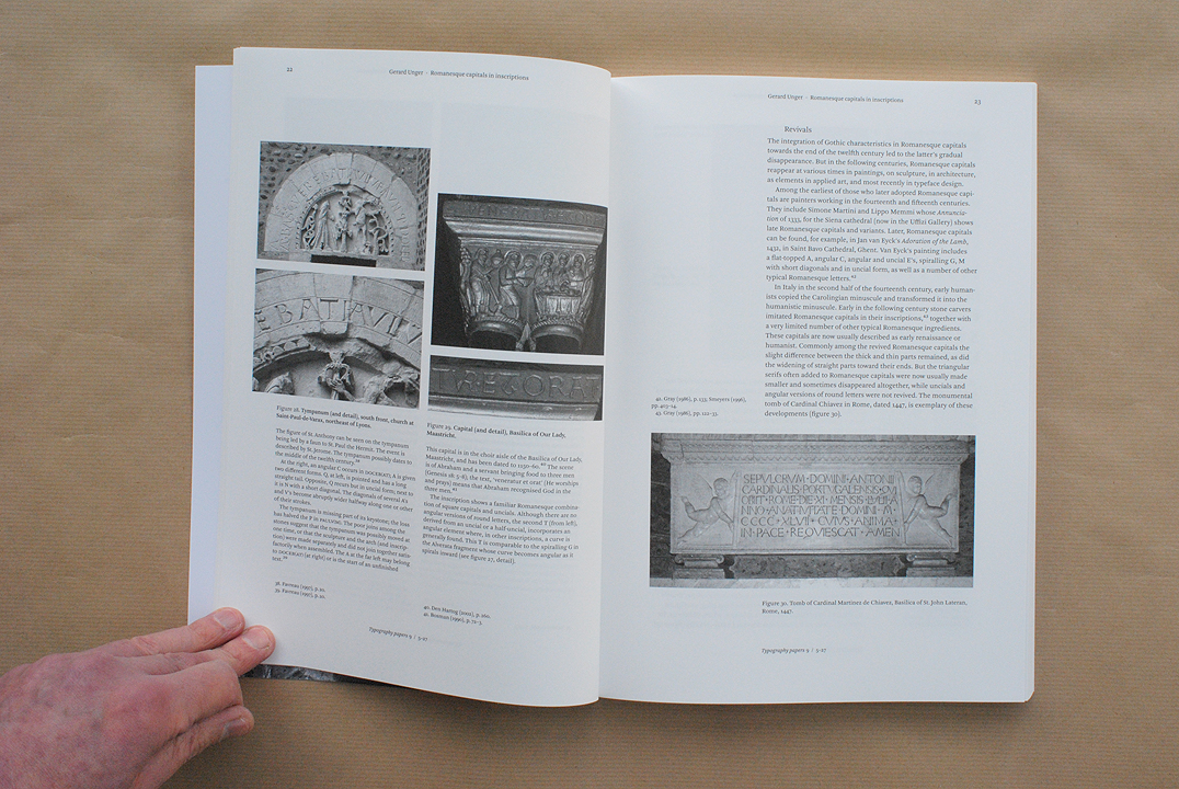
Gerard Unger:
Romanesque capitals in inscriptions
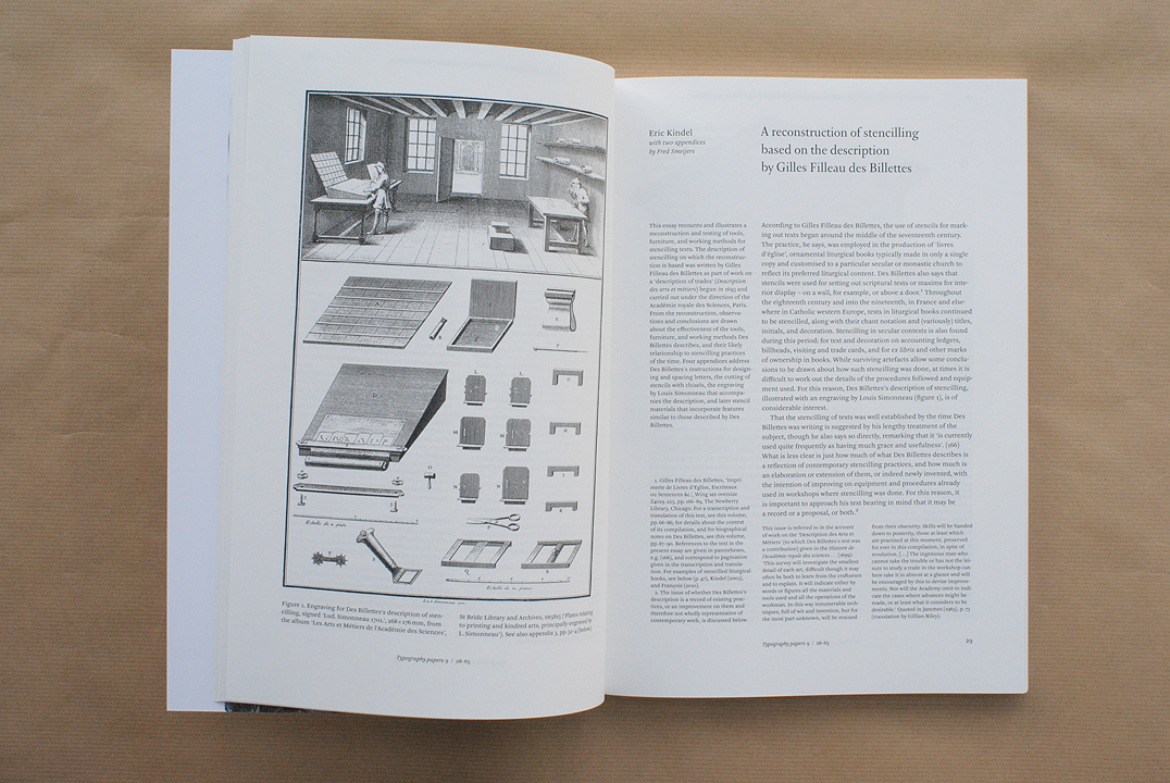
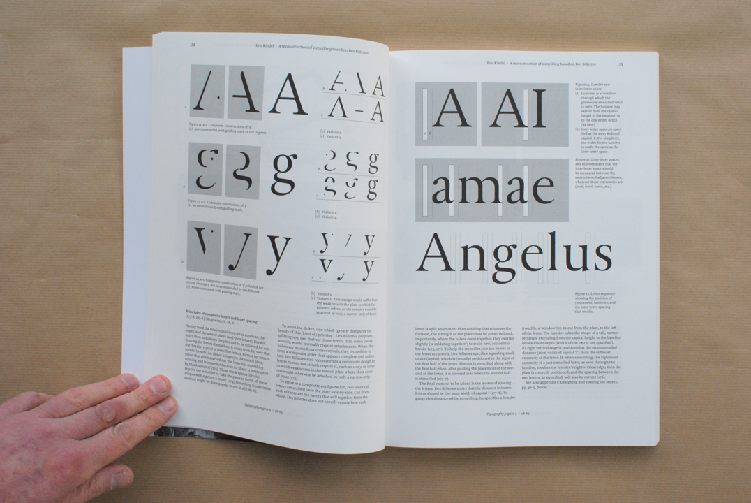
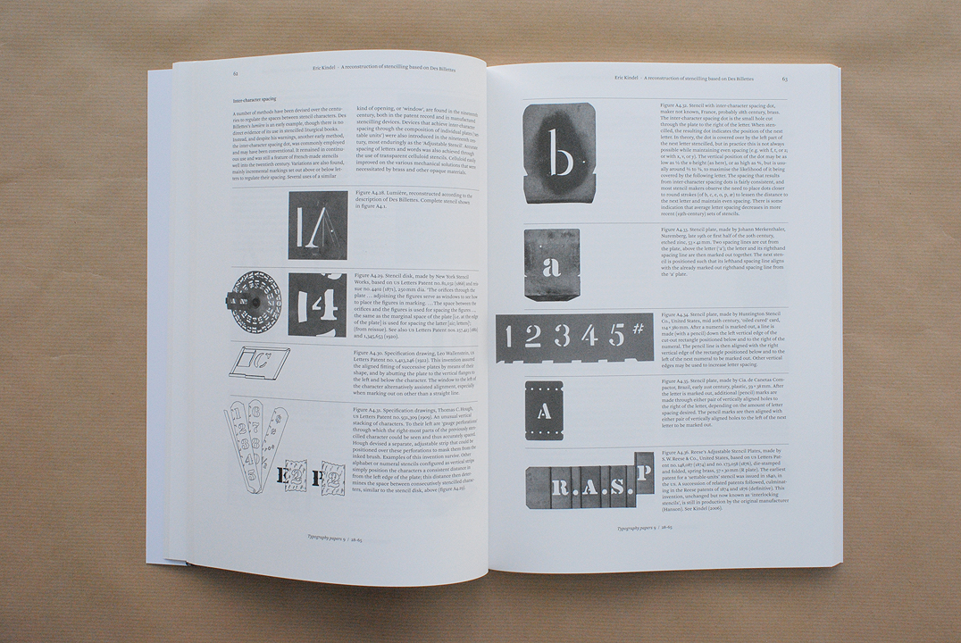
Eric Kindel:
A reconstruction of stencilling based on the description by Gilles Filleau des Billettes
with two appendices by Fred Smeijers
Eric Kindel (ed.):
The description of stencilling by Gilles Filleau des Billettes: transcription and translation
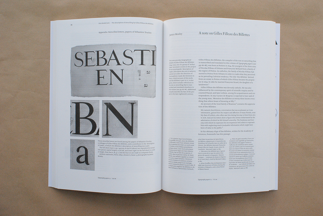
James Mosley:
A note on Gilles Filleau des Billettes
Maurice Göldner:
The Brüder Butter typefoundry
William Berkson & Peter Enneson:
Readability: discovery and disputation
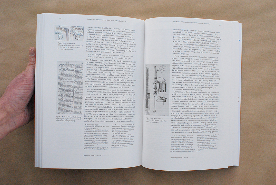
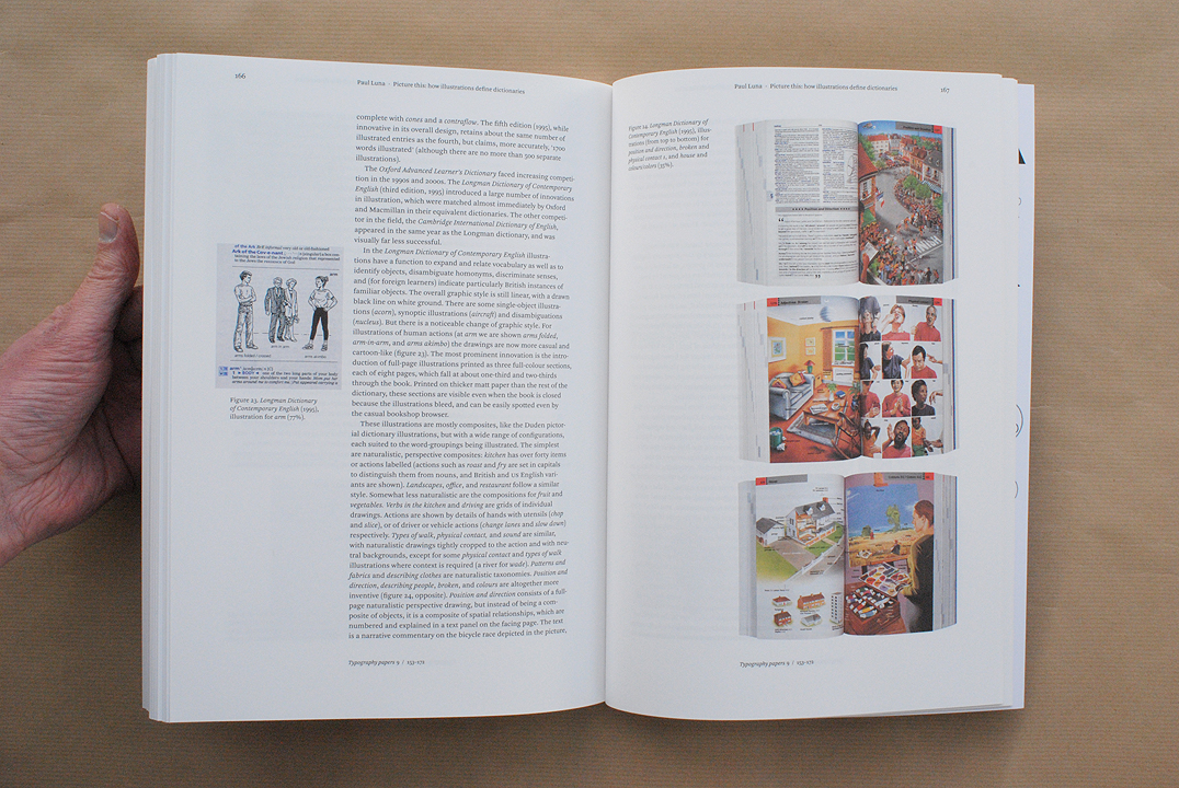
Paul Luna:
Picture this: how illustrations define dictionaries
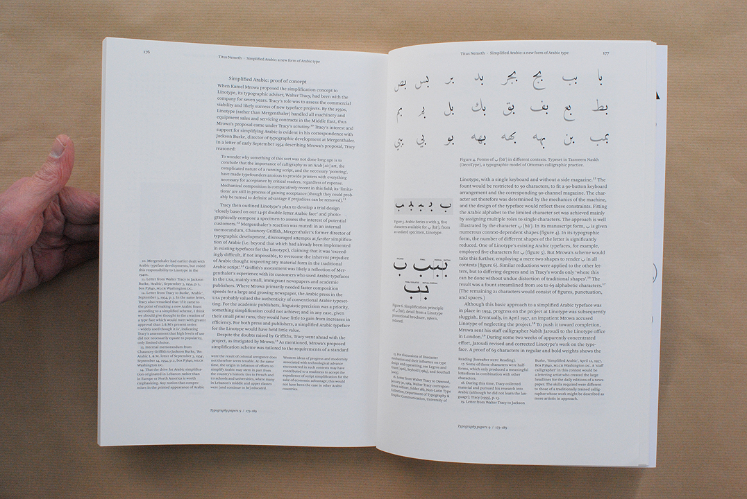
Titus Nemeth:
Simplified Arabic: a new form of Arabic type for hot metal composition