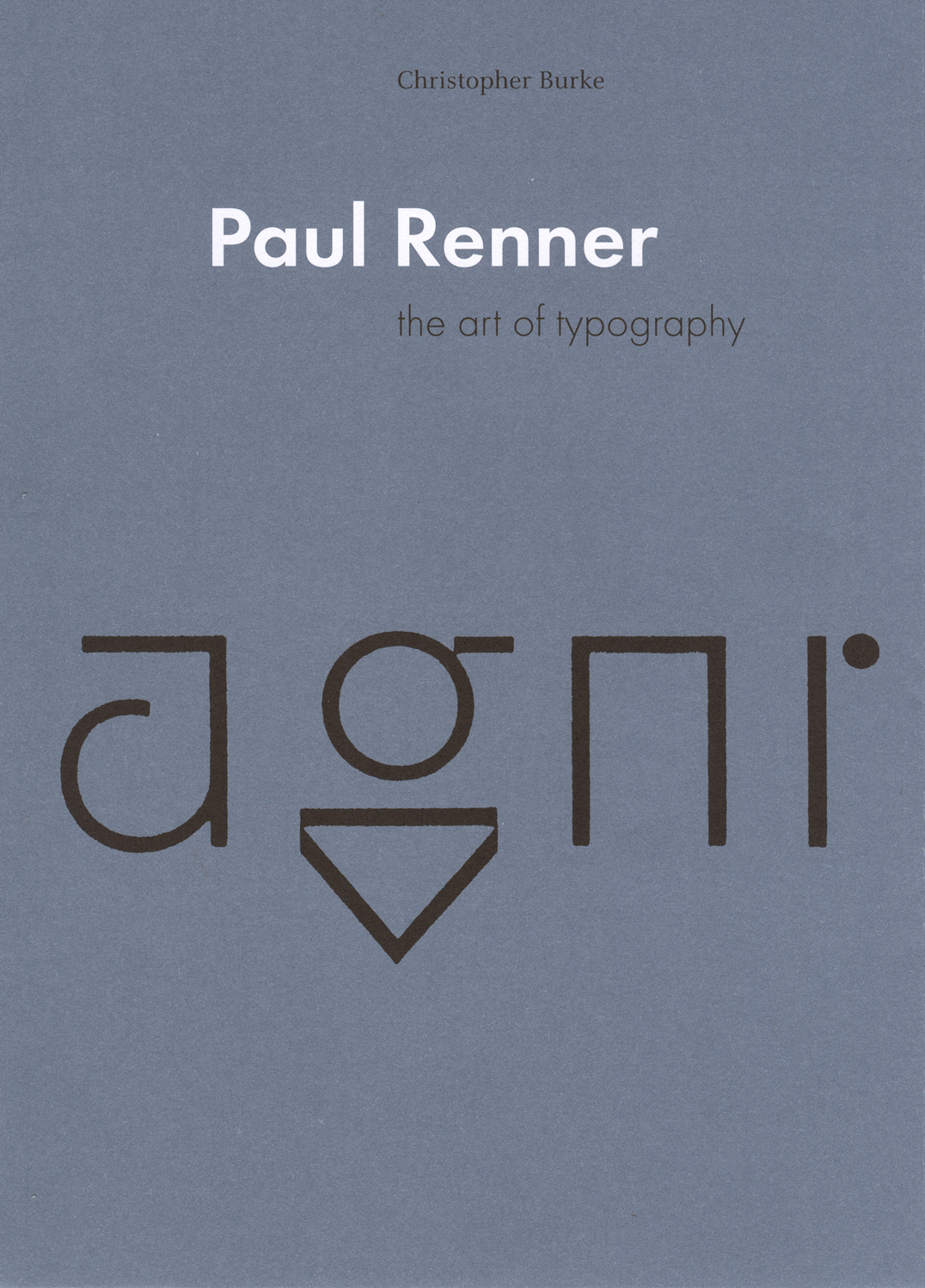
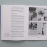
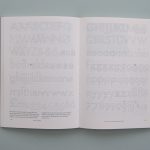
The work and life of this German type and book-designer are, for the first time, presented at length and with full historical documentation. Renner lived through the first half of the twentieth century, and this book is, in effect, a history of typography in Germany in those years. It also speaks to present concerns in design, and especially to the search for a rationality deeper than one of easy rules of style.
Contents
Background
Rejuvenation, 1900–24:
The beginnings of cultural rejuvenation
The German Werkbund
The German cult of the book
Renner as a Werkbund figure
Renewal, 1924–32:
Socially-engaged design
The New Typography
Renner confronts modernity
Theories of modern design
Futura and the modern letter in Germany:
The question of ‘gothic versus roman’
Futura
Orthographic reform
Crisis, 1932–3:
The course of the Werkbund
Renner’s engagement in controversy
Arrest
A brief stay in Switzerland
Typography in a dictatorship, 1933–45:
Gothic script during the Third Reich
Renner returns to Germany
‘Die Kunst der Typographie’
Renner’s attempt to fuse roman and gothic
The Nazis ban gothic
Survival, 1945–56:
Renner’s response to the dispute between Jan Tschichold and Max Bill
Ideas for the modern book
Towards a typographic philosophy
Renner’s last typeface
Final years
Conclusion
Published writings of Paul Renner
Sources
Bibliography
Index
Synopsis
German culture in the twentieth century moved quickly and intensely, bound up with the politics of the country. Paul Renner (1878–1956) lived and worked through constituent episodes of this history, both embodying the patterns of his times and providing a critical commentary on them. In this book Christopher Burke provides the first extended account of an essential and still underrated figure.
Beginning his career in the thick of the Munich cultural renaissance, Paul Renner worked as a ‘book artist’, applying values he had learnt as a painter to this everyday item of multiple production. An early and prominent member of the Deutscher Werkbund, he was committed to the values of quality in design, always tempered by a certain sobriety of attitude and style. In the 1920s Renner engaged with the radical modernism of that time, briefly in Frankfurt, and then in a more extended phase at the printing school at Munich. Under Renner’s leadership, and with teachers such as Georg Trump and Jan Tschichold, the school produced work of quiet significance. In those years Renner undertook the design of the now ubiquitous typeface Futura. Christopher Burke’s analysis of the design process reveals the characteristic Renner approach: he took up with current tendencies, but through an extended process of finely judged development, helped to deliver a product that has long-lasting quality. In the Nazi seizure of power of 1933, Renner was dismissed from his teaching post – in days recounted here in dramatic detail – and entered a state of ‘inner emigration’. Burke’s account of the Nazi years shows Renner negotiating events with dignity. After 1945, Renner lived in retirement, but entered public discussion of design issues as a voice of experience and sanity.
Paul Renner is a work of discovery. As part of its fresh narrative and analysis, it includes much new illustrative material and the first full bibliography of Renner’s writings.
Reviews
Typography would be a healthier profession if all its major figures were honoured by a study as meticulous and thoughtful as Burke’s book on Paul Renner.
Robert Bringhurst, Printing Historical Society Bulletin, no. 47, 1999
In ‘Paul Renner’ Christopher Burke has offered us a detailed illustration of Modernism and modernity filtered through the work of an exemplary practitioner, educator and writer whose response to the challenges his era posed present a richer and more complex rendering of what it meant to be a Modern designer throughout the first half of this century.
Eric Kindel, Eye, no. 31, 1999
At its heart the book becomes an argument about the meaning of the modern, modernity and modernism. It offers an ambitious revision of the many histories that have focused almost exclusively on Bauhaus modernism for being most representatitve of this stage of German typographic design. Burke prises open the easily made elision between design philosophy, political belief and artistic form.
Jeremy Aynsley, Journal of Design History, 2000
