In the early 1960s Peter Burnhill completed designs for a set of ornaments for the Monotype Corporation. For those too young to remember, an ‘ornament’ was a type or a ‘sort’ carrying an image that could be combined with other pieces, of the same design or as another part of a set, to make a larger pattern. These ornaments were issued by Monotype with the series numbers 1447 and 1448 (cast on 18 pt bodies), and 1449, 1450, 1451 (cast on 12 pt bodies). They were announced and displayed in the Monotype Newsletter, no. 66, July 1962.
I knew Peter primarily as a thinker about typography, as a typographer, and as an artist (drawing, painting, making prints). Certainly still with a modernist prejudice against ornament, I hadn’t taken this part of his work into account.
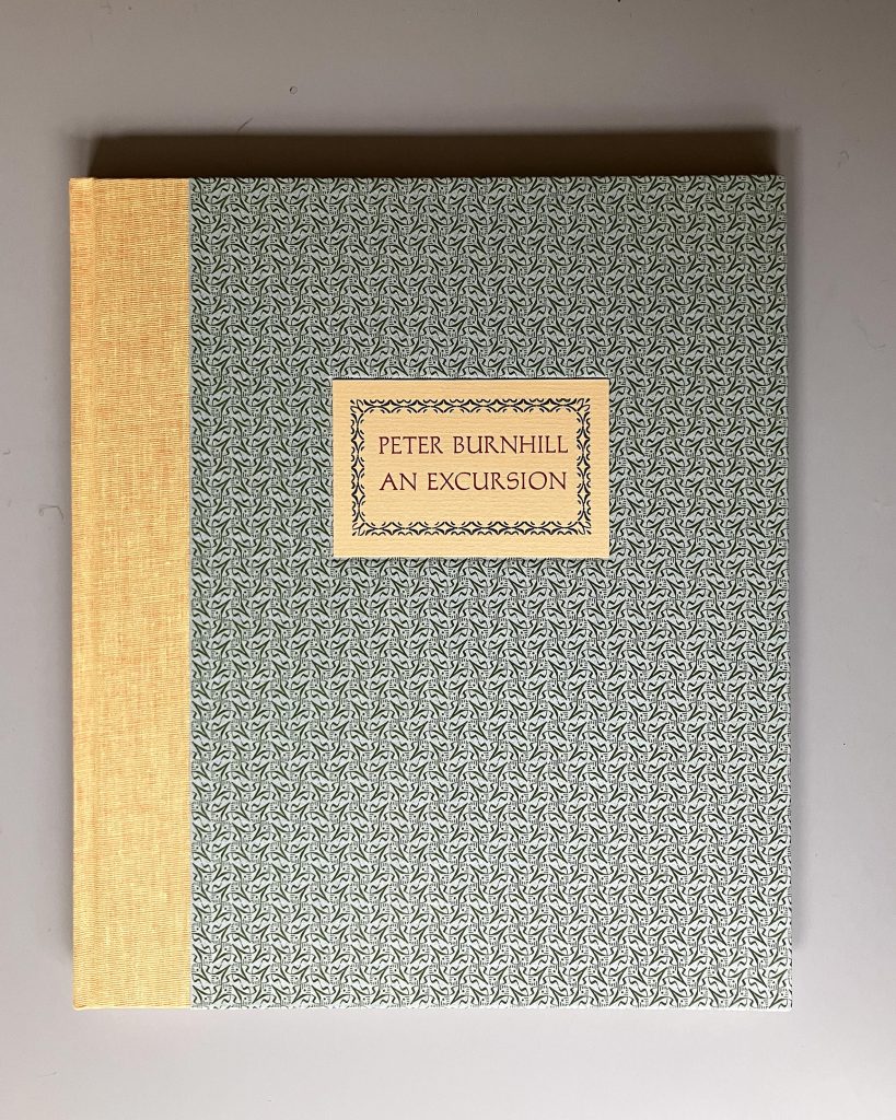
Now a book prompted by Peter’s Monotype ornaments has been published. It was conceived, designed and printed by Miles Wigfield at The Reading Room Press in Gloucestershire. Miles describes there how he acquired these ornaments. The 12 pt set was part of a batch of type that he bought from the estate of another letterpress printer, Kenneth Hardacre, and was kept in a box that had simply ‘Designed by P.J. Burnhill’ written on it.
The idea for this book started almost 20 years after the acquisition of this box of ornaments. Miles became curious, and began to investigate who P.J. Burnhill was. He found the pages about Peter on this website and, in September of last year, he wrote to me. From there he moved quickly. I introduced him to Peter’s daughter Jen, who was just then sorting out and cataloguing her father’s papers and all his surviving art. This included four boxwood blocks with engravings on them. These are printed in the book. As well as the acquired set of 12 pt Monotype ornaments, Miles had the 18 pt pair cast for this project. Last month copies of the book were finished and put on sale.
Peter wrote a short argument for designing and using ornaments, and that text is included in the book. It was offered to one of the trade journals of that time, British Printer, and it is addressed to printers with their customers in mind; but it has not been published until now. It is a typically strong and down-to-earth piece of writing. He gets quickly to this point: ‘one of the functions of decoration is to give delight. And the delighted customer is better than a satisfied one!’
Peter reveals his Marxist education in referring to the ‘use-value of ornament’. Thus his B.1447 (given the name ‘Carnival’ – a festival of pleasure and delight) ‘is a tentative feeler into the dimension of colour and overprinting. When printed in one colour the unit combines no matter which way round it is made to fall. Whether in strip form or mass, the individual entity of the unit is submerged in the new relationships of line, shape and texture’. Such possible effects are ‘unsuspected in the appearance of the single unit’. When one impression is printed over another, in a second colour, further possibilities reveal themselves. He credits the ‘miraculous precision’ of the Monotype machinery and ‘the strictly geometric structure of the design of the face of the square unit’.
The socialist William Morris – who used up-to-date printing presses and freshly designed type loosely based on photographs – might have agreed with all this.
This work of designing type ornaments certainly belonged to Peter Burnhill’s concern for a typography of rationality, meaning, and human pleasure. The journey towards his book Type spaces ran naturally through his design of Monotype series B.1447–1451.
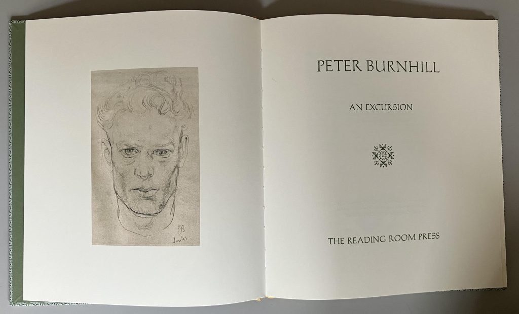
The frontispiece is a self-portrait, drawn in pencil: June 1947 (aged 24).
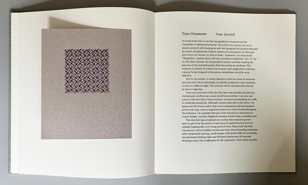
On the left page here, 1447 is printed as a mass in two colours.
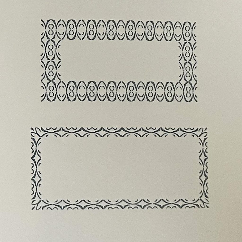
Two frames made of ornaments: above, 1449 and 1450 in two stacked rows; below, 1449 and 1451 in single rows.
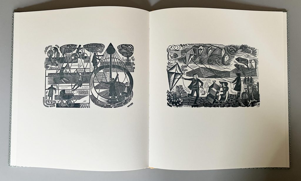
Two of the wood-engravings.
————————————————————————————————————————
Peter Burnhill: an excursion is available from The Reading Room Press, here
————————————————————
Robin Kinross
————————————————————