An article by Juliet Fleming on ‘How to look at a printed flower’ Word & Image (vol. 22, no. 2, 2006) throws surprising light on a usually unregarded element of the typographic armoury. Fleming works her way from early appearances of flowers in English printing (Henry Denham in the 1560s), via the aesthetic theory of Immanuel Kant (‘flowers are free natural beauties’) and the printed floral wallpaper that was contemporary with Kant, via ‘arabesques’ and the pattern-making of Islamic art, to the suggestion that these flowers and arabesques achieved their effects just through this exoticism that ‘allowed them to appear to presuppose no concept, with a technology that transformed copying into standardised reproduction, and thus took it out of the force field of imitation’.
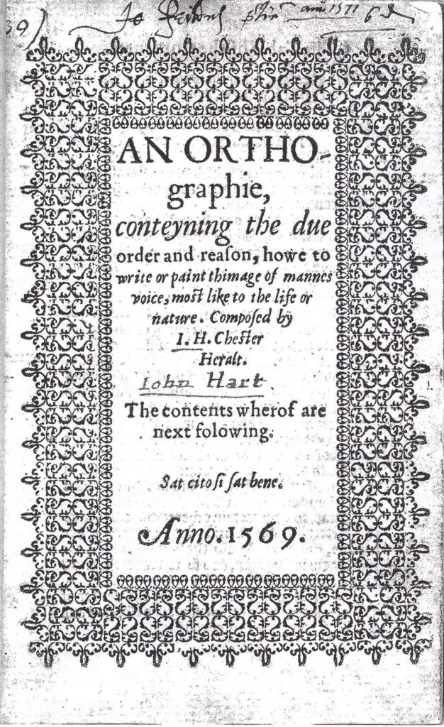
Title-page of John Hart’s An orthographie, printed & published by Henry Denham in 1569.
In the course of her argument Juliet Fleming writes a pregnant passage that bears pondering. Her thoughts start with a quotation from W.A. Dwiggins (as quoted by D.B. Updike in Printing types):
Excellent as single spots, the Caslon flowers multiply their beauties when composed in bands or borders as ornamentation for letterpress. They then become a true flowering of the letter forms – as though particular groups of words had been told off for special ornamental duty, and had blossomed at command into intricate, but always typographical, patterns.
Fleming’s elaboration follows:
Dwigins’s formulation usefully draws into question the more usually reified distinction between letter and ornament. For to see flowers as letters is to see the printed page as a visual field without semantic content, as an abstract pattern whose intricate black lines and white spaces provoke sensations of movement and light, and whose vibrating surface combines regularity and recurrence with a commitment to systemic local variance. Printer’s flowers, which make the visual proposition ‘this is what writing looks like’ even as they continue to manifest their own isotropic beauty, encourage readers to think about writing under the aspect of appearance, and to engage in the production of their own perceptual and conceptual analogies between the two visual systems. One could say that the appearance of printer’s lace turns the printed page into an aesthetic space that encourages projective – that is, subjective and imaginative – behaviour, and in doing so it breaks the stranglehold that the semantic function otherwise exerts over writing.
Some of us typographers have reached for ‘the semantic’ – the meaning of the text – in the face of the reductive strategies of stylist-designers (the page as a grey slab) and grim legibility researchers (the page as a work-camp for readers). It is good to stretch for a language that can describe the dimension of pure pleasure in the forms of typographic text, set in lines, in columns, in pages. That too must be part of any reader’s experience.