Counterpunch is packed with ideas. It is both an investigation into the technics of making metal type by hand, and a consideration of present questions in type design. The discussion takes in the fundamentals of designing and making letters, so that the book can be read as a guide to type and font construction in any medium. Lively, pointed drawings and photographs complement an equally fresh text.
Contents
Fundamental factors
Why this book?
Terminology
The three ways of making letters
Type: what it is and how it works
Comparing typefaces
Punchcutting in its contexts
Letters and the Italian intellect
The place of the punch in type production
The punchcutter and the historians
Where does the punchcutter come from?
The rise and fall of the punchcutter
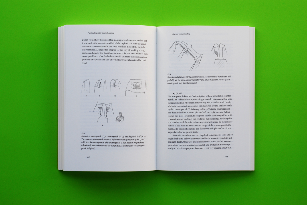
Punchcutting in the sixteenth century
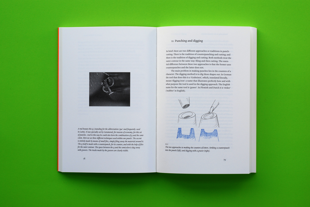
Punching and digging
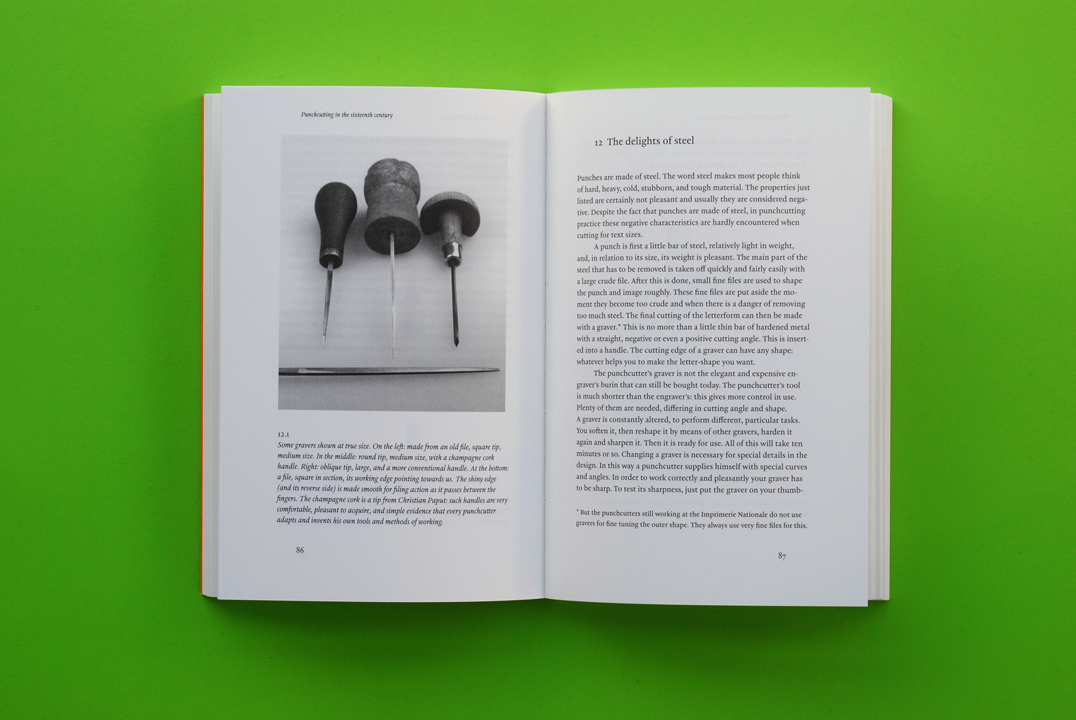
The delights of steel
Fournier on punchcutting
How did they really do it?
Fixing the image
Sequence of design and production
One punch a day?
Where are the counterpunches
Hendrik van den Keere and outlines
Linearity
Punchcutting and the working of type
Does technique influence form?
The unconscious eye
To the future
Punchcutting in the digital age
Type design and language
The limits of roman
Openings and changes
Hendrik van den Keere
Renard
Illustration sources
Index
Synopsis
Typography is still dominated by letterforms from the first hundred years of European printing. What were the processes and attitudes that lie behind these forms? Fred Smeijers is a type designer who learnt to design and cut punches: the key instruments with which metal type is made. This book is a work of practical history, with much contemporary relevance.
Counterpunch opens with some basic questions: just what – in any age – is type? How does it differ from what we call writing? How to evaluate type? The historical discussion then begins with a look at the attitudes to letters of the Italian humanists in the fifteenth century. Their abstract ideals are contrasted with the material realities of production. These realities are also set against the idealism of historians.
Two approaches are distinguished: one that uses a set of counterpunches to make the punches, and one that engraves each punch freshly. Smeijers sees the counterpunch as an essential aid. It ensures regularity of form, repeatability, speed in production – in fact it gives a system of design, which will always be applicable to roman letterforms.
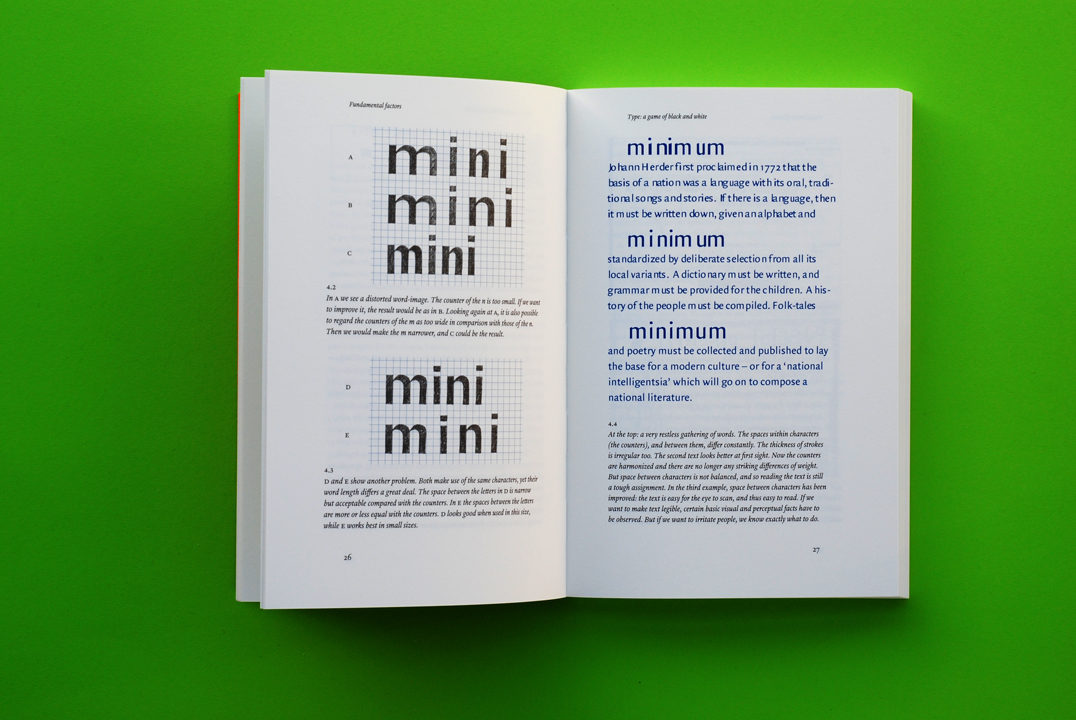
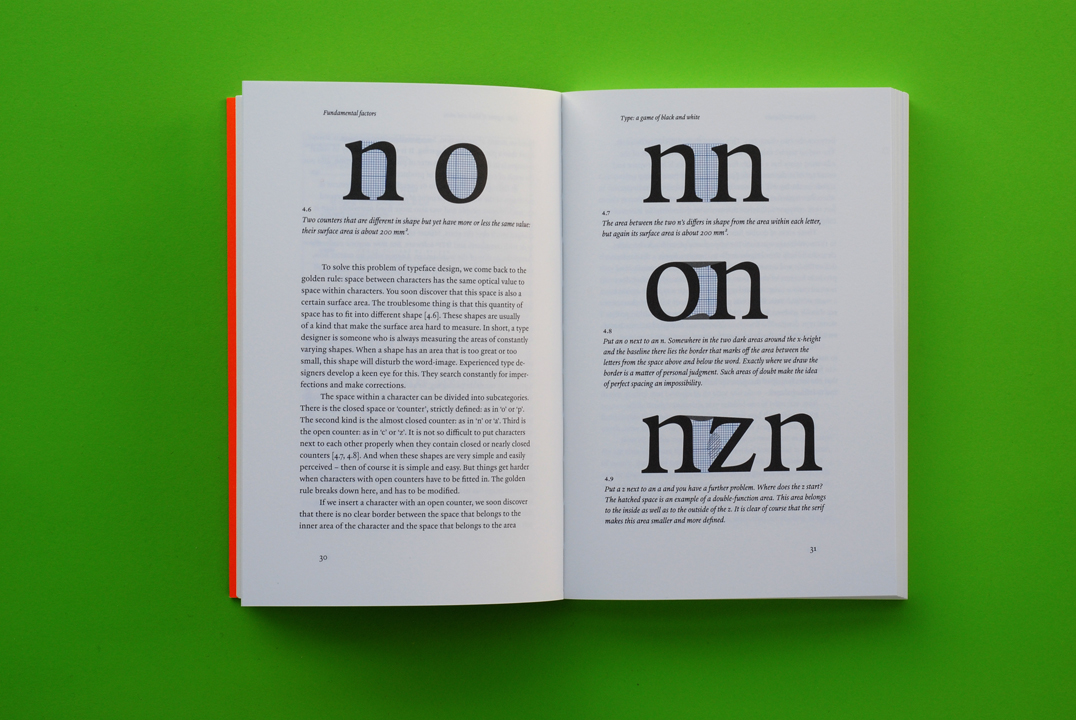
The central chapters of the book carry this argument forward, with a close look at the type and punches that survive from the sixteenth century, notably in the Plantin Museum at Antwerp. Here the illustrations are important: lucid line-drawings by Smeijers, photographs of early printing, and greatly enlarged photographs of punches – revealing them as the sculptures they are.
The book closes with some wider discussion, arguing for a way past the polarities of traditional/new-wave, and for clear socially-minded typography.
The second edition, like the first, is a high-quality flapped paperback, printed throughout in two colours. The text has been corrected and revised, and is reset in a new typeface (Haultin, designed by Smeijers).
Reviews
Smeijers, a Dutch type- and graphic designer, knows what he is talking about. Not an ivory-tower theoretician, he has practised punchcutting intensively. This shows, for example, in his commentary on two chapters of Pierre Simon Fournier’s ‘Manuel typographique’ of 1764, which Smeijers gives in an English translation and elucidates very instructively. The last part of the book extends the discussion to current type design and stresses the meaning of history for the present. Smeijers does not think that young designers nowadays must necessarily concern themselves with historical type, but he argues reasonably that they would profit from this.
‘Counterpunch’ is written in an entertaining manner and Smeijers’s ‘esprit’ frequently shines through – for which a compliment to the editor, Robin Kinross, is due. He revised the manuscript, largely written in English, without smoothing out the text too much. The carefully considered design, a bibliography, and a useful index complete a book that we can warmly recommend to anyone interested in type.
Kaspar Brand, Page [Hamburg], May 1997
It is no exaggeration that reading ‘Counterpunch’ is fun. … This book was not written for historians, ‘but for the makers and users of type,’ and anyone who has spent any amount of time intimate with the forms and counterforms of type will enjoy seeing the punchcutting experience through Smeijers’s eyes.
Angelynn Grant, Communication Arts, 1997
‘Counterpunch’ is a convincing argument, a strike back if you will, against the accepted theories of type design, history, and typography which have lead to a theory of mathematical precision in type forms that deadens their visual effect on the page.
Dan Carr, Matrix, 1997