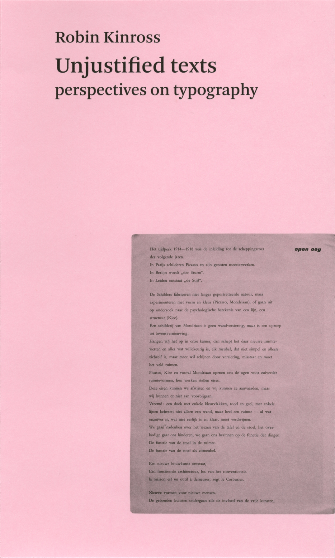
A book of writings from twenty-five years of engagement on the peripheries of both journalism and academic life, and drawn largely from small-circulation and now hard-to-access publications. Persistent themes include: editorial typography, the emergence of graphic design in Britain, emigré designers, Dutch typography, the work of critical modernist designers.
Our edition of this book has now been taken over by Éditions B42. Go here.
[September 2020]
Contents
An introduction
Examples
Elders, contemporaries:
Marie Neurath
Edward Wright
F.H.K. Henrion
Jock Kinneir
Norman Potter
Adrian Frutiger
Ken Garland’s writings
Richard Hollis
Karel Martens
MetaDesign, Berlin
Neville Brody
The new Dutch telephone book
LettError
Evaluations:
What is a typeface?
Large and small letters
Black art
Newspapers
Road signs
Objects of desire
Letters of credit
Two histories of lettering
Eric Gill
Herbert Read
Jan Tschichold
Fifty Penguin years
Teige animator
Adorno’s Minima Moralia
Judging a book by its material embodiment
The book of Norman
Adieu aesthetica
Best books
The Oxford dictionary for writers and editors
The typography of indexes
Stages of the modern:
Universal faces, ideal characters
The Bauhaus again
New typography in Britain after 1945
Unjustified text and the zero hour
Emigré graphic designers
Signs and readers:
Semiotics and designing
Notes after the text
Fellow readers
Index
Synopsis
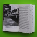
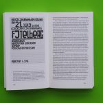
Over twenty-five years Robin Kinross has written for publication in magazines and journals, making a case for typography as a matter of fine detail and subtle judgement, whose products concern all of us, every day. This selection of his shorter writings – including some previously unpublished – brings his major themes into focus: the unsung virtues of editorial design and of information design, the fate of Modernism in the twentieth century, the work of dissident and critical Modernist designers, the contributions of emigré designers from Europe in the English-speaking world, the virtues of a socially-oriented design approach. He argues for a design that is of use in the world, and against the cult of design and the delusions of theory. The out-of-print pamphlet Fellow readers (1994) is reprinted in full. A separate section of illustrations with extended critical captions presents these themes in a direct and accessible way. Kinross introduces the book with a fresh essay that recalls just how these pieces came into existence. The book presents an unexpected body of writing, which stakes out fresh territory between the purely academic and the merely journalistic.
Reviews
Almost exactly in the middle of the volume is Kinross’s declaration of his favourite book (mine too): Adorno’s ‘Minima moralia’. I read that as a hint, because anyone who has read through the almost 400 pages of the book will have received not just diverse prompts to reflection; they will also have gained an impression of an observant and humane authority, who can be called not moralistic, but rather – in the spirit of Adorno’s book – moral. There should be more such authorities.
Roland Reuß, Text [Frankfurt a.M.], no. 8, 2003
In short, a nice book to read and the perfect antidote to all those slick design books. I am also rather curious to know whether the author-publisher himself, without any false modesty, wrote the blurb: ‘The whole is an unusual and powerful contribution to the subject of typography’.
Mathieu Lommen, Items, April/May 2003


